[ad_1]
The Union Of Two Weatherboard Cottages Into One Tactile Family Home
Architecture

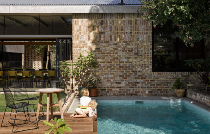
‘Recycled bricks and recycled timber are the two main materials,’ explains Mark Spence. ‘The brick; a dry-pressed blended browns mix, detailed with flush mortar joints and left intact and not acid washed; for both environmental reasons as well as to helps often the tones of the bricks.’ Photo – Christopher Frederick Jones.

Corridors connect the boundary flanks to the dining pavilion to the south, while the courtyard is linked to every side via windows and sliding glass doors. Photo – Christopher Frederick Jones.

The dining room opens to the courtyard and backyard. From this view you can see the 4.2m long dining table and light fittings made of timber repurposed from the demolished eastern cottage. Photo – Christopher Frederick Jones.

The kitchen and dining space are connected in the southern pavilion. Photo – Christopher Frederick Jones.

A feast of texture and material explodes in the kitchen. Photo – Christopher Frederick Jones.

Expertly crafted joinery comprises these in-built window seats. Photo – Christopher Frederick Jones.

The bathroom palette is kept cool and neutral. Photo – Christopher Frederick Jones.

An in-built desk on the eastern corridor creates an open study zone facing the courtyard. Photo – Christopher Frederick Jones.

The central courtyard anchors the entire house, with residential wings flanking each side. Photo – Christopher Frederick Jones.

Looking from the library onto the greenery. Photo – Christopher Frederick Jones.

The windows above the brick terrace link to the library, while the corridor facing the garden connects the bedrooms to the garden. Photo – Christopher Frederick Jones.

Looking back to the front entry passage and door from the central courtyard. Photo – Christopher Frederick Jones.

The two form facades from the street present opposing design attitudes. Photo – Christopher Frederick Jones.

To the left is the intact western cottage, to the right lies the site of the now-demolished eastern cottage. The timber-battened garage is built in its silhouette to gesture to its past form. Photo – Christopher Frederick Jones.
The Hamilton Courtyard project by Anthrosite was originally meant salvage two 1930s cottages and unite them together with one cohesive design. But the eastern structure could not be saved, and thus the design had to be reconfigured to include just one of the existing buildings.
‘Instead of being pressured into market norms of maximising floor space, the clients were more concerned with creating a series of family spaces that felt connected to each other,’ says director, Mark Spencer. ‘The result is a celebration of the courtyard, a generous central area that unites the wings of the house and promotes visibility, allowing the occupants to remain connected to each other even while engaged in individual tasks.’
A brick passage running between the two cottage sites acts as the formal entry to the residence, opening to a central courtyard (landscaped by the clients themselves!) which serves as the main node of the house. Wings surround this green space on all sides: to the west lies the bedrooms, to the south an open plan living-dining-kitchen area, and the east holds the ancillary zones such as a laundry, pantry and music room.
An in-built desk runs the length of the eastern courtyard window, creating a study corridor that looks onto the greenery beyond.
The intact western cottage holds more bedrooms and a courtyard-facing library, while the body of the eastern cottage is now a garage. Beyond the dining pavilion (which opens on both sides thanks to sliding glass doors) lies a backyard comprising rolling green lawn, a pool and a pool-house.
Floorboards from the eastern cottage were salvaged and repurposed as furniture and light fittings, specifically the 4.2 metre long dining table and the pendant light that hangs above it. Additionally, French doors and stained glass windows were also re-used from the demolished residence.
Finally, the eastern cottage was replaced with a timber battened garage that retains the same silhouette as the original structure. From the street-view, the twin silhouettes read like a form and its shadow, as well as a respectful gesture to the building that used to stand before it.
The result is a glorious expression of old-meets-new design!
The Hamilton Courtyard by Anthrosite was shortlisted in the Residential Architecture Category of The Design Files + Laminex Design Awards 2021.
See more projects from Anthrosite here.
[ad_2]
thedesignfiles.net


