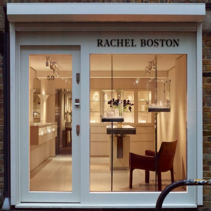
Interior design studio Hollie Bowden Interiors has created fine jeweller Rachel Boston’s flagship store and showroom in London.
Located in Shoreditch’s Redchurch Street, the store is split into four main areas – the retail space, private appointment area, workshop and office space for the jeweller’s team of 12.
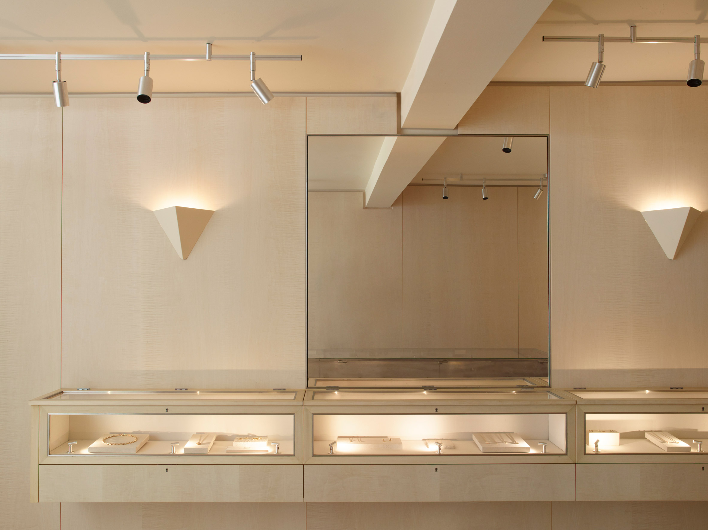
The store aims to blend a neutral material palette of glass and steel with sycamore wood veneer and velvet mohair upholstery.
“Jewellery stores can be read as quite uninviting and exclusive,” Hollie Bowden Interiors founder Bowden told Dezeen. “I wanted to create the opposite experience to that, something that felt open and un-intimidating, yet special and elevated.”
Placing the jewellery centre stage was a key objective for Rachel Boston when briefing Bowden’s team.
“Even though our pieces are striking, they are ultimately small objects by nature, so I didn’t want a huge amount of fussy furniture or bold colours to detract from the experience of customers viewing our pieces,” Rachel Boston told Dezeen.
In response to the brief, Hollie Bowden created a compact 19-square-metre front retail space “inspired by the concept of a jewellery box that draws your attention into the small, intricate objects within”.
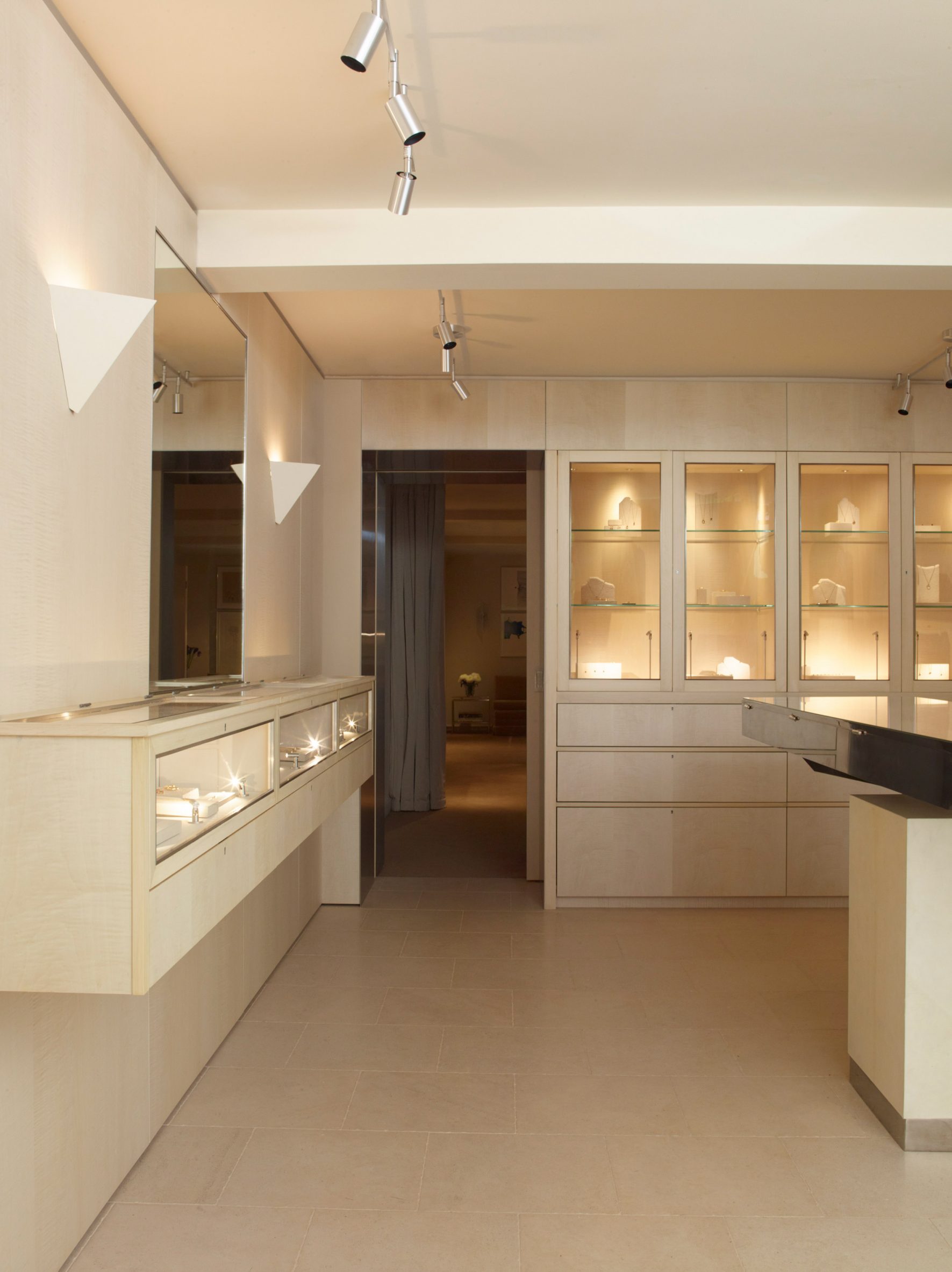
Sycamore veneer wall-cladding, limestone flooring and lining the display cases with ivory silk combine to create the jewellery-box effect, “emphasising this feeling of being cocooned in the space” Bowden told Dezeen.
“I wanted to focus on materials that have a quiet beauty about them, that you have to get up close to really appreciate,” she continued.
This process of refinement has been a hallmark of Bowden’s style since establishing her London-based studio in 2013.
“Not over-designing projects with too many materials is very important – to give objects the space to sing,” she explained. “I’m always trying to reduce and simplify.”
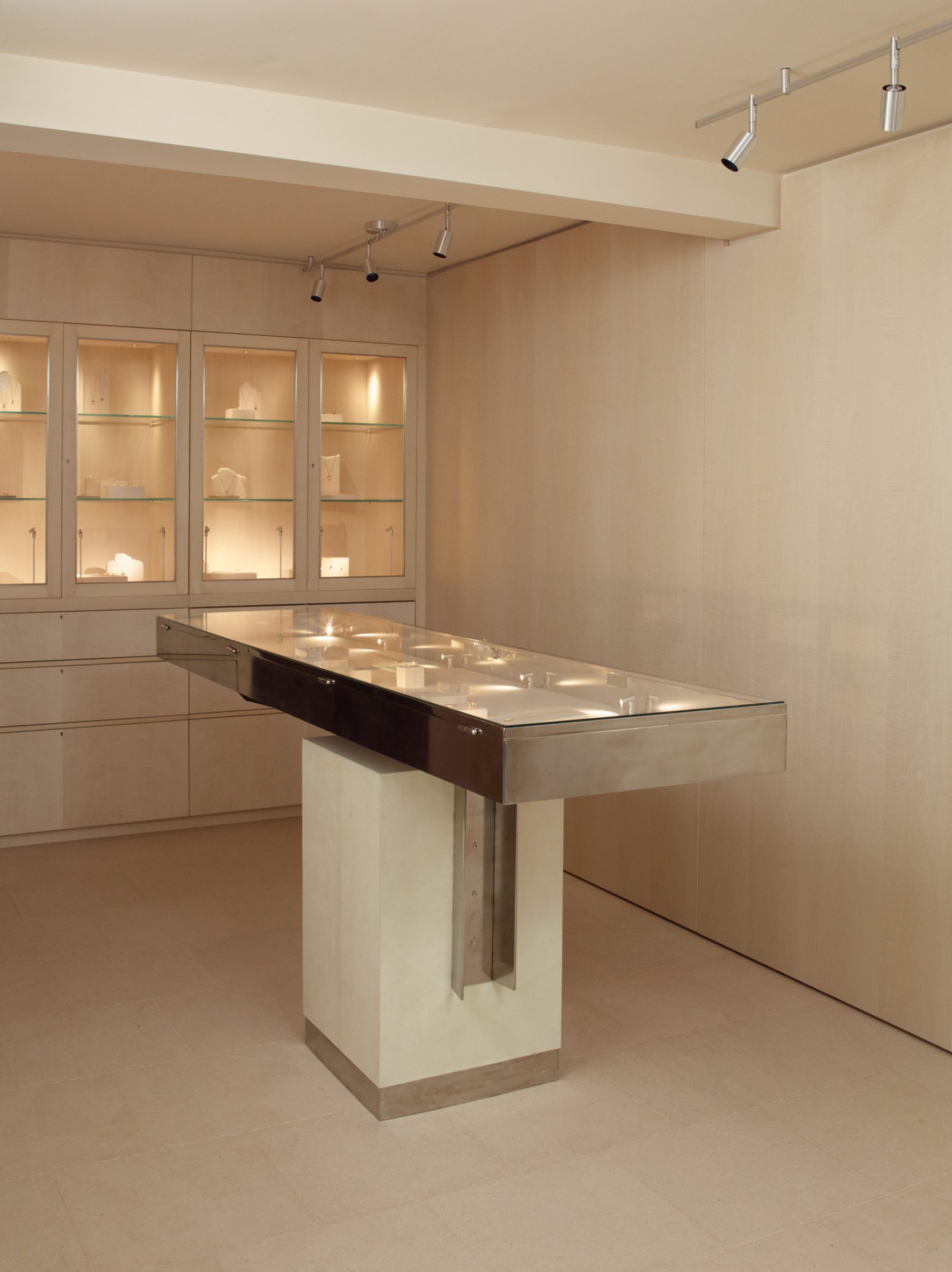
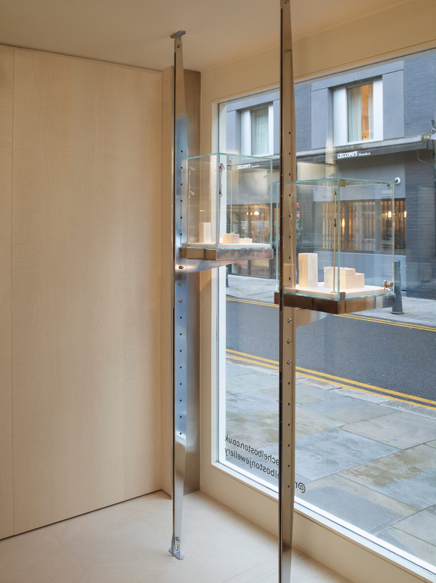
Jewellery is displayed in floating window vitrines and a cantilever display desk, designed in collaboration with London-based artist and designer, EJR Barnes.
Made from mirror polished steel, these bespoke displays introduce a “vertiginous moment that makes the space feel unique,” according to Bowden.
For these cabinets, Bowden and Barnes drew on the utilitarian design language of archives which “display, protect, and organise what they contain in quite a neutral way”.
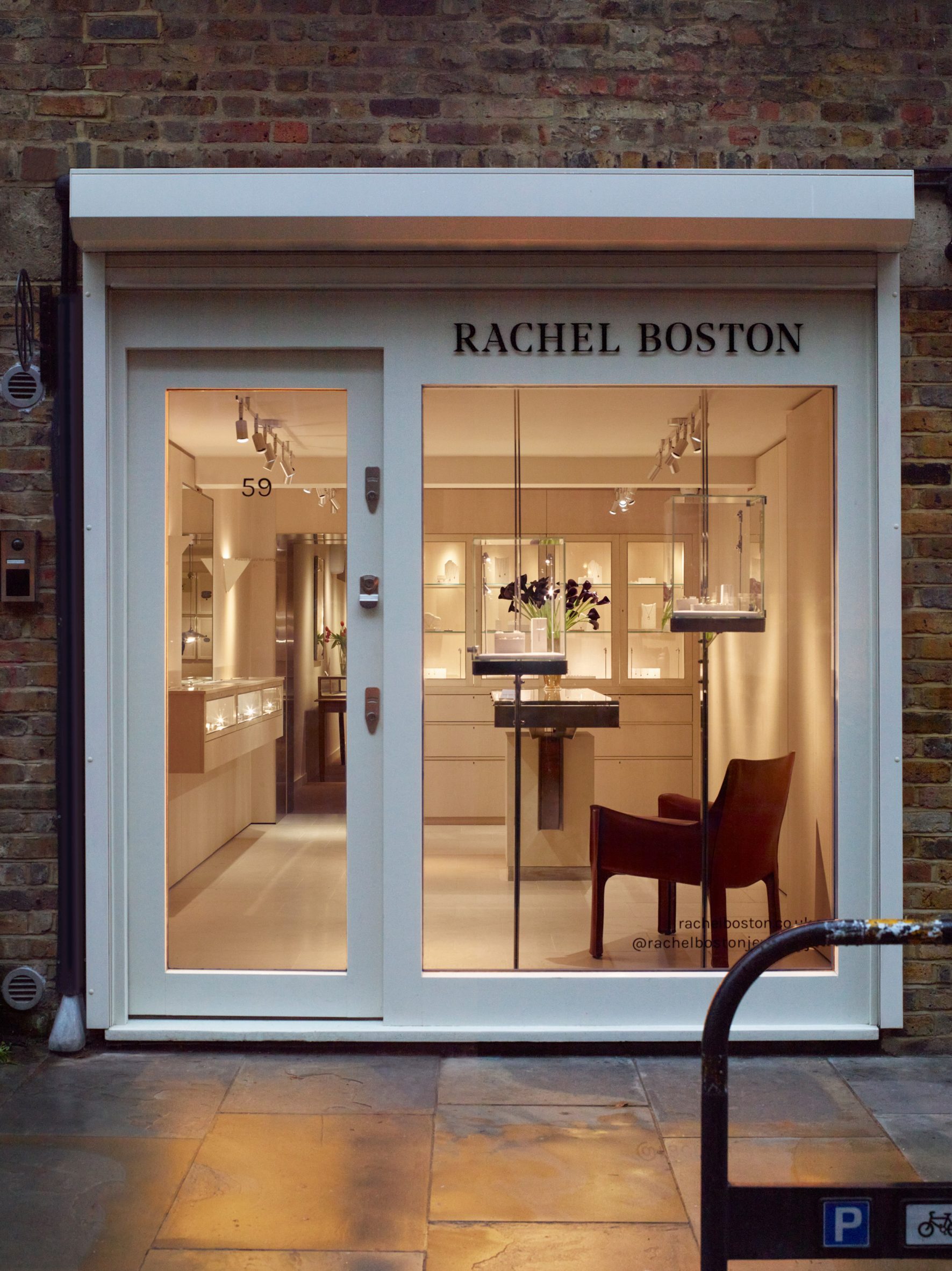
Rather than using big ornamental gestures more common in jewellery retail, Bowden says this approach “represents a unique and original way of presenting jewellery”.
“The idea of ‘subtle luxury’ feels like a great counterpoint to retail design at the moment that can feel like you’re in a casino,” she added.
The frames of the cases are simple and uninterrupted, maximising the display of the jewellery and encouraging guests to roam freely around any area.
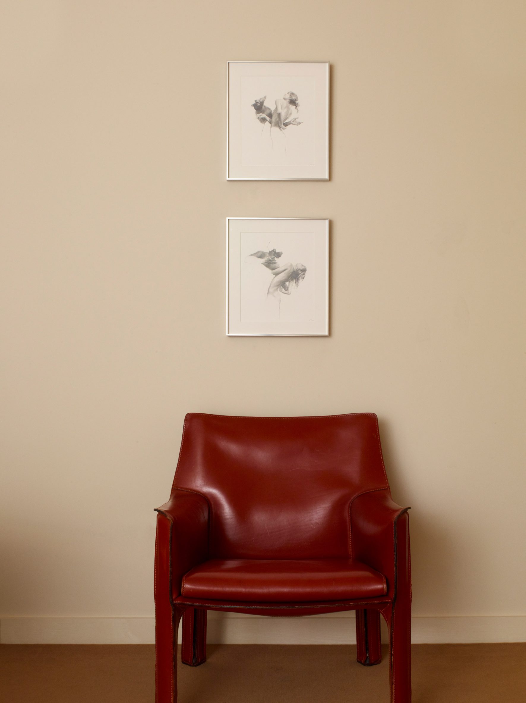
A Mario Bellini Cab Chair in a deep wine red, placed at the front of the store, works along the lines of the unexpected-red-theory interior trend, featured in our recent lookbook.
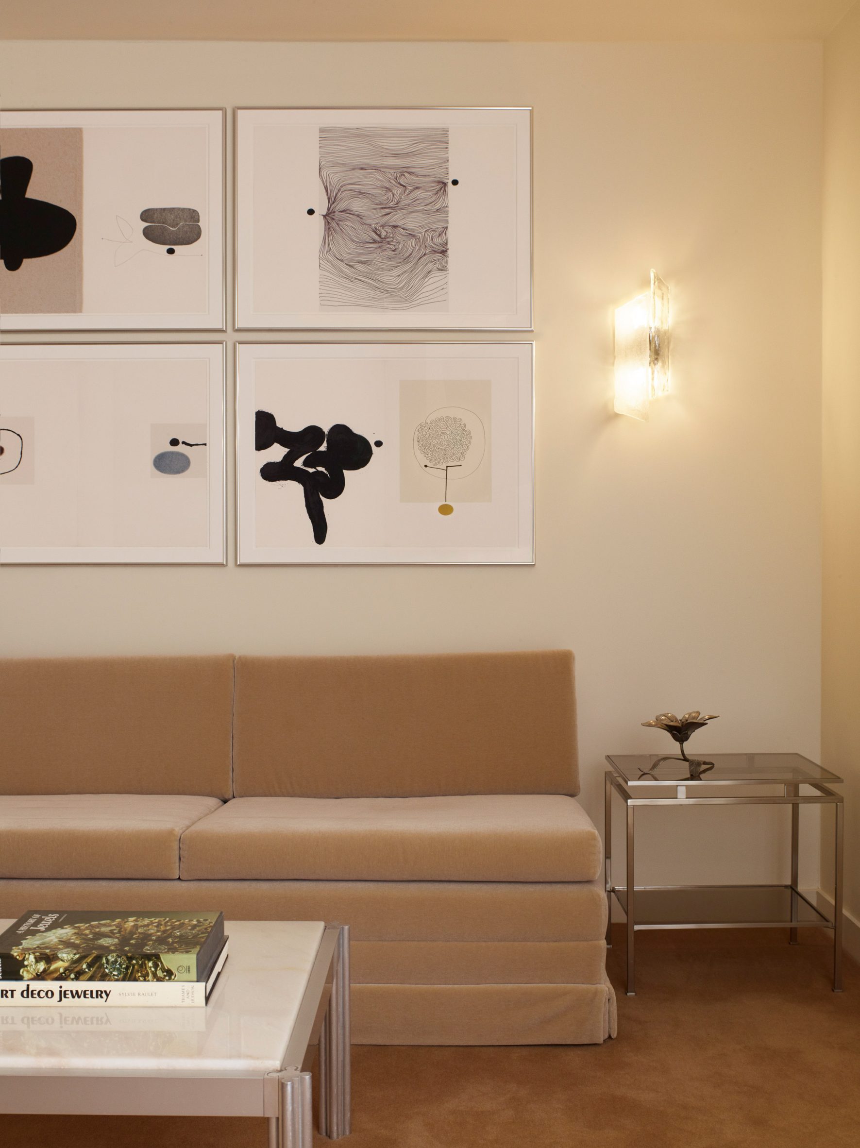
Through a stainless steel-lined open doorway, the rear space is curtained off for private appointments. This larger 42-square-metre showroom in the back has a more relaxed and intimate feel that mirrors the art-deco style of Boston’s jewellery.
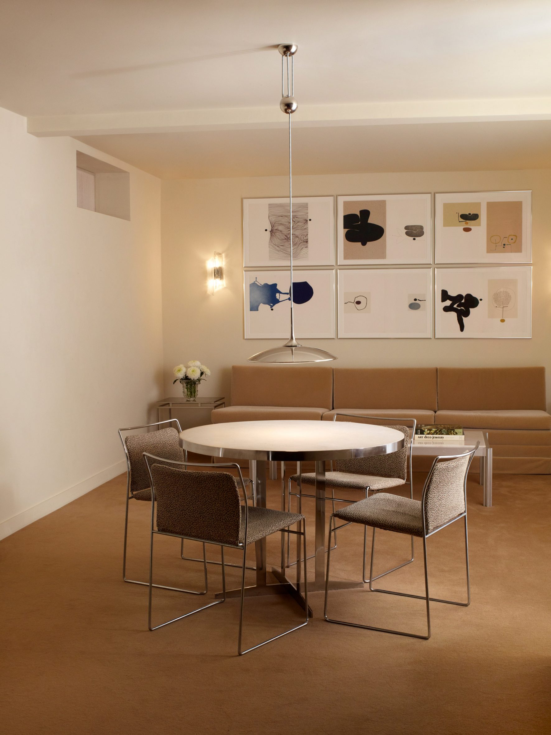
Upon entering the rear space, a brown short-pile carpet and bespoke sofa upholstered in Claremont mohair signals the transition from the storefront.
“We wanted to create two distinct spaces, independent of each other yet with a subtle link that reflects Rachel’s jewellery,” Bowden said.
“While the spaces contrast, the continuations of steel and limestone allow for a striking continuity throughout.”
Other projects by Hollie Bowden Interiors featured on Dezeen include a pared-back jewellery showroom and a London office space inspired by the sultry lighting of gentlemen’s clubs.
The photography is by Richard Round-Turner.
The post "Subtle luxury" defines Rachel Boston jewellery store appeared first on Dezeen.
www.dezeen.com

