[ad_1]
An Inspiring Makeover Of Standard Brick Veneer Melbourne Unit
Interiors

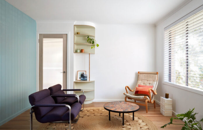
Easycraft VJ board in Dulux Baroque Blue. Oil painting by Ann Teng. Print by Georgia Janetzki. Roger Capron coffee table. Eero Aarnio armchairs. Bruno Mathsson armchair. Armadillo rug. Timber framed glazed doors by Pickering Joinery. ‘The odd alignment of the living room wall and placement of the door was handled by installing curved open shelves. This ended up looking like it was supposed to be there, so you no longer notice the odd wall nib,’ says Kathy Robinson, director of Robinson Architecture.

The circa 1970s brick veneer unit exterior.

Easycraft VJ board in Dulux Baroque Blue.

Narrow reeded glass to the kitchen door diffuses light from the courtyard and screens views of the neighbours, without obstructing the outdoor view. Timber framed glazed doors by Pickering Joinery.

The Super White Dolomite bench was an offcut sourced by the stonemason meant reduced cos. ‘It is strategically located as a feature to maximise bang for buck.’

Shower curtain by Seigaiha from Redbubble.

‘The plywood vanity cabinet and shelving in the bathroom was selected as it is cost effective but adds warmth.’

The 1970s unit pre-renovation.
Until recently, this circa 1970s brick veneer unit had near-original interiors in a tired state.
‘The living area was too small and difficult to furnish,’ explains Kathy Robinson, director of Robinson Architecture. ‘The kitchen was dark and without a pantry or dishwasher, storage was minimal, and the washing machine was located in the bathroom.
‘Typical of its era, the home was uncomfortable — stifling in summer, and chilly in winter. But there was lovely northern sunlight, a garden aspect, and park views.’
The clients engaged Robinson Architecture to transform the unit with plans of renting it out and eventually being lived in by their adult children. The project aim was to explore how a rental property could be upgraded with depth and integrity.
‘The work wasn’t about flipping a property, but creating a comfortable home that would last,’ says Kathy.
The construction budget was $99,000, which needed to cover the reconfiguration of the compact 65 square metre floor plan; all new internal finishes; and thermal upgrades.
Most significant to the property’s transformation was the reconfiguration of the hallway and bathroom to remove wasted space.
‘The biggest challenge [was] trying to fit together the puzzle of a reasonably-sized kitchen with a proper pantry and broom cupboard along with a European laundry, while allowing room for a comfortable bathroom. New internal walls had to be designed around the existing window openings,’ says Kathy.
‘Everything came down to the last millimetre and the architect was enormously relieved when it all worked properly!’
The reconfiguration increased the size of the north-face living room for comfort and to allow more natural light to stream into the unit.
‘The odd alignment of the living room wall and placement of the door was handled by installing curved open shelves. This ended up looking like it was supposed to be there, so you no longer notice the odd wall nib,’ Kathy says.
The kitchen was meanwhile stripped out and upgraded, with new bench tops added and a new wall of full-height cupboards. ‘The subtly varied finishes, routed panelling, open shelves and tile layouts are carefully articulated and scaled to make the spaces appear bigger,’ Kathy says.
The unit was also freshly painted with new light fittings and blackbutt floorboards installed over existing old pine flooring.
Last but not least, thermal upgrades were made to improve the home’s sustainability and efficiency to the benefit of all future residents. External blinds were added to west-facing windows to shade against summer sun, alongside internal honeycomb blinds to prevent winter heat loss.
More renovations will be completed as the client’s budget allows to replace the existing aluminium windows with timber framed double-glazed windows, and add install solar panels.
Kathy says the unit post renovation is a totally different place. ‘It is now spacious, light, warm and contemporary, and an example of how small living can be good living.’
[ad_2]
thedesignfiles.wpenginepowered.com


