[ad_1]
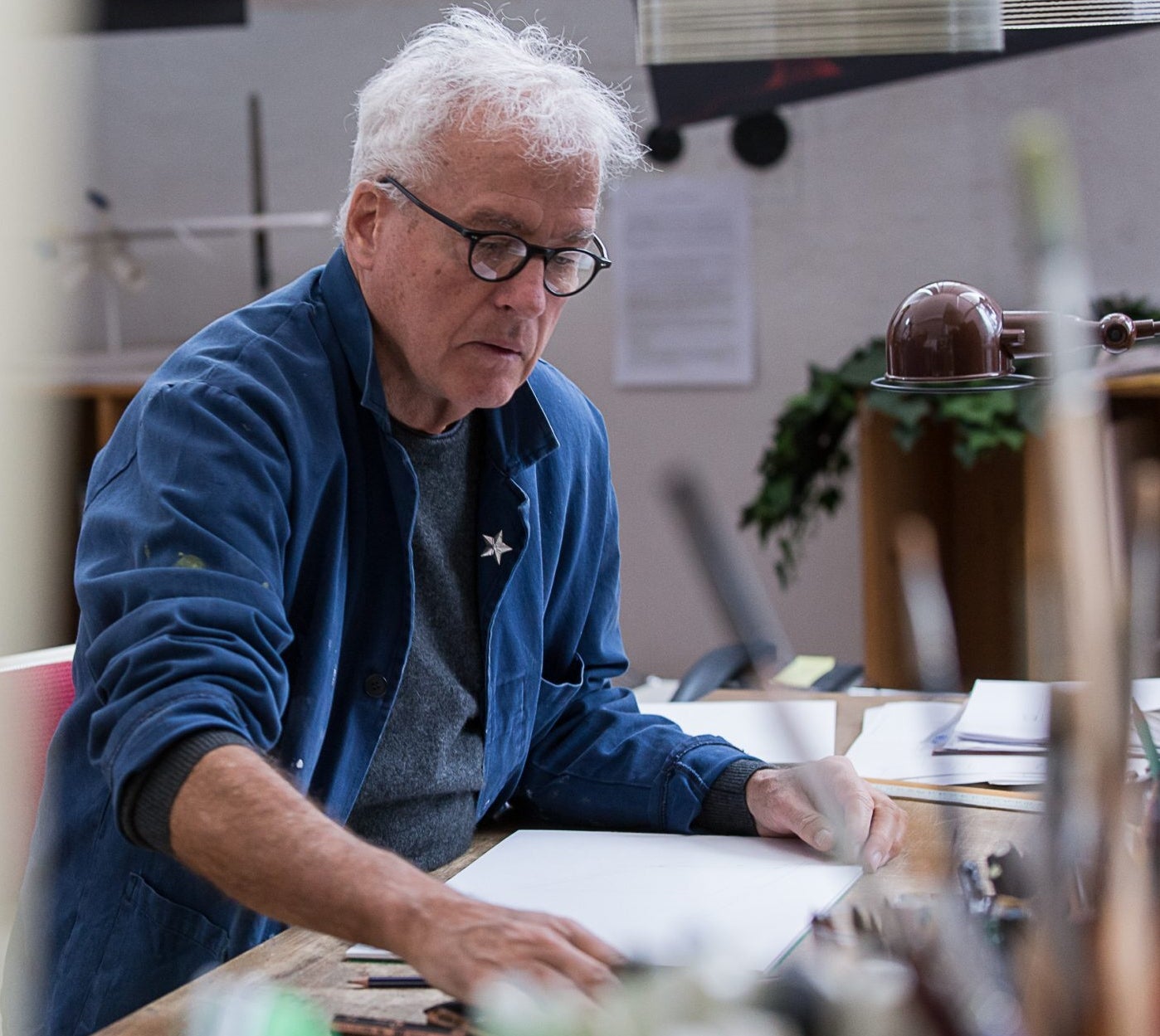
Much like the Twiggy Floor Lamp he first designed for Foscarini in 2006, Marc Sadler is versatile, innovative and the epitome of good design. His influential design work spans lighting, furniture, decor, luggage and as we recently learned: gelato machines (more on that later).
We had the pleasure of catching up with Sadler to talk about his design process, his theory on lighting and the “tragic beginnings” of the original Twiggy design.
What is your design story? Where did it all begin?
I was a student of ENSAD (Ecole Nationale Supérieure des Arts Décoratifs) in Paris. During my third year a brand-new branch of study was inaugurated under the name of “industrial aesthetics laboratory” (there was no talk of design yet) that I immediately joined. Once graduated, I had solid ideas about the designer’s mission: form and function were the key concepts (the egg has a certain shape so that the hen can produce it without difficulty), and the variables around these two founding factors were far from worrying me at that time!
But the working reality soon appeared far different from the school preparation, and I had to make the experience myself—thanks to some farsighted Italian entrepreneurs in the field of sports design, I became able to learn the production process and techniques, and at the same time, I became familiar with the market and the marketing rules.
As a “different young” designer I can say that many years of work have given me a varied experience, both because I have worked in so many different fields of the industry, and because I have lived and worked in different countries of the world. Nevertheless, every new experience may be surprising, which makes me believe that still being able to be surprised is a good thing of my job.
What makes for good lighting—is there more to it than simply illuminating a space?
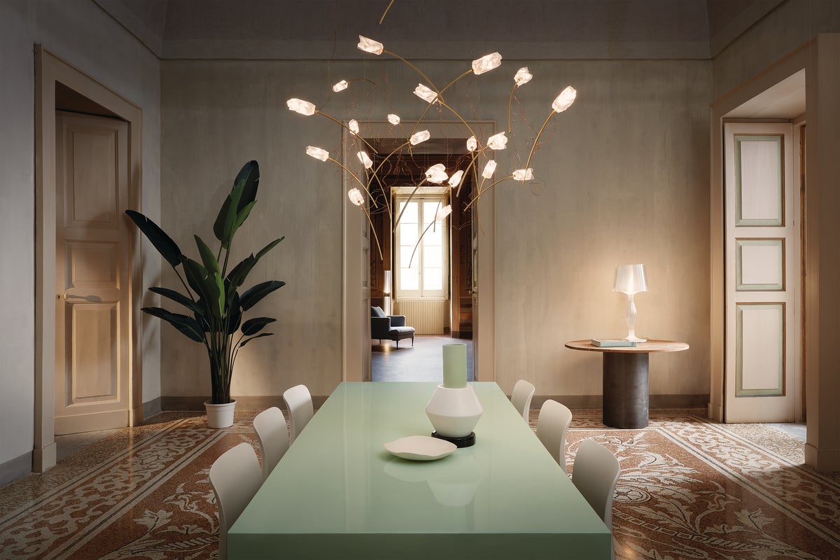
Light is a concept, a state of mind and a tool also: magic and function at the same time. Whether natural or artificial, the light strongly connotes any ambience, and its design process is also meant to handle its emotional capacity. Being able to rule the amount of light delivered by a lamp–intense and strong when needed, feeble and soft in more intimate situations–determines its “human-sized” quality. But even when they are switched off, lamps are elements that outclass other décor within the hierarchy of a hypothetical scale of importance because to give the light a shape influences the space around, portraying it in a technological, functional, aesthetic and emotional sense.
What is your design process? Does it start in the studio, or does inspiration strike you in unexpected ways?
My creativity is strongly powered by observation and information. Cinema, art, nature, everything contributes in providing valuable insights that can be translated into design solutions. It may happen to me to wake up at night having found the idea I was looking for. A few weeks ago, for example, I was skiing in the sun and was totally relaxed, then it clouded over and it got cold, so I went into a bar where I started sketching on a paper napkin in front of cup of hot chocolate: suddenly an idea came to me with the solution for a chair I was working on for months, and it was about a solution that completely changed what I had thought until then. But for sure ideas must be integrated with the requirements of the company. Keeping the pulse on strengths, weaknesses and peculiarities of the company is crucial to adjust the idea to the manufacturing and commercial reality to which it is intended for, without pretending to lay down any abstract rules!
Where do you find inspiration?
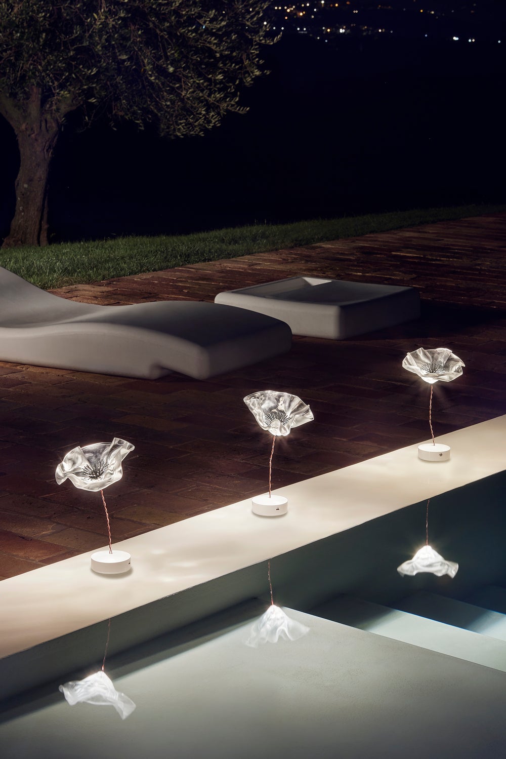
Inspiration comes from many other directions. For example from nature, where flora and fauna all around are often design masterpieces; the mineral world too, where geology is able to create wonderful mix of shapes and colors. History, architecture, all solutions found by the humans for any one issue offers sometimes interesting ideas. I am a very curious person, a great observer. I like to look around with my nose up in the air ready to pick up any kind of incentive. I very much like to visit museums to catch the essence of the quality of the past, it helps me to think of how to better forward some concept in the present world.
Do you have a favorite design or design process story?
Even if “every ugly child looks beautiful to his mom,” meaning that almost every project looks “beautiful” to me, I would pick the Dainese Back Protector [for motorcyclists] I first conceived in the early ’80s. Gratification didn’t arrive through the recognition of it formally (on the contrary, at the beginning people used to say that it was ugly), but from the fact that this product could save lives. At that time the concept of body protection was close to zero. I remember an American motorcycle pilot, Kenny Roberts, who had made a sort of self-made slider, a metallic welt wrapped around his knees with which he was able to improve the speed thanks to his lapping and overbalancing body in loop, where he was nearly touching the track with the knee to control the motorcycle balance.

Sadler’s experimental industrial design background pushes his works past mere function; his Mite collection (inspired by golf clubs and made from carbon fiber, Kevlar and marble—the Anniversary edition pictured here) earned him Compasso d’Oro awards in 2001 and 2021.
That was the starting point of a deep experimentation over different materials, either to improve the performances of the racers and to protect their body in case of accident: to fit the part of the body it needed to be a malleable material, thus very resistant to friction. From that point on, a big range of protections had been created (gloves, knee, elbow, etc.), until the back protector. But the most important thing is that the concept of body protection finally has migrated outside the world of sport competition to reach the mass consumers. Human lives have been saved thanks to the back protector worn by motorcyclists who had heavy accidents (that could have turned into tragedies if the back protector would not have existed). There’s a sequence of witnesses and letters of thanks from all over the world that M. Lino Dainese keeps in his files.
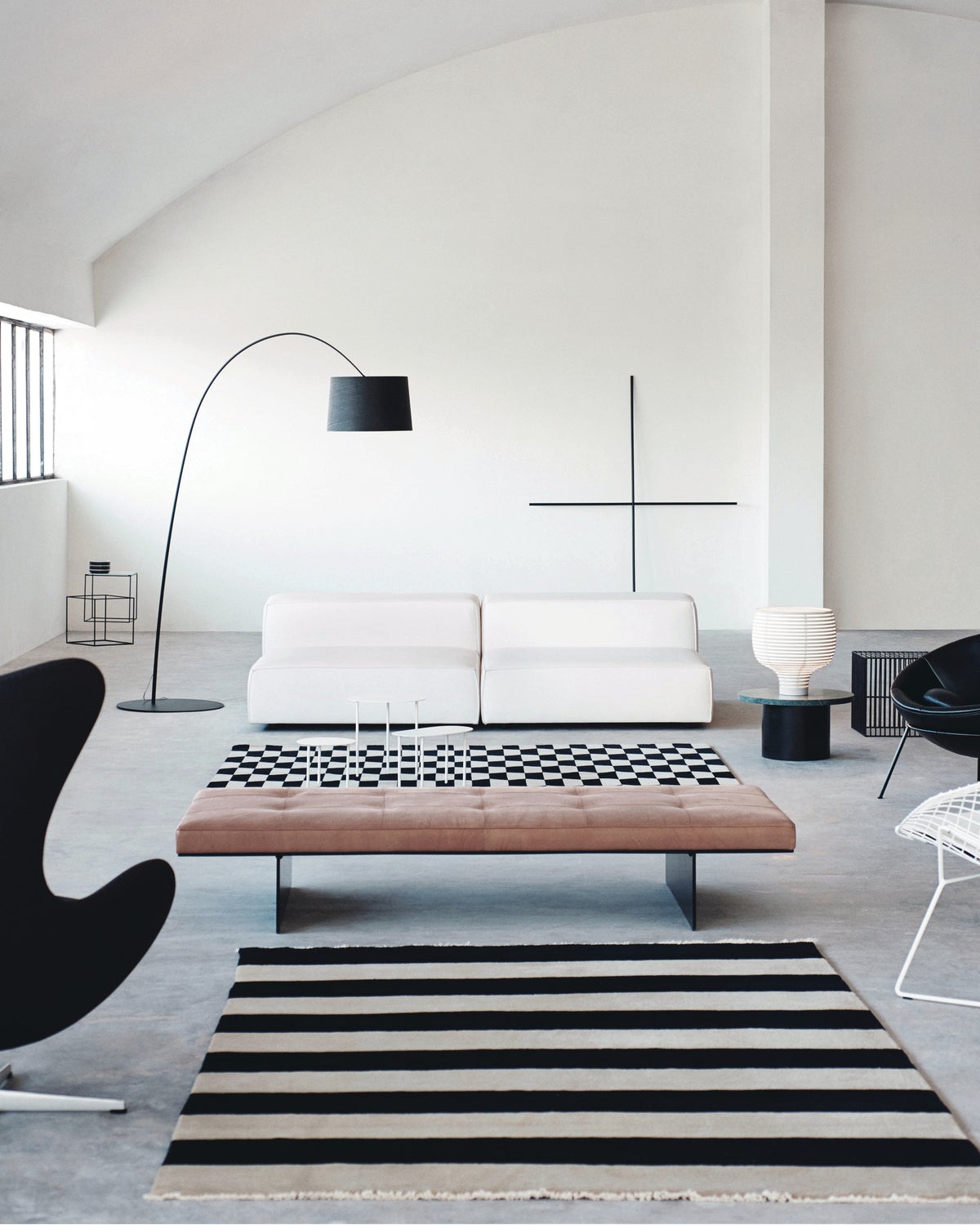
The Twiggy Floor Lamp that you designed for Foscarini in 2006 is a modern icon. Can you tell us more about the original design and its updates over the years?
Twiggy was born in the footsteps of the Mite family, made of a composite material that already had proved to have a high mechanical resistance, together with a lightweight and a ductility enough to make it possible to stretch the shapes to the extreme. At that time, we were so concentrated on the performance of such composite material, that it was inevitable for me to think of an informal design. After all, Twiggy is nothing more than a half-conical diffuser, a pole and a base, but it is the combination of these three elements that have determined the magic of this “no design” object with such a strong personality.
During the product development process, one of the objectives was to get the constant curvature of the rod, which is produced straight. Actually, at the beginning the rod was produced curved, but its cost had put the lamp totally out of the market, and it was therefore necessary to find an alternative solution. Today the rod is produced straight and a weight is added to the terminal part to bend the stem, obtaining the same formal result as the curved stem from the mold.
Getting back to the phase of product development, I remember the tragic beginnings: in order to find the perfect and constant arching of the rod, we were adding weight as it was supposed to be OK according to certain calculations, and the next morning it happened to find the rod completely straight or completely bent on the ground. It was not easy, but in the end, the reliable solution was found, and together with it also the perfect balance between aesthetic and economic reasons which made Twiggy a successful product rather than a niche product.
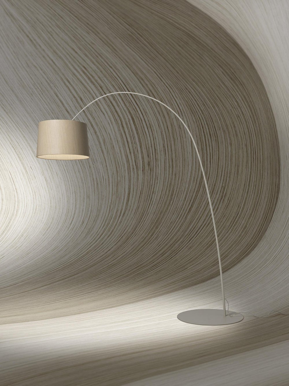
And then it goes forward! Twiggy Wood featured two important evolutions: one is in the field of aesthetic through the introduction of the diffuser in a reconstituted essence of wood, as the best synthesis of the wood essences in nature, in order to match with almost every piece of furniture in wood. The second one, more technical, was about the redesign of the “illuminating engine:” The result is a spot of a warm, diffused light with a remarkable improved quality of the light.
Is there anything else you’ve been working on that you’d like to share?
I’m working in quite different fields, as usual: luggage, lighting, furniture, kitchen, wellness, appliances for the gelato and food industry. Also I run a quite new collaboration in a very specific sector, gaming, within the casinos and home gaming. It’s a complex world, totally unknown to me until recently, but truly intriguing.
The post Designer Sportsmanship: A Q+A with Marc Sadler first appeared on The Edit: The Lumens Content Library.
[ad_2]
www.lumens.com


