[ad_1]
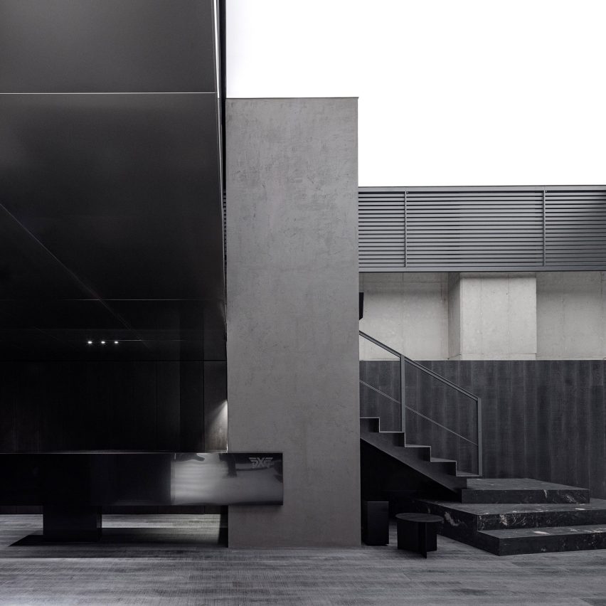
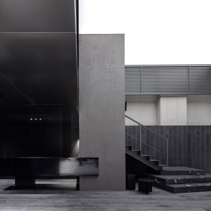
South Korean spatial design studio WGNB has completed a flagship shop for golf brand PXG in Seoul, featuring an achromatic material palette and a graphite-covered wall that leaves smudges on visitors’ clothing.
The store is located in Seoul’s Gangnam district and was designed by WGNB to reference the graphite used to produce PXG’s golf clubs.
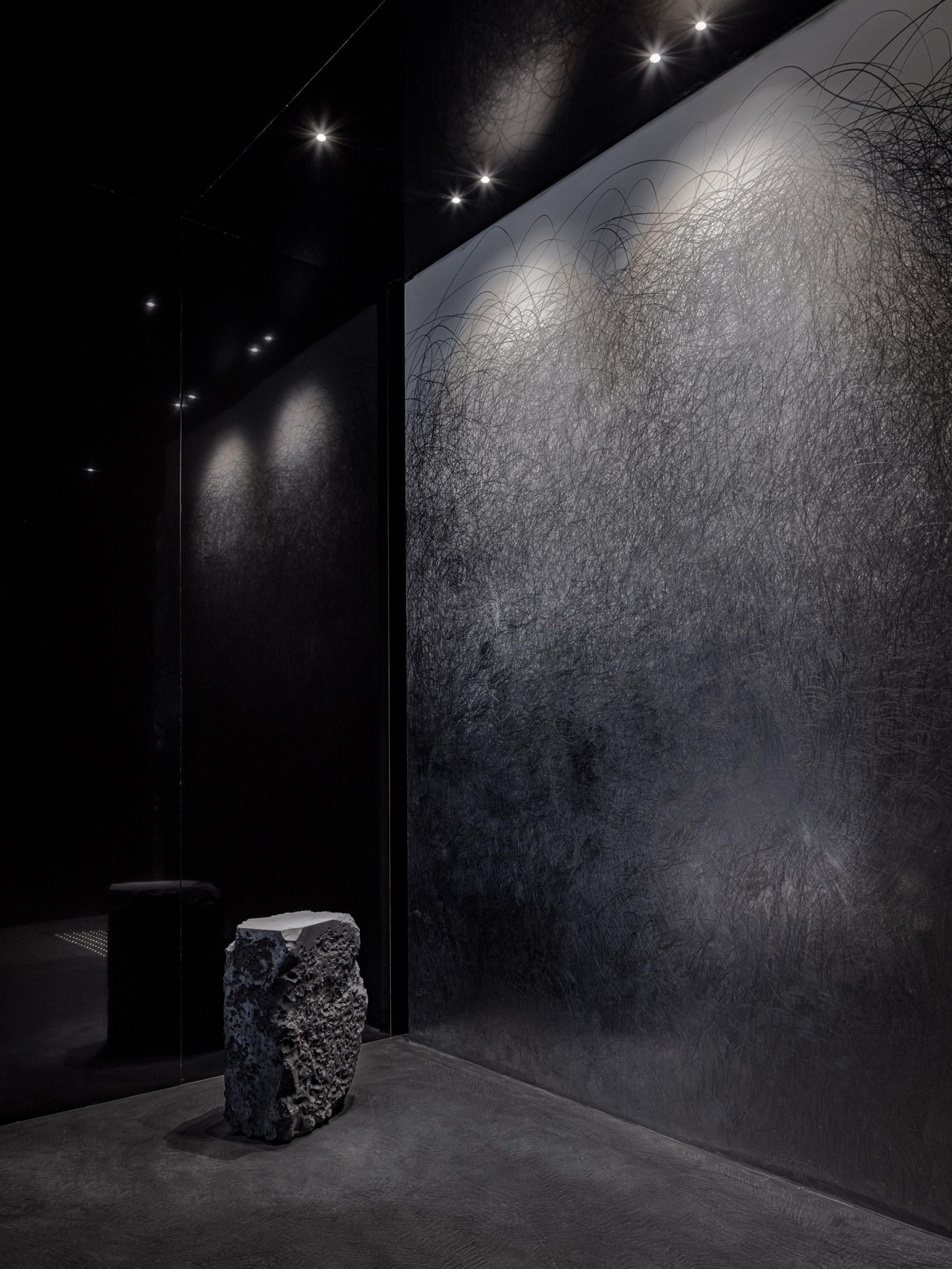
“Rather than merely applying the material to every plane, we studied the characteristics of graphite itself,” the studio told Dezeen.
“It is lighter than it appears and is an allotrope of carbon, like diamond. The graphite embeds calmness and humbleness. And, most importantly, it smudges.”
WGNB interpreted these characteristics in the pared-back forms and materials chosen for the shop’s internal surfaces and display furniture.
At the entrances, visitors are greeted by a sculpturally engineered graphite block and a wall covered with graphite squiggles that will transfer onto hands and clothing on contact.
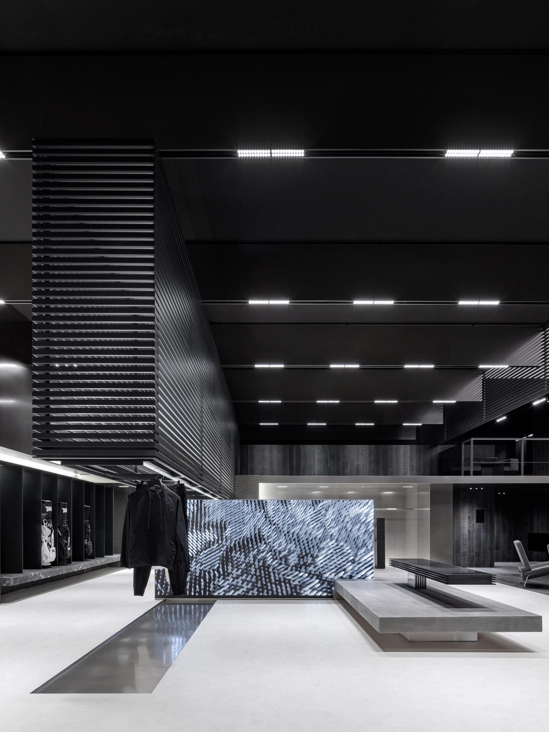
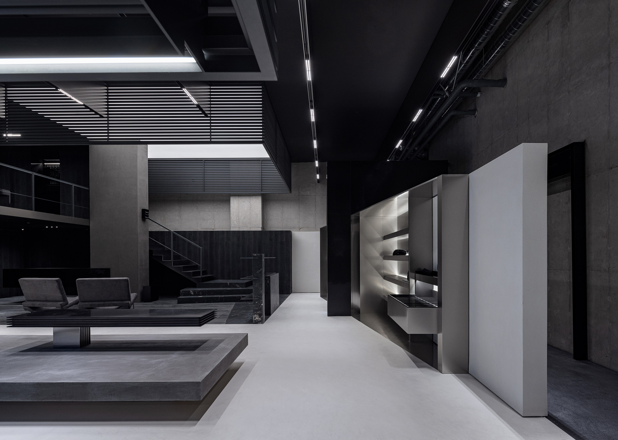
A series of orthogonal volumes are suspended from the ceiling throughout the store to define various areas within the open-plan space and incorporate suspended rails for hanging apparel.
Made using powder-coated steel slats, the volumes help to create a sense of lightness and buoyancy within the interior that is further enhanced by the cantilevered display unit at the centre of the store.
An abstract animation that ties in with the shop’s visual language is displayed on the store’s prominent media wall instead of commercial images.
The project brief called for a black interior in keeping with PXG’s visual identity. Instead of creating a monochromatic black-and-white interior, WGNB developed an achromatic design using shades of black and grey.
“While monochromatic materials are limited to similar tones and hues, an achromatic scheme dismisses colour altogether, leaving materiality only,” the studio said.
“We used various achromatic materials with unique textures and materiality, believing that these would emphasise the idea of shedding light on the essence of the material.”
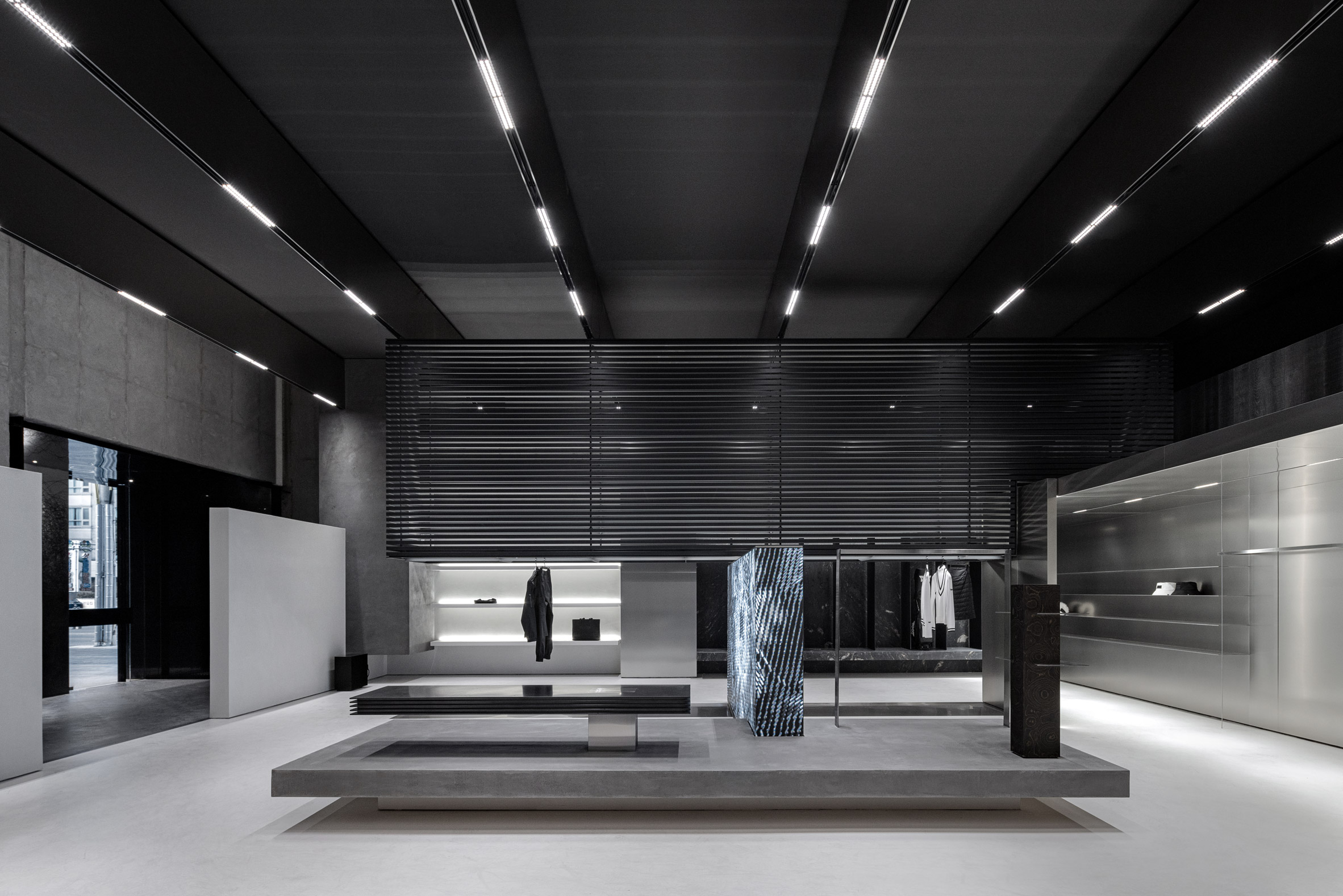
The limited material palette includes a micro-cement finish that was applied to walls and floors. These textured surfaces are complemented by engineered wood flooring, which is also used on some of the walls.
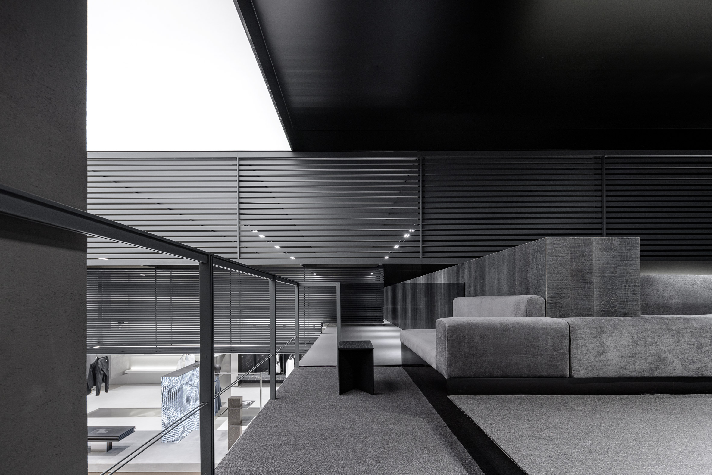
The staircase leading up the mezzanine is finished in marble and cold-rolled steel while upstairs, a grey carpet and upholstered furniture introduce softness to the space.
PXG approached WGNB to design its flagship store after seeing some of the studio’s previous projects, including the all-black shop it created for fashion brand Juun.J in Seoul.
The spatial design studio was established in 2015 and named emerging interior design studio of the year at the 2021 Dezeen Awards, with the judges commending its “interesting and different approach to retail design”.
The photography is by Yongjoon Choi.
The post WGNB completes colourless interior for golf supply store PXG appeared first on Dezeen.
[ad_2]
www.dezeen.com

