[ad_1]
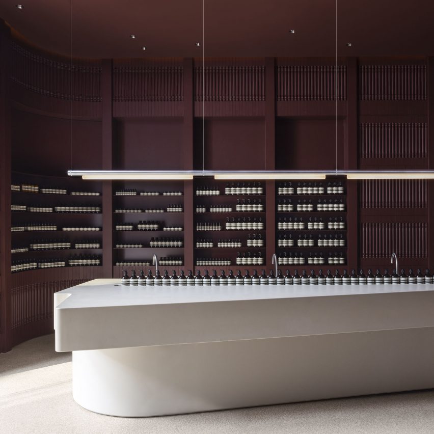
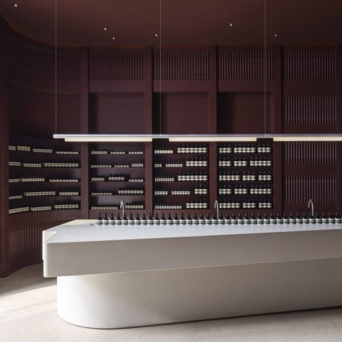
The history of Toronto’s Yorkville neighbourhood informed this store for skincare brand Aesop, which local studio Odami has given ruby-toned walls and smooth beige counters.
Odami, a design studio based several blocks west of the Aesop Yorkville shop, used features typical of the area as a starting point for elements of the design.
“The interior takes inspiration from the downtown area’s architectural and societal history – starting with the Victorian houses that populate the district, and the lanes and squares where communities have gathered over the decades,” said a statement from the brand.
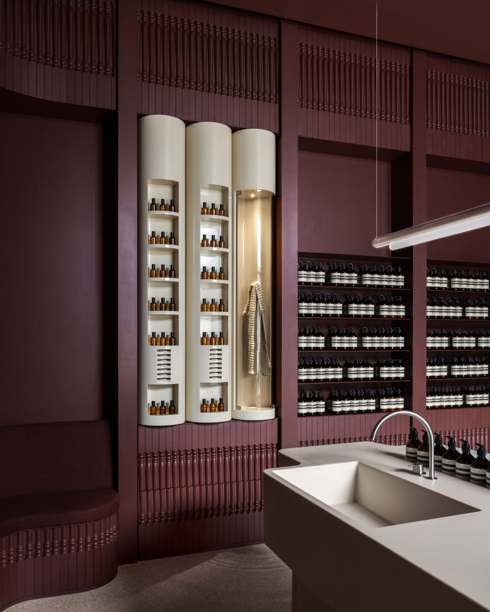
The profile of balusters found across nearby buildings and porches is translated as a closely repeated pattern that forms maple wainscoting around the interior.
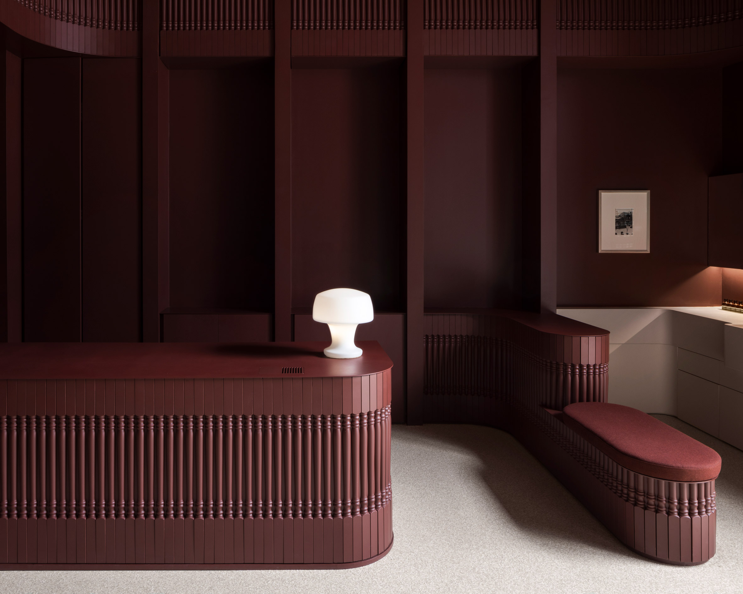
Walls and ceiling are painted oxblood red, creating a dusky and intimate atmosphere inside the compact space.
“The design is anchored by a sense of warmth, and sees traditional materials imagined anew,” said Aesop. “The geometry is akin to that of a bustling town square: a large and open space with smaller enclaves around its perimeter.”
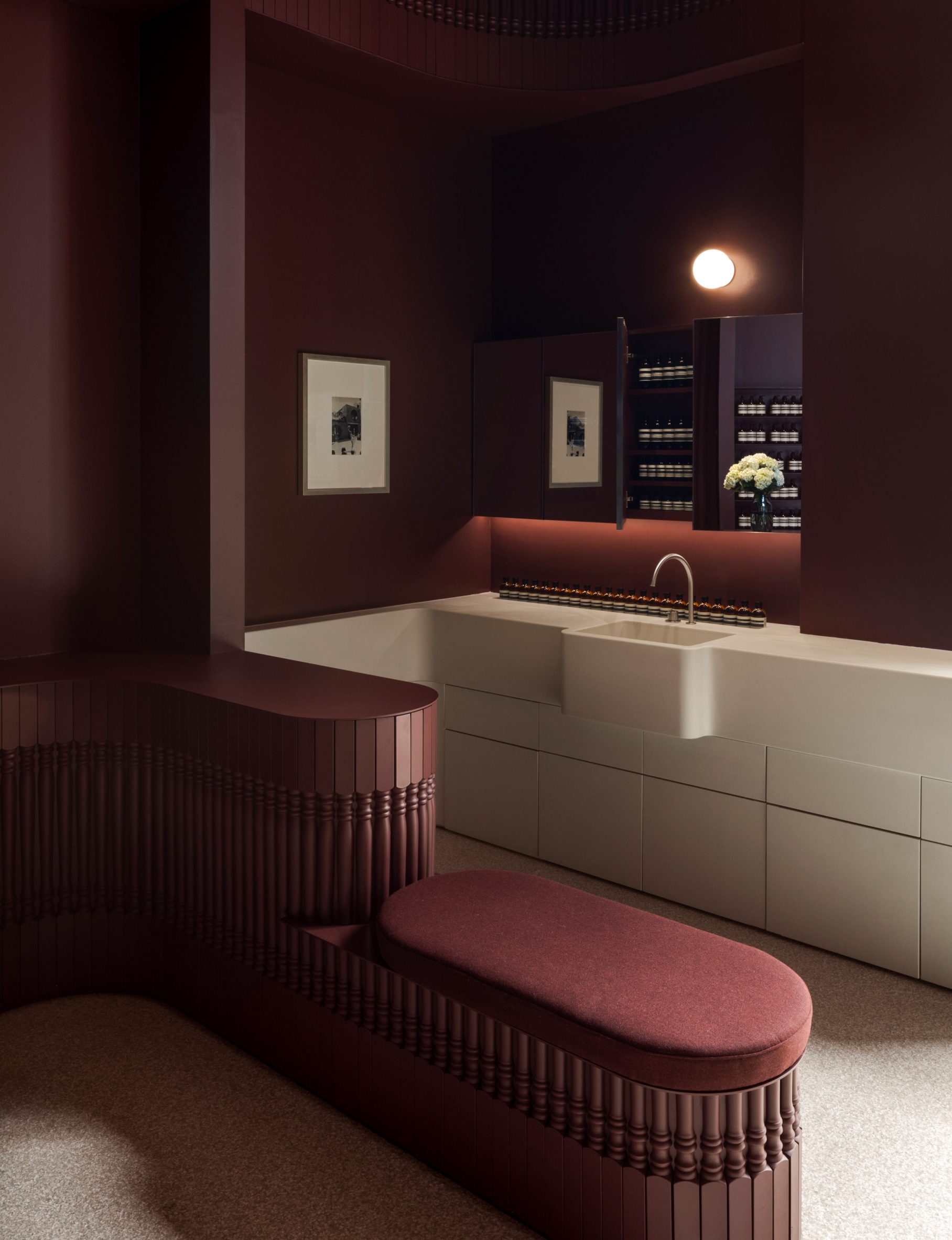
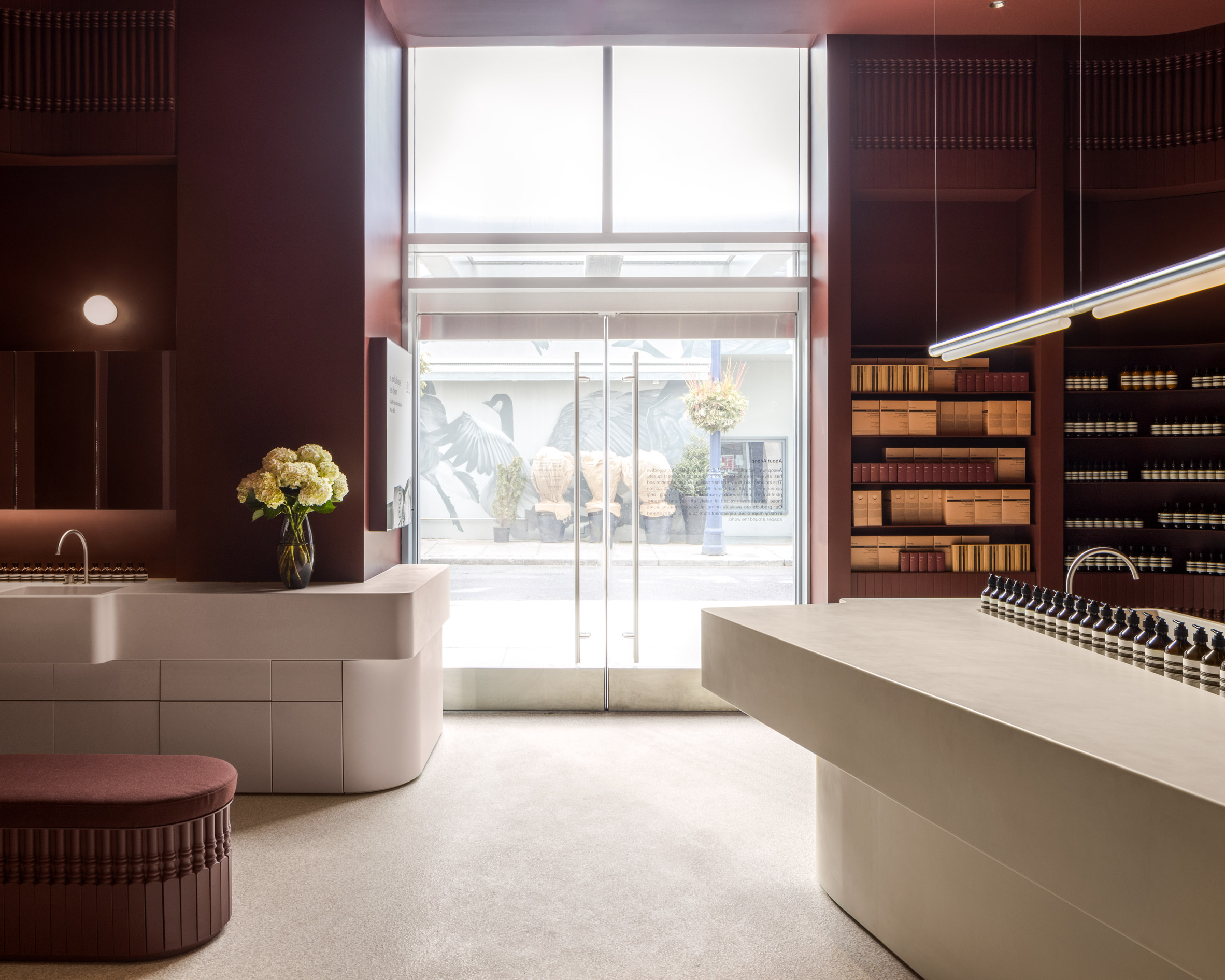
Seating and counters that are coloured to match the walls blend into the background, while units that have sinks for testing skin and hair products stand out in pale beige.
The largest basin is positioned in the centre of the store, incorporating three faucets and doubling as a tea station.
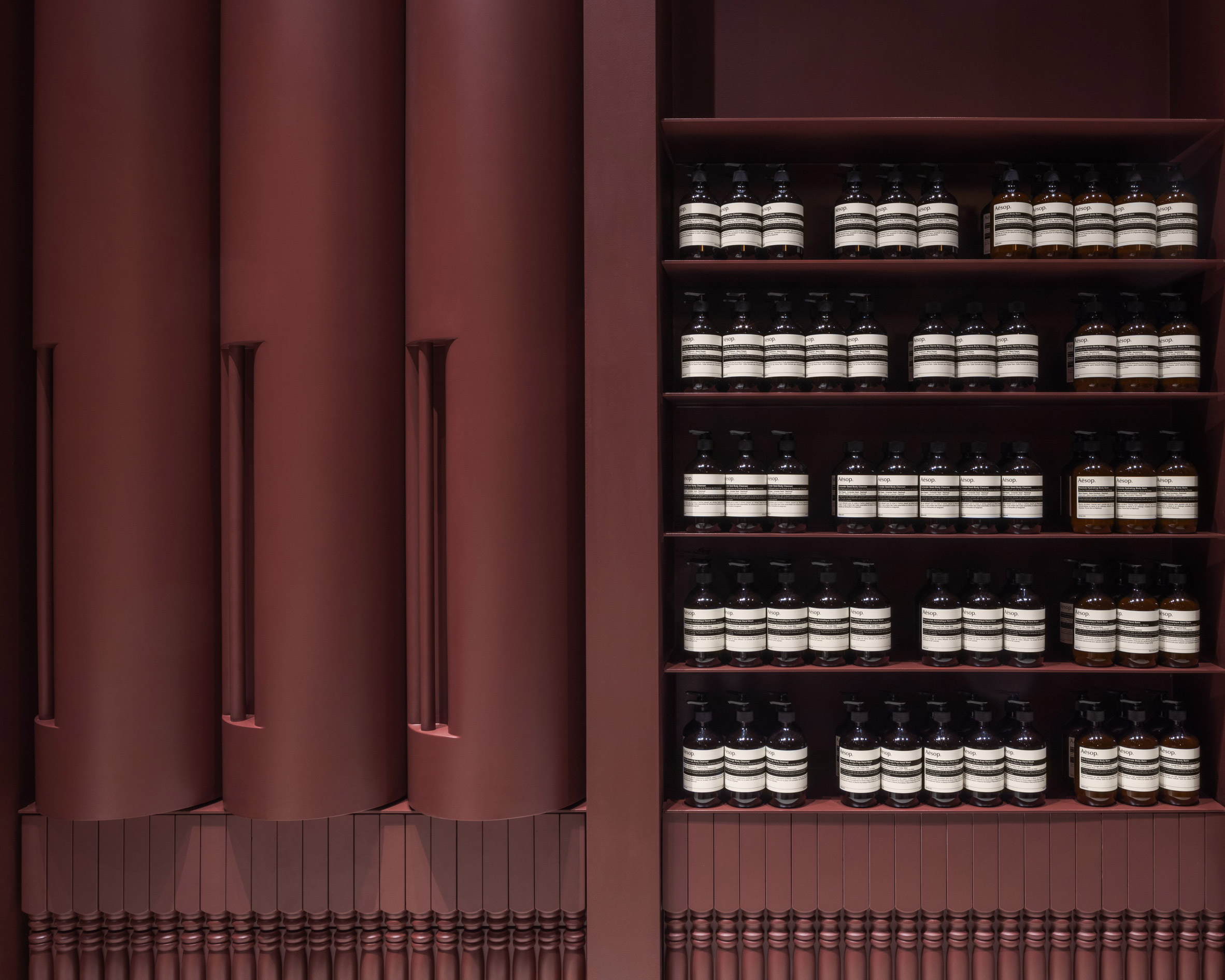
A slender, metal light fixture is suspended horizontally above, directing light from a trio of tubes down onto the central counter.
Three pale-toned cylinders set into the back wall form a “fragrance library” for the brand’s growing collection of aromas.
Two tubes display the signature Aesop bottles, while the third has a clear front and acts as an infusion chamber for items of clothing.
Odami was founded in 2017 by Spanish architect Aránzazu González Bernardo and Canadian designer Michael Fohring, and has completed several interiors in its base city.
They include the Sara restaurant, where a roughly plastered wall curves over the dining area, and a renovated 1980s apartment with a green-painted sunroom.
This is the third Aesop location in Toronto, following a store designed by MSDS on Queen Street West, and another in the Downtown district.
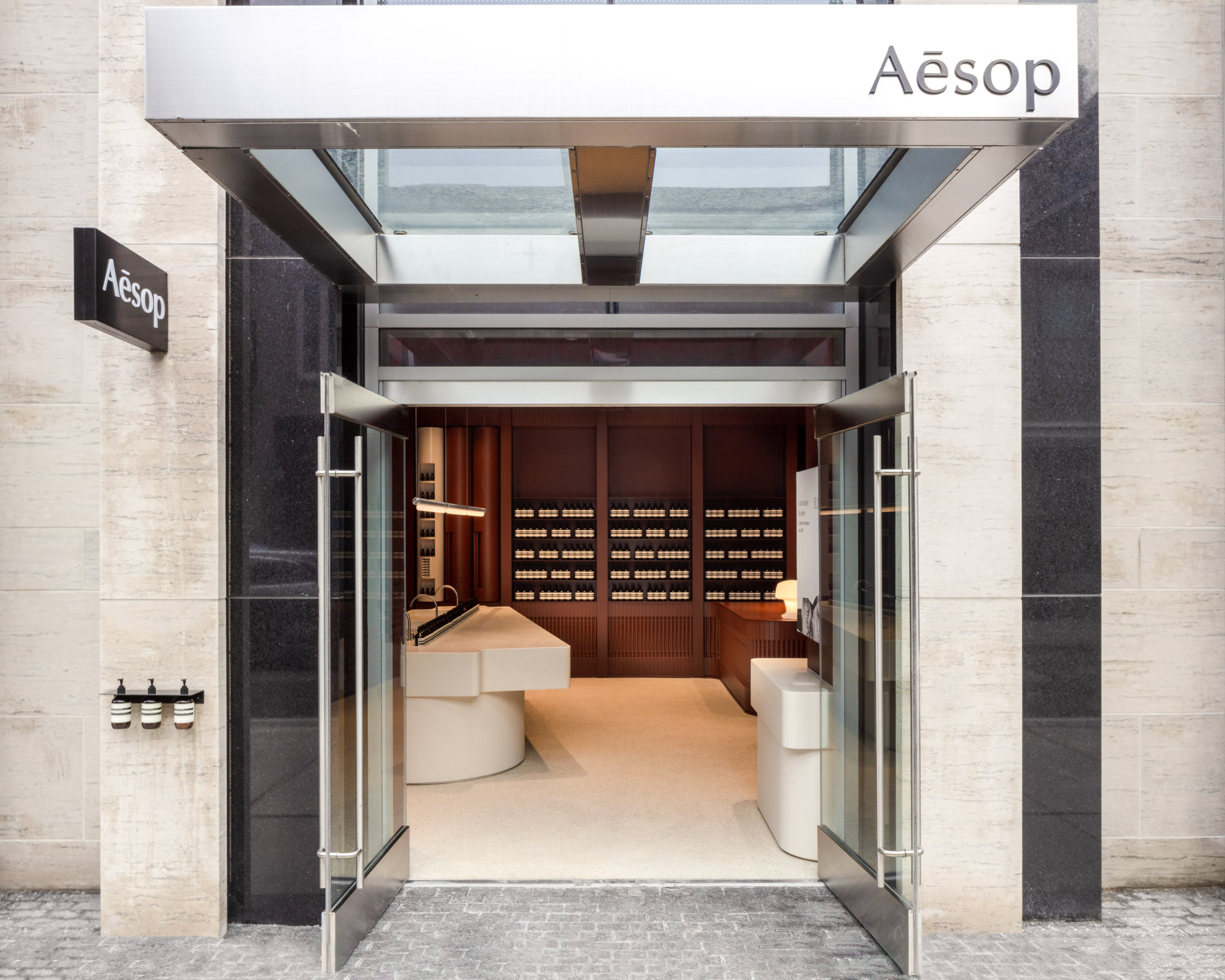
The brand regularly collaborates with local architects and designers on its store interiors around the world.
Among the most recent are an outpost in Tokyo by Case-Real that features coarse plaster walls, and another in London by Al-Jawad Pike that’s filled with red sandstone from Scotland.
The photography is by John Alunan
The post Victorian balusters pattern surfaces at Aesop Yorkville store by Odami appeared first on Dezeen.
[ad_2]
www.dezeen.com

