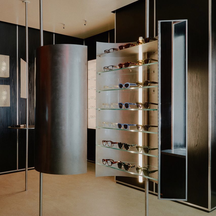
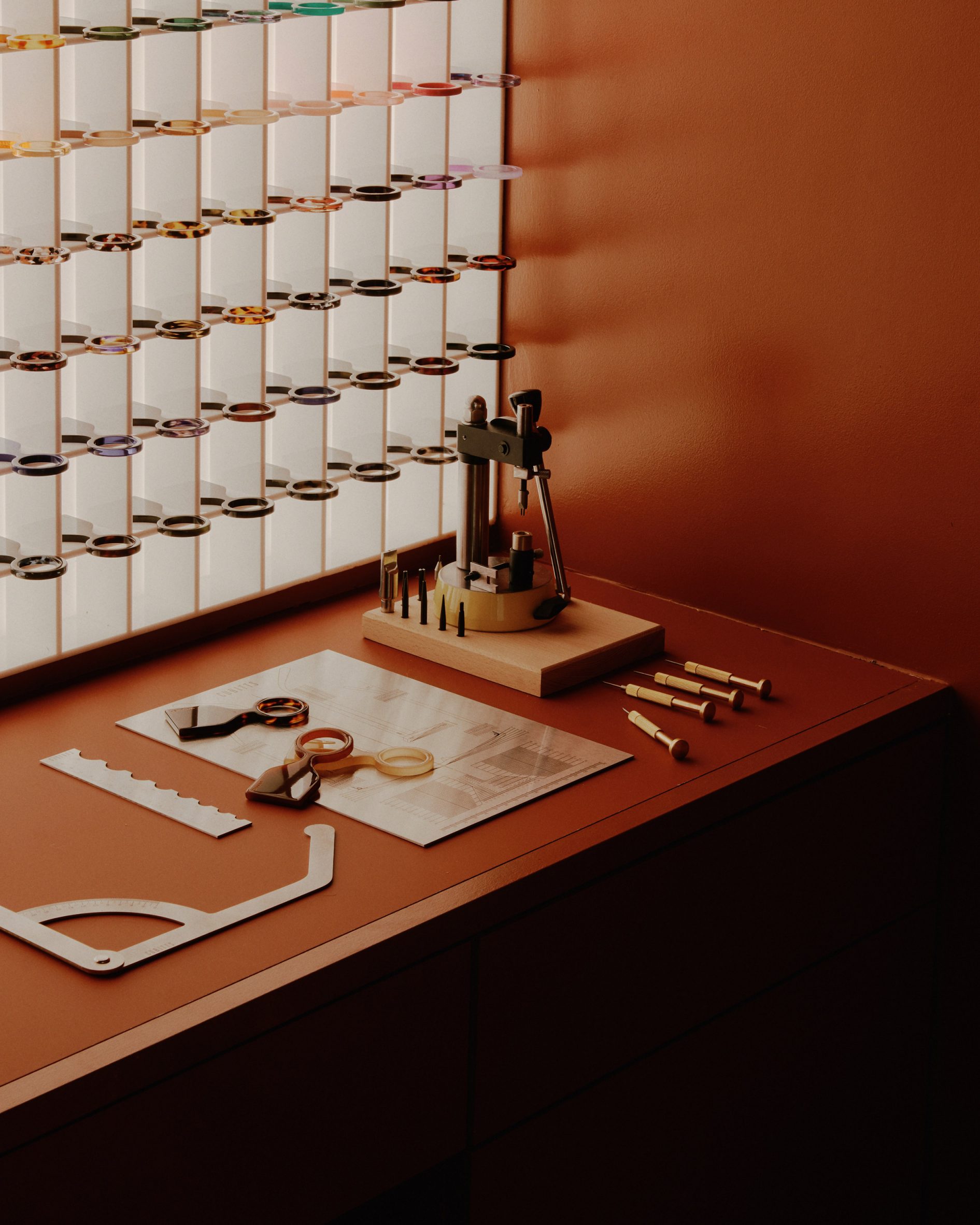
Curved metallic surfaces influenced by early 20th century American industrial design form displays at this compact store in New York City, designed by London studio Tutto Bene for eyewear brand Cubitts.
Tutto Bene was briefed to create an elegant and meticulously crafted space for Cubitts’ first store outside of the UK that evokes the past century of New York’s history.
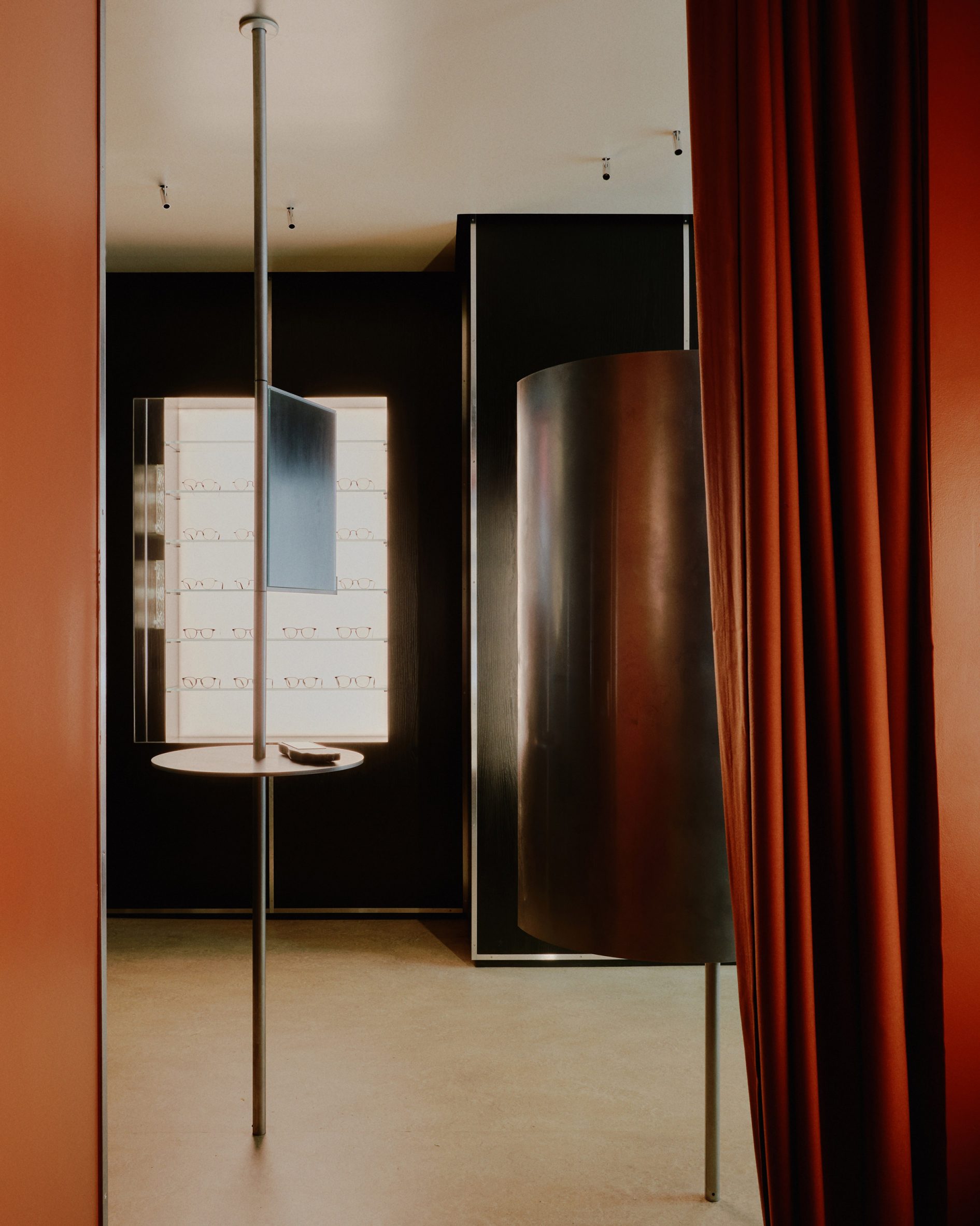
The store at 103 Mercer Street has a total floor area of just 25 square metres, which the designers claimed makes it possibly the smallest retail site in all of SoHo.
Felizia Berchtold and Oskar Kohnen of Tutto Bene told Dezeen that they set out to create an experiential and intriguing interior with “the ornate precision of a jewellery box”.
“Within the retail landscape of SoHo there is a pop-up feeling and one sees a lot of set-design quality fit-outs,” the designers said.
“We wanted to counterbalance this trend by creating a space made to last for a decade and to communicate the value that is put into the product inside it.”
The functional and precisely detailed design of Cubitts’ spectacles provided the main inspiration for the store, which also references the streamlined forms of Streamline Moderne – an aerodynamic offshoot of art deco that emerged in the 1930s.
“We took that engineering aspect of spectacle-making and interpreted it in kinetic elements throughout the store, like the rotary mirrors and the sculptural steel curve, reflecting hues of light like the sparkling towers we know New York for,” the duo said.
An S-shaped metal display at the centre of the space helps to define the flow of movement whilst echoing the smooth silhouettes of the brand’s eyewear.
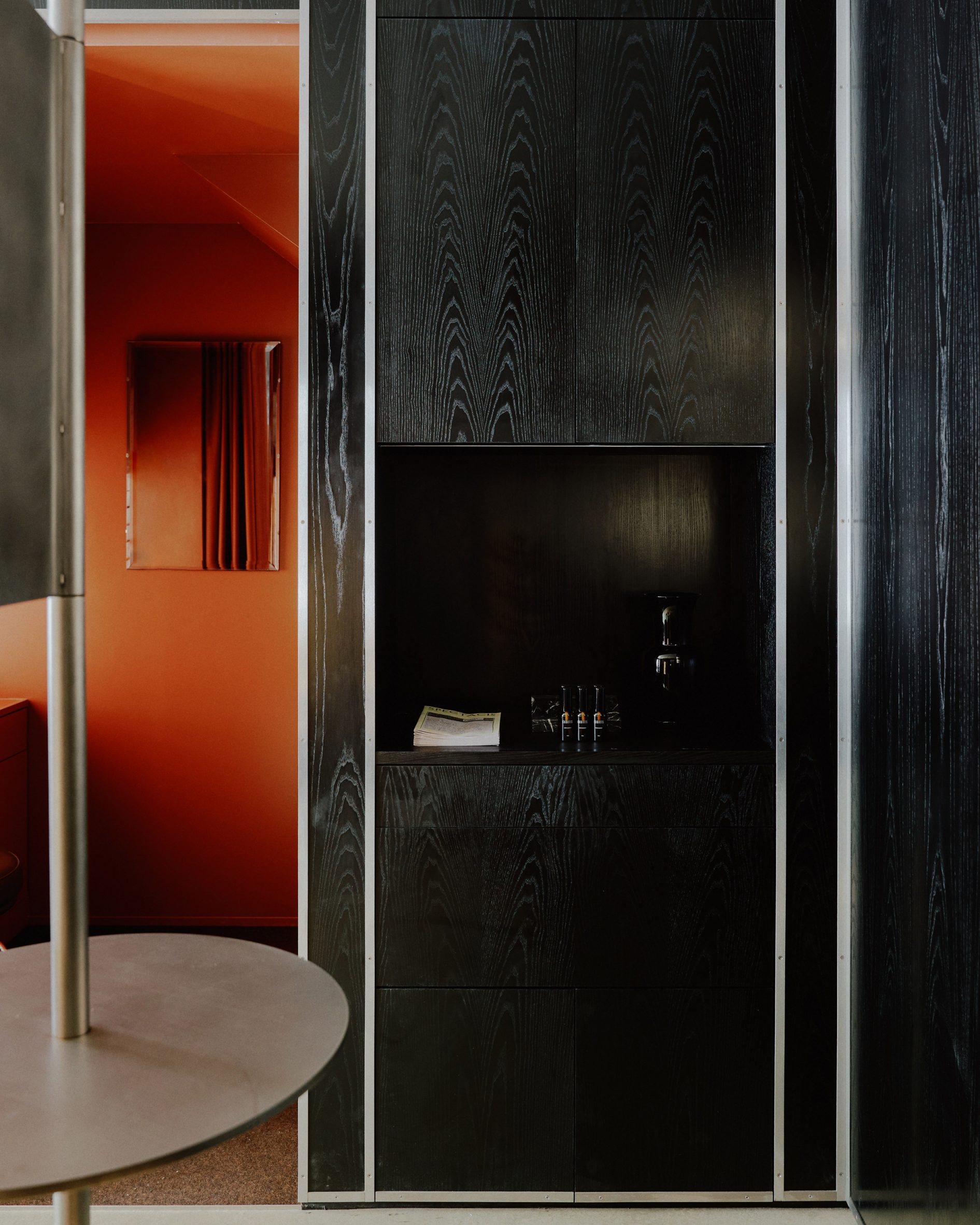
Walls clad in black ebonised ash create a dark backdrop, against which soft lighting and pops of colour create a theatrical effect reminiscent of the paintings of American artist Edward Hopper.
“Areas of glamorous darkness are peppered with light,” said Tutto Bene. “Shimmering reflections, reminiscent of city lights, emphasise the store’s meticulous detailing and represent the care and attention put into the products it encloses.”
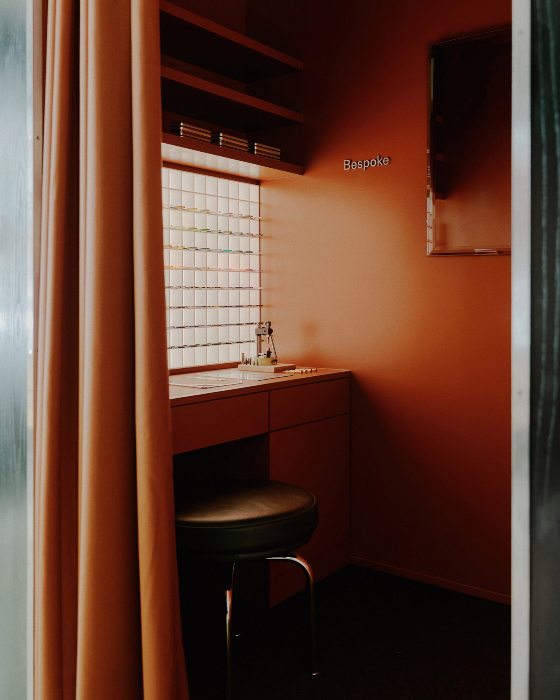
The main colour used is a brick-red hue borrowed from the New York streetscape, which according to the studio adds “some playfulness and art deco glamour, contrasting the muted black with dramatic warmth and texture”.
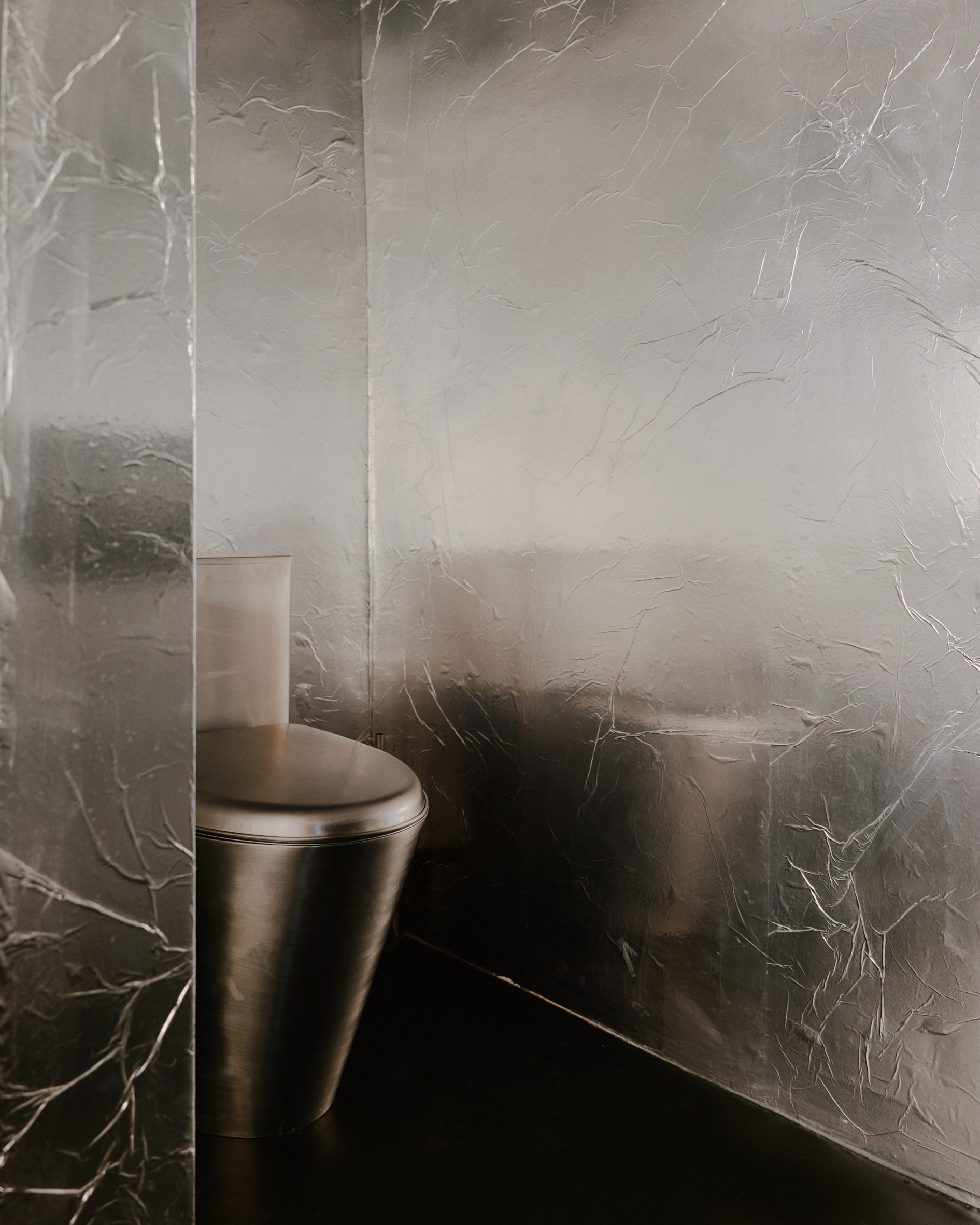
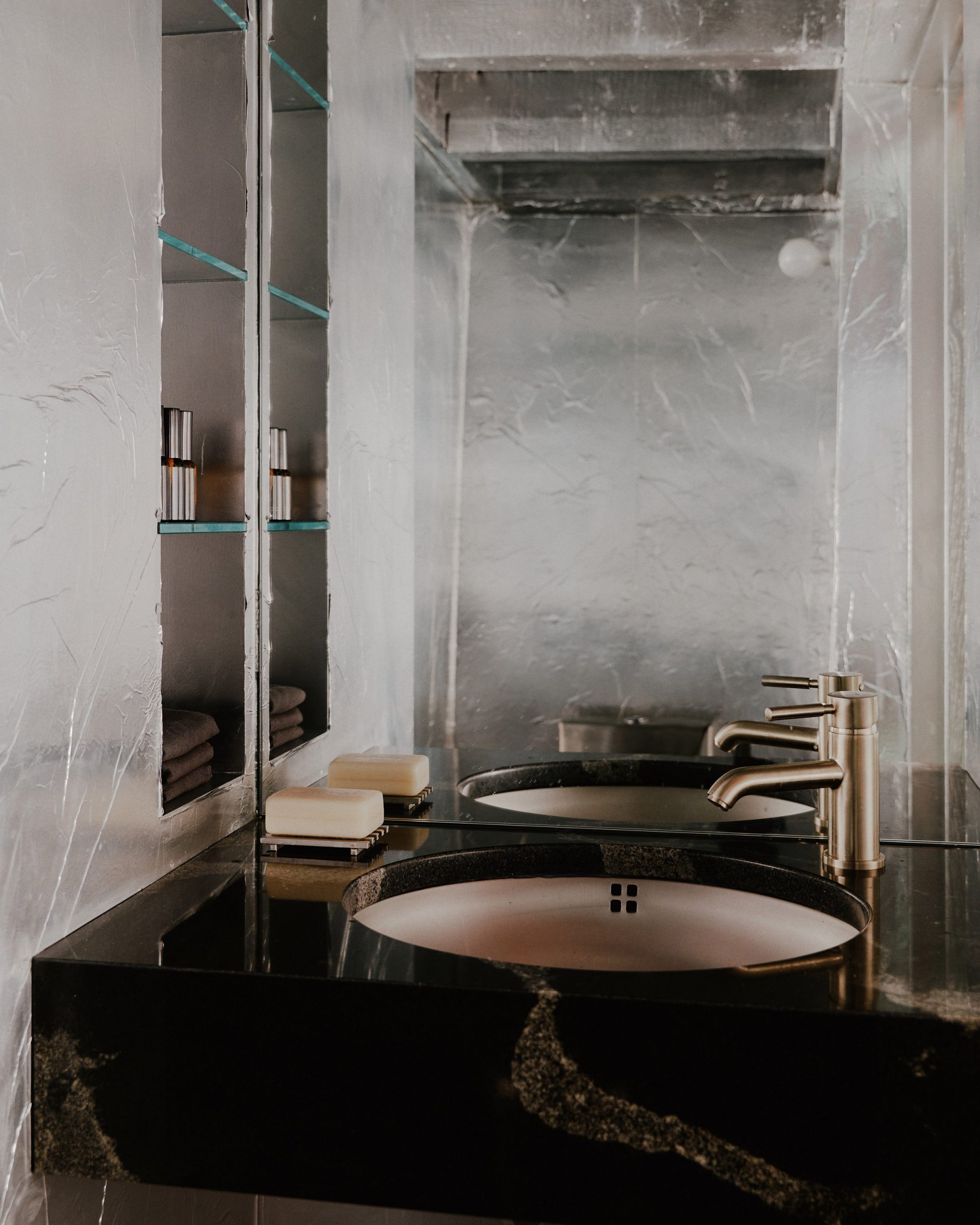
The geometric forms used throughout the store recall the works of artist Donald Judd, who once lived and worked across the street. The artistic tributes continue in the restroom, which is papered with aluminium foil as an homage to Andy Warhol’s Silver Factory.
Carefully chosen vintage pieces including wall lights from Austrian brand Kalmar, Charlotte Perriand’s LC8 stool and an Opalino vase by Tommaso Buzzi complement the store’s colour and material palette.
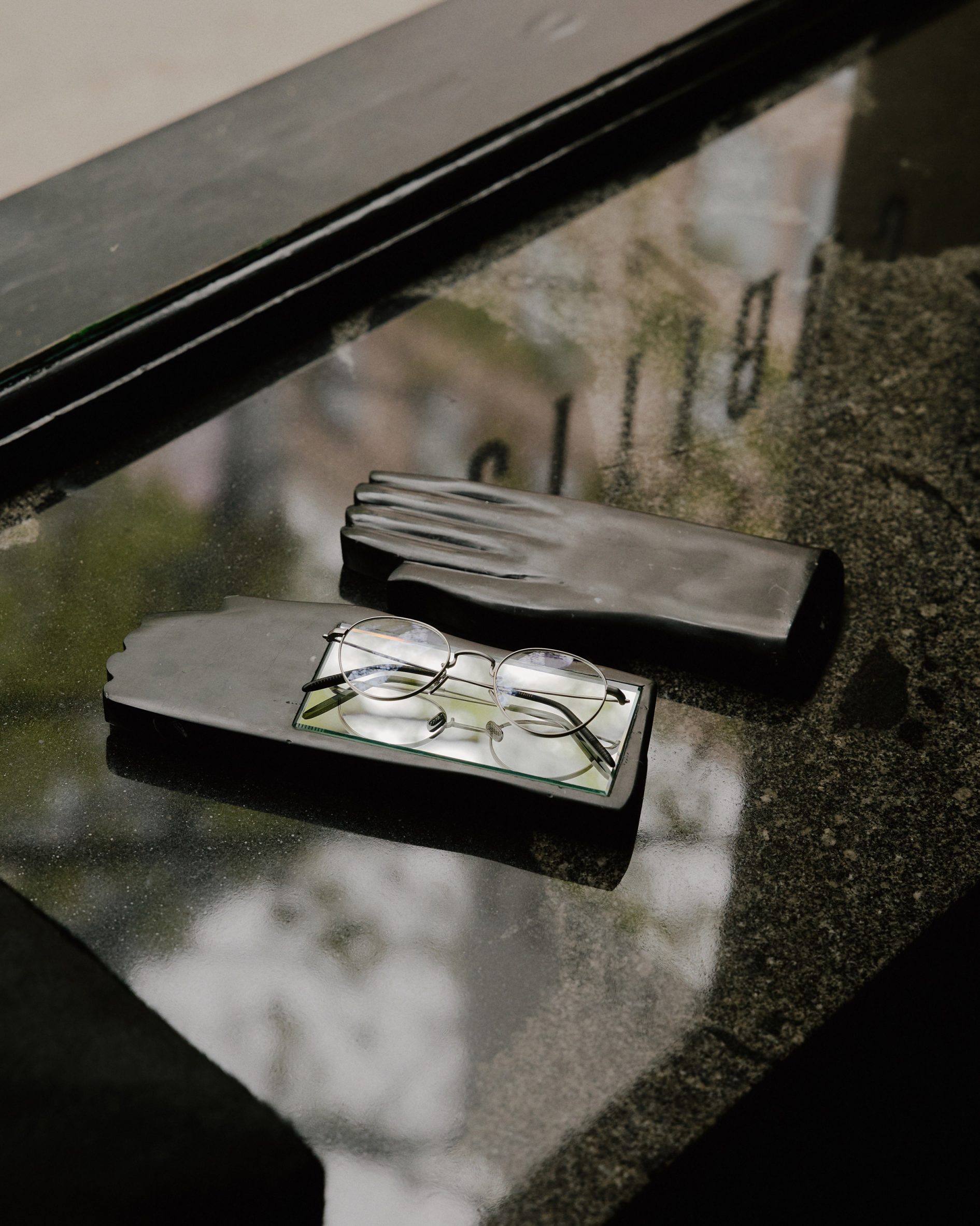
Tutto Bene also created bespoke mirrors, which customers can use when trying out different frames. The marble objects were hand-crafted at a stone workshop in Florence, Italy.
“In the pared-back store, these hand-carved glove-like marble sculptures draw attention through their surrealist appearance,” the designers added.
“When you pick them up, they lie heavy in the hand. The weight sharpens one’s consciousness and gives the gesture of looking in the mirror a considered quality.”
To celebrate the store’s launch, Cubitts released a collection of seven frames inspired by New York landmarks including the Flatiron Building and Radio City Music Hall.
The opening follows a series of new Cubitts stores in the UK including one in a former jellied-eel restaurant and another in a 19th-century London townhouse.
The post Tutto Bene references Streamline Moderne in tiny New York eyewear store appeared first on Dezeen.
www.dezeen.com


