[ad_1]
This Renovation Puts A ‘Contemporary Spin’ On A Classic Randwick Home
Interiors

Centennial Residence underwent a full scale redesign and renovation, with the help of architect George Carone and interior design practice Parker Studio.

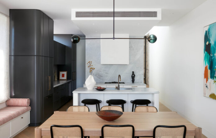
The project features custom-designed joinery across the home, nodding to the architectural curves.

Artwork: ‘Burn Bright, Fade Out, 2021′ (Studio Gallery) by Peter Summers. Sculpture: ‘A Warm Embrace, 2020’ (Curatorial + Co) by Tracey Lamb. Ceramics: Amicta Tall Vessel and Tetsuya Ozawa ceramic by Ignem Terrae Ceramics, from The DEA store.

A blend of grey and white was chosen for the sophisticated two-tone cabinetry.

‘One of my favourite curved details is the double bullnose on the kitchen island bench, and the striped terracotta upholstery rolled edge cushions,’ Parker Studio’s Caitlin says.

Artwork on wall: ‘Bleu #9, 2022′ (Studio Gallery) by Jean Paul Mangin.

Artwork: ‘Travel with me, 2021’ (Studio Gallery) by Louise Blyton.

The formal sitting room has been dubbed the ‘good room’, reserved for some of the home’s most special pieces. Bronze sculpture by Carol Crawford.

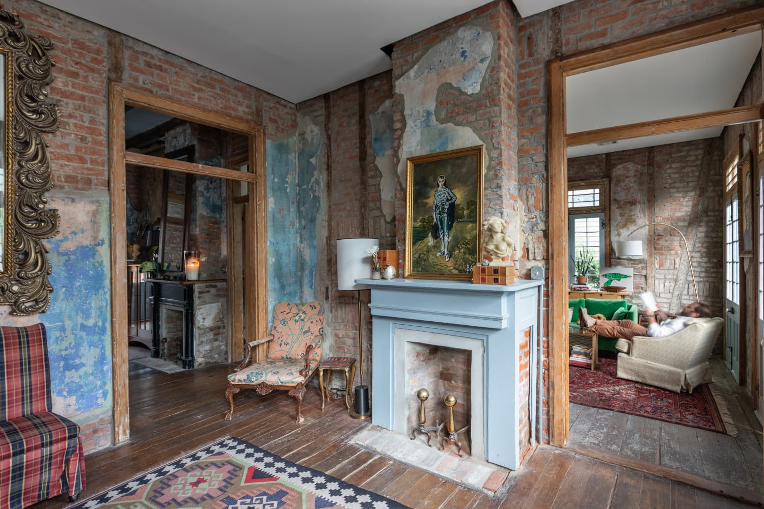
An existing brick wall has been stripped back and retained in the renovation, marking where old meets the new parts of the house.

Sculpture: ‘Queen Albertina, 2021’ (Curatorial + Co) by Tracey Lamb.

The bathrooms showcase the owners’ love of colour and pattern.

Calming blue tones are contrast with pops of terracotta.

The cosy built-in bench seat in the main bedroom. ‘Sitting forgetting, 2022′ (Studio Gallery) by Peter Summers.

Patterns bring a sense of fun into the sleek and modern home. Ceramic vessel by Lucy Tolan.

Each bathroom has it’s own unique aesthetic.

Altus Vessel by Ignem Terrae Ceramics.

A bold mosaic covers the floor and part of the wall

The view from the newly built second floor.

A study rounds out the family home. ‘Freeform II’ (Curatorial & Co) by Diana Miller.

Bi-fold doors ensure the family can now enjoy indoor and outdoor living!
The renovation of this Randwick home began with the kitchen.
Parker Studio founder Caitlin Parker-Brown says the brief was to put a ‘contemporary spin’ on a classic Federation home, looking to create timeless spaces in replace of the currently dated interiors for a family of four.
‘We wanted to respect the heritage of the home yet bring it up to meet the quality expected of modern everyday living,’ Caitlin says. ‘Our client loved a black-and-white aesthetic, so we drew on those colours and made it slightly more muted with the charcoal colour cabinetry [in the kitchen].’
But rather than stick with the monochrome theme throughout, they decided the kitchen would serve as the minimalistic hero of the home and channelled the owners’ love of colour into the rest of the rooms — especially in the bathrooms.
‘Each bathroom has its own playful aesthetic,’ Caitlin explains. ‘Being a bathroom, it was a space that we could experiment with pattern and colour in a really fun way.’
They blended a palette of blue, green, and charcoal tones with a subtle Carrara marble across the floor on or the vanity tops, offset with hints of warm terracotta. Caitlin says the use of bold tiles also helped inject a sense of fun into the spaces, without being overbearing or too busy.
The new interiors also hold nods to architect George Carone’s redesign of the home — which now features a new second-storey extension — referencing the new architectural lines through subtle curves in the custom joinery of the kitchen island, range hood and cabinetry panelling. ‘One of my favourite curved details is the double bullnose on the kitchen island bench, and the striped terracotta upholstery rolled-edge cushions,’ Caitlin adds.
The biggest challenge was balancing the old and new parts of the property. A grand, pivot-style glass door in the hallway marks the junction where the original brick wall ends, and the contemporary part of the home begins. Meanwhile the new parquetry floorboards and crisp white walls look like they could’ve already been part of period home, just as much as they belong in the modern era.
‘Where possible, we tried to match existing or retain decorative ceiling roses, cornices and skirtings to maintain the decorative elements of the front of the house,’ Caitlin says. ‘This was a tricky exercise!’
‘One of my favourite rooms in the house is the sitting room (AKA “the good room”). Before we even started pulling together the furniture and fabric scheme our client showed us the beautiful large scale painting she purchased, we started pulling together a colour palette for the room based on this piece. It is a really gorgeous room and feels so luxurious to be in!’
The resulting Centennial Residence feels equal parts restrained and whimsical, hidden behind the elegant facade.
[ad_2]
thedesignfiles.wpenginepowered.com

