This Family’s Perfectly-Sized Party House Nods To 1950s Architecture
Architecture

Home Pavilion by MRTN Architects is a new build in Northcote.

Garden spaces and paved courtyards surround the home as outdoor entertainment areas.

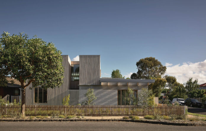
The design features limited double-storey spaces, ensuring the house doesn’t ‘dominate’ the streetscape.

The mid-century-inspired home features a blend of masonry block, concrete and timber. Grazia and Co Ditta stools.


Glued laminated timber bring warmth to the interiors.

‘We imagined a living and dining space that is dramatic in character and expressed its construction clearly as a combination of elements placed one upon another,’ director Antony Martin says.

The open-plan living, dining, and kitchen areas forms the heart of the home, surrounded by double-glazed windows.

The burnished concrete floor was very carefully constructed by Resicon builders to eliminate any cracking.


Ross Gardam Mene table lamp. Armadillo rug.

The precast concrete beams cantilever over the west facing glazing, providing a sheltered pathway along the house.

The adaptable layout of the house caters to the owners’ busy social life with growing kids.

Sheer curtains line the bedroom window.

A second living room serves as a kid’s retreat.

The bathroom features pale teal tiles alongside continued brick masonry.

A terrazzo benchtop.


A fluted glass door opens to the serene bathtub.
From the street, Home Pavilion by MRTN Architects is both simple and striking.
But the way the house’s character subtly catches your eye wasn’t a happy accident. It was all part of director Antony Martin’s vision from the very beginning when MRTN was engaged to design a new family home in Northcote.
The brief was to replace an existing weatherboard house with something purpose-built to the client’s needs as a growing family, with enough space to host their out-of-state grandparents whenever they came to stay.
‘It also had to be an amazing place to throw a party,’ Anthony says, noting how the owners love to entertain.
With interest in featuring concrete and timber in the build, the couple suggested exploring the series of robust, mid-century modern homes developer Joseph Eichler built in California during the 1950s.
‘One of the clients had spent some of his formative years growing up in an Eichler home and it had left a lasting impression on him,’ Anthony adds.
‘We were interested in designing a really wonderful living space for the family and that is where the idea of a “home pavilion” came from. We loved the idea of having a limited palette of materials, and then delineating them as they were used upon another.’
The resulting house reads as a unique assembly of parts. Each structural element is articulated from the one it connects to, using timber volumes to separate glazed windows, a series of masonry blade walls that support oversized concrete beams, with floating timber rafters floating overhead. Many of these features nod to Eichler’s similarly geometric designs, as the clean lines instil a sense of calm throughout the pared-back interiors.
‘The scale of the beams and use of pillars to support them creates a rhythm to the pavilion, but also serves to divide the separate functional zones of the space: kitchen, dining and living,’ Anthony says. These areas revolve around the surrounding gardens, allowing activity to spill out into the paved courtyards and towards the inviting pool in summer.
In developing the design for the corner block, the team decided to go against convention of the area — where most homes at the intersection feature an imposing two-storey frontage — in favour of ‘bookending the home’ with double-storey volumes that settle the new build into the existing streetscape.
‘We are most proud of the sense of calm that is created on a corner block,’ Anthony adds. ‘A corner can feel quite exposed and it is a challenge to design a home that is both private, and doesn’t completely turn its back to the street.’ But Home Pavilion seems to find the perfect balance.
Want to see more from The Design Files? Sign up to our newsletter for your weekly dose of home and design inspiration here!
thedesignfiles.wpenginepowered.com


