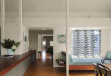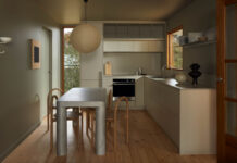

Last month, I wrote a post that seemed to resonate with quite a bit of you in which I tried to name a style I think is ripe for the takeover of the ubiquitous Modern Farmhouse. I called it “Warm Modern Beach Bungalow” but since then, I’ve thought of a few more names that might be better suited to the look:
- Modern Mid-Century Modern
- Warm California Modernism
- Modern Australian Cabin
- Happy Lake House Modern
Folks, this naming of styles business is NOT easy. But it’s a good thing we’re not here for that today.
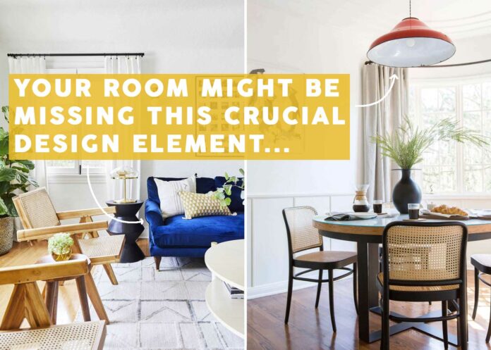
Instead, I’m narrowing in on one portion of Happy Modern California Australian Lake House (ha…not it) that can be, and should be, translated into homes of nearly any style: Primary colors. The internet as a whole has talked extensively about the unexpected red theory, but I’m here to expand on that. Frankly, I think it should be the unexpected primary color theory (Even Em with this Instagram reel). In short, a quick and calculated punch of a single primary color in small doses can seriously up the cool factor of any room and make it feel more complete, interesting, and even memorable.

You may or may not have had certain immediate visual references pop into your head when I mentioned primary colors: Fisher Price, Mondrian, Marimekko, any mid-century designer, MoMa…anything else? And I get it. I’m not particularly fond of red, blue, and yellow in their full potencies all appearing in the same space. It’s like having three type-A personalities in a friend group. It’s too much. They all try to take control. And then no one wins.
That’s not to say you can’t use them together in some combination. I tried to think through some guidelines for using primary colors in a room where you want to add that signature “omg, why didn’t I think of that!” vibe and here’s what I came up with:
Primary Rules for Using Primary Colors:
- Use in small doses: The whole point of having a surprise primary color moment is to be just that: a surprise. An unexpected flash of something new. This specific design tool doesn’t work if say, you paint your whole room fire engine red. You can certainly do that, but it would just give you a different emotion and result. If you want to employ paint, try an interior door, your window frames, or the inside of an archway. That kind of thing. Otherwise, opt for one to three moments with that color in small packages, like a throw blanket, an armchair, or a vase, for instance.
- Mix two primary colors max: Remember those type-A friends? They’re like alphas in the animal kingdom, only one per crew. The same goes for primary colors. Pick your moment, and, like #1 said, keep it targeted. I do, however, think you can mix up to two primary colors in the same room and still get the effect we’re going for here. (Caveat: just to clarify, I’m not saying you can never mix all three primary colors together in one room. Of course, you can. Some design styles are based in that. But for the sake of the surprise one gets by the power of a primary, I say keep it to two and let any other colors you use in your room be muted, moody, or neutral. Or green. Green always works, too.)
- If you’re scared, start with yellow: Think about it…yellow is closest to beige, which is a safe, non-scary neutral. So…yellow is essentially a neutral, which means it’s the easiest place to dive into primary colors. Plus, psychologically, a bright primary shade of yellow can incite happiness, excitement, enthusiasm, confidence, and hope.
Okay, before we do some serious shopping, I’m going to walk through some examples to get you primed and ready.

The Griffith Park project from many years ago immediately won over my heart when I saw it, and it’s 99% due to that red pendant light. It’s lovely otherwise, but that makes it such a star. It’s daring, unexpected, and magnetic.

I’ve had my cobalt blue sectional for about six years now, and it injected so much energy and joy into my mostly neutral living room. I’m not sure a darker, moodier blue would have been able to do the same thing. Primary blue, all the way here.

Okay, so this isn’t primary yellow. It’s mustard but I think the saturation level keeps it in line with what we’re going for. Honestly, I think this works in any instance where you expect a piece of furniture or decor to be a particular color and then BAM, it’s not. It’s red. or bright blue. Or bright yellow. In my parents’ low-light townhouse, choosing a color like this was just the thing to bring some life and excitement to all the drab beige on the walls.
Now, from the internet:
Red, Blue & Yellow In Action
View this post on Instagram
I mean, COME ON! Does this not make your stomach flutter and make you immediately stop in your tracks? This would be a beautiful modern kitchen had the designer picked a non-red chair, surely, but the fact that they did, well…wow.
View this post on Instagram
These amazing barstools from Fenton & Fenton have the same effect. They give this island area DTE: double take energy. Wait, did I just invent a new acronym?
View this post on Instagram
I recognize that this isn’t a “home” per se. It’s more catalog than anything else, but still, what would have been a calm, neutral (kind of forgettable) space suddenly buzzes with creativity.
View this post on Instagram
I’m just going to say it: Every neutral space needs a strategic play from a primary color. It just takes up so much visual space. This blue desk in this home tour from Clever expands in my eyes, making it feel grand in a room that has very little going on in it. Honestly, it pulls some serious weight that just wouldn’t be possible if the desk were a wood tone.
View this post on Instagram
I’ve shared this image in a previous post and thought it would be perfect to boomerang back for this one. When I cover the rug (and even the pitcher) with my hand, I see a quiet, soft little nook. And yes, there is always room for those peaceful moments in our homes. But when I move my hand away and reveal the zap of blue, all of my insides start buzzing (in a good way) without being overwhelmed in the same way a pattern would.
View this post on Instagram
I wanted to show this kitchen as an example of a space that perfectly employs yellow and electric blue. The yellow is the main primary hue, and the impact that that blue stool (and yeah, even the handle of the glass pitcher on the island countertop) is undeniable. It’s the drizzle of acid every rich dish needs to cut through the density of fat. A palette cleanser…for the eyes!
View this post on Instagram
Especially when partnered with warm wood tones, yellow totally reads as a safe neutral, don’t you think? It gives us just enough interest to be able to pull it out visually and draw the eye, but not enough that you miss any other moment in the room.
Shopping For Primary Colors
While I was working on the below product round-ups, I took note of how I found all the items. Some of these were serendipitous meetings. Some were from brands I knew were primary-color-friendly (Areaware, Design Within Reach, Blu Dot, Bend Goods, Schoolhouse). Others, well, I had to get creative with how I searched for them. Here are some of the terms I used for each color to get the right shades (just add the type of product you’re looking for):
Blue: ultramarine, cobalt blue, International Klein blue, electric blue, primary blue
Red: Bright red, cherry red, Chinese red, scarlet, candy apple red, primary red
Yellow: Canary yellow, electric yellow, golden yellow, lemon yellow, vivid yellow, primary yellow
Now, let’s look at everything I found. I had to leave A LOT on the cutting room floor (a.k.a. my secret Pinterest board). Oh goodness, I edited out so many beautiful things, but I know how overwhelming it can be to see hundreds of products. For ease of perusing and also shopping, I broke down the products into four categories: furniture, lighting, decor, and kitchen/dining.
First up is furniture. Apart from the bed (#9…very similar to the one I have in my own bedroom and LOVE), I opted for smaller-scale pieces. Things like barstools, side tables, and accent chairs. I was very tempted to pull large sofas (::cough:: like mine ::cough::) but at this point, a colored sofa is a bit expected. A bright red shelving unit or vintage electric blue dining chairs? Not so much.

1. Collins Bar Stool | 2. HAY Color Cabinet – Floor | 3. Wave Table in Electric Blue | 4. Hide Side Table by Hem in Ultramarine | 5. Method Lounge Chair | 6. Don’t Leave Me Side Table | 7. TON 18 Bentwood Caned Chair in Persimmon | 8. Open Hands Stool | 9. Nabiha Platform Bed in Citronella Velvet | 10. Pluma Stool by Areaware in Yellow | 11. New Order Bookshelf – Double Low in Red | 12. 1970s French Mullca Stacking D Back Dining Chair Blue – Set Of Four
Next is probably my favorite way to bring in a primary color (especially red): lighting! This is the best place to start if you’re tempted by primaries but scared of going too far. Truly, there is only good that can come from adding a red table lamp or bright blue sconce to your home. Go ahead…be bold. Live your life. Pick the yellow lamp.
I’m thoroughly obsessed with the pendant from Doco (#2), as well as the table lamp from Design Within Reach (#6). That floor lamp (#9) would be as welcome in an amazingly hip office space as my daughter’s bedroom. It’s so cool, modern and interesting, it reads more art piece than light source (which to me is the key to not crossing over into tired trend territory in just a few months or years).

1. 11″ Suillius Contemporary Bohemian Rechargeable/Cordless Iron LED Mushroom Table Lamp | 2. Tizio Pendant Lamp | 3. Cobalt Blue Mushroom Table Lamp by Nicholas Bijan Pourfard | 4. Loa Sconce with Mediterranean Blue Shade | 5. Carson 12″ Wall Sconce With White Base | 6. Matin Table Lamp | 7. Golden Lighting Duncan 2-Light Flush Mount | 8. Flowerpot VP7 Pendant in Cobalt Blue | 9. Rocky Floor Lamp (49″)
If lighting is my favorite way to introduce primary colors, then decor is the easiest way, because it’s the least permanent (that’s a bit of a duh moment but worth saying). I’d love to see bright yellow wall hooks (#2) in an entryway, a crisp red quilt on a bed (#6), a cobalt blue throw (#9) draped on a neutral sofa. At the very least, switch out your taper candles with a highlighter blue or red for some serious DTE.

1. Sculpt Framed Wall Art | 2. Hall Pass Wall Shelf with Hooks | 3. Lombard Wool Blend Throw Pillow | 4. Dot Soft Cushion, Yellow | 5. Strata Plant Vessel | 6. Shelburne Cotton Coverlet | 7. Omar Strong Coral Vase | 8. The Sunniest Yellow Bobbin Style Mirror | 9. Untitled Ap10 Throw, 150 X 200 Cm, Electric Blue | 10. High Shine Spiral Taper Candles, Set of 2 | 11. Brodie Wall Hook Medium Apple Red | 12. Tango Watering Can
And finally, some personality for the kitchen or dining room. I don’t have room on my counters for it, but boy do I wish I could get that paper towel roll holder (#5)! The center of my dining table might soon be met with that red splatter enamelware tray (#3)—plus, it’s $34!—and never once have I thought about having red silverware (#7)…until now. AND DON’T GET ME STARTED ON THAT KETTLE (#1). GOOD LORD!

1. Great Jones x Fellow Kettle | 2. Outline Baskets | 3. Splatter Red Enamelware Deep Tray | 4. Dansk Købenstyle Casserole | 5. Spool Paper Towel Holder | 6. Cotton Blend Square Napkin | 7. Sabre 4 Piece Bistro Flatware Set | 8. Zero Japan Butter Dish | 9. Beatriz Dinner Plates, Set of 4
So……………..have I convinced you yet? Did anything make your fingers itch to add to cart? I want SO MANY things, but primary colors take a great deal of restraint. It’s about picking the few moments where they shine the brightest and have the most impact. It’s a good thing we have multiple rooms in our homes… 
Until next time…stay (strategically) colorful, friends.
Opening Image Credits: Left: Design By Arlyn Hernandez | Photo By Sara Ligorria-Tramp | From: Arlyn’s Bright & Happy Rental Living Room Makeover | Right: Lead Design by Ginny Macdonald | Associate Designer Mel Burstin | Photo by Tessa Neustadt for EHD | From: The Griffith Park Dining Nook Reveal + Get The Look
The post This Color Trend Will Give Your Home DTE: Double-Take Energy (+ 42 Of Our Favorite Shopping Picks) appeared first on Emily Henderson.
stylebyemilyhenderson.com

