[ad_1]
This Calming Apartment Kitchen Renovation Brings Nature Indoors
Interiors

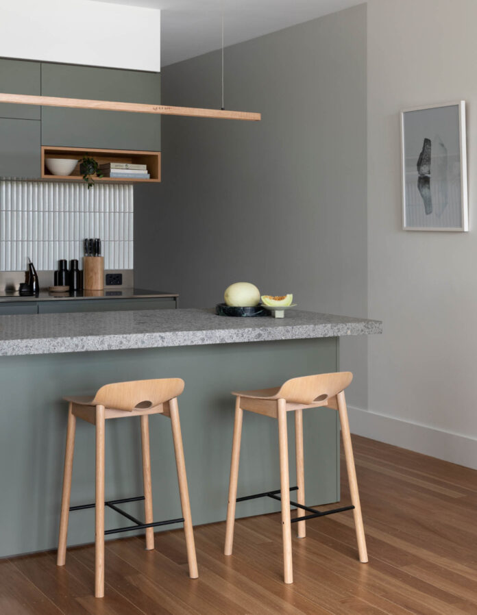
The K2 Kitchen System by Cantilever Interiors brings nature-inspired materials and colours into this Carlton apartment. Photo – Martina Gemmola. Styling – Kylie Forbes

Vessels by Tanika Jellis via Modern Times. Photo – Martina Gemmola. Styling – Kylie Forbes

What was previously an all-white and cramped apartment lacking in personality has been given a new lease on life. Vessels by Tanika Jellis via Modern Times. Photo – Martina Gemmola. Styling – Kylie Forbes

The homeowner chose the K2 Kitchen System for its thoughtful, robust, and elegant design with considered ergonomics. Sculpture on shelf by Tom Summers via Modern Times. Photo – Martina Gemmola. Styling – Kylie Forbes

Lucy also worked with Cantilever’s Interiors Service to guide the remainder of the space. Photographic artwork by Marija Ivkovic via Southwood Home. Ceramic vase by Katarina Wells via Modern Times. Sculpture on shelf by Tom Summers via Modern Times. Photo – Martina Gemmola. Styling – Kylie Forbes

The lighting scheme was strategically planned, utilising pendants and feature lighting to create an ambiance and focal point in the more social areas of the home. Sculpture by Bree Cribbin via Modern Times. Photo – Martina Gemmola. Styling – Kylie Forbes

Photographic artwork by Marija Ivkovic via Southwood Home. Photo – Martina Gemmola. Styling – Kylie Forbes

Photographic artwork by Marija Ivkovic via Southwood Home. Ceramic vase by Katarina Wells via Modern Times. Photo – Martina Gemmola. Styling – Kylie Forbes
The young professional owner of this Melbourne apartment was attracted to the property for its location, light, and balcony views across Carlton’s rooftops.
Less desirable was its all-white kitchen with a cluttered U-shaped layout unconducive to the flow of the space.
The homeowner, Lucy, engaged Cantilever Interiors to cosmetically renovate the apartment, selecting their K2 Kitchen System as the hero of the space.
‘She valued quality and longevity. She wanted a kitchen that was well made, had attention to detail and would really stand the test of time,’ says Kylie Forbes, creative director of Cantilever Interiors.
Lucy chose the K2 Kitchen System for its thoughtful, robust, and elegant design with considered ergonomics. The material palette features a stone bench top and refined timber detailing with the option of two-pack or veneer joinery. Handle-free cabinets and motorised doors provide enhanced accessibility, while offering a sleek, timeless appearance.
In the K2 Kitchen System, clients have the option of designing their own fully bespoke scheme, or choosing from one of seven pre-selected material palettes curated by Cantilever.
Lucy was drawn to materials and colours inspired by nature in the K2.3 palette. In particular, she had an instant connection with the slightly rustic texture of the basalt, which reminded her of hikes outdoors.
Basalt bench tops became the centrepiece of Lucy’s kitchen palette, complemented by Dulux Currency Creek on the two-pack joinery.
Lucy’s kitchen — like all Cantilever kitchens — was designed, made to order, and hand-built in the business’ Brunswick East workshop.
In renovating her apartment, Lucy also worked with Cantilever’s Interiors Service to guide the remainder of the space, tying together finish selections across walls, floors, lighting and furniture to compliment the joinery finishes and create a modern, calming home.
‘We used various techniques to help divide the open plan space into individual zones,’ says Kylie. ‘Using contrasting paint colour and carefully placed lines in the paint work, the apartment is visually divided, providing the sense of moving from one area into another.
The lighting scheme was likewise strategically planned, utilising pendants and feature lighting to create an ambiance and focal point in the more social areas of the home: the kitchen island and the dining table.
These collective cosmetic updates have provided Lucy’s apartment with an entirely different look and feel. The apartment now has a refreshed, refined ambiance and an added warmth, creating a welcoming environment for Lucy to retreat.
Learn more about the K2 Kitchen System from Cantilever Interiors.
[ad_2]
thedesignfiles.wpenginepowered.com


