[ad_1]
This Blushing Bondi Apartment Makes The Most Of A Narrow Space
Architecture

Blushing Bondi is a 1960s apartment renovation by Studio Weave Architects. Photography – Tom Ferguson

The renovation transformed a tired brick apartment into a contemporary beach abode blending old with new. Photography – Tom Ferguson

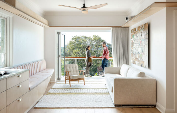
Unique joinery pieces and a pastel colour palette feature in this beachside apartment, which seamlessly connect the kitchen and living areas. Photography – Tom Ferguson

The material palette consists of three main elements carried throughout the apartment: terrazzo, brass, and plywood. Photography – Tom Ferguson

Pink stones in the terrazzo governed the cohesive use of the colour throughout. Photography – Tom Ferguson

The kitchen island bench, which needed to feel more like furniture as not to dominate the open-plan space. Photography – Tom Ferguson

Curved corners, elevated brass legs, and pastel pink fabric upholstery soften the bench – inviting people as they walk down the corridor to congregate around it. Photography – Tom Ferguson

A crowded, dark bathroom was overhauled to accommodate a more generously-sized room. Photography – Tom Ferguson

A brass-bordered glass panel divides the bathroom into two distinct spaces (wet and dry) each brightened by different white detailing. Photography – Tom Ferguson
With the right approach, a narrow apartment can be just as conducive to entertaining as a large home. Case in point, Blushing Bondi – a recent renovation of a 1960s beachside apartment – designed by Studio Weave Architects.
The client had recently sourced a commercial pasta maker (!) and was keen to create a space for hosting guests. Studio Weave’s response was to better connect the adjacent kitchen and lounge areas by introducing space-saving, built-in furniture.
Of particular importance was the kitchen island bench, which needed to feel more like furniture than a blocky bench, so as not to dominate the open-plan space. Curved corners, elevated brass legs, and pastel pink upholstery soften this element – inviting people to congregate around the bench. Also built-in is a lounge, which features the same brass legs and pastel pink fabric.
Instilling playfulness in the joinery was a highlight of the project for Studio Weave Architects, as well as designing the high living room shelf above the open-plan domain. ‘The shelf also provides an opportunity to conceal lighting, electrical and even a drop down screen and projector, removing the reliance on a space centred around a television,’ says Davin Turner, director of Studio Weave Architects.
The soft, pastel hues of the beach-side locale provided a unique reference point for the material palette here, seen through the use of terrazzo on kitchen bench tops and in the bathroom. ‘The specific terrazzo chosen has speckles of pink, which led to the selection of a pink fabric installed on the built-in sofa and recess of the island bench,’ says Davin. ‘The sandy colour of the beach defined the use of plywood, and this warm colour was also a factor in selecting the flooring,’
Davin describes the project as an embrace of the art deco architecture dotted around the suburb, but with a modern beach vibe. The result is a relaxed, robust space that caters for the rigours of everyday life, with just enough wow-factor to entertain with ease!
[ad_2]
thedesignfiles.net


