[ad_1]
The Treasure-Filled Sydney Home Of Two Global Art Collectors
Architecture

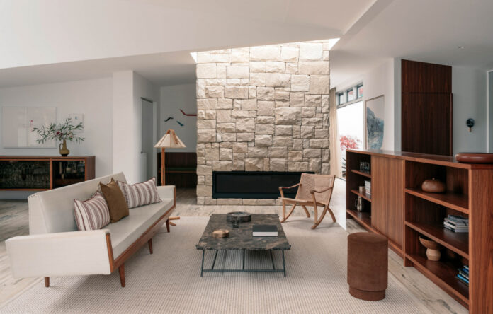
The living room sits at the centre of the house, and is the first point of contact from the front entry. Photo – Felix Forest. Stylist – Anna Delprat.

Walnut joinery sweeps the house, exemplified here in this piece of built-in furniture. Photo – Felix Forest. Stylist – Anna Delprat.

A sandstone fireplace makes a statement in the centre of the house. Photo – Felix Forest. Stylist – Anna Delprat.

Though restricted to one storey, access to natural light and tall ceilings were key components of the brief. Photo – Felix Forest. Stylist – Anna Delprat.

The clients wanted a space to house their art and furniture collections. Photo – Felix Forest. Stylist – Anna Delprat.

A custom martini bar reflects the clients’ hobbies. Photo – Felix Forest. Stylist – Anna Delprat.

The kitchen sees walnut joinery and stainless steel combo. Photo – Felix Forest. Stylist – Anna Delprat.

A narrow passage links the communal living and dining zones to the pricate sleeping quarters at the front of the house. Photo – Felix Forest. Stylist – Anna Delprat.

Natural light and outlooks intervene at opportune moments. Photo – Felix Forest. Stylist – Anna Delprat.

Small walled courtyards create new glimpses into the outside world. Photo – Felix Forest. Stylist – Anna Delprat.

Sweeping walnut joinery along the bedroom wall. Photo – Felix Forest. Stylist – Anna Delprat.

Access to light and greenery in the main bedroom. Photo – Felix Forest. Stylist – Anna Delprat.

Skylights bring brightness into the study nook passageway. Photo – Felix Forest. Stylist – Anna Delprat.

Travertine is a constant theme throughout the material expression. Photo – Felix Forest. Stylist – Anna Delprat.

Californian modernism exemplified by architects like Craig Ellwood and Pierre Koenig inspired this new mid-century home. Photo – Felix Forest. Stylist – Anna Delprat.

Low rooflines, access to greenery and mid-century materials such as breezeblocks typifies this iconic architectural style. Photo – Felix Forest. Stylist – Anna Delprat.

Looking from the studio pavilion into the lounge of the main house. Photo – Felix Forest. Stylist – Anna Delprat.

The main entry is positioned at the side of the house, not the front. Photo – Felix Forest. Stylist – Anna Delprat.

The main entry leads residents directly into the living room at the belly of the house via an entry foyer specifically designed to house the couple’s art. Photo – Felix Forest. Stylist – Anna Delprat.

Original bricks sit beside new (but stylistically complementary) breezeblocks at the entrance. Photo – Felix Forest. Stylist – Anna Delprat.
The owners of this home in Sydney’s upper north shore looked to a lifetime of global travel as the influence for their renovation designed by Studio Prineas.
‘Having lived in the Netherlands for many years, both Patrick and Elizabeth were enamored by the concept of Gezellig/Gezelligheid — a Dutch word that is difficult to describe but is best translated as a general and abstract sensation of individual wellbeing that one typically shares with others,’ explains principal architect, Eva-Marie Prineas.
They wanted space to unite their collections of art and mid-century furniture – but they did not want more floor space. Instead, they engaged Studio Prineas to redesign the layout of their home in a more functional arrangement.
The previous design saw the communal living spaces at the centre sandwiched between bedrooms at either end. Studio Prineas reconciled these disparate zones, pushing the three bedrooms to the front of the house to abut multiple new courtyards and a car port, leaving the communal zones at the centre of the house.
Eva-Marie and her team approached the brief by continuing with the material expression of the original house. They found matching bricks to re-use again in the new additions, and added fresh breeze blocks to continue with the modernist-inspired palette.
Inspired by architectural work of Craig Ellwood and Pierre Koenig, Studio Prineas devised House Gezellig. They retained the design language of these modernist masters, namely low rooflines, lofty ceilings and brick chimney structures typical of Californian architectural canon.
A travertine floor runs throughout, anchored by a statement sandstone fireplace.
‘From the minute we met our clients, we just clicked,’ says Eva-Marie. ‘Our design meetings became longer and longer as time went on, as did any site meetings with the builder, who was also incredibly passionate about creating the perfect forever home that Patrick and Elizabeth had envisaged for themselves.’
‘By the end of the process, we were all very fond of each other and there was a wonderful atmosphere of sharing and togetherness, that we recognize as “gezellig”.’
See more projects from Studio Prineas here.
[ad_2]
thedesignfiles.net


