[ad_1]

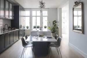
Previously this kitchen presented an awkward layout that didn’t maximise the room’s classic proportions. Before being renovated this long space featured an L-shaped counter jutting out into the middle of the room, which effectively cut it in half, and, on the other side of it, was an uninspiring TV area. Now it’s a vision in contemporary design; a classic shaker style green kitchen.
A thoughtful modern makeover has transformed the original kitchen idea into a space where friends and family can gather with ease.
Classic shaker style green kitchen

Image credit: Future PLC/ James French
The owners wanted a classic Shaker style kitchen with a streamlined look, and so chose a design by Roundhouse. They added a contemporary touch to the kitchen colour scheme with a deep-green painted finish, complete with sleek pull-bar handles.
These are contrasted with an off-white stone worktop. There’s a generous concealed larder, a hob inset into the island and some fluted glass cabinetry above the sink to soften the overall look.
Cantilevered dining table

Image credit: Future PLC/ James French
The owners approached interior designer Stephanie Rackind to reconsider the layout. Everything fell into place when she suggested working in the full length of the room by designing a kitchen with a long, cantilevered dining table integrated into a central island running down the room.
Flexible entertaining space

Image credit: Future PLC/ James French
The revised layout has turned the formerly impractical space into a natural hub for gatherings for family and friends. The island features deep drawers on both sides for plenty of storage and an inset hob by Miele.
Wide wooden planks provide a kitchen flooring idea, that’s hard-wearing, practical and stylish. Simply dressed windows keep the look minimal but warm.
Seating area

Image credit: Future PLC/ James French
A feature was made of the former TV area by papering the wall with a bold monochrome jungle mural, complemented by two chairs in cotton velvet. It’s an informal space where the children can play and friends can chat as the owners cook.
Elegant detailing

Image credit: Future PLC/ James French
Pull-bar handles in a diamond cut, cross knurl pattern with a smoked bronze finish add a softly contemporary twist to the more traditional Shaker units. Smoked bronze taps and pull bar handles, both by Roundhouse, add depth and texture to this scheme.
The family’s favourite ceramics are outlined behind softly reeded glass-fronted cabinetry – a popular choice now in kitchen trends.

Image credit: Future PLC/ James French
Working with the natural flow of a room instead of against it can really transform a space. In this case, white framed windows at both ends of the room introduce plenty of light into this third-floor Edwardian apartment.
The post Slimline elegance and bold colour creates wow in this light-filled kitchen appeared first on Ideal Home.
[ad_2]
www.idealhome.co.uk


