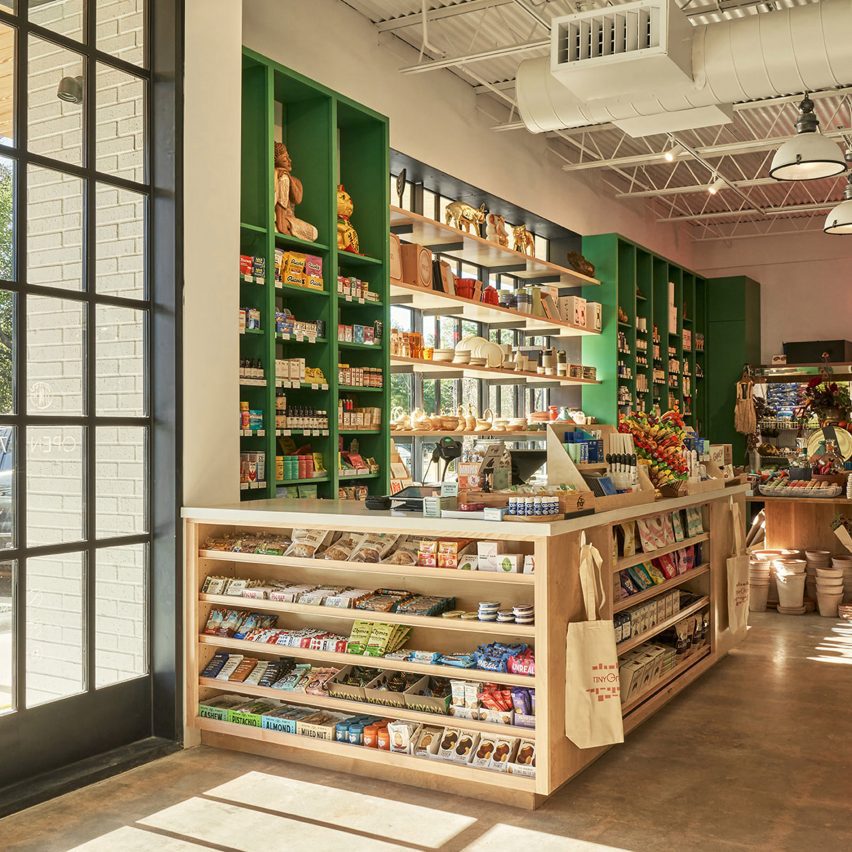
Texas architecture studio Side Angle Side has adapted a 1960s post office into a food market and restaurant in Austin.
Opened in October 2023 in the Hyde Park area, Tiny Grocer serves as a speciality market, bar and cafe while Bureau de Poste is a modern French bistro led by celebrity chef Jo Chan.
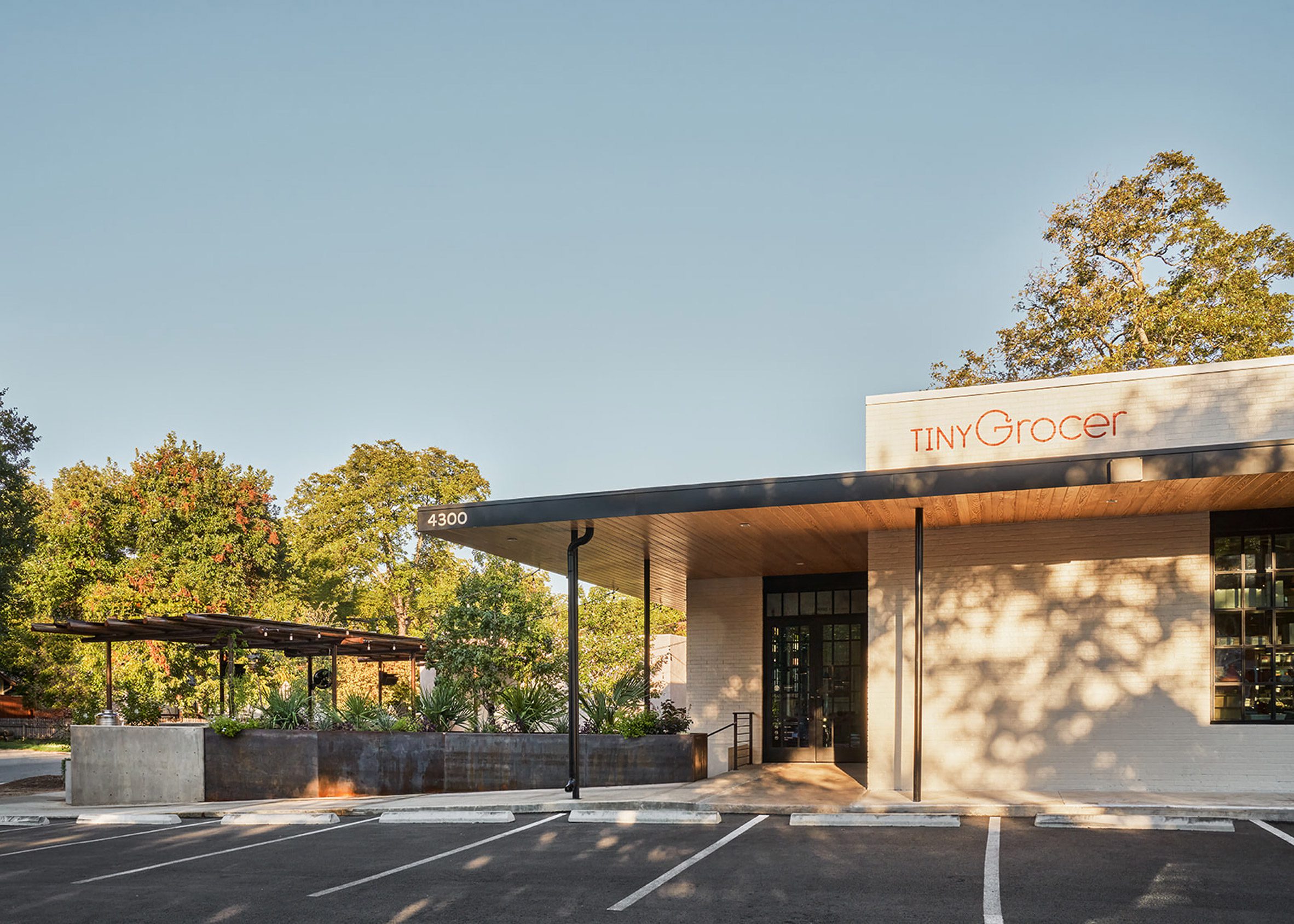
Austin-based commercial and residential architecture firm Side Angle Side renovated the 3,500-square foot (325-square metre) 1967 US Post Office building and added a 1,500-square foot (140-square metre) outdoor dining patio.
“The Hyde Park U.S. Post Office was an important neighborhood hub in the 1960s – so we were especially careful to keep the integrity and spirit of the mid-century-utilitarian design,” Arthur Furman, founding partner of Side Angle Side, told Dezeen.
“As the anchor tenant in the space, Tiny Grocer continues to be the centre of the community, a place to gather, shop, eat and drink.”
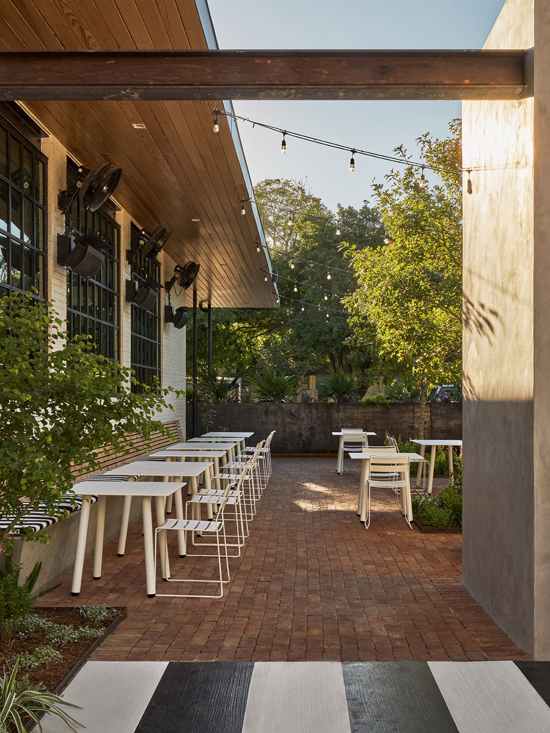
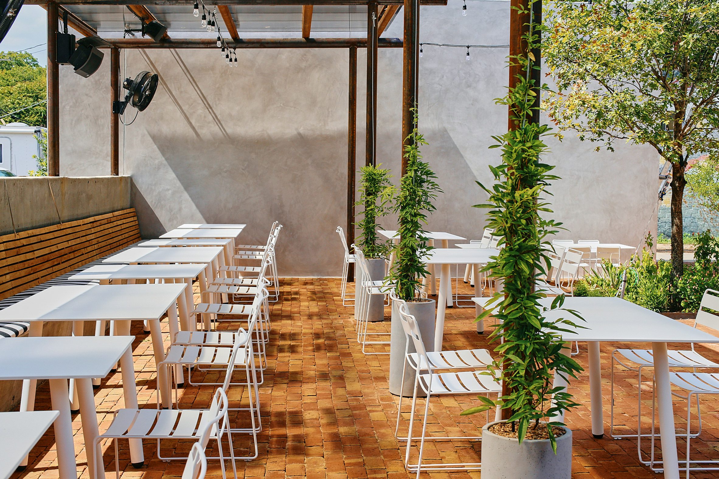
The shell of the white brick building was left intact, but the street-facing facade was previously used as a loading dock so the team transformed the back-of-house edge into a welcoming patio for the neighbourhood by removing the asphalt and adding two large live oak trees and a steel trellis and planters.
A cast-in-place concrete banquette holds the edge of the patio that is paved with antique red brick.
The steel planter forms a boundary between the parking area and the dining space, while the other edge is held by a light grey-coloured stucco restroom building. White metal furniture from Isimar and Portofino was used to furnish the patio.
“The patio and wine garden is the real heart of the project,” the team said, mentioning that it wasn’t within the original scope of the project but added later when its larger value was realized. “This is where all the care and thought of the interior spills to the outside, creating a lively environment.”
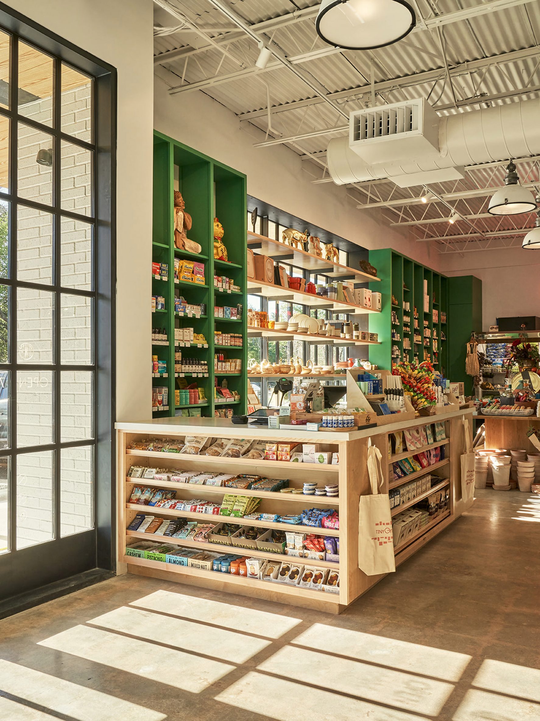
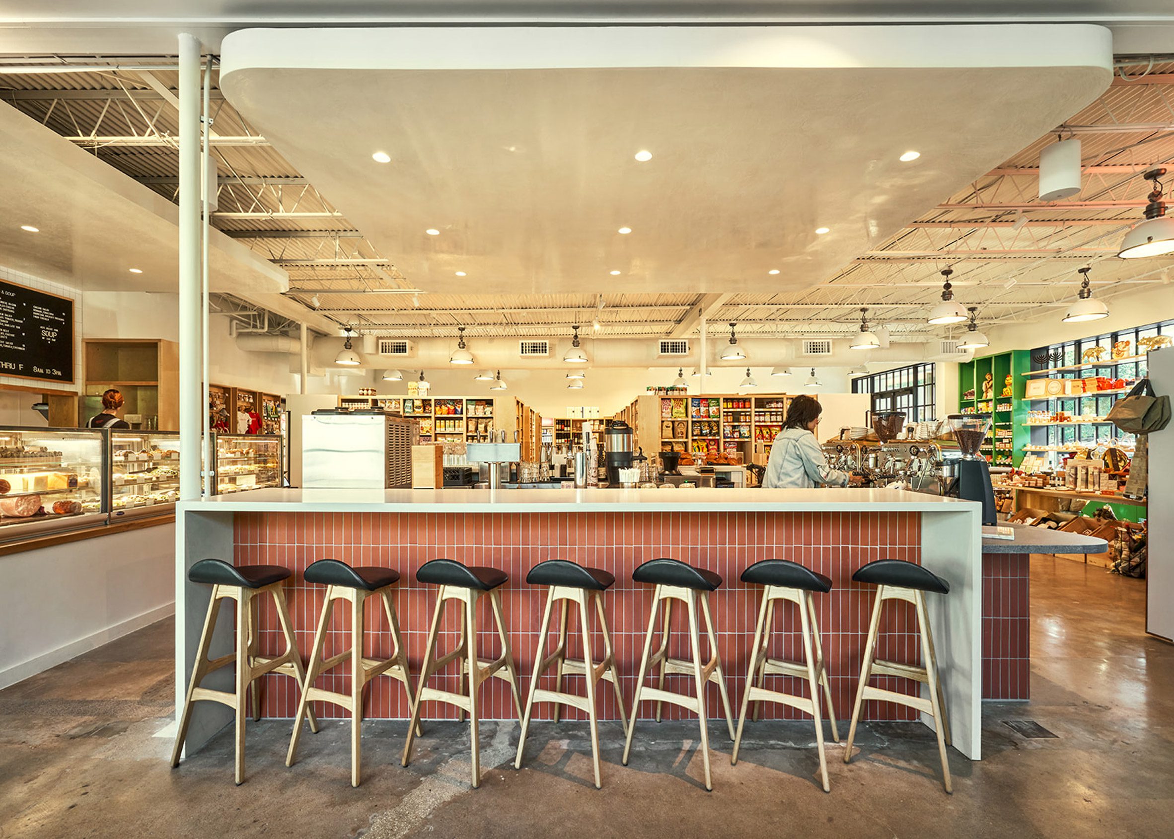
On the interior, Side Angle Side complemented the original ceiling and open web joists with metal decking and industrial warehouse pendants by AQ Lighting. The polished concrete floors expose the weathered imperfections and show the history of the building.
Upon entering, shoppers take in the colourful selection of curated products displayed on white oak mercantile shelving. Green millwork hugs one wall and the space widens to an open interior plan.
A central deli and coffee bar floats in the middle of the room and creates a transition from the market to the bistro. The bar is wrapped in Seneca terracotta tile and topped with grey and white quartz countertops. Wooden Soule barstools are tucked under the waterfall counter.
The back-of-house spaces hold a kitchen office, storage, and bar equipment.
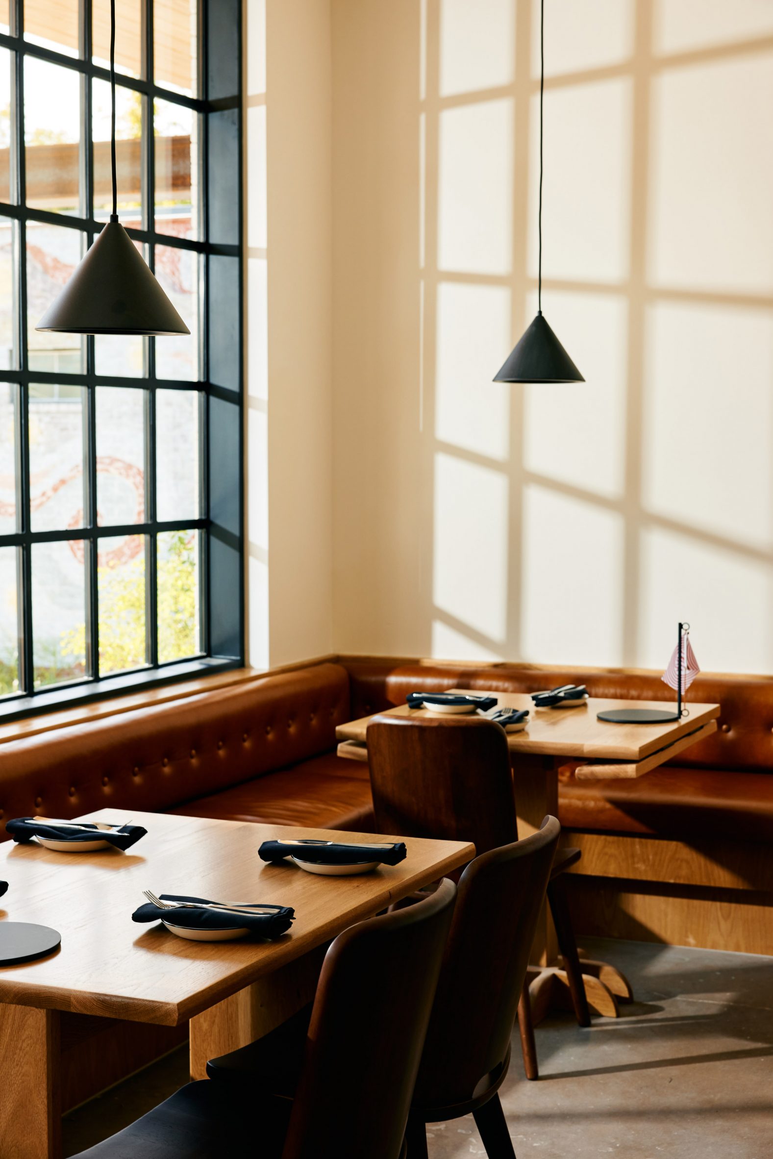
“Working closely with the owner, design finishes hint at the building’s midcentury past,” the team said, referencing the custom, built-in leather banquette by Undercover Austin Upholstery that lines the bistro’s back wall.
Above the banquette and Second Chance Custom wooden dining tables hang black cone light pendants by All Modern.
“The single biggest sustainable feature of this project is one that is often overlooked,” the team said, noting the adaptation of the structure. “The ‘loose fit, long life’ style of these old buildings leads to more reuse and far less waste.”
Recent adaptive reuse projects in Austin include a 1900s house converted to a luxury office by Michael Hsu and commercial units converted to an architecture studio by Baldridge Architects.
The photography is by Likeness Studio and Mackenzie Smith Kelly.
Project credits:
Structural engineer: Creative Engineering
MEP engineer: ATS Engineers
Builder: Archive Properties
Commercial interior design: Side Angle Side
Architects: Side Angle Side
Building shell: Thought Barn Studio
Landscape design: Side Angle Side & Wild Heart Dirt
Owner: Steph Steele
The post Side Angle Side transforms mid-century Austin post office into restaurant appeared first on Dezeen.
www.dezeen.com


