[ad_1]
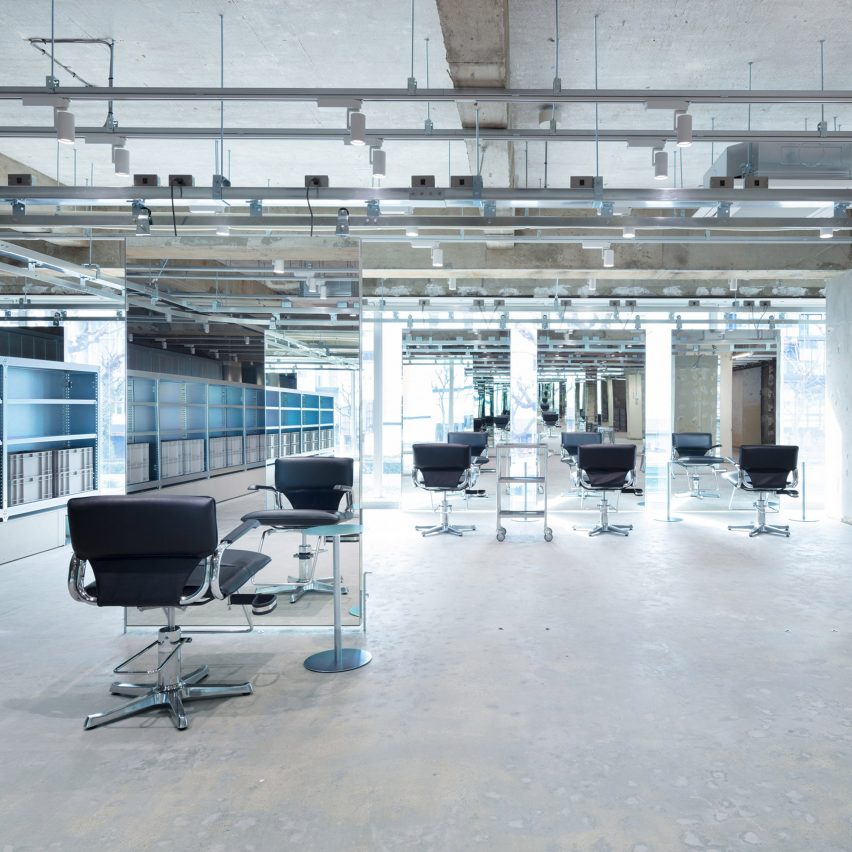
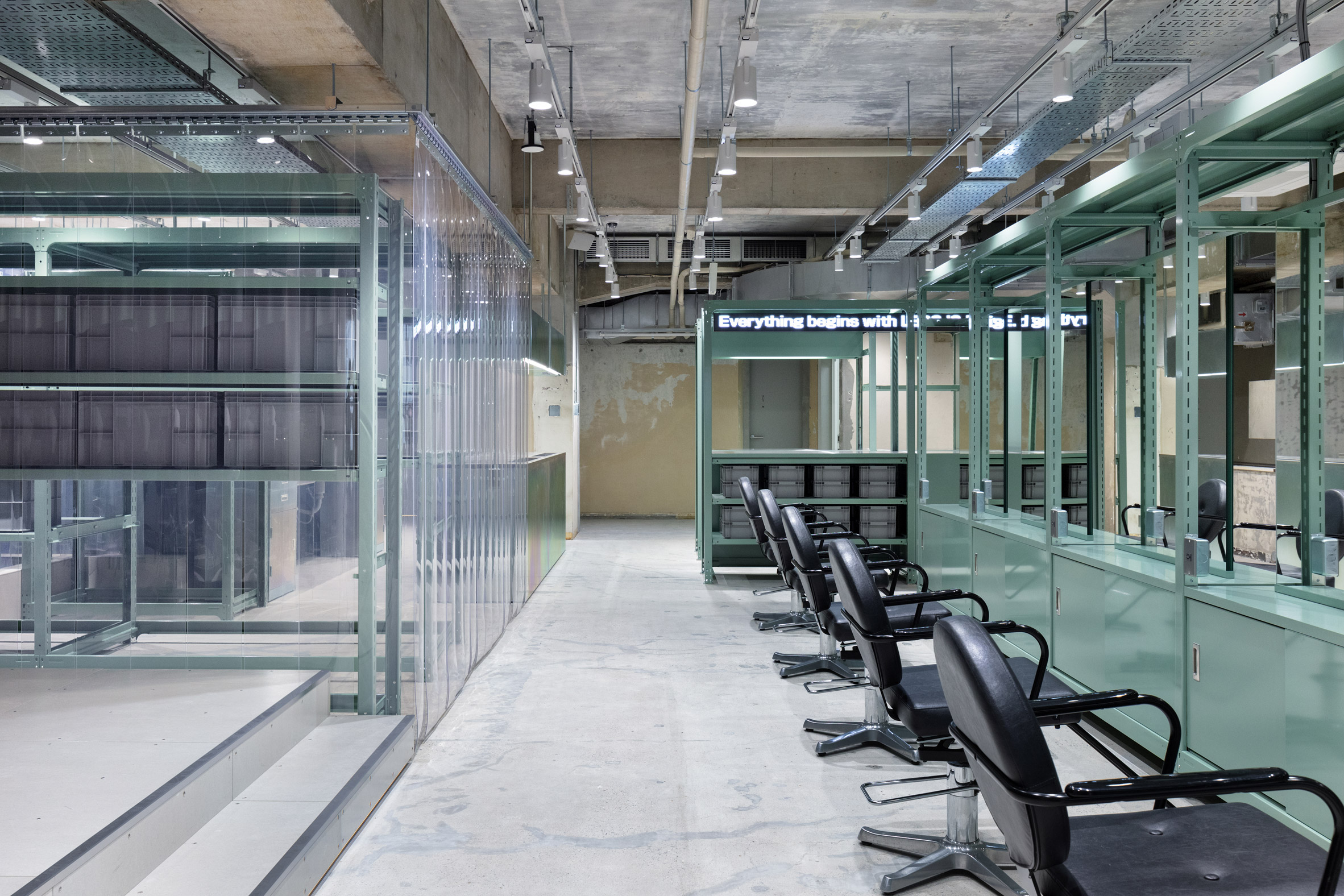
Steel fixtures, clear PVC curtains and mirrors hung on pulleys give this Japanese hair salon by Schemata Architects the feel of an industrial warehouse.
Called LIM, the salon is located in Osaka’s Shinsaibashi district and occupies an expansive, 563-square-metre retail space with an open-plan layout punctuated by exposed concrete columns and beams.

“Our client explained to us that the name LIM is derived from ‘less is more’ – a famous quote by the modernist architect Mies van der Rohe,” said Schemata Architects, which is headed by Jo Nagasaka.
“For us architects, the maestro’s words are like a holy mantra that we feel too embarrassed to even mention. But the client unexpectedly suggested it to us as a theme.”
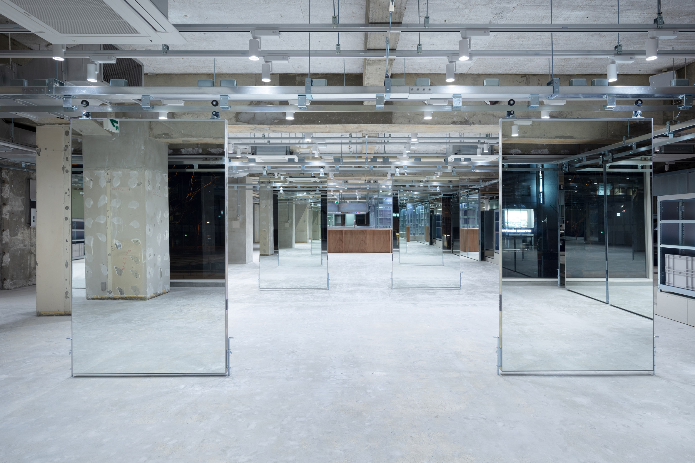
Working within a tight budget, the studio modified off-the-shelf steel storage units with iridescent zinc-nickel plating and used them to create all of the salon’s fixtures.
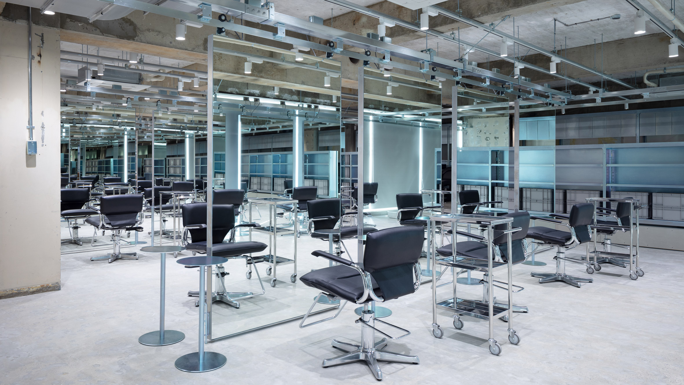
Large rectangular mirrors on a ceiling-mounted pulley system create flexible individual styling stations. The mirrors double as room dividers that can be easily moved to clear the large space for events.
Schemata Architects used plastic strip curtains, more typically found in industrial buildings such as warehouses and factories, to divide the front and back of house.
“We have created a space where people can experience the most refreshing, wide-open space in Kansai,” explained the Tokyo-based firm.
A second, smaller salon called Loji sits at the back of the LIM space and offers fashion-forward services at low prices.
“It is a stepping stone for young stylists,” explained the practice. “Those who gain young customers and hone their professional skills there will move on to LIM.”
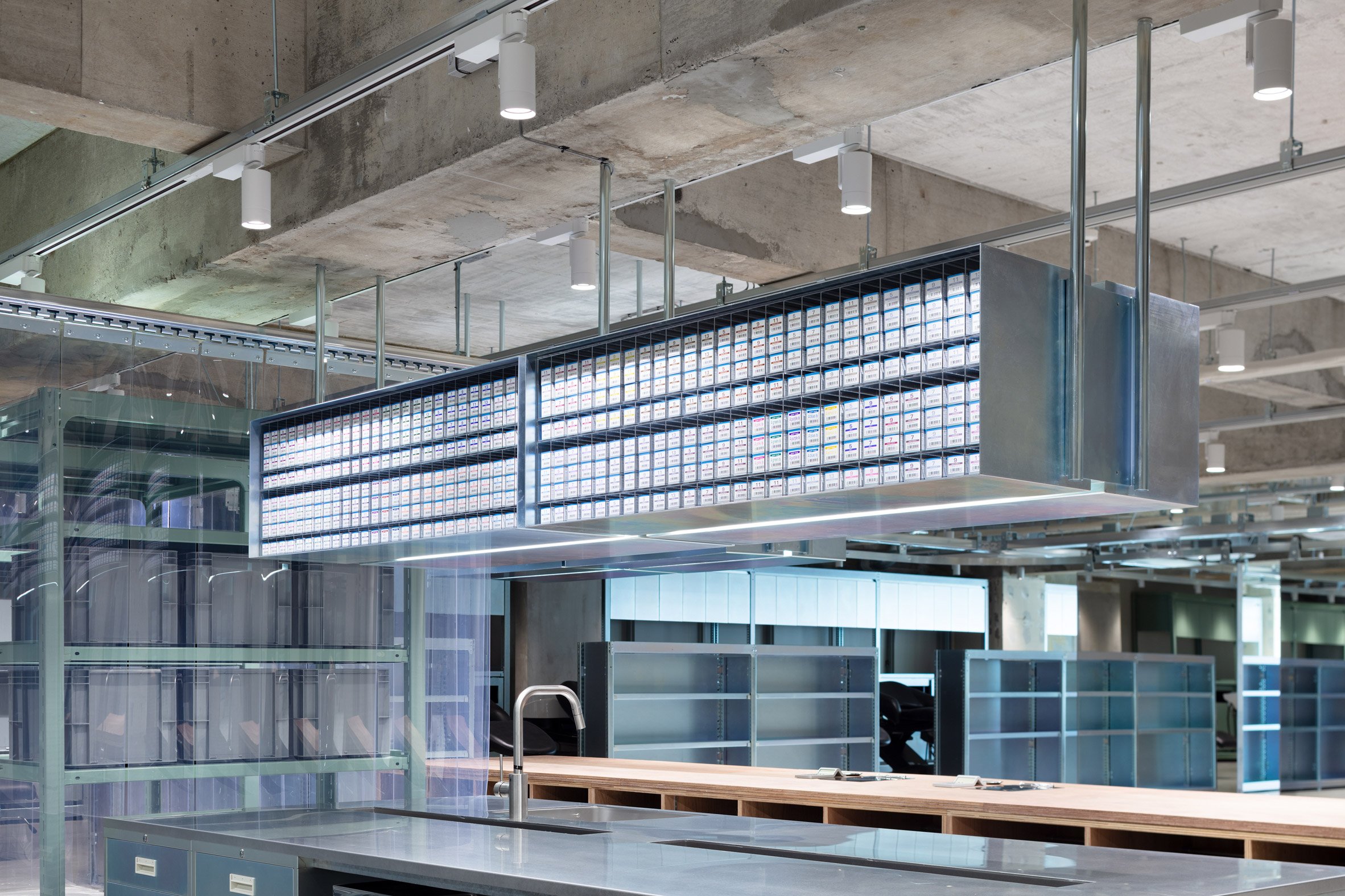
The Loji space, which is made up of two banks of styling stations, uses the same off-the-shelf storage fixtures as LIM but without the zinc-nickel plating, leaving their original seafoam green finish exposed.
This creates both visual consistency and distinction between the two salons while also saving on cost.
Also in Osaka but at a much smaller scale is this 59-square-metre beauty salon by design studio Sides Core. Squeezed into a narrow site between two buildings, the architects created a clever narrow floor plan, which makes the most of its slender proportions.
Photography is by Takumi Ota.
The post Schemata Architects designs Osaka hair salon to recall an industrial facility appeared first on Dezeen.
[ad_2]
www.dezeen.com


