[ad_1]
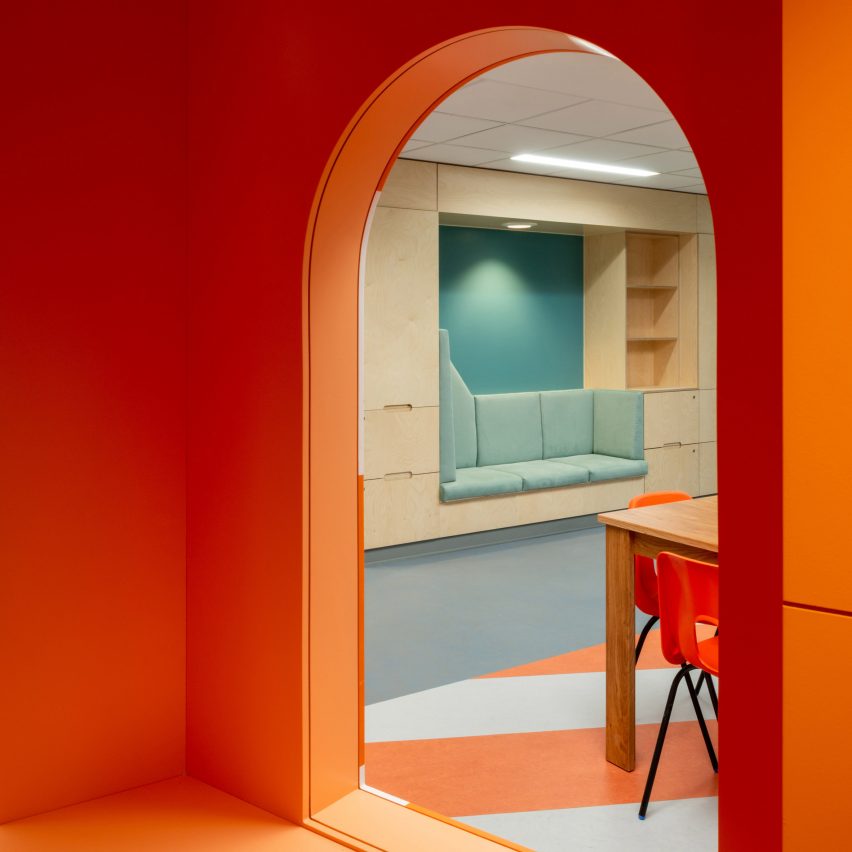
London studio Projects Office has used seaside-inspired colours and imagery to create a comfortable but practical interior for a mental health unit at the Royal Hospital for Children and Young People in Edinburgh.
The Child and Adolescent Mental Health Service (CAMHS) facility is designed to feel non-institutional, so as to make patients feel at ease, but to also look distinctly different than a domestic environment.
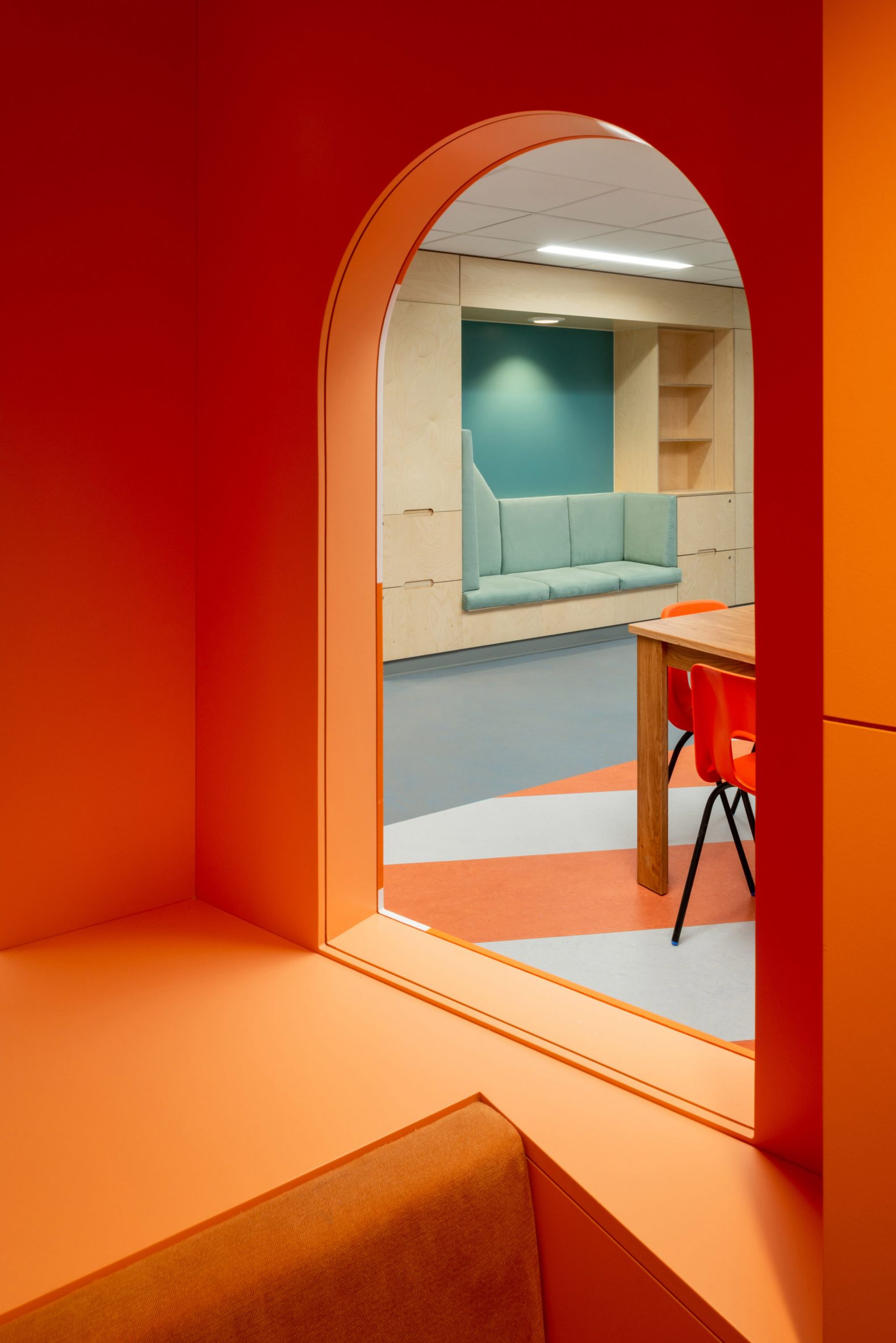
The Projects Office team – led by architects Bethan Kay, James Christian and Megan Charnley – collaborated with art consultancy Ginkgo Projects on the interior, envisioning it as “a third space which is neither hospital nor home”, but instead has its own identity.
They developed this approach following a series of workshops and interviews with young patients, their parents and staff members.
These sessions, carried out with help from artist James Leadbitter, helped the architects understand many of the subtle details that can make a big difference to how patients feel in a space.
For instance, the bedrooms are designed so that occupants can easily personalise them, giving them a feeling of ownership. But they can easily reverted after patients are discharged, giving a clean slate to the next resident.
“At a time of stretched NHS funding and increased demand for mental health services, we believe that good design is a powerful and cost-effective healing tool,” said James Christian.
“We also believe that asking patients, staff and parents what they really need and want from healthcare spaces leads to richer, more useful spaces.”
The mental health unit includes outpatient facilities for five to 18 year-olds and an inpatient unit for 12 to 18 year-olds.
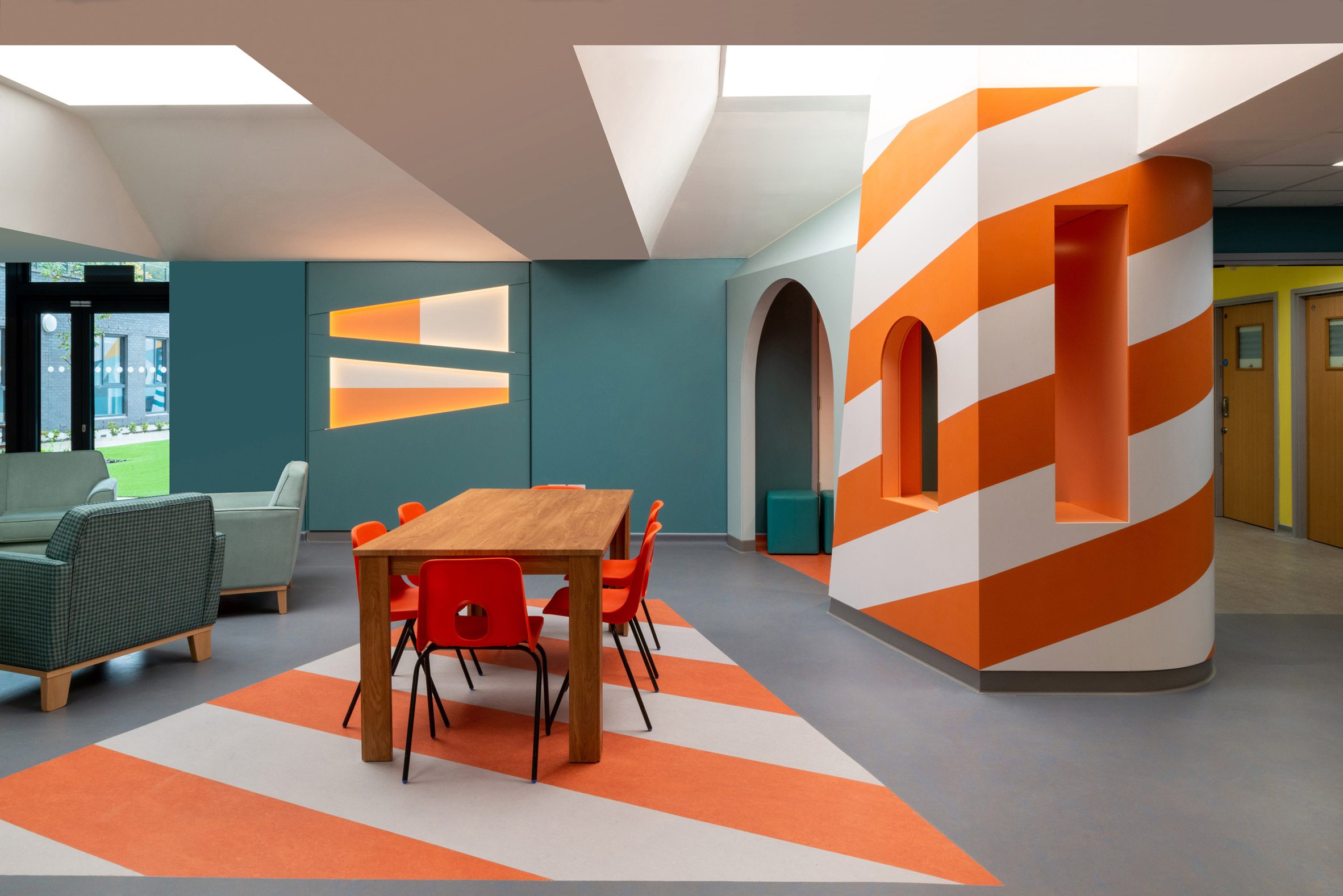
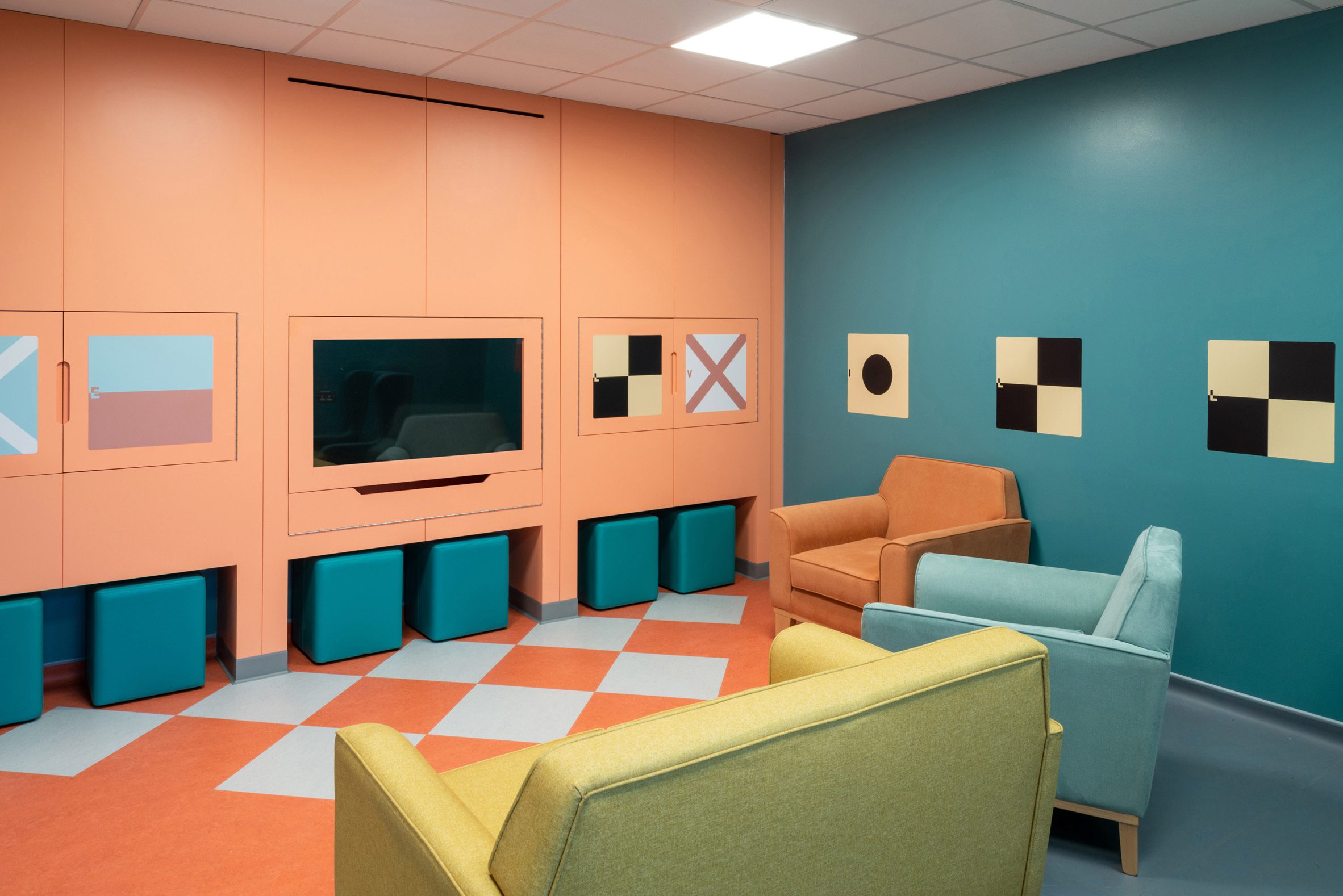
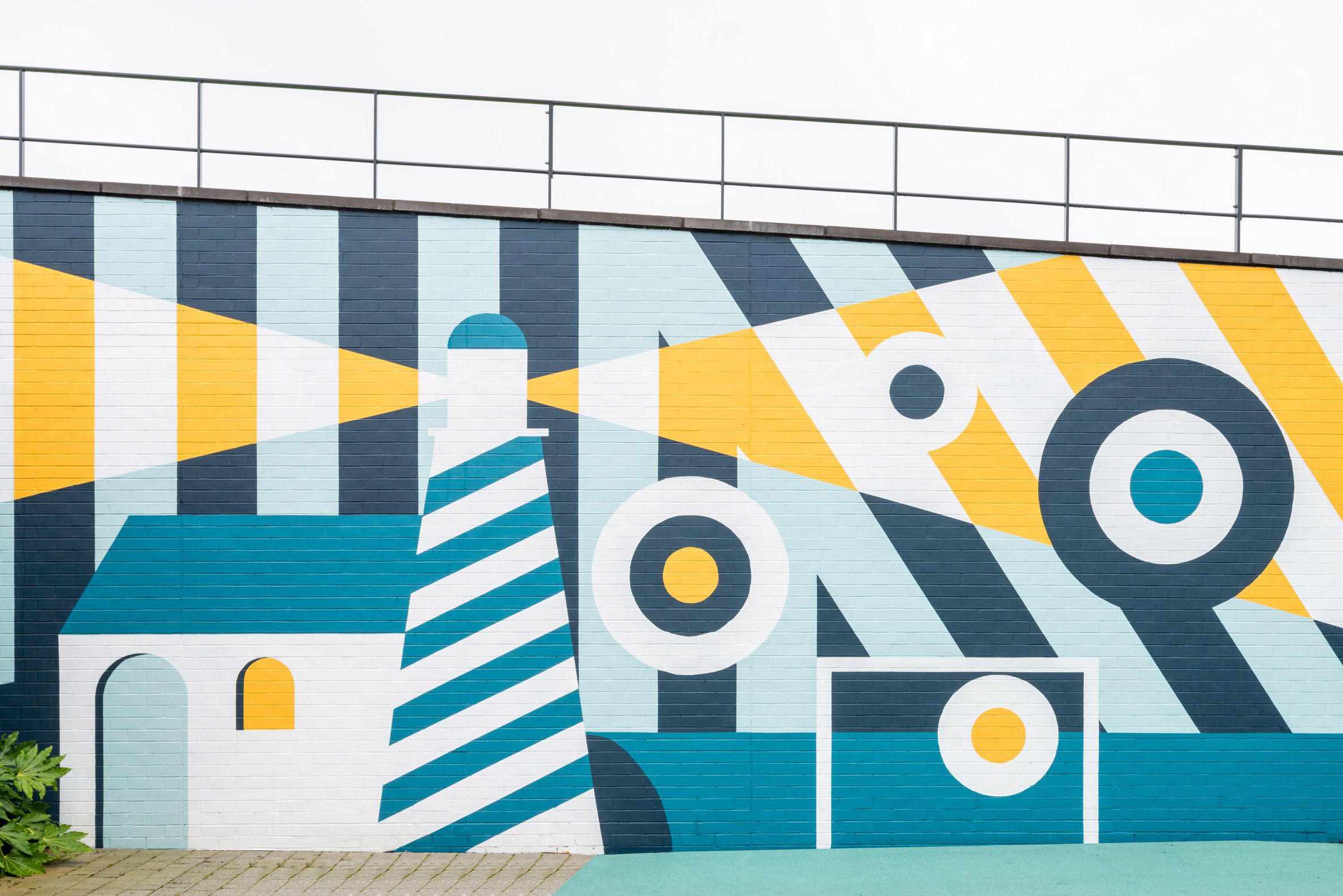
The designers found that the seaside was often mentioned as an environment that helps to improve mental health, which is why Projects Office used this as the starting point for the design. Colours, patterns and motifs incorporate various seaside references.
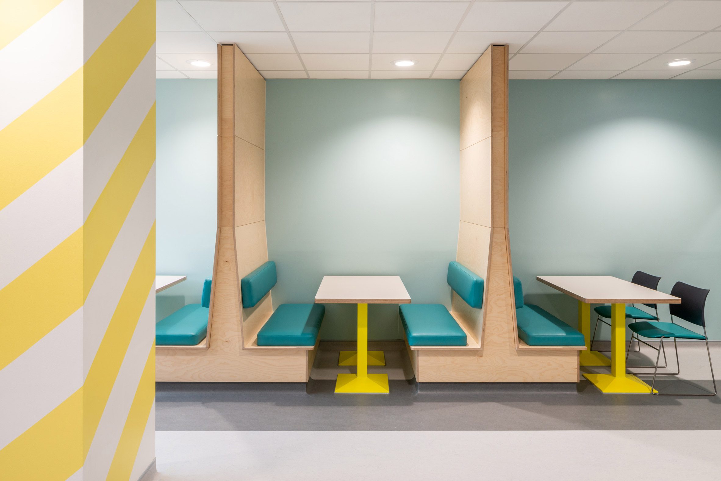
“We took a playful approach to our designs for the artworks, whilst taking care to avoid the sometimes patronising wall graphics that can appear in children’s hospitals,” Christian told Dezeen.
“Each graphic intervention reinforces the overall coastal theme, but a varied approach has been taken to how they manifest in the different spaces,” he explained.
“This ranges from simple maritime pendants that spell out the name of the unit in a TV room all the way to a large lighthouse mural with a goal and targets, for ball games in the central garden.”
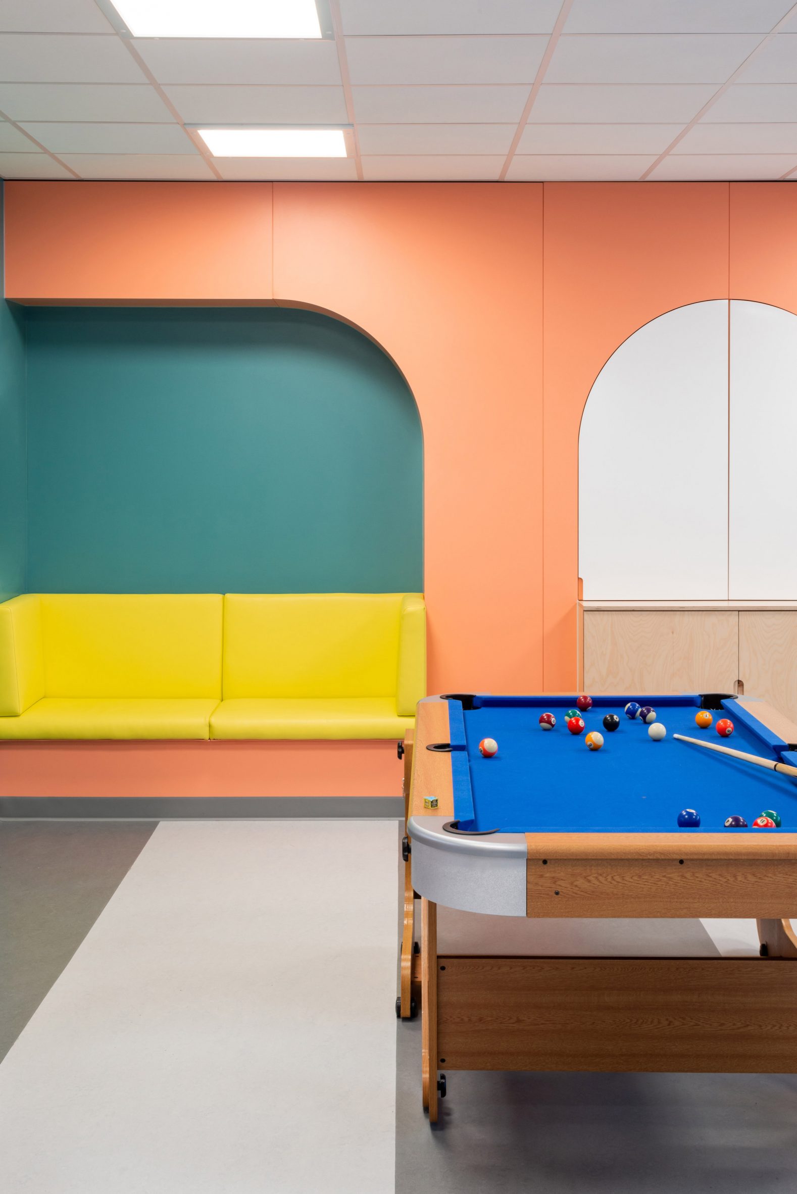
For the communal areas, a key challenge was to offer a sense of safety and privacy to all patients, particularly those suffering severe distress, without creating blind corners.
The designers tackled this with upholstered seating nooks built into the walls, banquettes that extend up to the ceiling, and a lighthouse-inspired den.
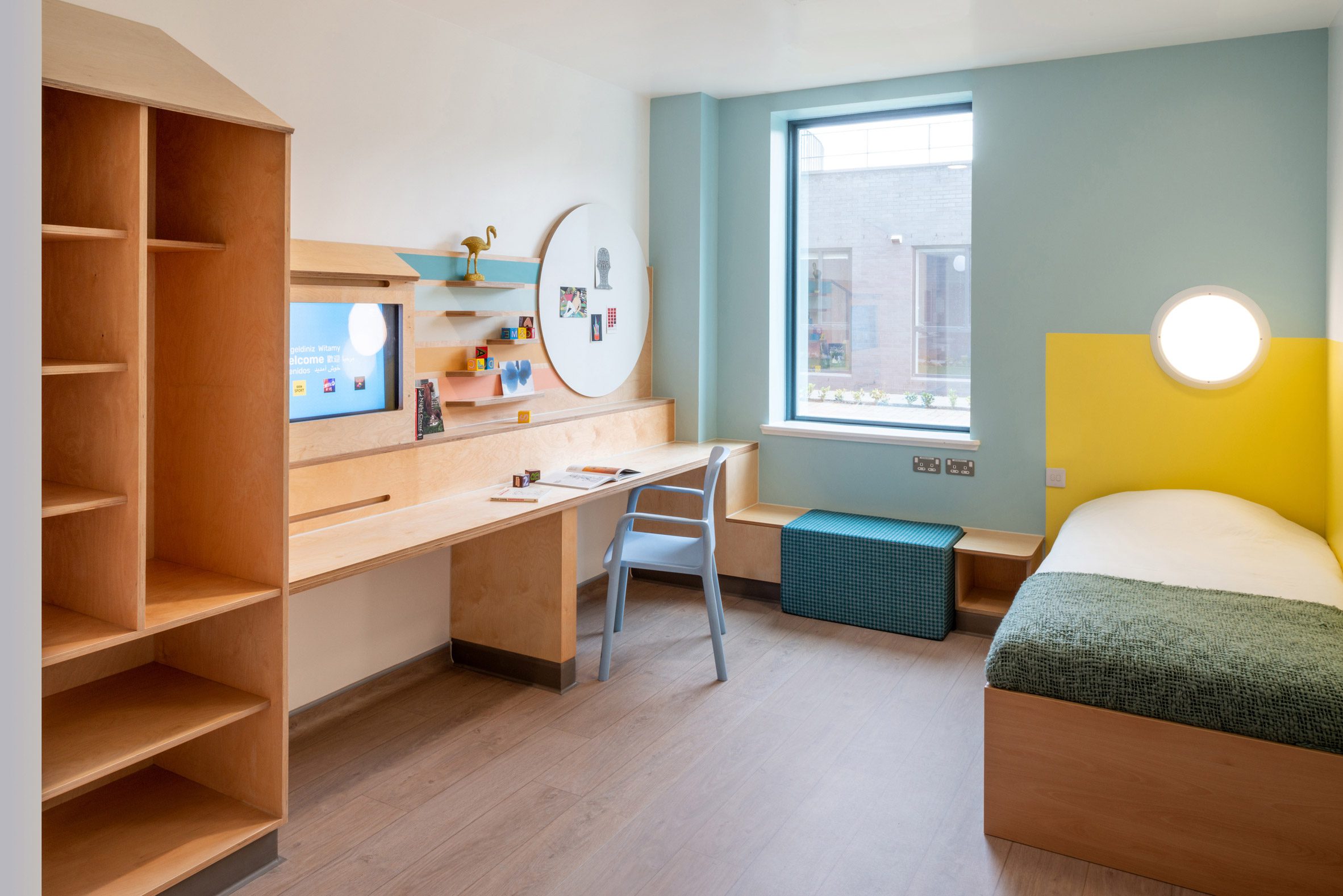
“A spectrum of levels of privacy and togetherness is utilised to create zones that range from communal activity and convivial conversation through to nooks and corners that offer the opportunity for private conversation and to retreat without feeling isolated from others,” said Christian.
All of this was achieved on a tight budget thanks to the use of standard and off-the-shelf elements. Standard hospital furniture was simply customised, while bespoke furniture elements were built from simple plywood.
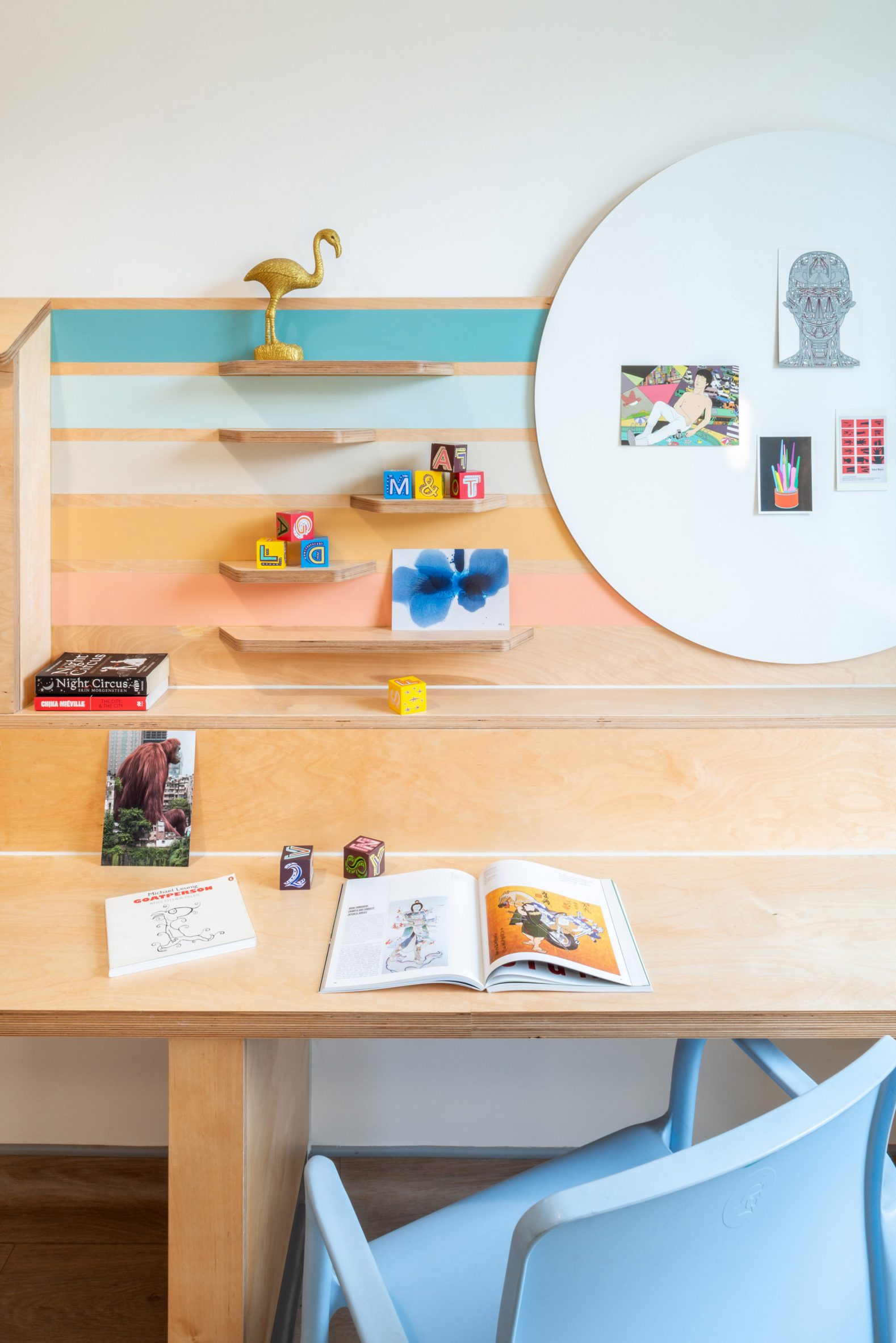
A similar approach features in the bedrooms, although these spaces have a softer and more relaxed feel.
Playful shelving and large wall boards make is easy for patients to display their personal belongings, while a window seat integrates a movable ottoman, creating a variety of different ways for families to sit together.
Both details help to make the rooms feel less like a hospital.
The project was funded by Edinburgh Children’s Hospital Charity. The charity’s CEO, Roslyn Neely, said the results have exceeded expectations.
“Coming to CAMHS can be a very stressful time for children, young people and their families so it was important to ensure that, from the moment they arrive, they know they are in a safe place where they will be supported and valued,” she said.
“Ginkgo and Projects Office have gone above and beyond to make sure children and young people were involved in the design and have transformed the space from bare and clinical to bright, welcoming and suitable for children and young people experiencing mental health difficulties.”
Photography is by French + Tye.
The post Projects Office designs non-institutional interior for mental health facility in Edinburgh appeared first on Dezeen.
[ad_2]
www.dezeen.com


