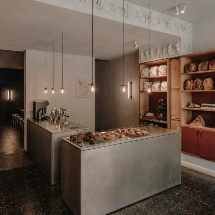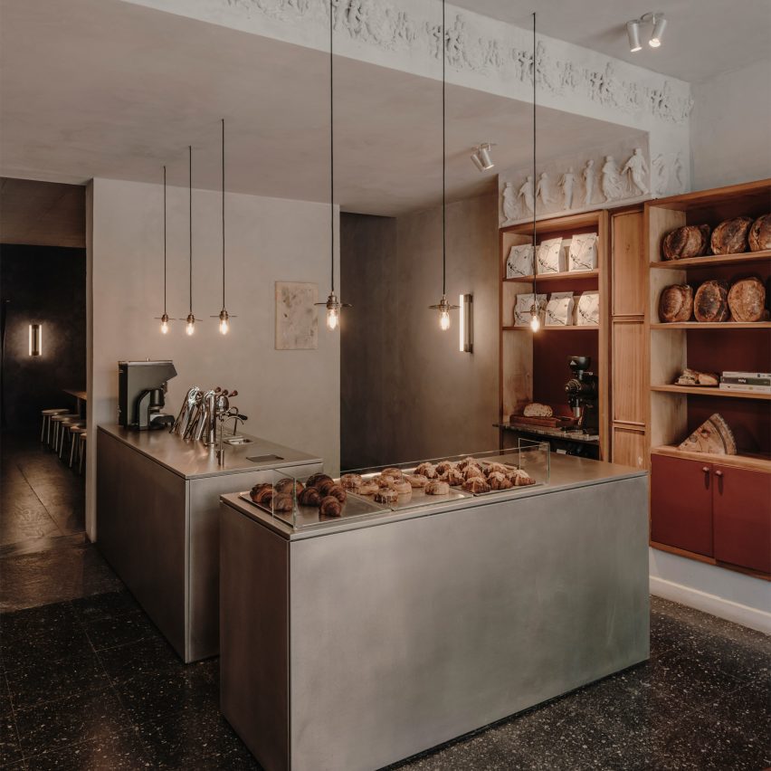
Spanish studio Plantea Estudio has completed a cafe and bakery inside an early 20th-century building in Madrid, contrasting the original dark tones of the interior with modern steel surfaces.
Taking over a former gem store on a busy street in the Justicia district, the Acid cafe and bakeshop was designed to provide a place for quiet conversation away from the bustle of the city.
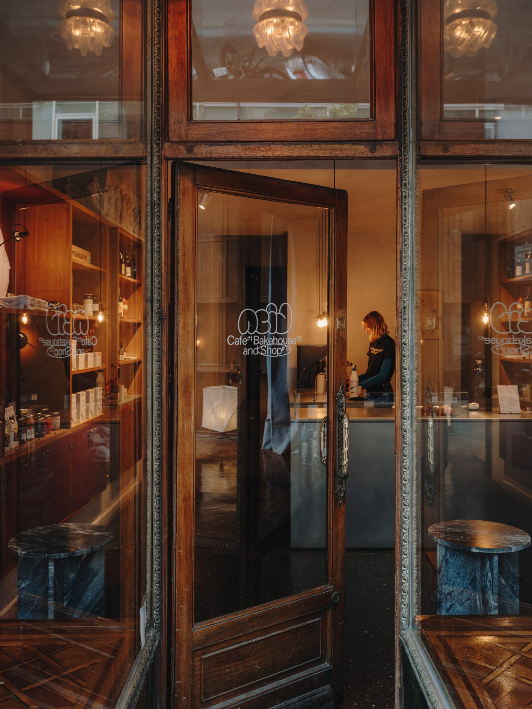
It occupies the ground floor of a turn-of-the-century building, which is rich with historic details such as a deep storefront made from wood and green marble, with curved windows on either side of the entrance.
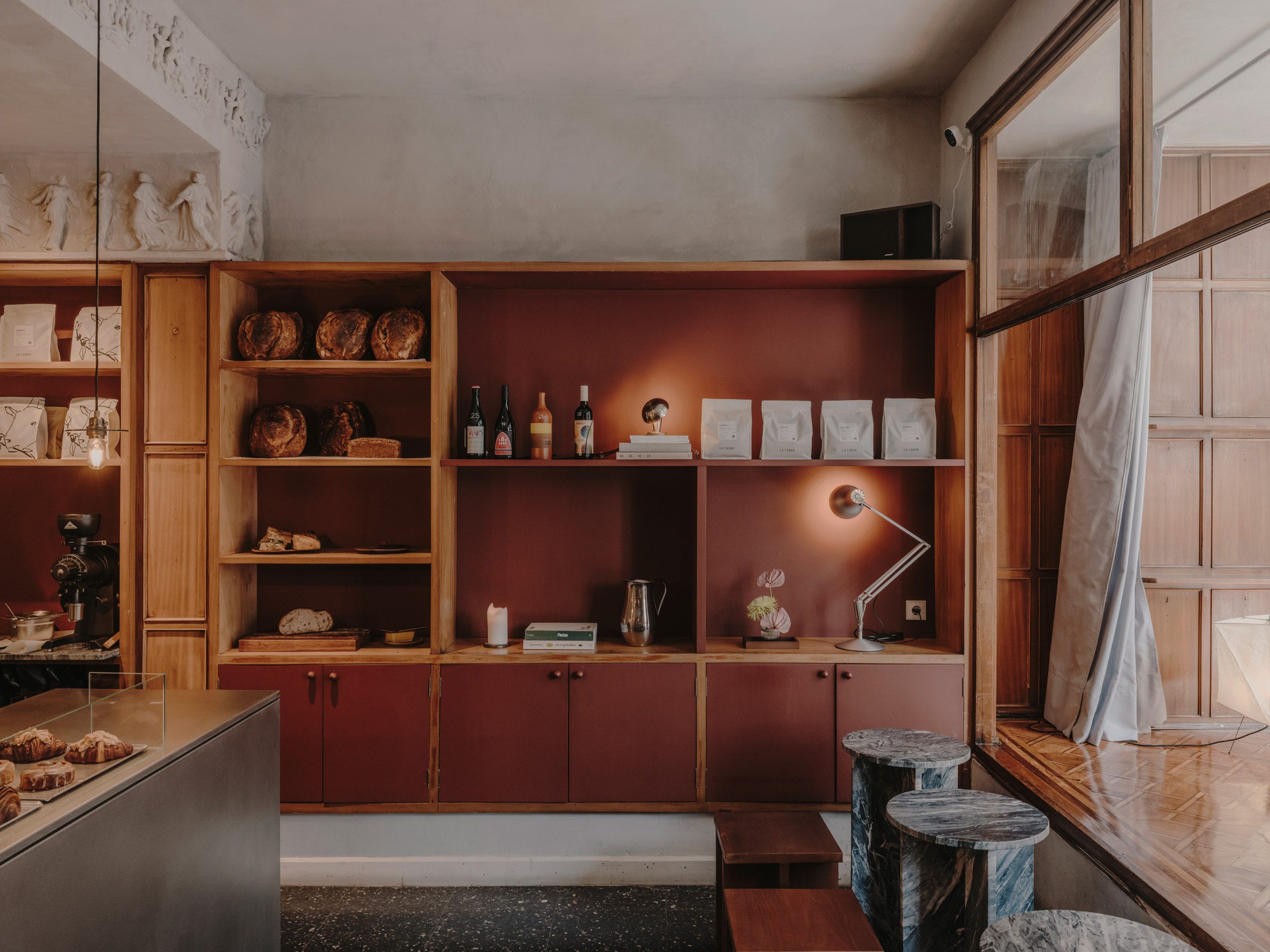
Plantea Estudio sought to retain the original character of the space by restoring elements including the facade and the internal wood shelving and windows, as well as a decorative plaster frieze above the new serving area.
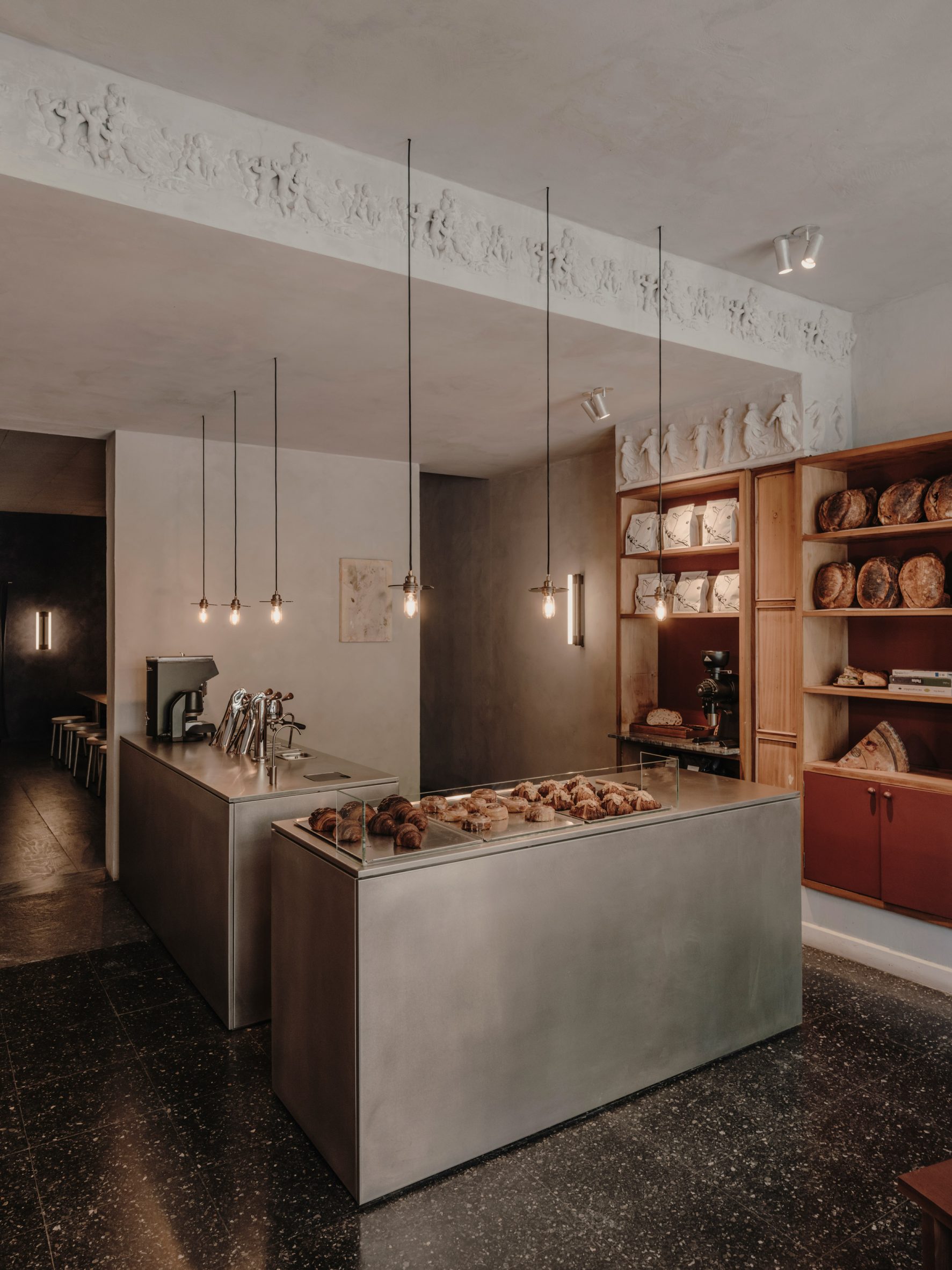
Minimal architectural interventions and a carefully chosen material palette help to define Acid’s interior ambience while supporting the new function of the space.
“We completed and adapted what was there and added the rest to match this same character – or to contrast as an opposition that enhances it,” Plantea Estudio architectural designer Carla Morán told Dezeen.
“Old and new, figurative and abstract, colour and shadow, rough and soft, matt and satin, all in the same space as different sides of the same coin.”
The shop was previously divided into two parts, with the rear part housing storage and toilets. Plantea Estudio retained this configuration but looked to make better use of these neglected space at the back by creating a cosy lounge area for patrons.
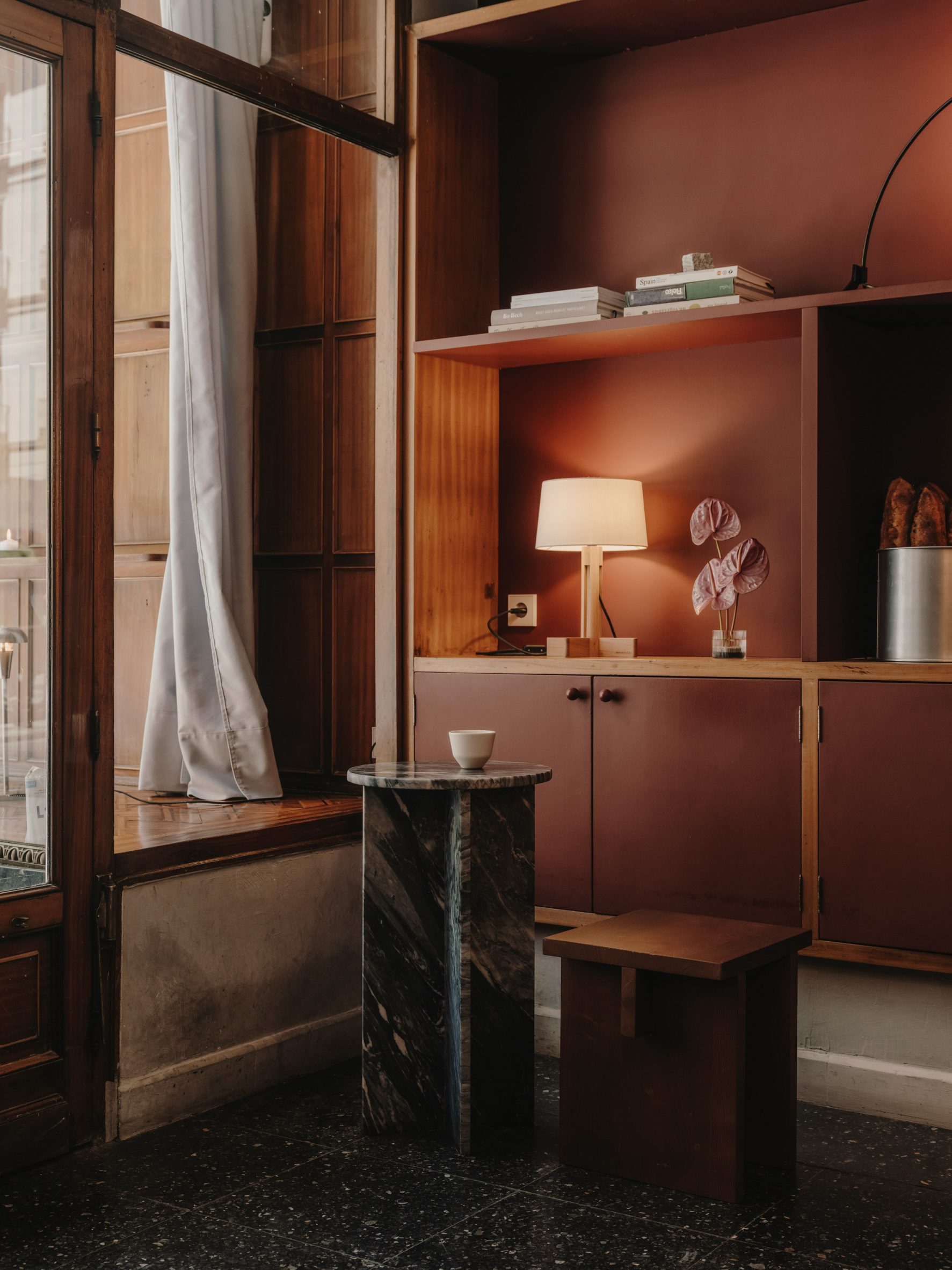
In the front part of the space, wooden shelves were sanded and varnished to return them to their original condition. Any anachronous additions were removed and replaced with shelves or doors painted in a deep red chosen to complement the wood tones.
A mirror added to the ceiling above Acid’s entrance increases the sense of space in this area and multiplies reflections produced by the curved windows.
The building’s original terrazzo was uncovered from underneath layers of flooring, while the walls and ceiling were finished with a warm-grey lime wash paint that contributes to the cosy atmosphere.
A coffee machine and pastry display sit on a stainless steel counter that provides a point of contrast with its precise and modern appearance, softened by a matte finish that produces blurred reflections.
The elongated lounge area at the rear of the unit is designed as a refuge from the busy neighbourhood, where guests can relax in semi-darkness with a coffee and pastry.
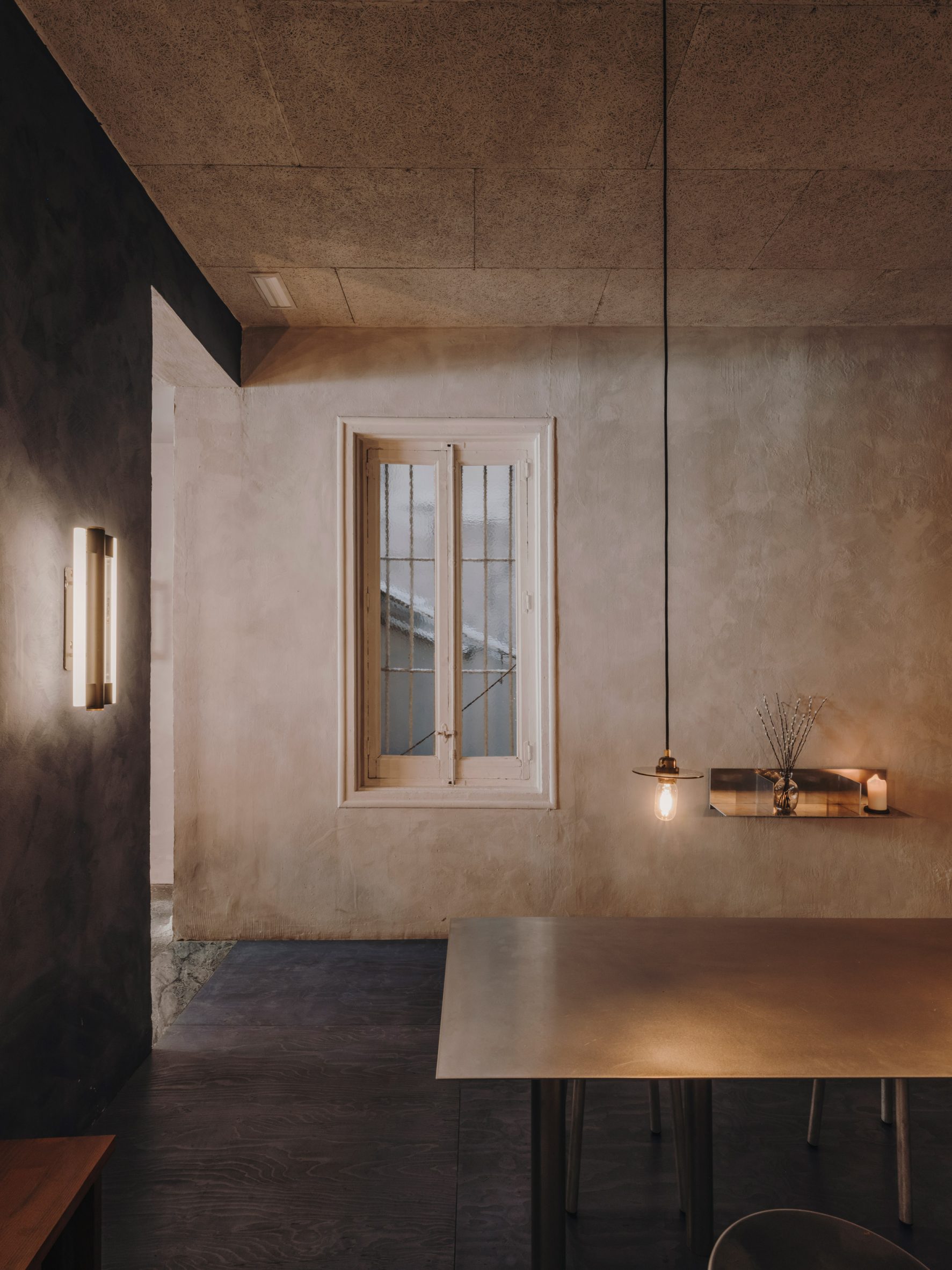
“The interior space was quite dark, only connected to the exterior part by two openings in a structural wall,” Morán recalled. “So we thought about a room in shadow and quietness, with the reflection of the soft light over a stainless steel shared table.”
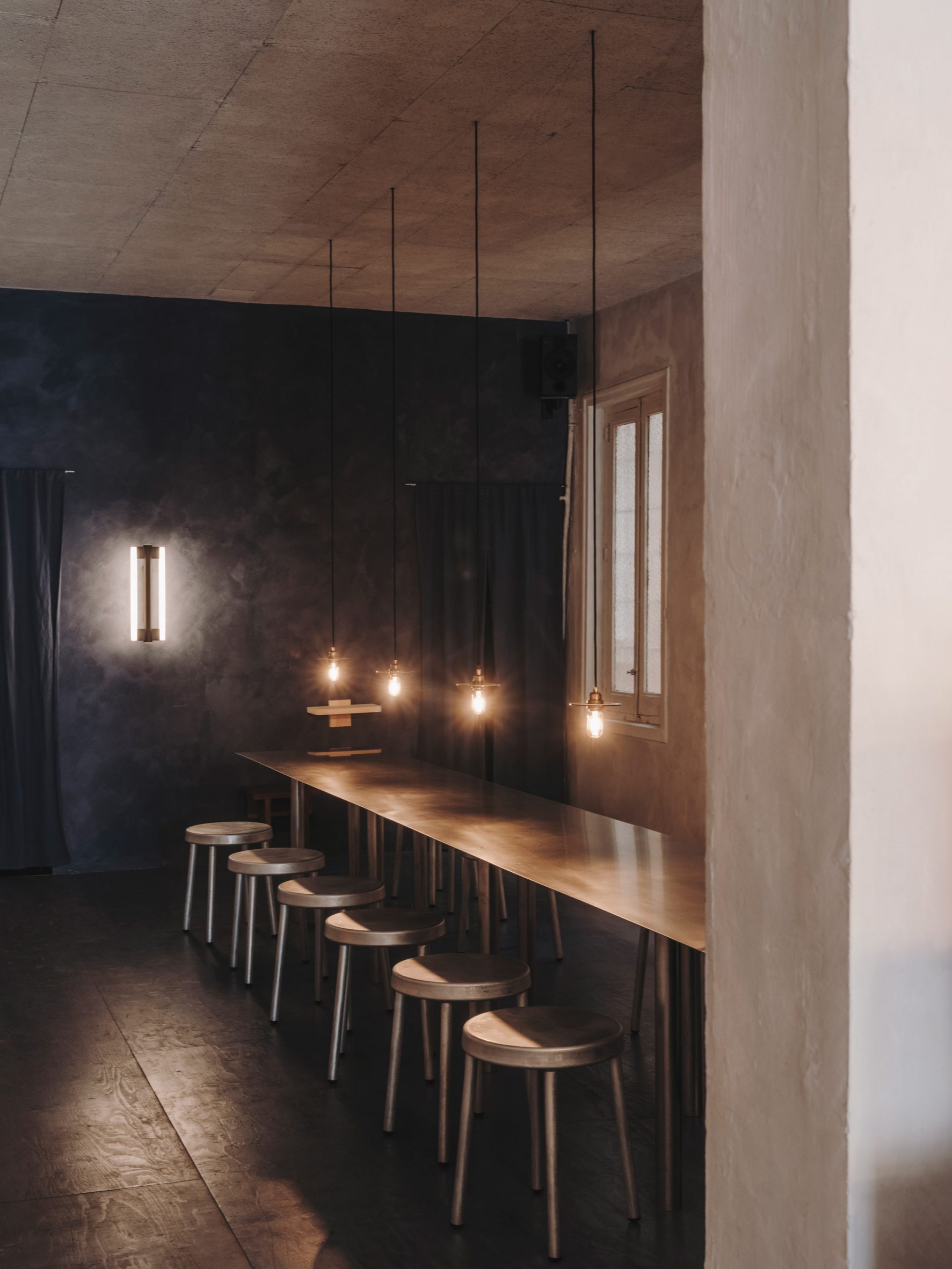
The room’s new floor is made from plywood that produces a soft sound underfoot as guests transition from the terrazzo-floored shop to this calmer and quieter space.
The wood is painted a deep blue colour to match the walls at either end of the room and contribute to the intimate half-lit atmosphere. A row of exposed light bulbs hangs above the table to provide gentle illumination along with shimmering reflections.
This is the third project that Plantea Studio has completed for the owners of Acid cafe in Madrid, following the Gota wine bar with its cave-like dining room.
The studio was founded in 2008 by brothers Luis and Lorenzo Gil. Its other projects include a raw and minimal shop for footwear brand Veja and a multi-purpose entertainment space housed in a former erotic cinema.
The photography is by Salva López.
Project credits:
Architecture and interior design: Plantea Estudio
Promoter: Acid café
Furniture: Plantea Estudio and Frama
Lighting: Frama, Santa & Cole, Vitra, Ferm Living and Anglepoise
Graphic design: Koln studio
Art: Armando Mesías
Paint: Bauwerk colour
The post Plantea Estudio plays with light and shadow for Acid cafe interior appeared first on Dezeen.
www.dezeen.com

