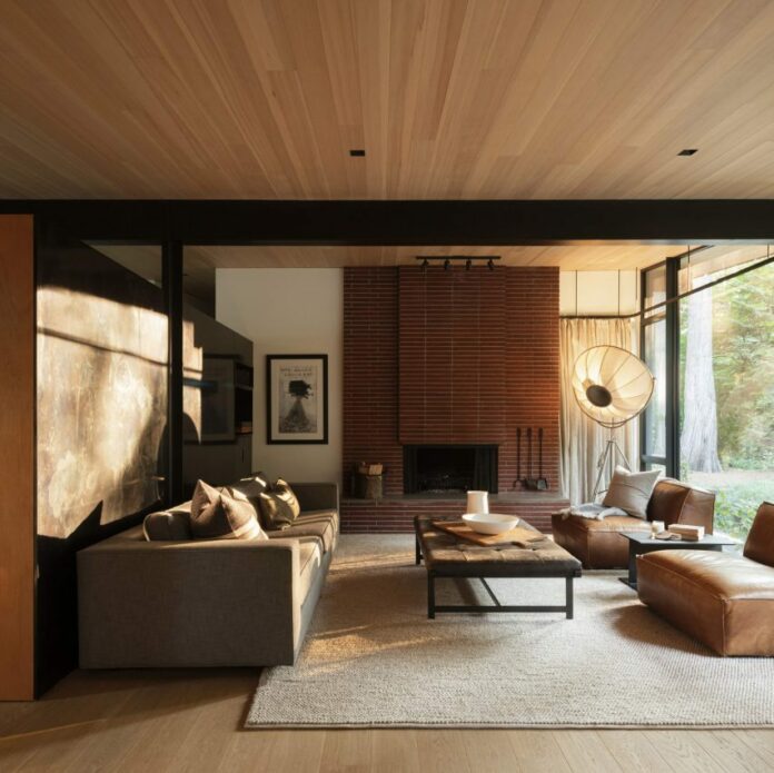
US architecture firm Olson Kundig and Canadian designer Erica Colpitts have renovated a mid-century house near Vancouver, warming the modernist structure with natural materials and neutral colours.
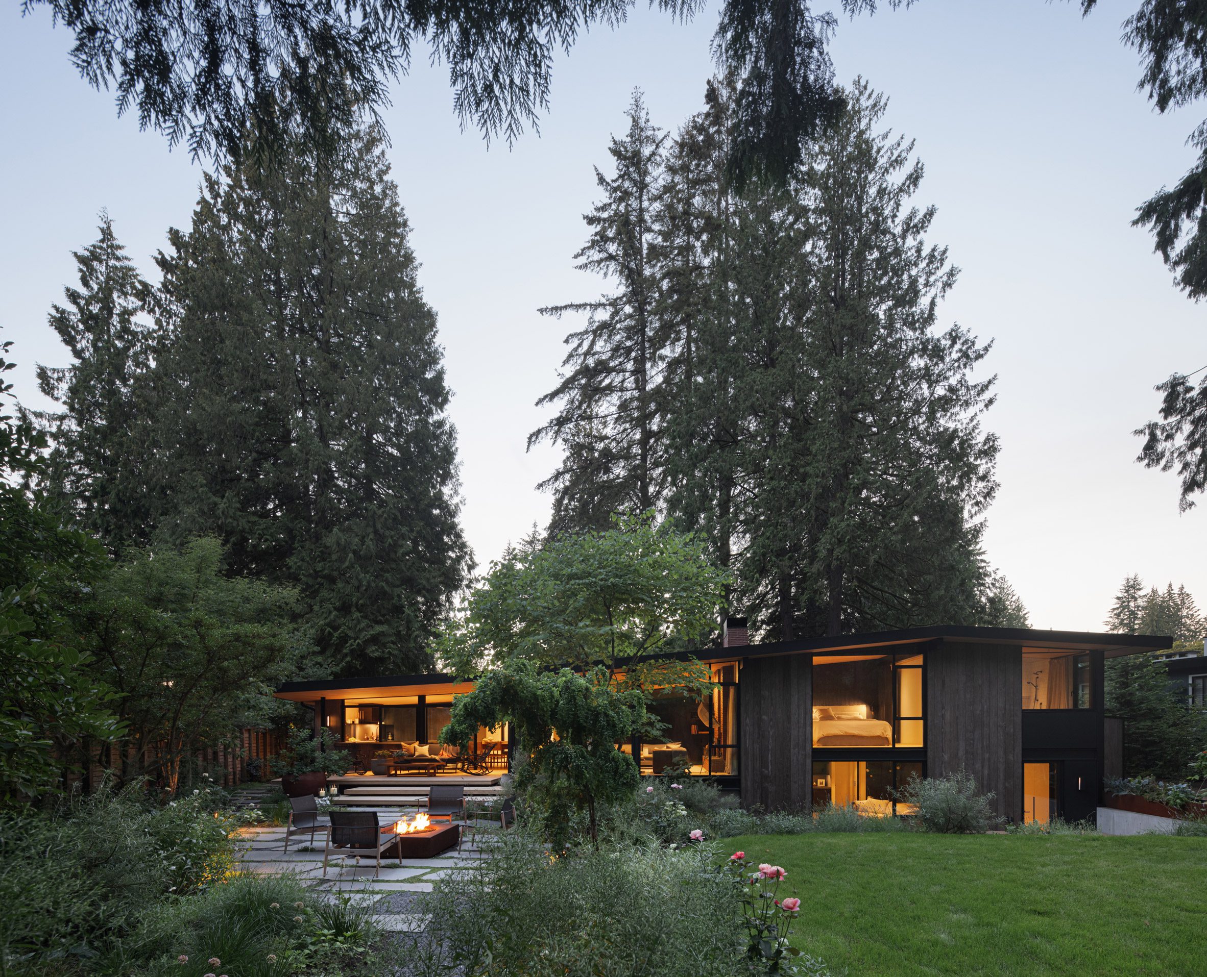
The residence is surrounded by tall cedar trees on a quiet plot in Edgemont, a village-like neighbourhood of North Vancouver, across the water from the Canadian metropolis.
Its new owners are a family of four who relocated to the West Coast from New York City, looking for a community to put down roots.
Olson Kundig, which has an office in nearby Seattle, was asked to update and slightly expand the building to meet the owners’ needs while respecting the original design.
Locally based Erica Colpitts was brought on to complete the interiors with a softer, warmer feeling than typical mid-century designs.
“The pure challenge of this home completely appealed to me,” said Colpitts. “My task was to meld Olson Kundig’s overall design for the home with an ever so slightly soft and romantic interior.”
Like many homes from the period, the building has a low-slung form, a shallow roof pitch and large expanses of glass across its facades.
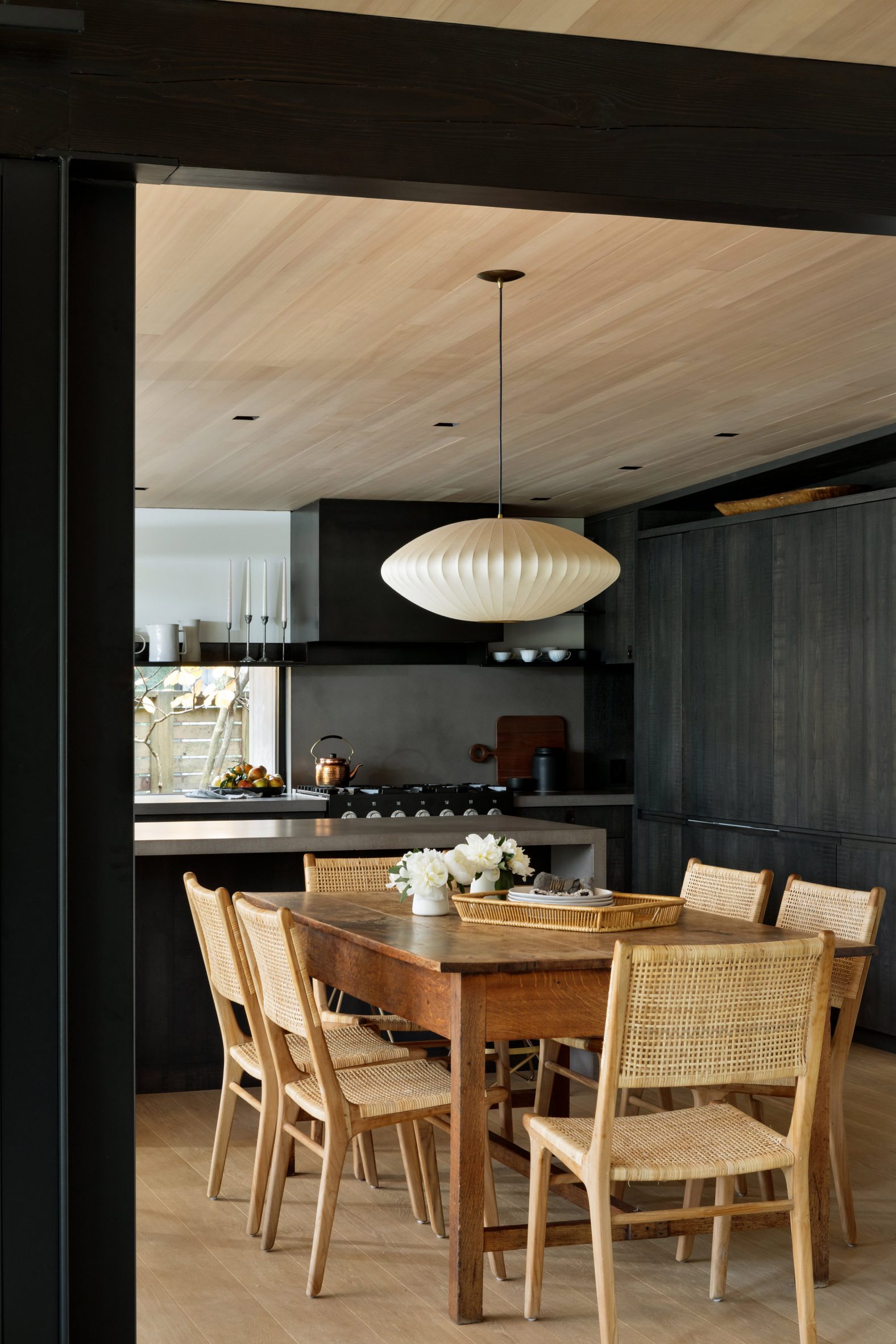
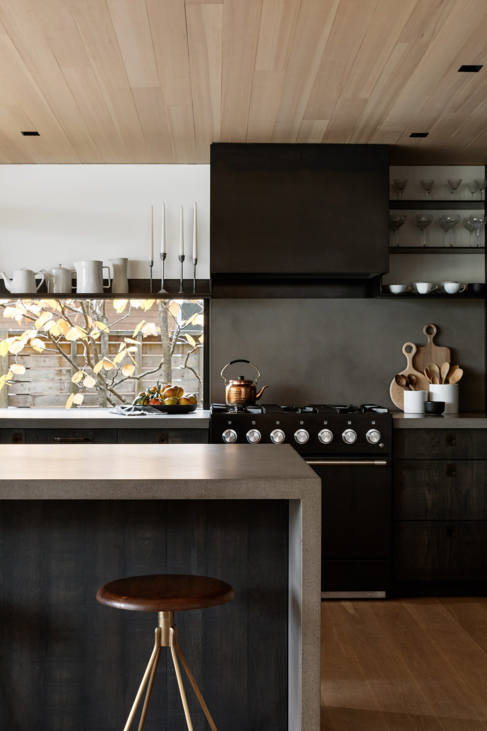
Blackened steel structural elements were highlighted throughout the interior, and their dark colour is repeated across several other elements.
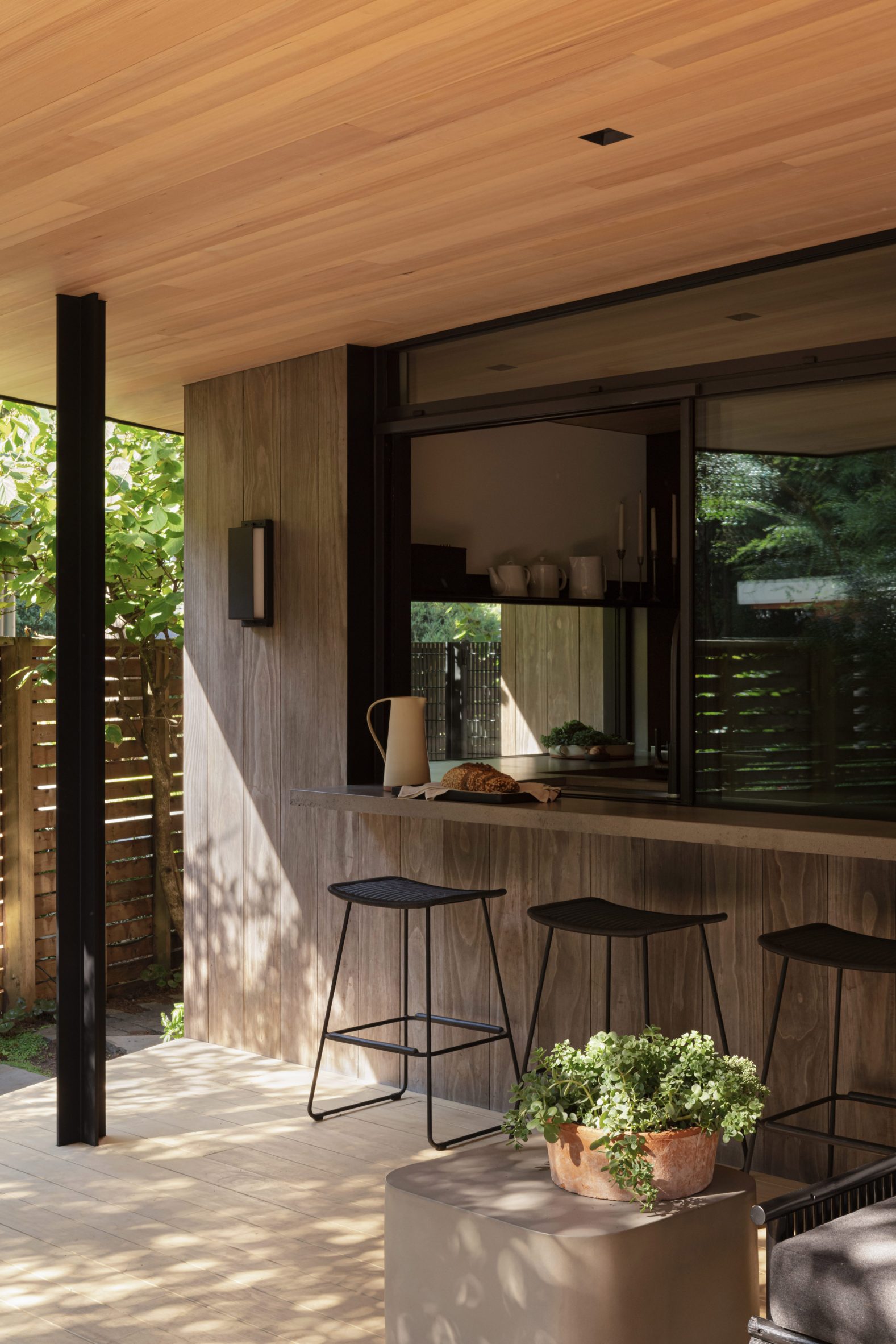
These range from the guardrails and supports for the staircase unit, which connects the home’s multiple split levels, to a custom hood and shelving in the kitchen.
The staircase is separated from the lounge by a huge bookcase that is original to the house, along with a red-brick fireplace on the other side.
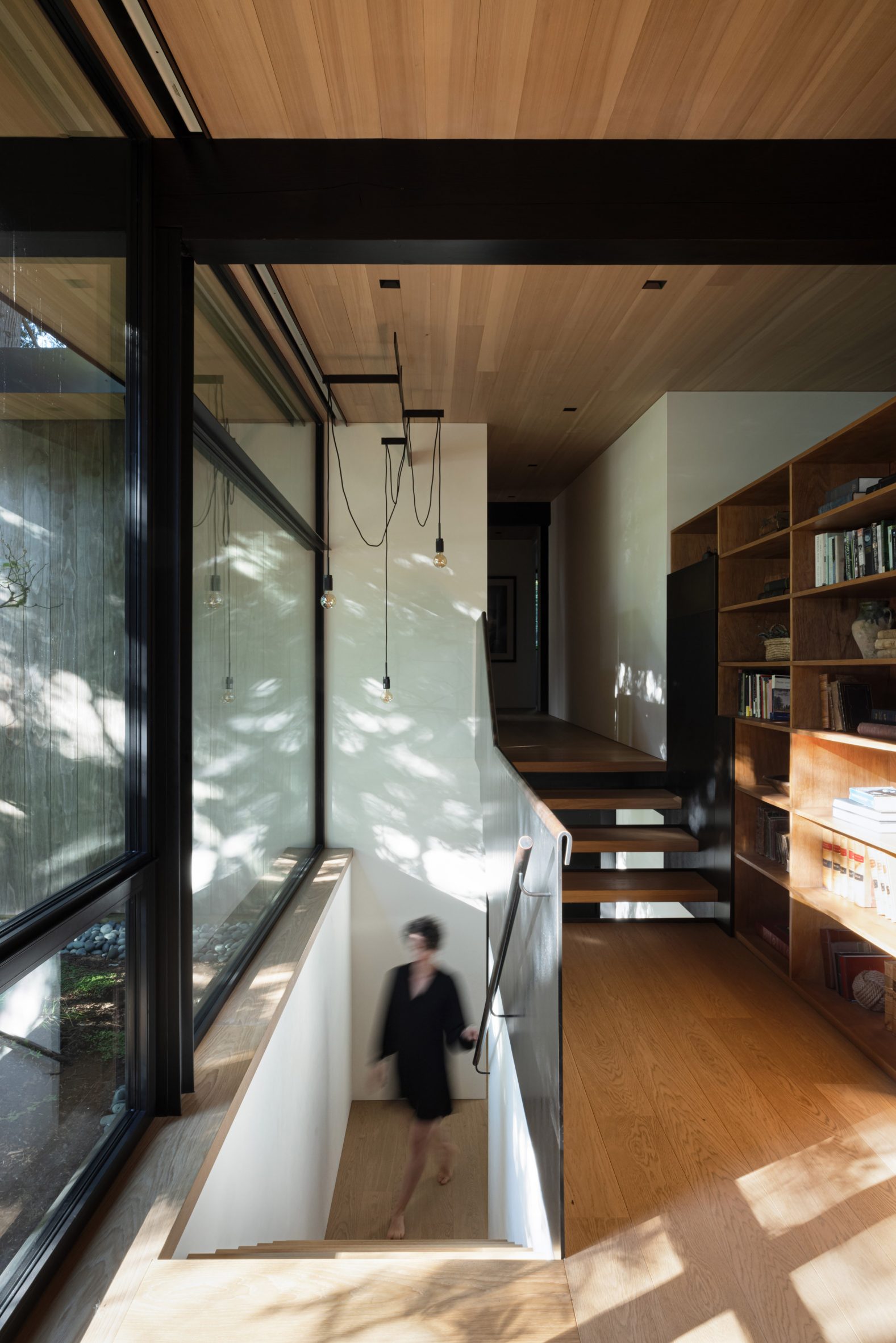
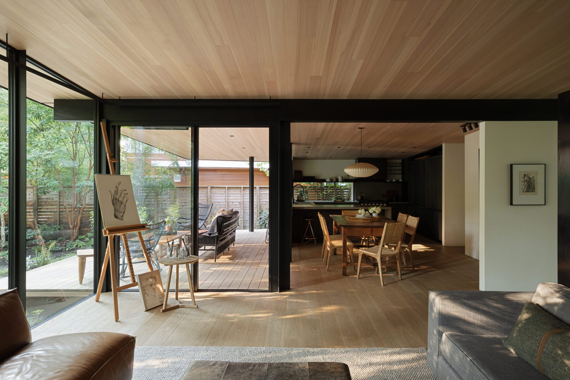
All of the primary living spaces run along the back of the home, in the single-storey portion, facing the landscaped garden and a plunge pool through huge windows.
Wide-plank flooring and a wood-covered ceiling connect the open-plan areas, which culminate at the dark-stained kitchen.
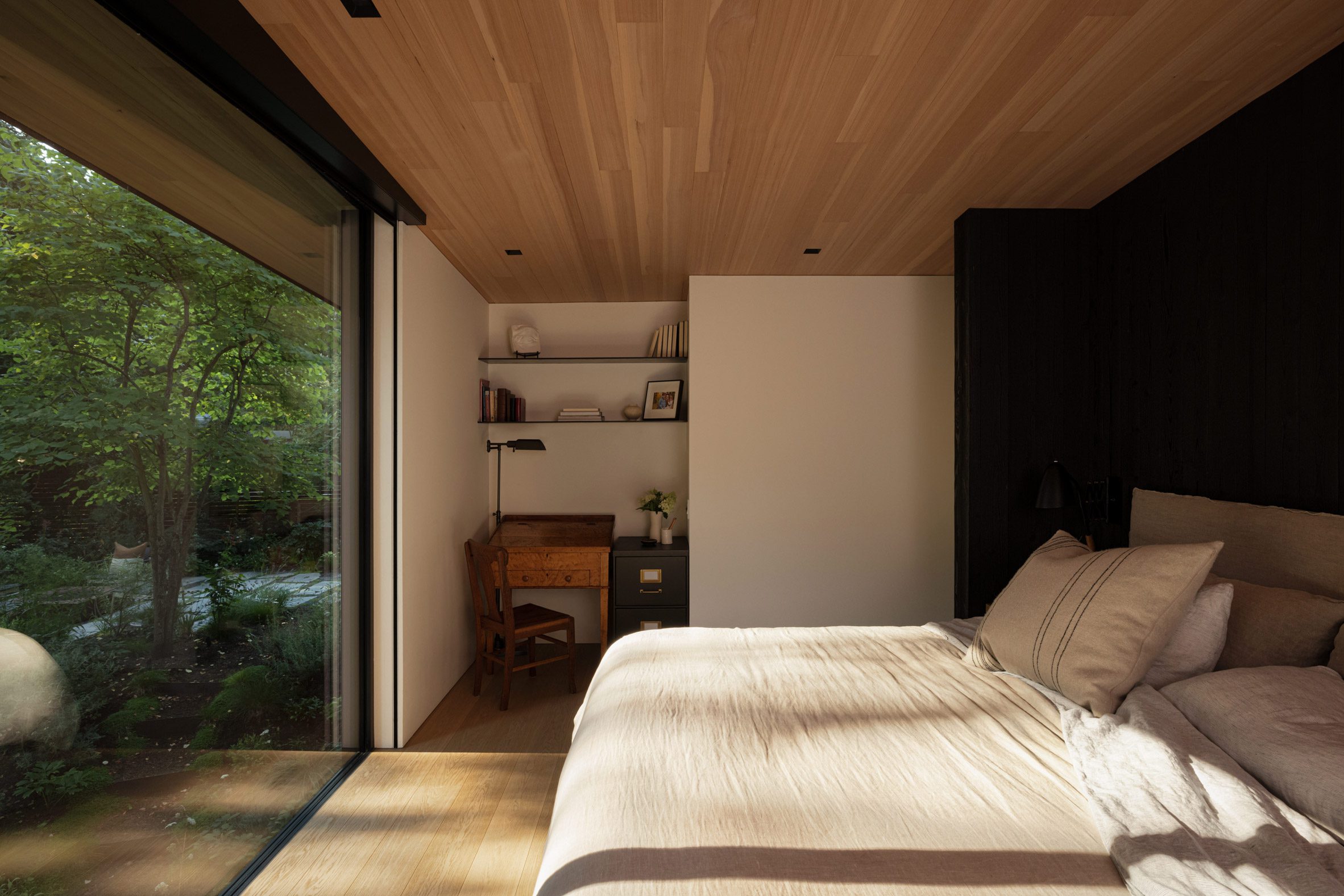
The hues and materials chosen for the these spaces are warm and inviting, such as cream surfaces and heathered oatmeal textiles paired with cognac-coloured leather, dark flax, and deep grey.
“This home has a decidedly neutral colour palette to go with the natural materials selected; however, it is warmly neutral and texturally layered,” said Colpitts.
“Where colour was used, we wanted those colours and their textures to be reminiscent of a gentleman’s library,” she added.
The bedrooms, bathrooms, and additional living areas are organised within the two-storey side of the house, where the same design aesthetic continues.
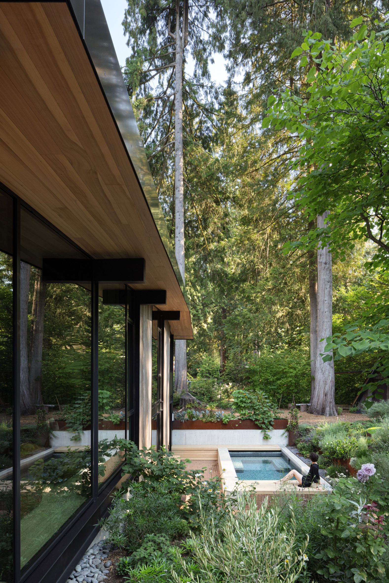
On the exterior, weathered ebony siding and a Corten steel front door were added in keeping with the building’s modern-industrial appearance.
“This home is a juxtaposition of all good things,” Colpitts said. “Dramatic and serene. Rustic and refined. Industrial and romantic. Exquisite and comfortable.”
The mid-century architecture style remains incredibly popular with homebuyers across the US and Canada, which has led to many renovations that align these residences with contemporary living.
Recent examples include a Hamptons home that owner Timothy Godbold transformed to resemble a lair from a James Bond movie, and the former seaside home of modernist architect Henry Hill respectfully overhauled by Studio Schicketanz.
The photography is by Ema Peter.
Project credits:
Architect: Olson Kundig
Interior design: Erica Colpitts Interior Design
Contractor: Brent Braybrook / Braybrook Projects
Millwork: Robin Woronko / Intempo Interiors
Landscape architect: Amelia Sullivan
Metalwork: Drabek Technologies
The post Olson Kundig and Erica Colpitts renovate mid-century house in North Vancouver appeared first on Dezeen.
www.dezeen.com

