[ad_1]
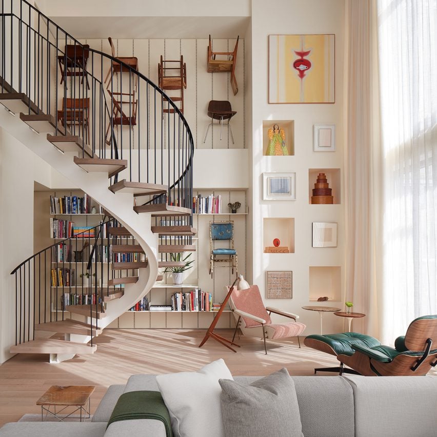
Design studio Norman Kelley and architect Spencer McNeil have completed Apartment for Chairs, a two-storey unit that features ample space for guests and a diverse collection of chairs.
Located in a contemporary, high-rise building in Chicago’s Near North neighbourhood, the apartment was designed for a couple.
One of the clients is a longtime local resident who collects art and furniture, and the other is a Detroit transplant who prefers cosy environments with organic materials and neutral colours.
The goal was to create a home that suited both personalities and offered plenty of space for hosting guests and displaying the owners’ extensive chair collection.
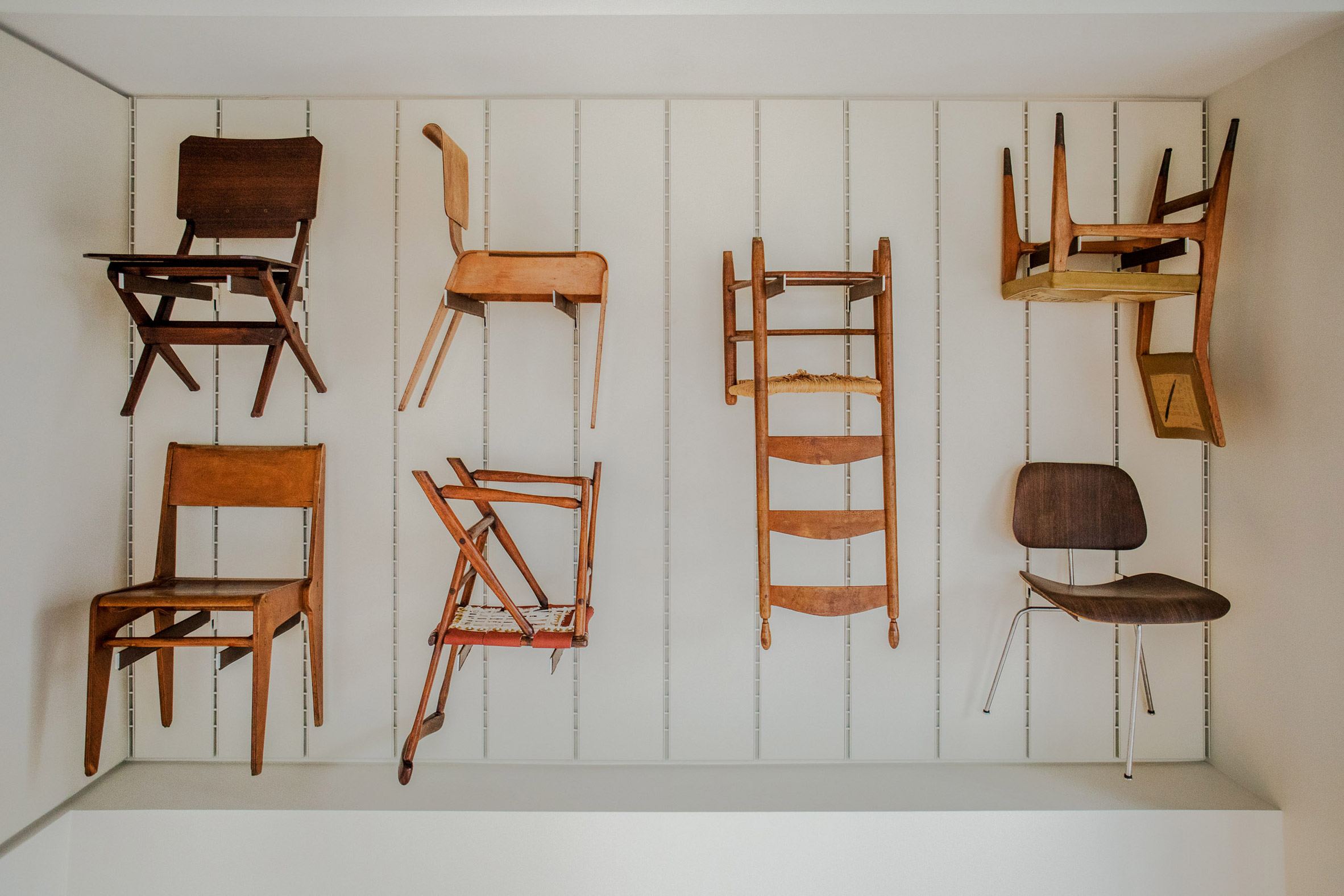
Spanning from the early 20th century to the present, the collection includes a Shaker tilter chair and pieces from the Bauhaus and De Stijl movements. Designers include Gerrit Rietveld, Piero Fornasetti, Gio Ponti, Marcel Breuer and Lina Bo Bardi, among others. The exact number of chairs is not being disclosed.
“It is very much a living collection,” said local studio Norman Kelley, which designed the apartment in collaboration with Chicago architect Spencer McNeil.
The project entailed combining two apartments – one atop the other – to form a spacious, two-storey unit.
In total, the conjoined apartment encompasses 4,000 square feet (372 square metres).
The lower level serves as the main apartment, while the bulk of the upper level is meant to act as its own private apartment – similar to an in-law suite, the team said.
A range of modifications were made throughout the unit, including spatial changes and new finishes.
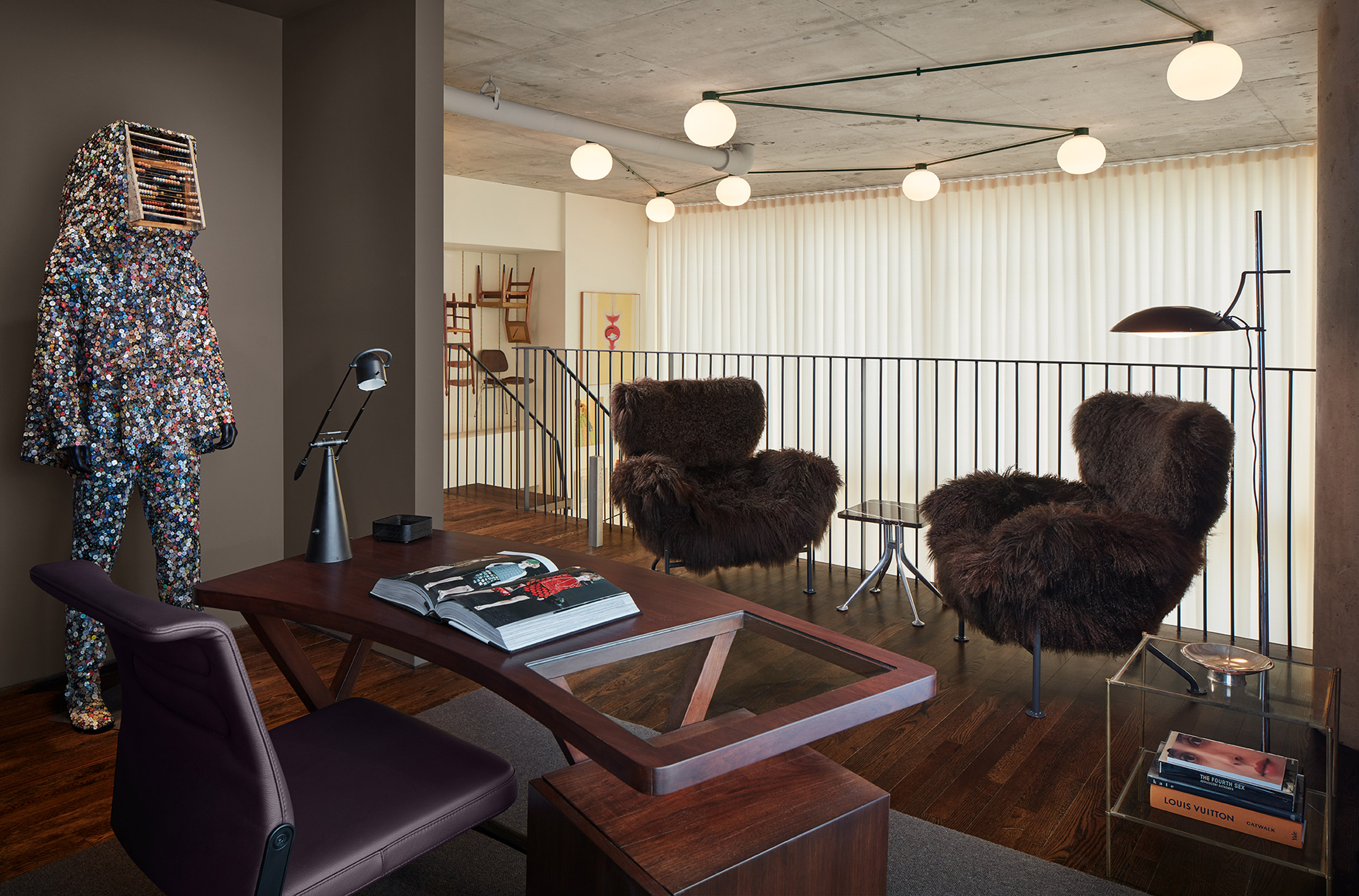
The most drastic change involved opening up a room on the upper level to form a mezzanine overlooking the lower-level living room. The double-height living room was pre-existing.
The mezzanine, which holds an office, is connected to the room below by a new spiral staircase.
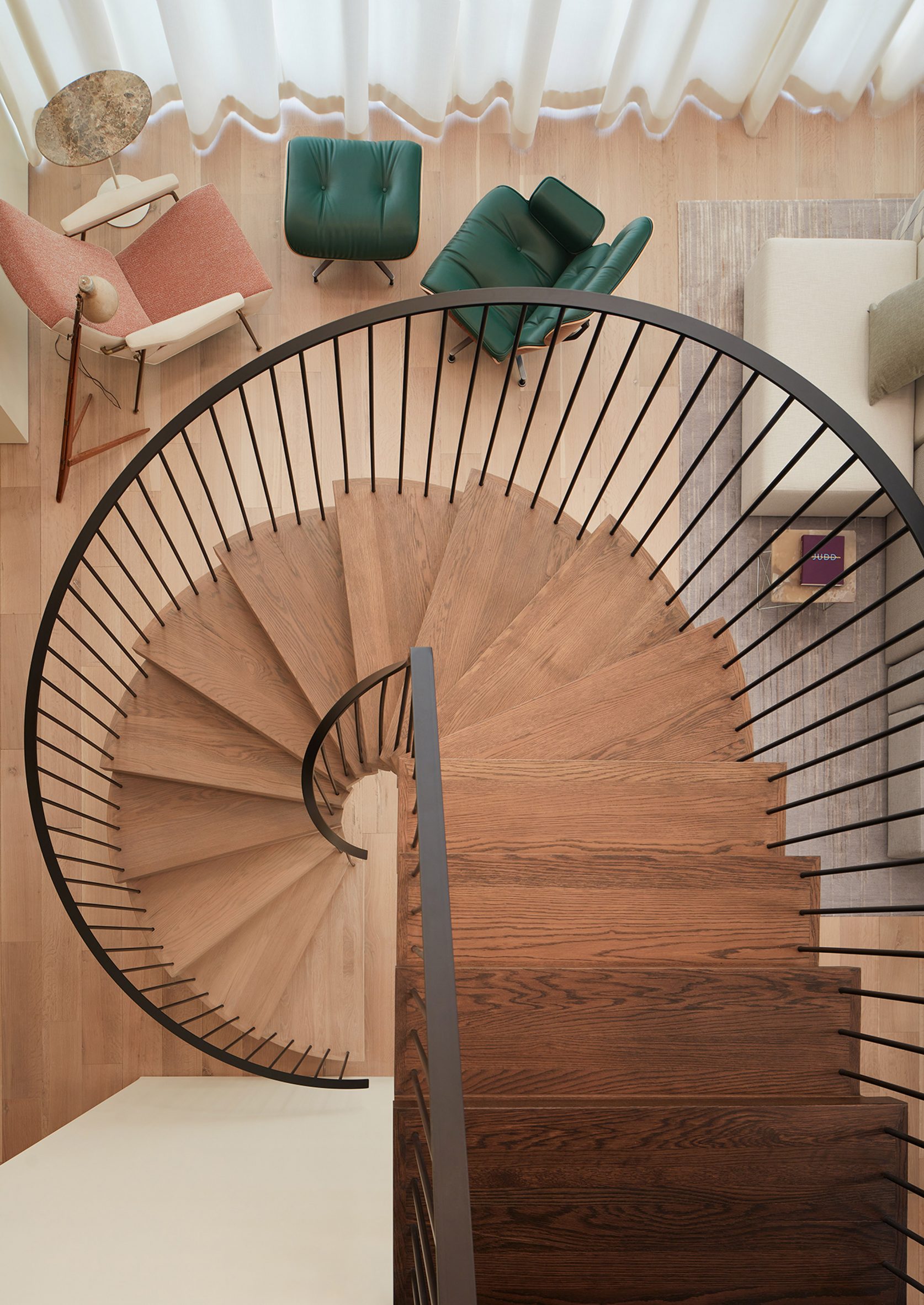
“Our mandate from the owner was to create an object worthy of inclusion with the collected works of design in the home,” the team said of the staircase.
Near the stair is a 20-foot-tall (six-metre) display area where books and chairs are on view. The steel display system has pegs, shelves, and backlit niches.
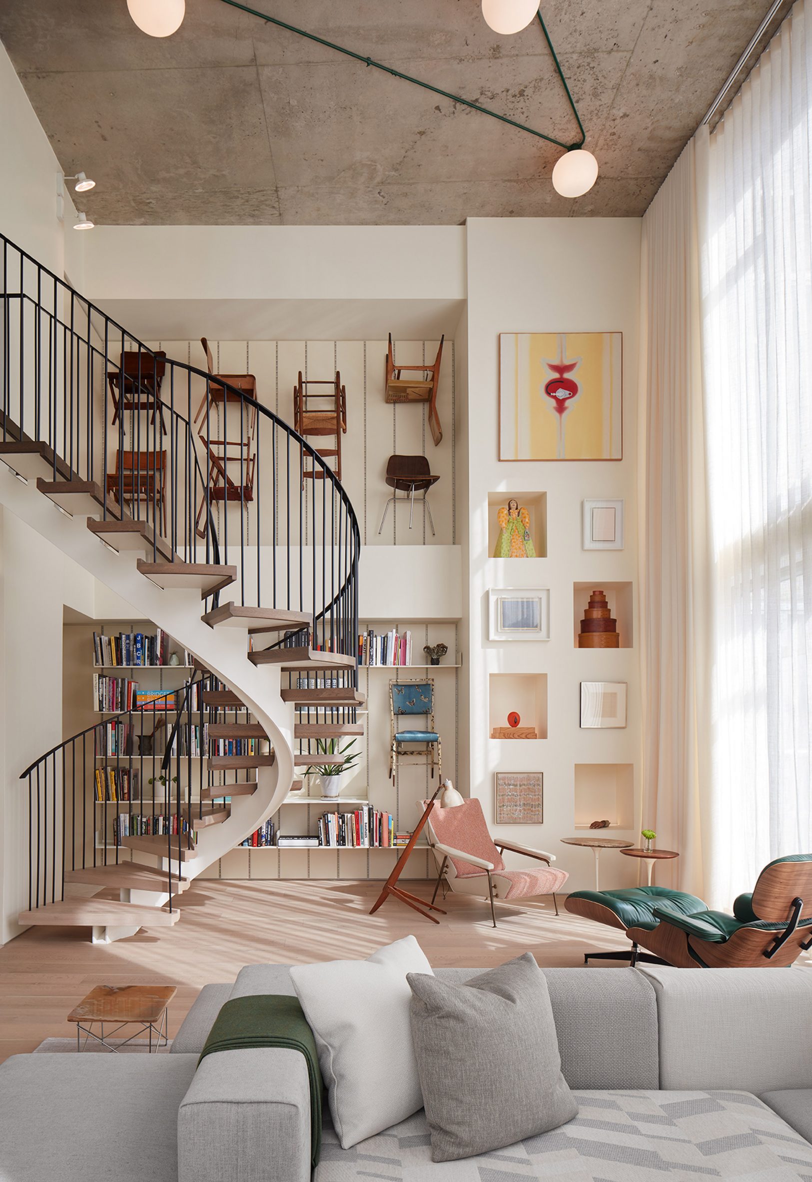
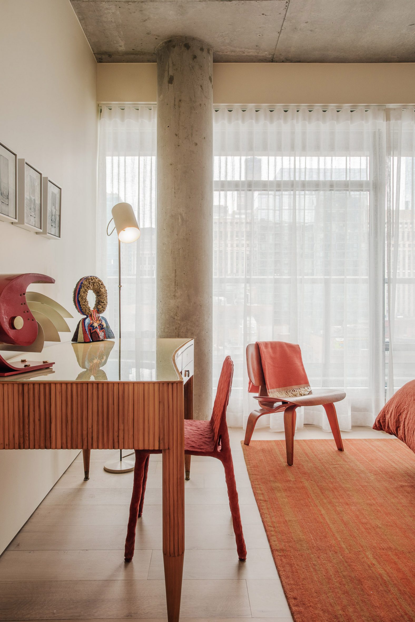
Overall, the unit features a mix of vintage and contemporary decor, along with finishes such as white oak, walnut and limestone. In several areas, concrete structural elements were left exposed.
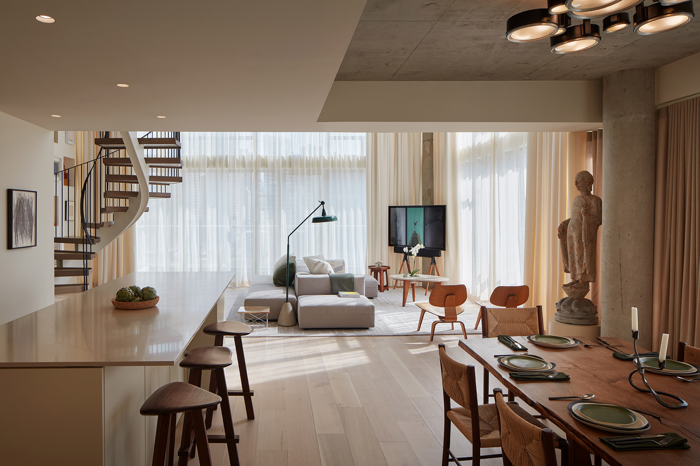
The living room is fitted with a sectional by Molteni, Eames side chairs and a vintage Noguchi coffee table. An adjacent reading nook is adorned with chairs by Ponti and the Eameses. Overhead are globe-shaped lights by Jasper Morrison.
Just off the living room, the kitchen and dining area were expanded, which was made possible by the elimination of a powder room.
Finishes in the kitchen include lacquer cabinets, quartz countertops and a back-painted glass backsplash.
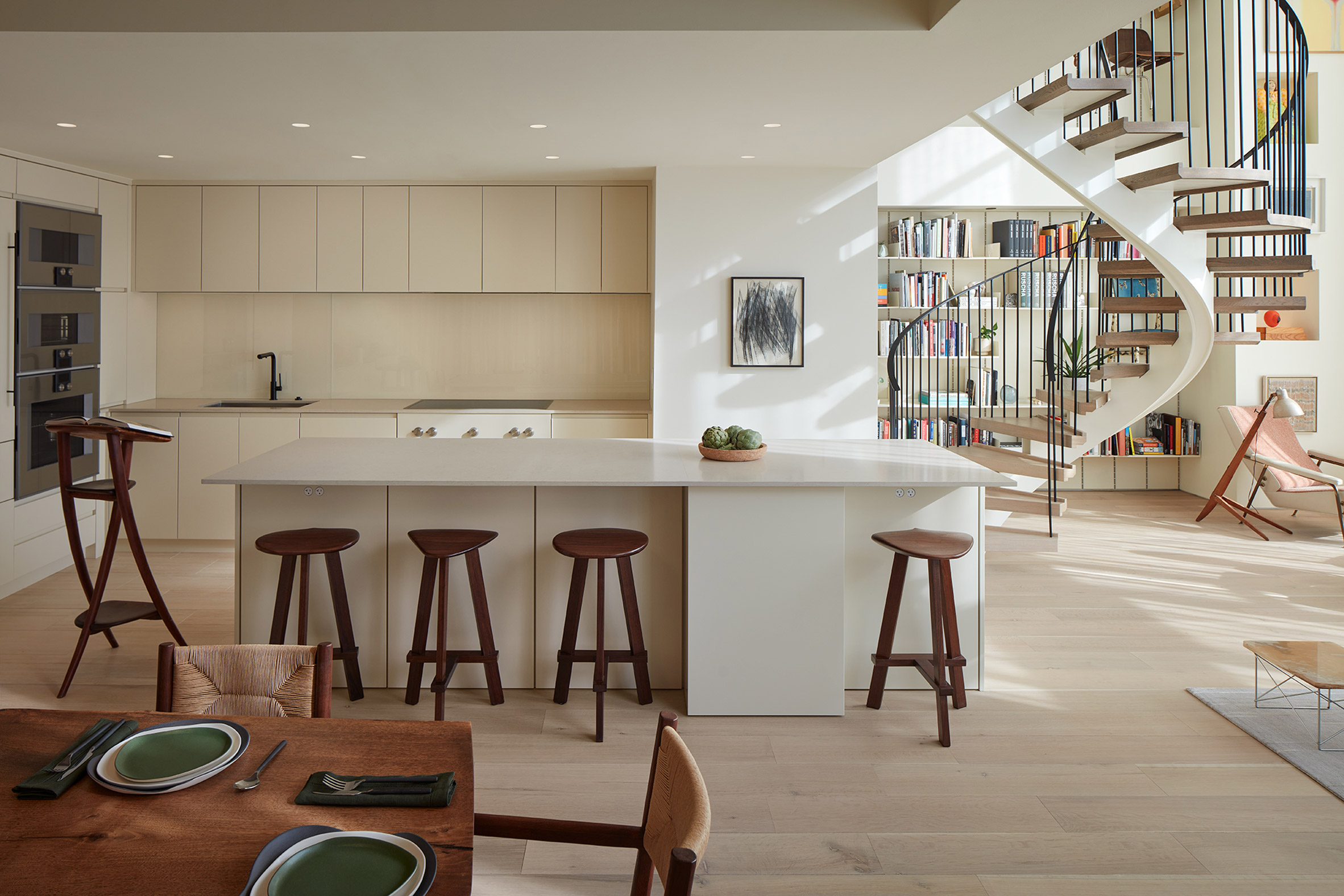
Walnut stools were conceived by Norman Kelley and fabricated locally by Jason Lewis – one of several bespoke pieces.
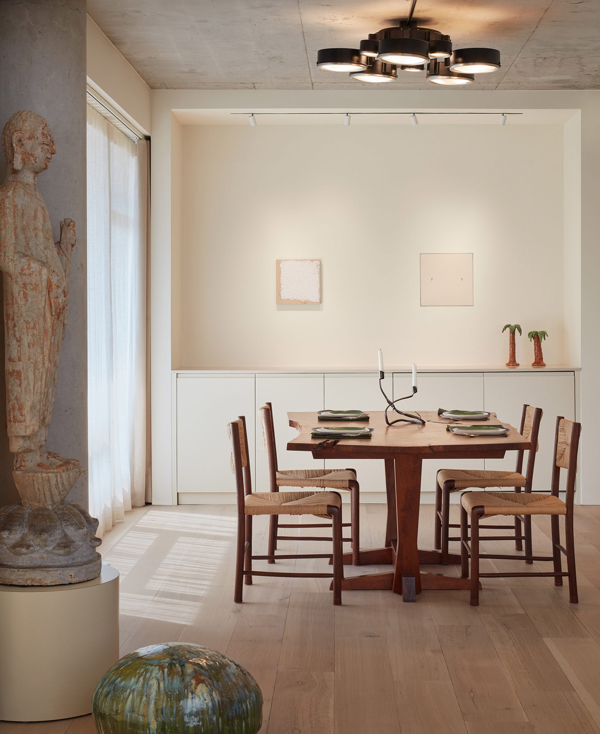
In the dining area, the team placed a walnut table by George Nakashima and caned-wood chairs by Emanuele Rambaldi. Above is a lighting fixture by BBPR and manufactured by Arteluce.
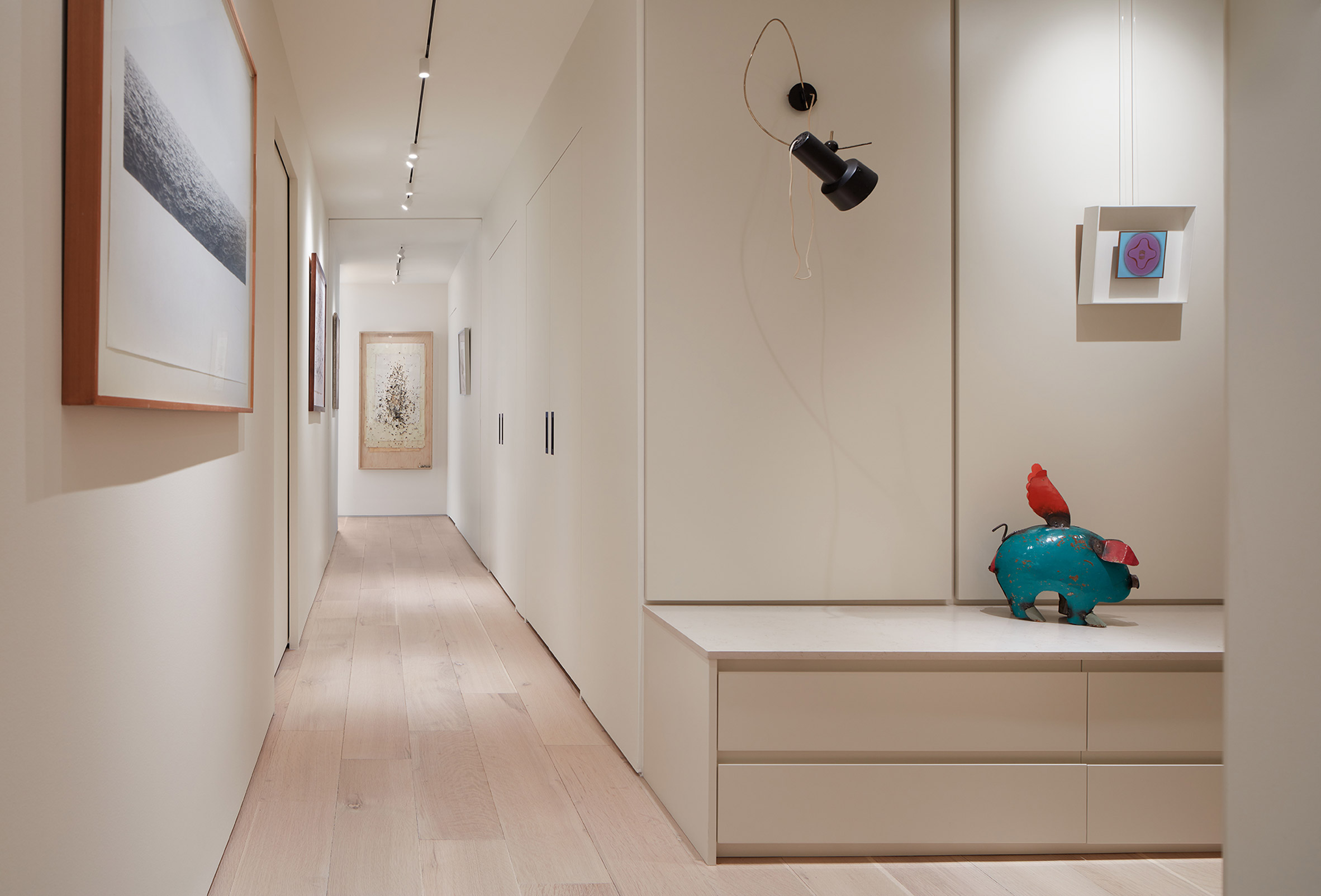
In addition to the common areas, the first level has a main suite and two additional bedrooms. The team took an unusual approach by blurring the division between public and private spaces.
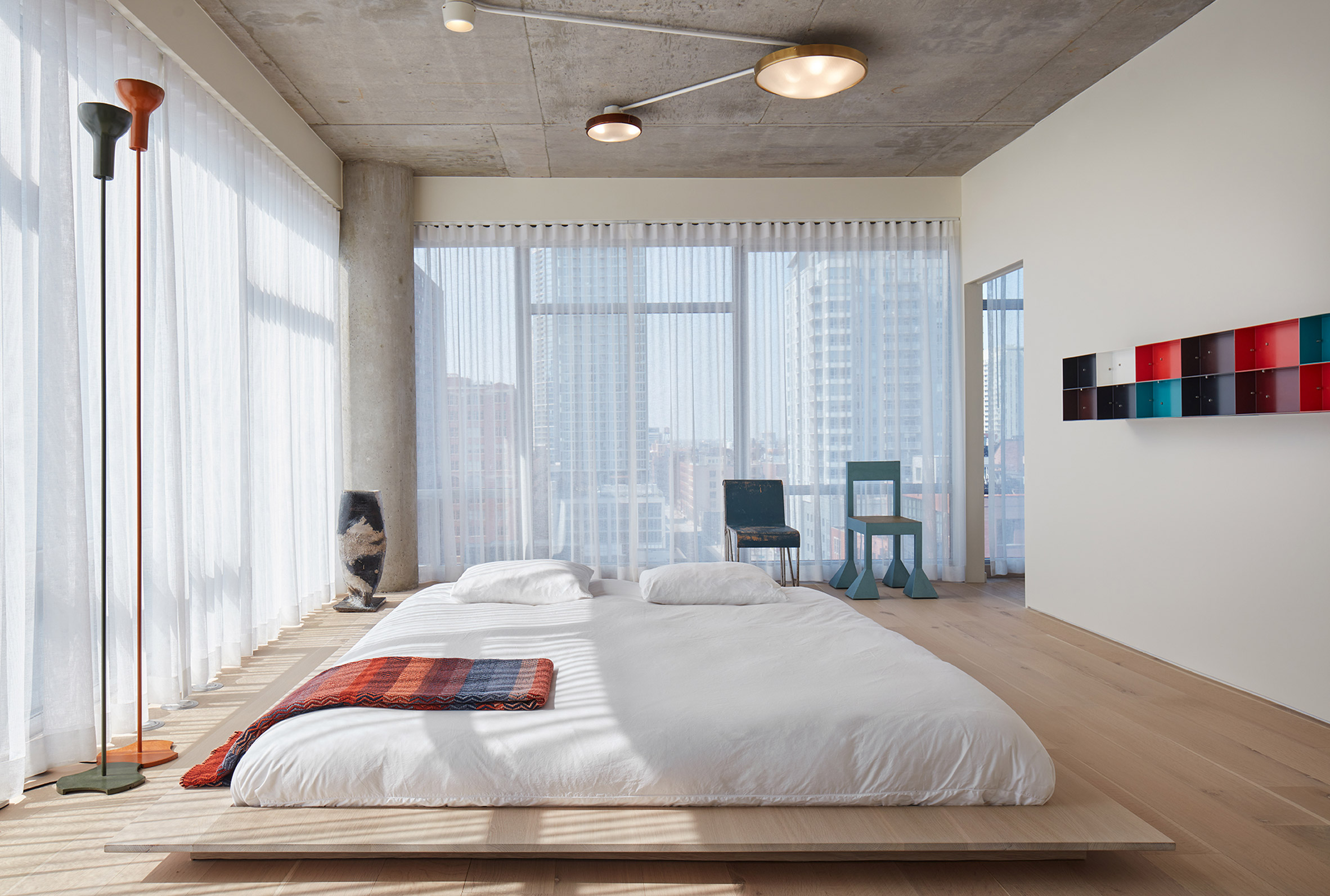
For instance, the main bedroom’s door is a frameless, sliding wall that disappears when opened.
“In a home for two adults, we saw no reason for the bedroom to be considered a separate space,” the designers said.
“There is no threshold between living room and the primary bedroom,” they added. “The whole apartment is a living space.”
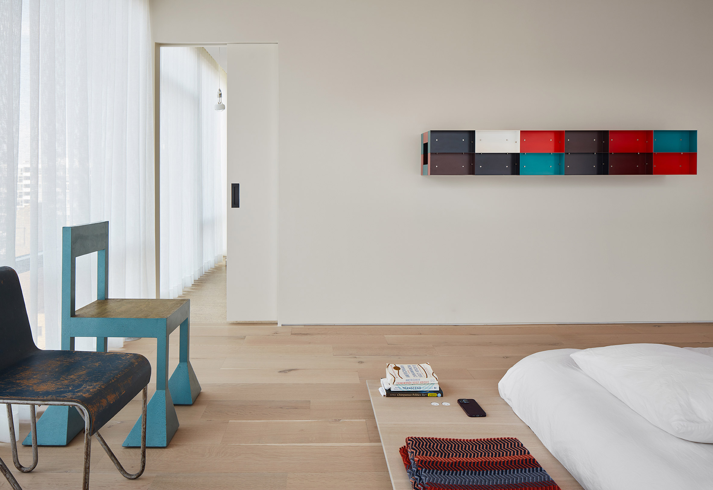
The sparsely adorned main bedroom features a white oak platform bed with built-in plugs – another element designed by Norman Kelley. Floor-to-ceiling windows are covered with gauzy curtains.
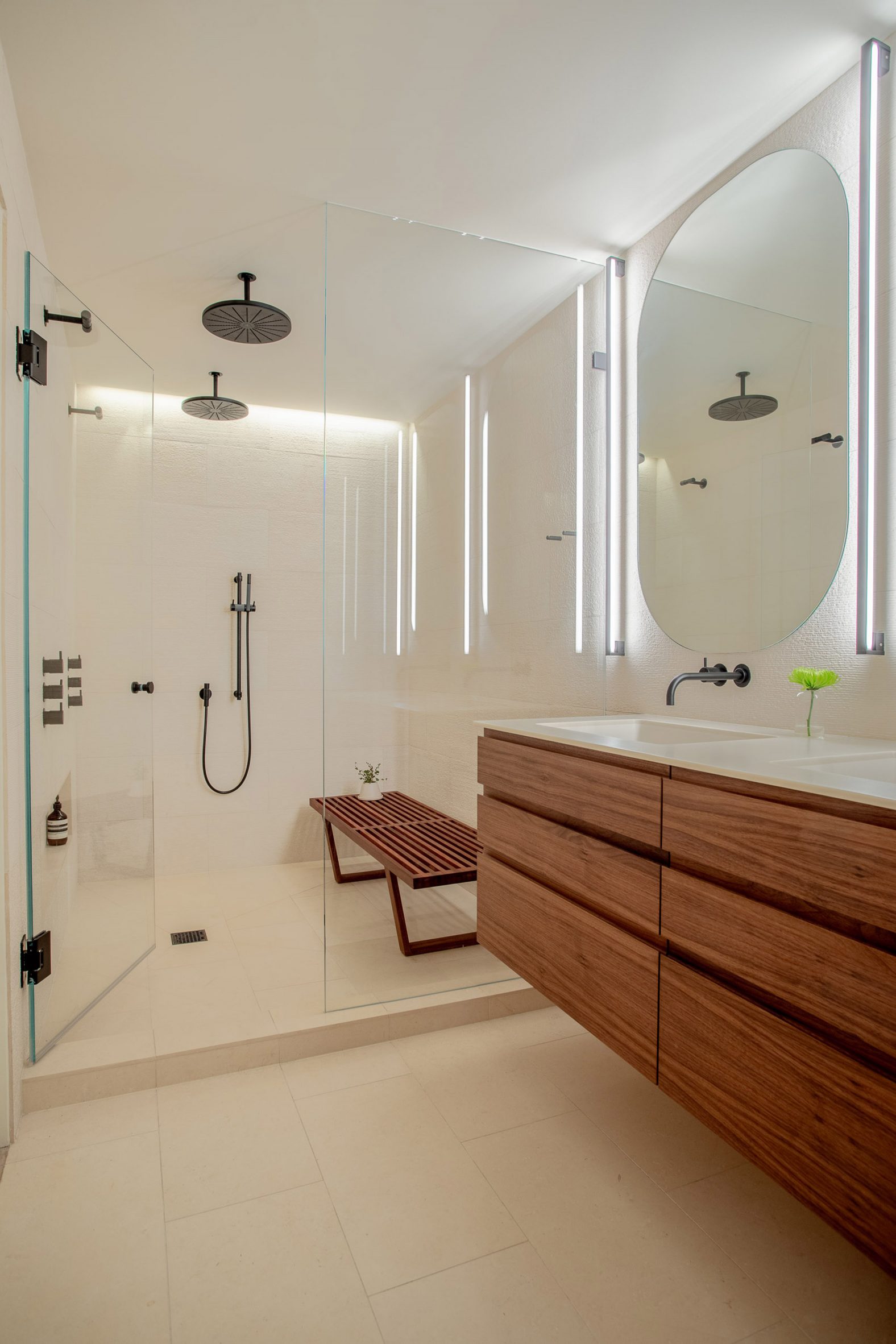
The main bathroom has raked limestone walls, a walnut-and-Corian vanity and a Norman Kelley-designed ipe shower bench inspired by George Nelson’s mid-century platform bench.
Upstairs, the team made limited changes to the layout beyond the mezzanine. The upper level has two bedrooms, a kitchen and a living room.
“We specified furnishings for the upper unit, but there were no significant architectural changes,” the team said.
“The majority of the renovation was limited to the lower unit and its connection to the upper unit.”
Other Chicago projects by Norman Kelley include an Aesop store that features reclaimed bricks arranged in pinwheel patterns and the update of a lobby inside a postmodern tower by John Burgee and Philip Johnson.
The photography is by Kendall McCaugherty Ristau and Sarah Crowley.
The post Norman Kelley remodels Chicago apartment to showcase chair collection appeared first on Dezeen.
[ad_2]
www.dezeen.com


