[ad_1]

Italian studio Andrea Tognon Architecture has collaborated with former Moschino creative director Jeremy Scott to renovate the brand’s flagship store in Milan.
Located on Via della Spiga, one of Milan’s famed shopping streets, the store sits within the 18th-century Palazzo Perusati, which was recently transformed by real estate company Hines into a luxury retail development.
The store was designed by Andrea Tognon Architecture in collaboration with Scott who aimed to recreate and allude to the history of ancient Italy through a minimalist yet ornamental interior scheme.
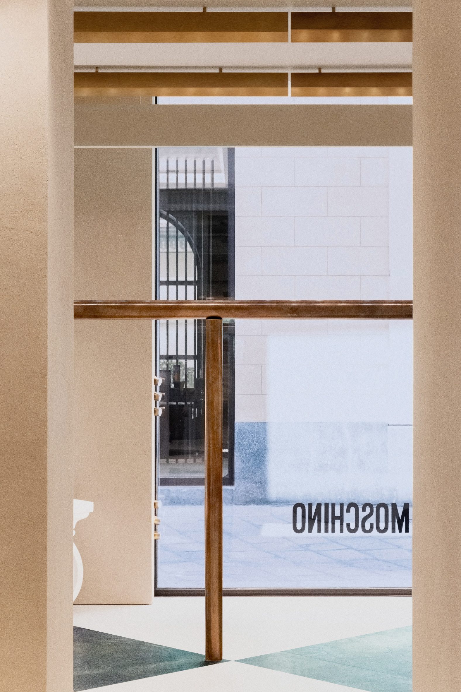
“I was inspired by the rich history of ancient Italy and the beauty and decadent opulence of its design,” said Scott.
“Sometimes we start to design from memories, sometimes from form, materials and colours,” added Andrea Tognon Architecture founder Andrea Tognon.
“For this project, I started only from words.”
The Milan flagship spans two floors and covers 380 square metres.
Its ground floor is dedicated to the brand’s women’s ready-to-wear collections and accessories, while its first floor is dedicated to its men’s and kid’s collections.
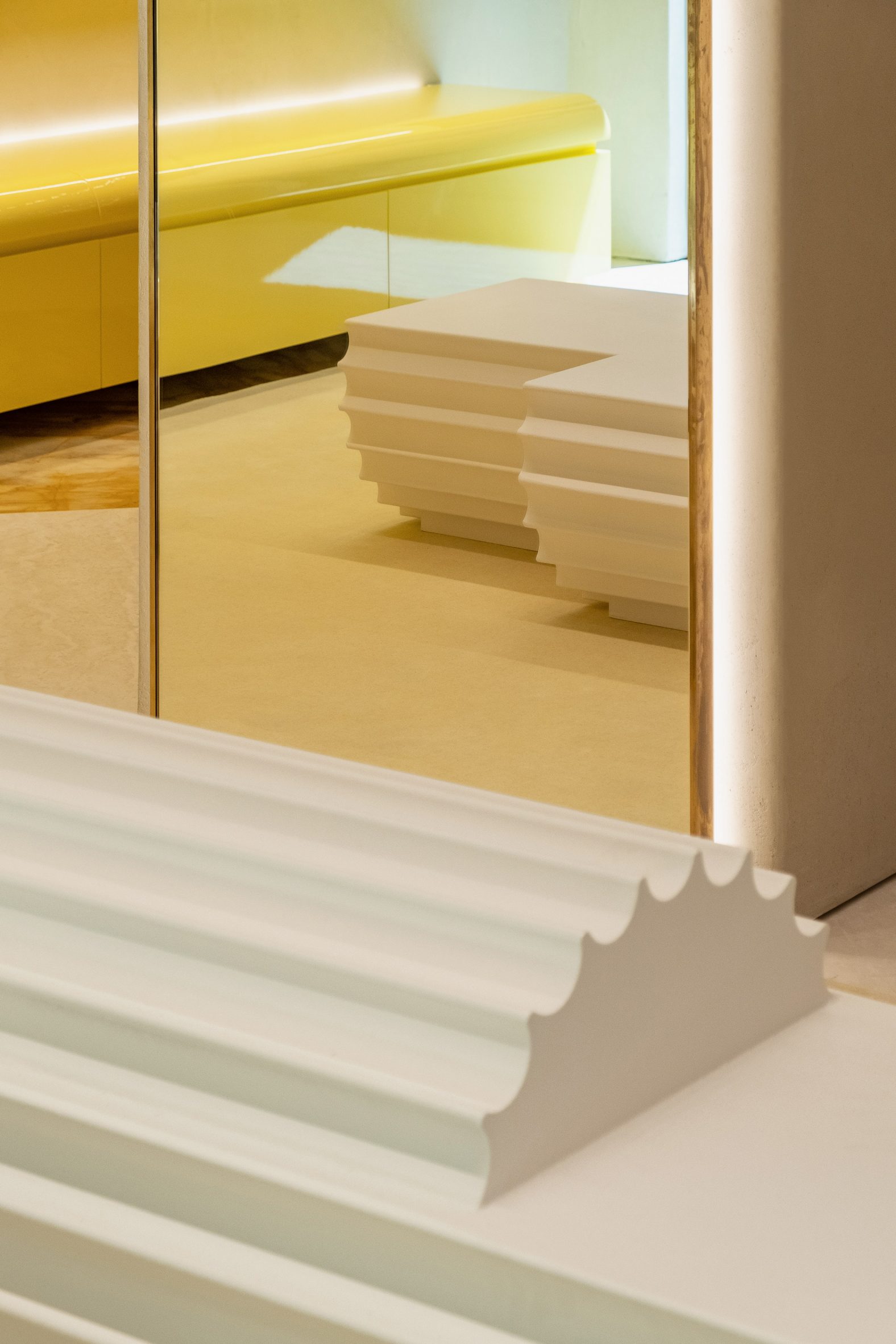
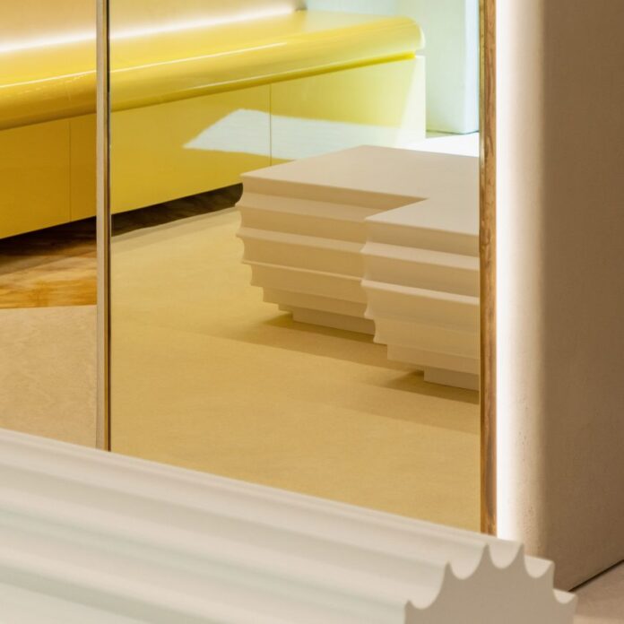
Throughout the interior, Andrea Tognon Architecture used rich materials that speak to Moschino’s baroque flair, which was also highlighted through decorative and oversized architectural elements.
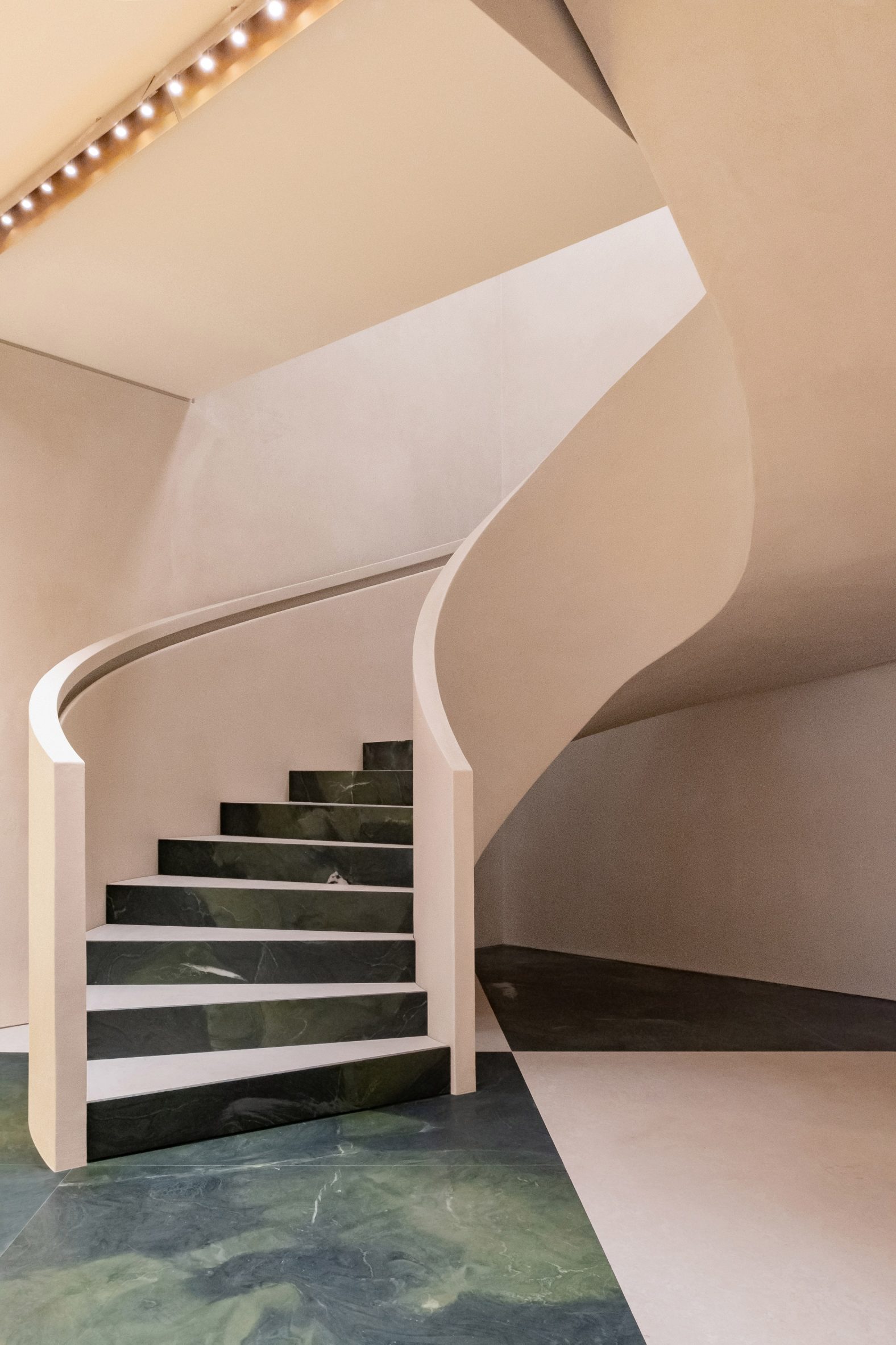
A checkered floor constructed from Botticino marble and green stone, sourced from Brazil, covers the ground floor retail area while the above floors were clad in yellow Siena marble.
A vast stone spiral staircase connects the two floors of retail space and forms a continuation of the oversized checkered floor – with the tread and rise of each step similarly clad in green stone and marble.
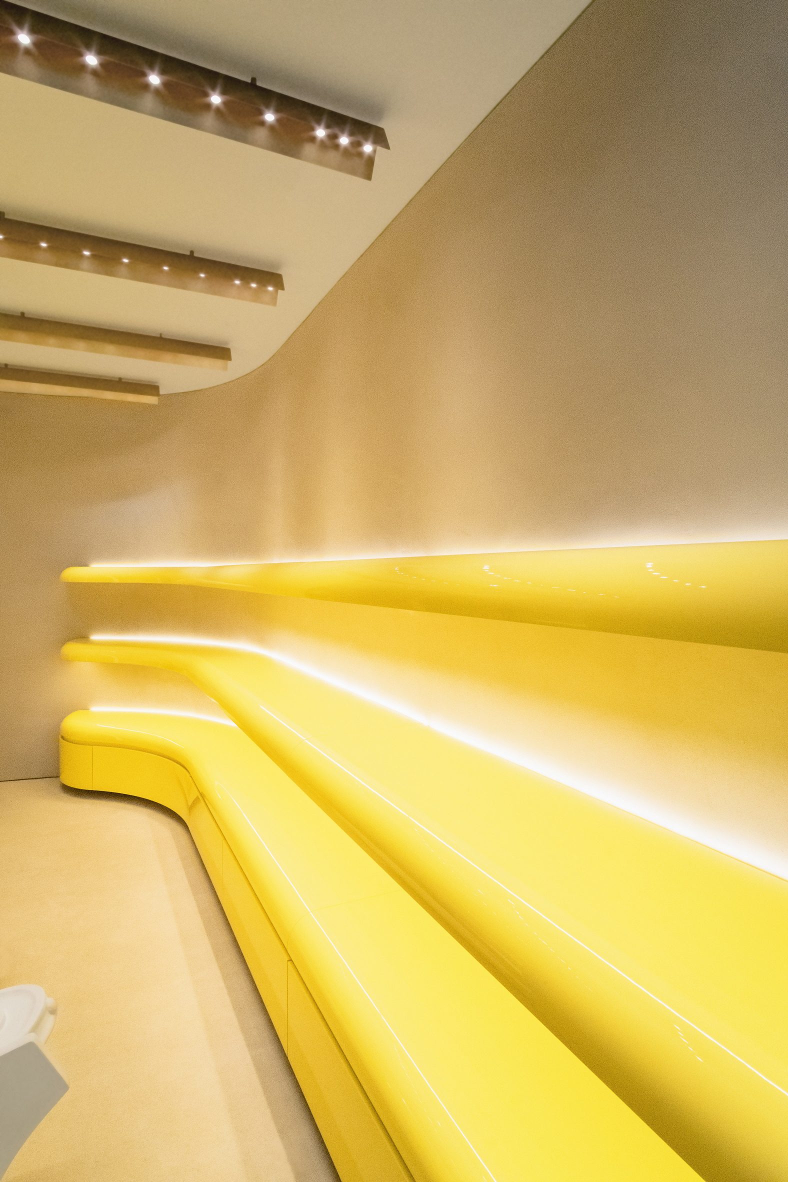
Patinated brass lighting stretches rhythmically in horizontal rows across the ceiling of the store. Curving tubular display rails line the boundaries of the interior and were constructed in the same brass finish.
Pops of colour were introduced to the interior through bright yellow lacquered wood shelving that flank the walls of the store and follow its curving profile.
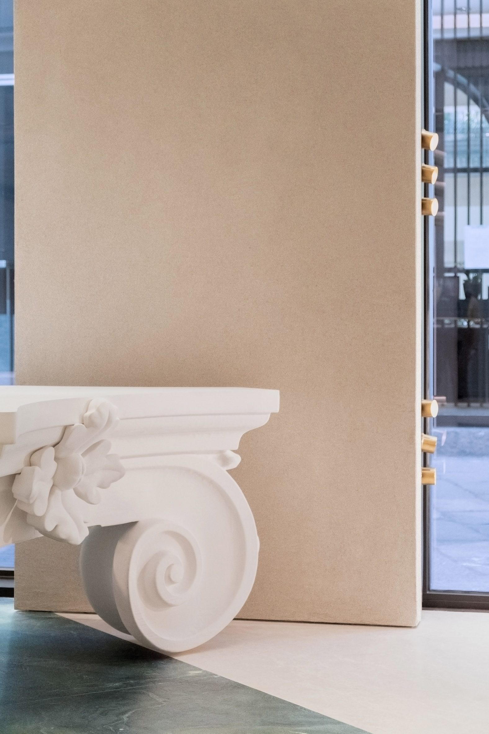
Oversized columns and capitals were placed throughout the interior and function as furniture and display areas for the brand’s products and accessories.
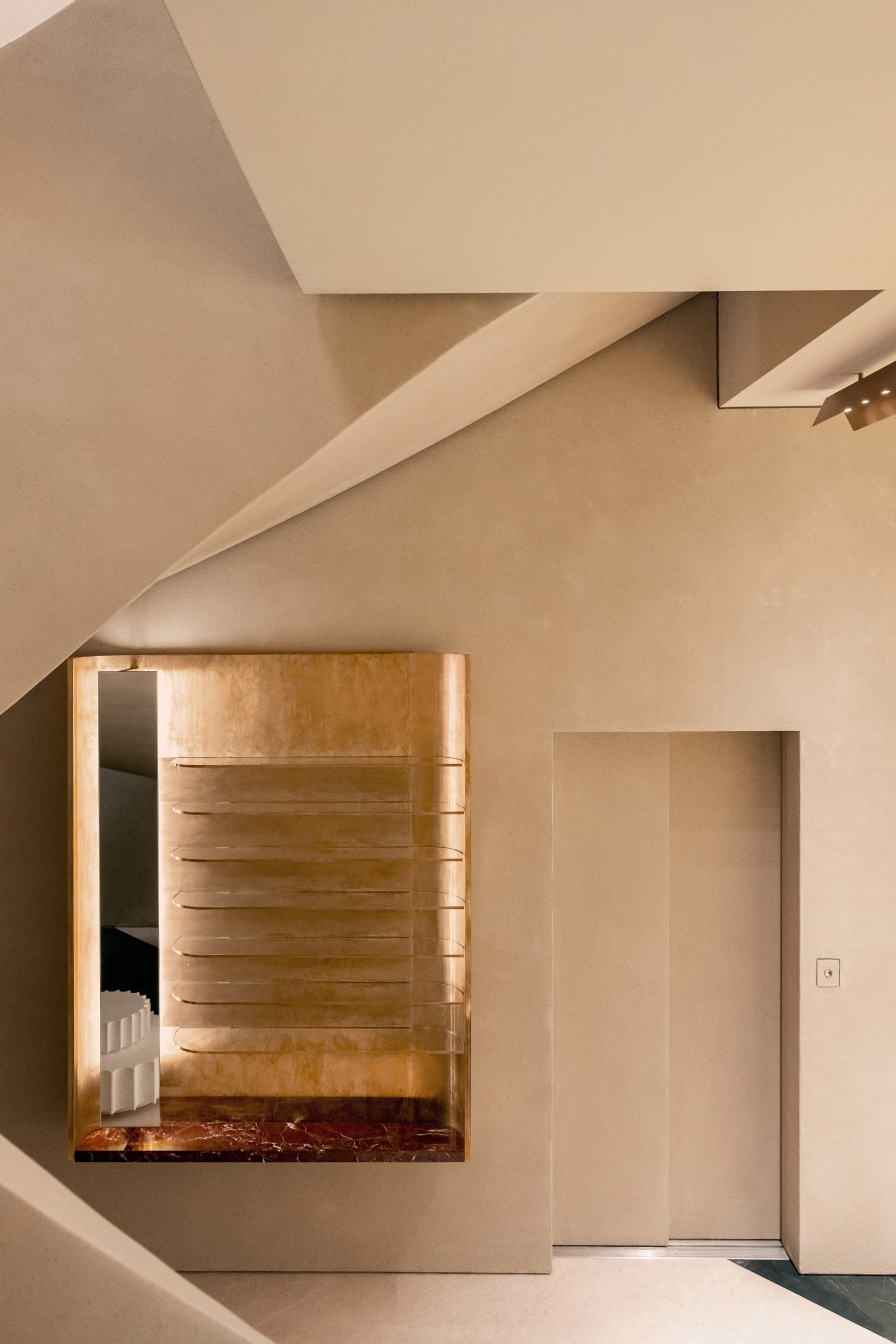
Also scattered throughout the store are additional custom furniture pieces that were created by Scott in homage to Moschino’s founder Franco Moschino.
These tables combine two tables which were spliced in the middle, joined together and decorated with marble tops and gold leaf ornamentation.
Last week news broke that Jeremy Scott was leaving Moschino after a decade-long tenure at the Milanese fashion house. In 2020, Scott replaced models at his Spring Summer 2021 show with puppets that wore the brand’s womenswear collection.
Elsewhere in Milan, London design studios Brinkworth and The Wilson Brothers created a caravan-shaped artist studio for Marni’s flagship store in the Italian city.
The post Moschino flagship store references the "history of ancient Italy" appeared first on Dezeen.
[ad_2]
www.dezeen.com

