[ad_1]

LA-based furniture designer Jialun Xiong has completed her first restaurant interior in the city for 19 Town, achieving a retro-futurist look by pairing soft hues and metallic surfaces.
Serving Chinese fusion food, the 19 Town restaurant is located in an industrial area close to Downtown LA.
The name is a play on words from a phrase in Mandarin, signifying a venue that has food and wine according to Xiong, who is originally from Chongqing.
She used a variety of materials and her own furniture designs to give the space a sense of “lavish restraint”, through the combination of minimal forms and rich details.
“Crafted with rigorously minimal forms balanced by rich materials like Venetian plaster, silver, and leather, the restaurant’s high-drama interiors create an elevated dining experience where connection around food takes centre stage,” said a statement on behalf of Xiong.
The 4,200-square-foot (390-square-metre) restaurant is divided into five areas, which include the main dining space, a bar and lounge, and three private rooms.
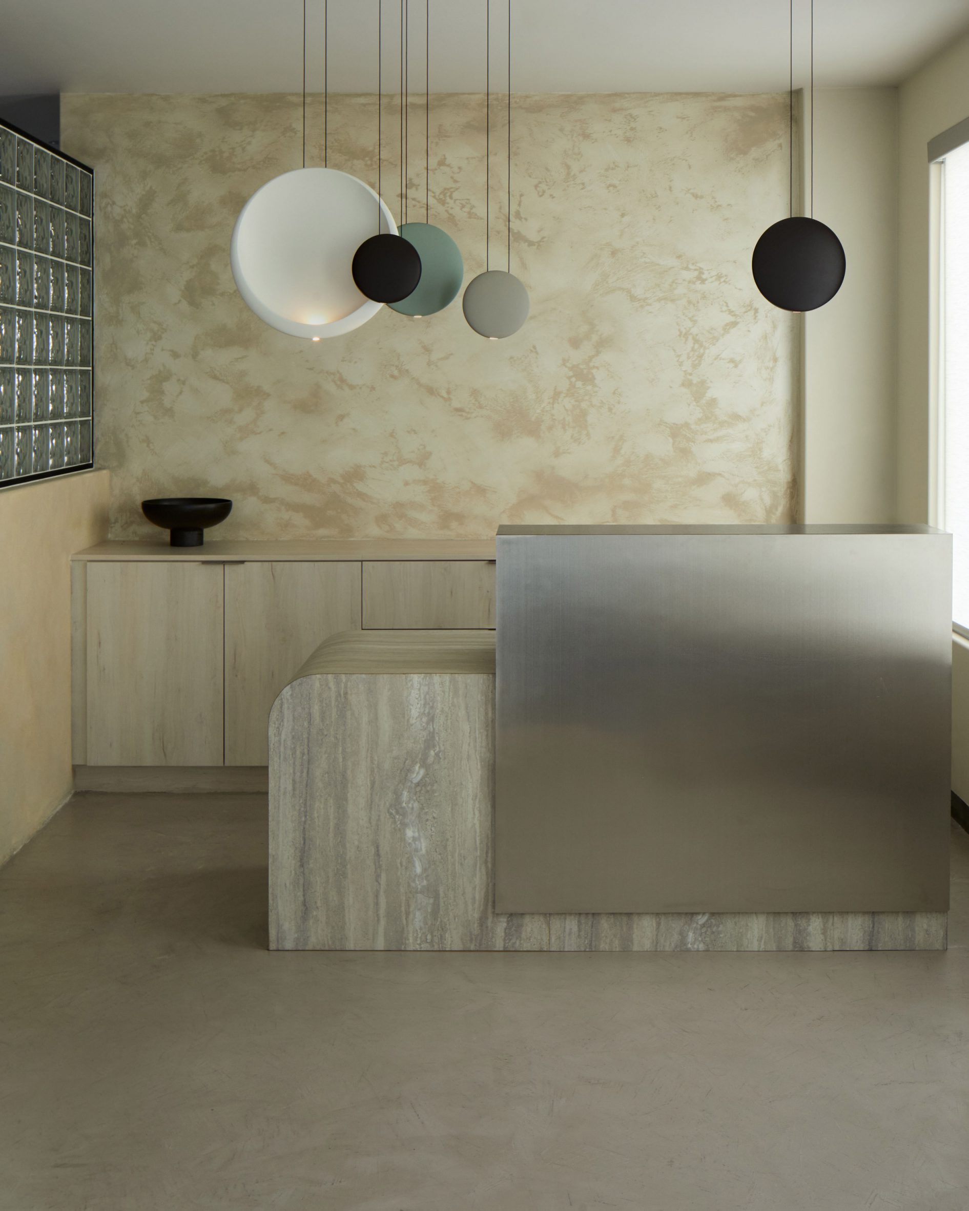
Each space is designed with its own identity, including the entry, featuring a custom brushed stainless steel and Formica reception desk.
Behind, the wall is covered in Venetian plaster and plywood cabinets offer storage, while a series of circular Vibia pendant lights hang above.
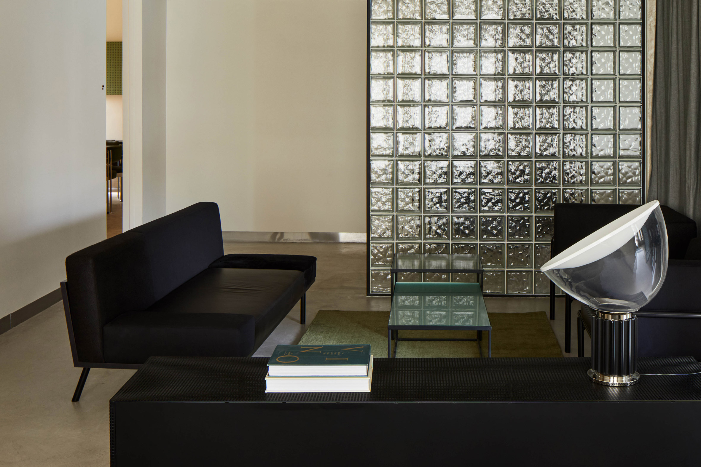
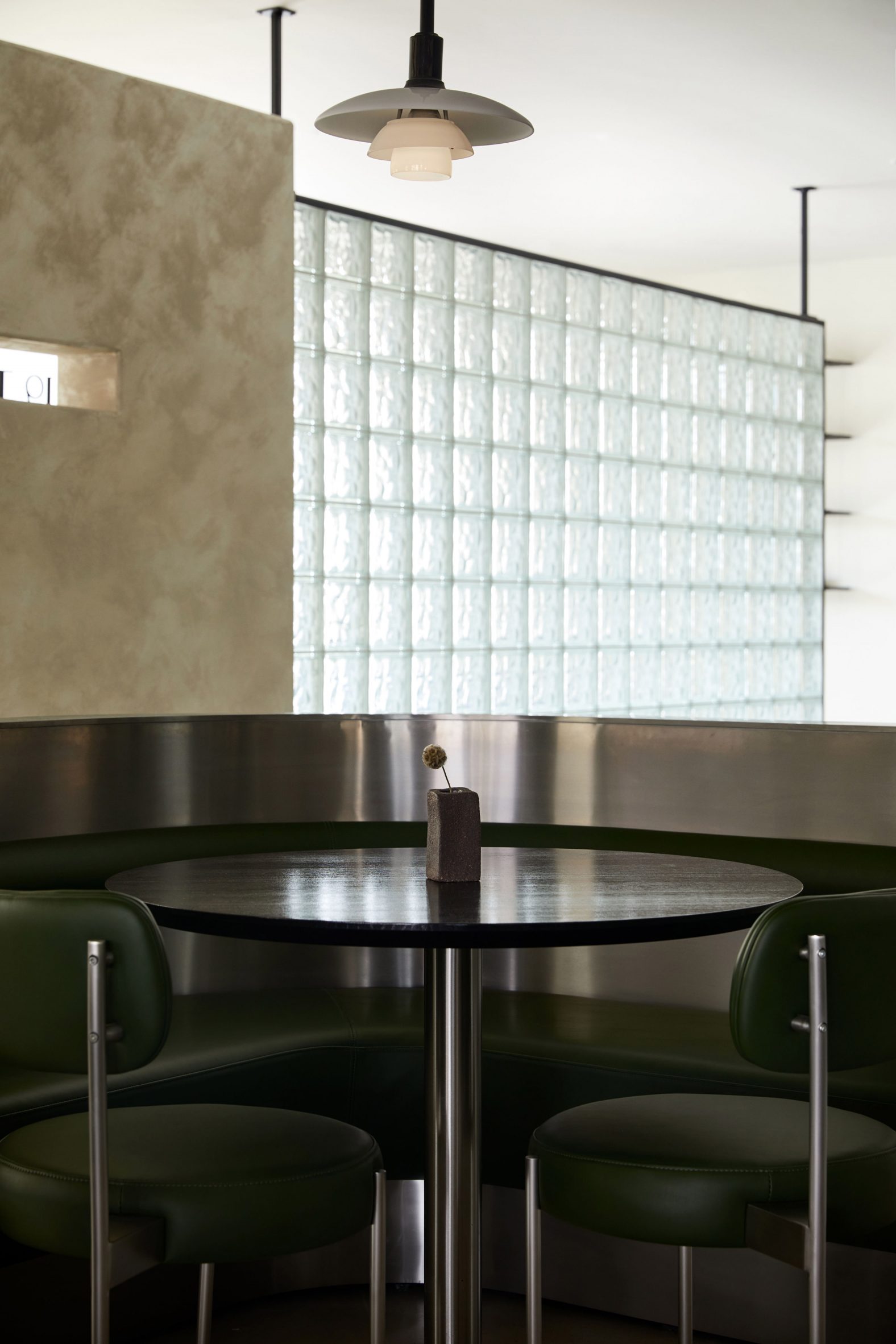
Glass block partitions define the perimeter of the main dining area, comprising a central seating area with round tables, and custom banquettes made from brushed stainless, green leather and vinyl.
“Overlooking an open kitchen, the main dining space evokes an aura of retro-futurism,” said the team.
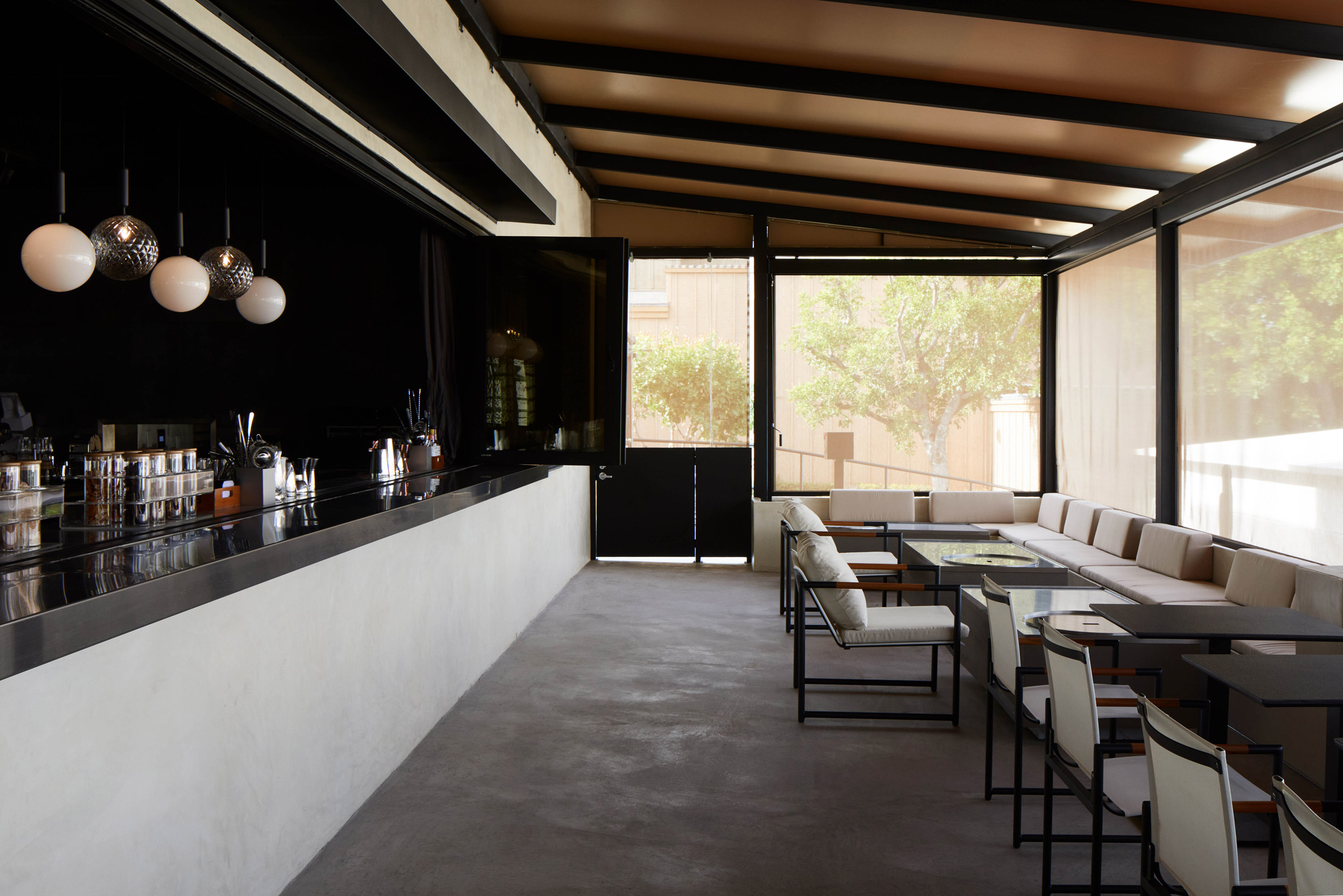
The lounge is located on one side and the screened bar is situated on the other – both continuing the same design language as the central room, but with their own twist.
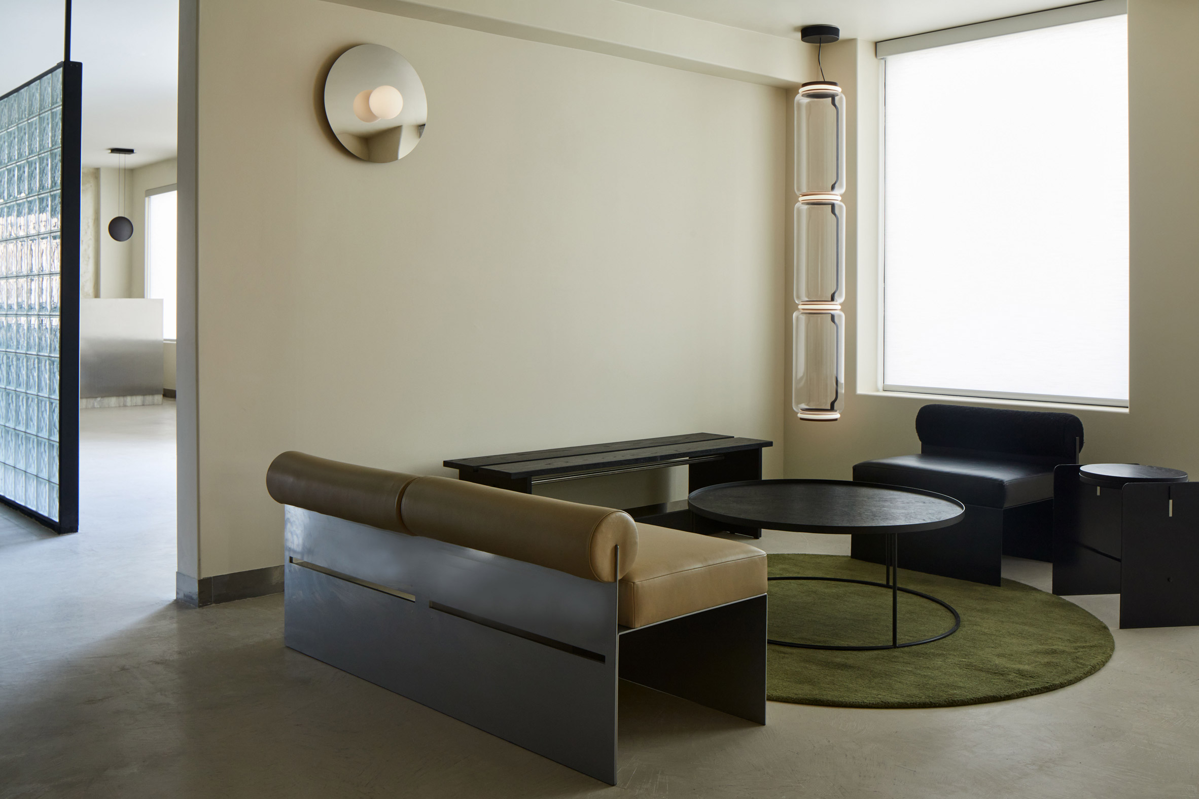
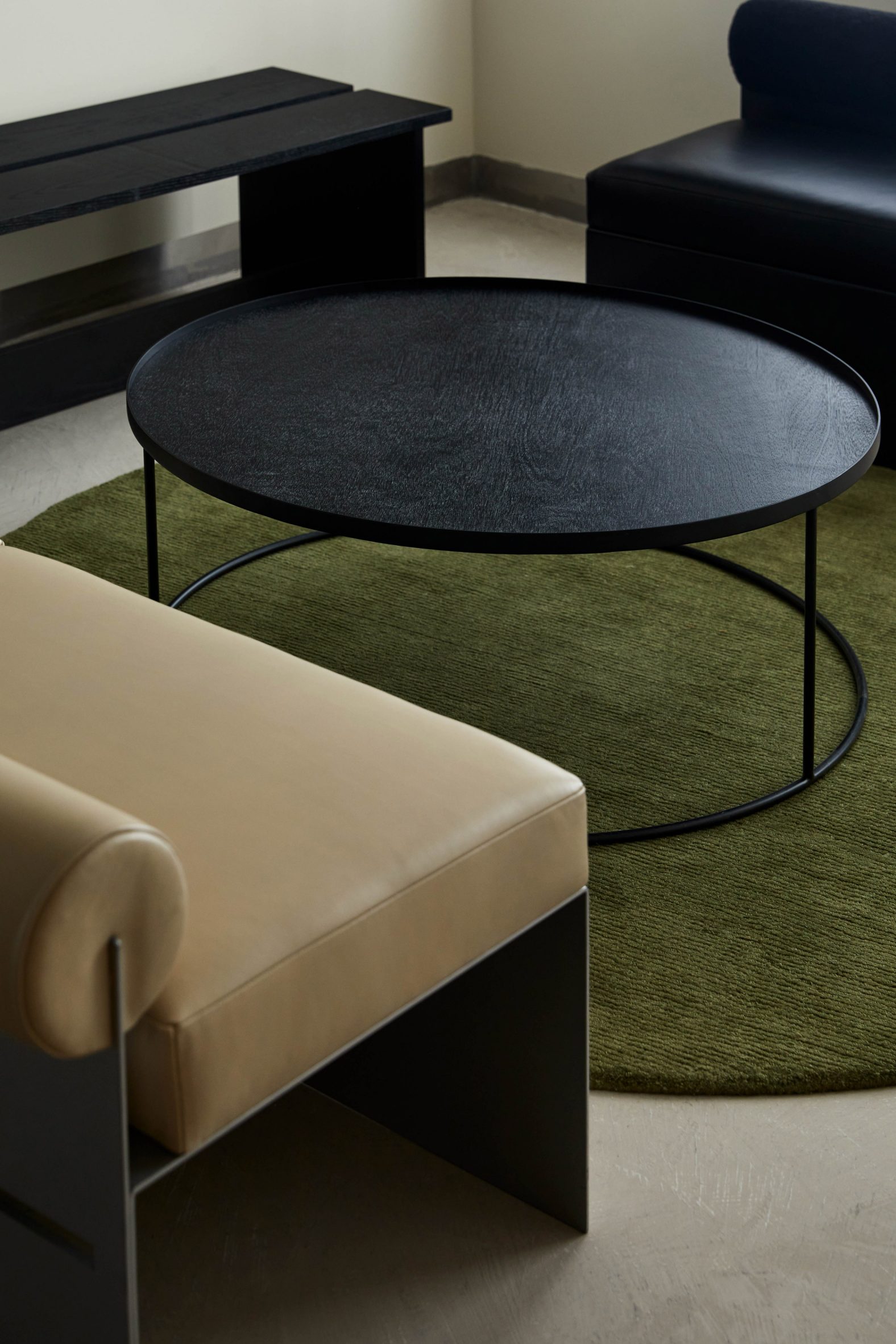
Xiong used multiple pieces from her Building Blocks collection to furnish these spaces, such as a silver powder-coated metal bench with off-white leather upholstered seats.
Other items also combine industrial and natural materials, creating a balance between soft and hard, shiny and matte, and heavy and light.
A variety of lighting designs with disc-shaped elements are installed throughout, adding to the retro-futurist appearance.
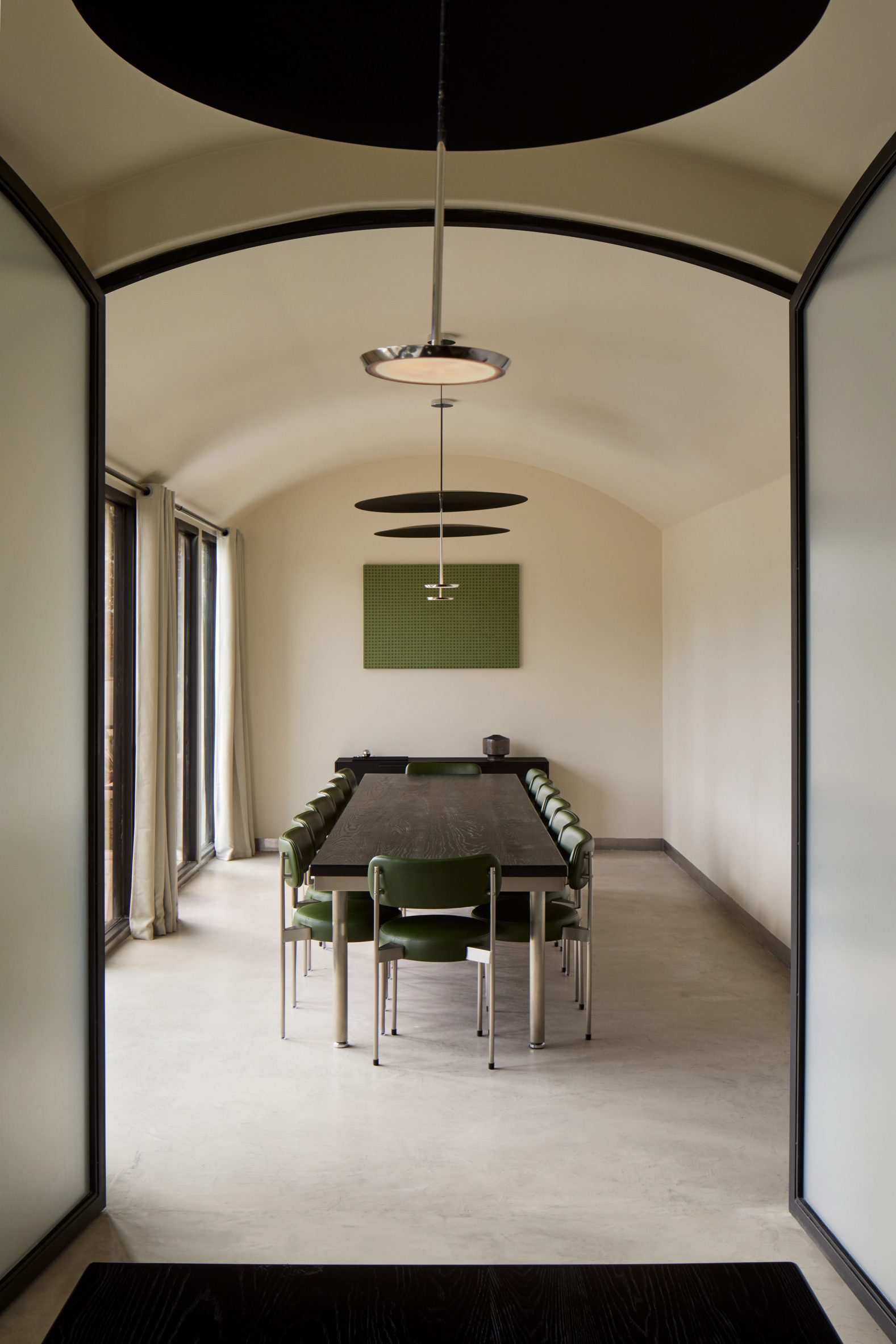
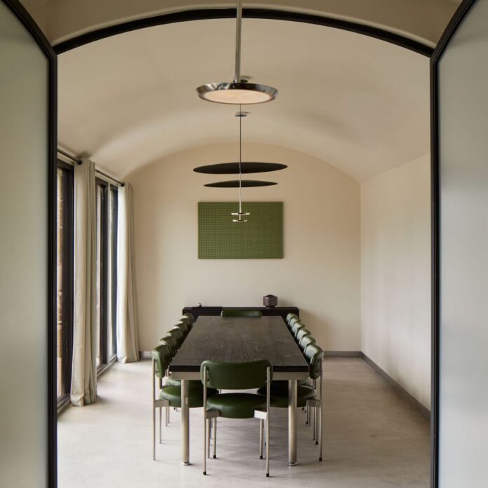
The private dining spaces are decorated using a monochromatic palette and a restrained approach, with green providing a subtle injection of muted colour.
The overall result is a series of “balanced spaces where furnishings, lighting, and spatial volumes are considered together as a total composition”.
Minimalism has become an increasingly popular style choice for Chinese restaurants, both in China and around the globe.
Others include a hotpot restaurant with thick stucco walls in Qinhuangdao, a muted monochrome space in Ontario, and an eatery featuring stainless steel, brass and polycarbonate in Manhattan.
The photography is by Ye Rin Mok.
The post Jialun Xiong balances contrasts at "retro-futurist" restaurant in Los Angeles appeared first on Dezeen.
[ad_2]
www.dezeen.com

