[ad_1]

With its choice of a shade of purple, which it claims is blue, as colour of the year, Pantone has once again failed to use the opportunity to talk meaningfully about how colour reflects moments, says Michelle Ogundehin.
It’s time to reconsider the whole colour of the year carnival. The extraordinary hiatus of the last two years granted us a reprieve from trends as we knew it. Bigger issues – health, community, sustainability, the climate – came to the fore and we had a moment to consider what we liked for ourselves.
And yet, most of the big paint companies alongside Pantone, the self-acclaimed “global colour authority for the design community”, persist in declaring a single shade as emblematic for the year ahead.
Somehow, trends pegged to the sentiments of a single company now seems wrong. Previously, it felt more fun. Today, the societal landscape has been fundamentally altered and yet this colour of the year (COTY) carnival continues. And when we know it’s just a huge marketing exercise, it feels especially outdated.
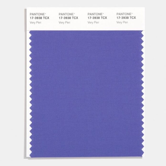
Of course, you could cheerfully ignore the whole spectacle were it not for the aggrandising justifications which accompany such pronouncements. There’s also the fact that Pantone insist on defining its latest release as blue: “a dynamic periwinkle blue hue with a vivifying violet-red undertone”.
Pantone also call it Very Peri, a name so awful it doesn’t merit further mention
To even primary age children, that’s purple. If we’re going to get pedantic, I’d call it a saturated lilac. Significantly, it’s not lavender, which has more of a blue, rather than red, undertone (more on this later). But Pantone 17-3938 is definitely not a blue.
Pantone also call it Very Peri, a name so awful it doesn’t merit further mention. Albeit to note that periwinkles are commonly known in European folklore as the “flower of death” because its vines were apparently woven into headbands worn by dead children or criminals on their way to execution.
In the interest of balance, other sources variously claim that the plants symbolise sentimentality or tranquillity and it can even be considered capable of exorcism. Regardless, according to Pantone, its COTY 2022 displays “a carefree confidence and a daring curiosity” that will help us to “embrace this altered landscape of possibilities, opening us up to a new vision as we rewrite our lives”.
It continues, “blending the faithfulness and constancy of blue with the energy and excitement of red, this happiest and warmest of all the blue hues introduces an empowering mix of newness.” Except purple was used in the Neolithic era by prehistoric artists to decorate their caves, so I’m unsure as to the basis of the reference to “newness”.
Purple also has roots in Greek mythology. Hercules’s dog was said to have discovered the colour when walking on the beach. His owner, en route to court the nymph Tyro, saw the dog bite into a Murex sea snail and his drool turn purple. Legend has it that the nymph demanded a gown of the same colour, and so Tyrian purple was born.
The colour is still routinely associated with royalty, extravagance, wealth and power
Certainly, it’s true that the pigment was originally derived from the mucus of these snails. But tens of thousands of molluscs were required to yield an ounce of dye. It was an extremely laborious process thus the colourant was highly coveted and restricted only to those who could afford it.
Indeed, in Roman times only the Emperor was permitted to wear Tyrian purple. And in 1547, when the Earl of Surrey was tried for high treason against Henry VIII, evidence against him included his flagrant wearing of the hue. Accordingly, even after synthetic purple compounds were created in the 1850s, the colour is still routinely associated with royalty, extravagance, wealth and power. It was the colour of the elite. A portent of vanity, greed and pride.
It’s also a shade right on the edge of the colour spectrum. It’s harder for the eye to see, which makes it comparatively more tiring. It agitates. It’s a colour that operates on the margins of the visible world that nonetheless demands to be noticed. It craves recognition. Appropriate then that it was adopted by the Women’s Suffrage movement.
It was also later associated with the psychedelic drug culture of the 1960s and 70s. Notably, its opposite number is green. Literally, the easiest colour for the eye to perceive as it’s placed at the heart of the spectrum, green is universally acknowledged as restful and restorative.
Lilac tones of purple, similar to its sticky-sweet perfume, is irritating
And yet, according to Pantone, Pantone 17-3938 “is a symbol of the global zeitgeist of the moment and the transition we are going through… expressing what people are looking for that colour can hope to answer.” Hmmm. So, we need a difficult colour that frustrates and alienates? A colour of individualism and hierarchy? I think not.
If we are to evaluate Pantone 17-3938 purely objectively, it’s the red undertone that causes all the problems. It adds heat ergo anger, passion or reactivity. To have chosen more of a lavender tone, would have been unexpected. Subtle. Considered.
Lavender can be quite modest and sedate yet still pack a punch. It’s a team player not an attention seeker. Lavender is a soothing solution seeker. Whereas Lilac tones of purple, similar to its sticky-sweet perfume, is irritating. It’s the over-eager puppy to lavender’s grown-up Labrador. A love it or loathe it colour. A marketeer’s dream then for headlines?
It cannot be denied that different colours reflect different moods and moments
Generally speaking, it’s said that colours within the purple sector – those composed primarily of blue and red – engage the intellect and engender concentration. It’s reputed to be a shade favoured by those of a creative disposition, as well as mystics. Something I believe reflects more the rarity of its natural origins than any grounding in fact. No doubt Prince chose it as his signature colour because it made him feel like a violet majesty.
But wherever you stand on the legitimacy of colour psychology, it cannot be denied that different colours reflect different moods and moments. Shades inevitably flow in and out of popular consciousness, whether buffeted by fashion or political concerns.
Colour of the year could be an opportunity to talk meaningfully about such issues. Once again, Pantone choose not to rise to that challenge.
Michelle Ogundehin is a thought-leader on interiors, trends, style and wellbeing. Originally trained as an architect and the former editor-in-chief of ELLE Decoration UK, she is the head judge on the BBC’s Interior Design Masters, and the author of Happy Inside: How to Harness the Power of Home for Health and Happiness, a guide to living well. She is also a regular contributor to many prestigious publications worldwide including Vogue Living, FT How to Spend It magazine and Dezeen.
The post "It's time to reconsider the whole colour of the year carnival" appeared first on Dezeen.
[ad_2]
www.dezeen.com


