[ad_1]
Inside A Surprisingly Serene Melbourne Warehouse Apartment
Interiors


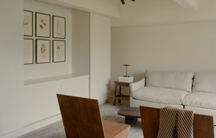
The cosy home is located inside the landmark MacRobertson confectionary factory in Fitzroy.

Built-in joinery helped make the most of the 75-square-metre floorplan.

The breakfast bar was a key focus of the renovation. Framed 19th century oil painting by Elias Mercantile.

The built-in dining area was inspired by wine bar seating, in replace of a dining table.

Croissant handles by Emily Gillis x Zachary Frankel feature across the interiors.

‘We didn’t want it feeling too modern or stark, [which is why] we opted for richer, more earthy tones throughout,’ Emily says.

The floors are made from Kustom Timber Storm, in contrast to the light oak timber veneer of the cabinetry.

Tiento Clay Linen tiles feature in the bathroom and kitchen splashback. Bathroom floors are Eco Outdoor Tolfa tiles.

Brass taps and hardware tie in with the dark industrial windows and original features of the warehouse apartment.
Melbourne’s former MacRobertson chocolate factory is home to a series of unique converted apartments, renovated over the last few decades.
One of these is the unique ‘Fitzroy apartment‘ that’s been recently updated with the help of interior designer Emily Gillis.
Her clients — a young professional couple with a baby — engaged her with a brief to bring a ‘comfortable’ and ‘warm’ feel to their warehouse apartment, in addition to making the most of the home’s compact 75-square-metre footprint.
‘It was to be a home that catered to their home-body lifestyle, while being able to entertain small groups on the odd occasion,’ Emily says. ‘We opted for a large kitchen, cosy living area, and sizeable bathroom.’
They approached the kitchen knowing it would be ‘the heart of the home’. Rather than limiting its size to find space for a traditional dining table, a built-in breakfast bar functions as their main dining spot overlooking the kitchen. It took a few iterations to get it right, but Emily says the finished product is reminiscent of seating at wine bar or a cosy dining nook.
‘We looked at an array of warm and inviting hospitality spaces to draw inspiration for the kitchen and bar area,’ she adds.
‘Having everything integrated in the kitchen, including a breakfast bar, makes the room feel bigger [since] everything is hidden.’
The overarching goal was to ensure the apartment felt inviting as soon as you walked in. This, combined with Emily’s fascination with Belgium interior design — ‘their execution of warmth and materiality is second to none’ — helped shape the minimalistic palette of the renovation.
‘We opted for neutral, warm and earthy tones, choosing materiality that complemented the existing brickwork and the space’s footprint at large,’ she adds.
Walls painted in Dulux Grand Piano helped offset the ‘harshness of hard materials’ everywhere, like the aged brass tapware and intricate croissant-shaped handles from a playful collaboration between Emily and designer Zachary Frankel.
Clay tiles offer a textured focal point in both the bathroom and kitchen, as light timber oak cabinetry contrasts with the mid-brown oak flooring. ‘The existing factory black steel window frames were accentuated using black can lights on a track system,’ Emily explains.
‘I think we’ve captured the home’s unique identity by staying true to the fact that it’s a unique building, and not trying to morph it into something that it’s not. There are elements of the warehouse that shine through, and are juxtaposed by warmth and simplicity with features brought in during the renovation. It feels like the perfect mix.’
Want to see more from The Design Files? Sign up to our newsletter for your weekly dose of home and design inspiration here!
[ad_2]
thedesignfiles.wpenginepowered.com


