[ad_1]
Inside A Striking Two-Storey Addition, Hidden Behind A Heritage Facade
Interiors

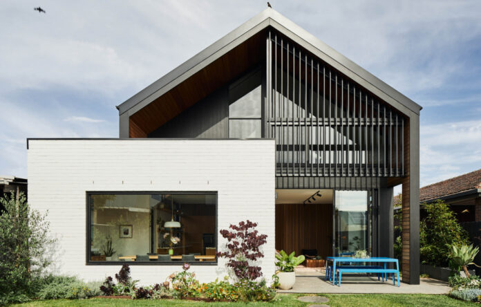
The two-storey contemporary additions at Henry II. Photo – Jade Cantwell

The humble facade stays true to its original design. Photo – Jade Cantwell

Large windows connect the dining space to the garden. Painting by David Bromley. Photo – Jade Cantwell

The kitchen features a marmoreal white terrazzo benchtop by Dzek Dzek. Photo – Jade Cantwell

Two curved timber ‘pods’, one containing the stairwell and the other containing the bathroom frame the opening to the new part of the build. Photo – Jade Cantwell

The large kitchen is flooded with light! Photo – Jade Cantwell

The curved timber wall wraps into the living area. Owl Print by Leila Jefferys. Photo – Jade Cantwell

The living area. Photo – Jade Cantwell

The staircase leads up to the the ‘kids zone’. Photo – Jade Cantwell

The stairwell pod is finished in acoustic panelling, which is very successful in keeping the upstairs and downstairs noise separate. Photo – Jade Cantwell

The upstairs ‘kids zone’. Photo – Jade Cantwell

The second timber pod contains a bathroom. Photo – Jade Cantwell

The original part of the house now contains the main bedroom suite. Photo – Jade Cantwell

Striking aluminium black features on the exterior. Photo – Jade Cantwell

The exterior is painted in Dulux Terrace White and Dulux Lexicon. Photo – Jade Cantwell
It’s a tale as old as time; ‘The worst house on the best street’ that’s well overdue for a makeover. This was the state of Henry II, a classic double fronted villa in Northcote, Melbourne, in dire need of a transformation.
Now, after a respectful restoration of the original house and a sweeping new contemporary two-storey addition by Altereco, Henry II is befitting its spot on street.
From said street, the home retains its beautiful heritage look. ‘A cleanly restored facade and gardens ensures the street appeal is nothing out of the ordinary,’ explains James Goodlet, director of Altereco.
The ‘wow factor’ is saved for the transition into the new addition, which features a soaring three metre high ceiling, large windows that invite the outdoors in and curved timber-battened ‘pods’, one containing a bathroom, the other concealing the stairwell to the second storey.
James worked with his client, interior designer Renee Richards of Ochre Studio, on the interior. They chose a standout marmoreal white terrazzo benchtop for the kitchen, burnished concrete floors and sculptural timber battens in the new addition. These warm material choices are reflected in the original part of the home where original timber floors and painted bricks are the hero.
The decision by Renee to engage Altereco in the restoration and renovation of this home was an easy one. After all, they’d designed an award-winning house, nicknamed Stompbox, on the same street, for her back in 2014.
‘The main inspiration for Henry II was the last house we designed for these clients; Stompbox,’ explains James. ‘They wanted a slightly larger version of this to allow for their growing family.’
Key design features in the new build such as the curved timber ‘pods’ that frame the opening to the new addition where the main living area, kitchen and dining are situated were directly inspired by Stompbox.
‘It was quite a unique design experience,’ says James. ‘We were able to reflect on our past experiences and inherent shared knowledge of the last project; what worked well for them and what could be improved.’
Their previous laundry layout, for instance, was ‘perfect’ and therefore replicated exactly in the new house. The curved timbers pods are a nod to the pantry and ensuite in the previous home, too, and the en suite, which is described as a ‘room within a room’, worked so well that this was also translated into the new home.
As James notes, ‘If it ain’t broke, you don’t fix it!’
[ad_2]
thedesignfiles.net


