Inside A Cosy Sydney Home With ‘Mid-Century Sensibilities’
Interiors

Southwell House is a Sydney family home in Pymble.

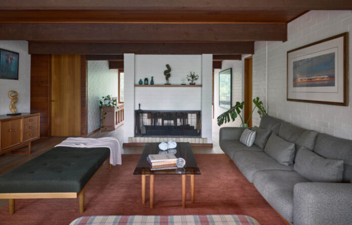
A warm colour theme runs throughout the interiors, inspired by the western red cedar ceilings and terracotta tiles.

The renovation bought in timber oak floors over the living room’s dated Kauri pine. Artwork by Giorgia McRae.
- Main lounge – colorful geometric artwork Giorgia McRae, Tim Storrier ‘blazeline series’ (print), Martine Emdur swimmers, Clement Meadmore sculpture (on mantle),

Exposed brick walls and timber beams help give the house a mid-century feel. Sculpture by Clement Meadmore. ‘Blazeline series’ on wall by Tim Storrier.

The retro stairwell.

Dividing one long room into a series of living zones, including an informal dining room with a built-in banquet seat.

Painting by Nic Everist. Pomegranate painting by Nell Symons. Vintage print. Painting by Daniel Bodey.

Blue Tea Kitchens and Studio Fiorasi designed the new kitchen and pantry.

The kitchen features a terrazzo benchtop.

Artworks by Freddie Timms.

Rachel Castle tea towel.

Colourful terrazzo and Japanese tiles round out the mix of reds, greys, and greens across the home.

A vaulted ceiling in the bathroom makes the airy space the perfect place to relax in the bathtub.
Marketing professional and interior design student Leigh Brezler and her family were living nearby in Roseville when they first came across this endearing Pymble home.
It was larger than their current California bungalow, and after enduring the pandemic’s early lockdowns there, they’d realised just how much they needed the extra space. With a series of spacious bedrooms, a ‘cleverly placed’ home office, and a self-contained granny flat out the back, the retro property ticked all the boxes.
‘I love colour and was immediately drawn to the terracotta tiles on the front veranda that carry through the entry way, as well as the western red cedar timber ceiling,’ Leigh says.
The original architect Graham Southwell had designed it for his own family before being sold to another family lived there for almost 30 years. Leigh says they could tell it was a well-loved home, and the functional lay out meant they knew their updates would be strictly cosmetic.
‘I believe it was built in 1978, so slightly late to be considered mid-century, but it certainly has those sensibilities,’ she adds.
‘We think Graham was a resort designer, which tracks, because the house has an airy feel with lots of big windows, which stream in natural light and a really lovely flow to the spaces.’
Their renovations focused on modernising the bathrooms and the kitchen, including adding a walk-in pantry behind a playful deep-red arched doorway. Other sympathetic changes involved replacing the main bedroom’s worn-out light green carpet to a rich sea-blue, laying wider timber oak floors over ‘dated Kauri pine floors’, and installing new joinery.
Leigh worked on the redesign with Frank Designs founder Amelia Hesketh, who also helped source key vintage pieces that have enhanced the interiors’ existing warmth.
‘We wanted to keep and enhance all the beautiful original mid-century tones, and we went with a forest palette of oranges, greens and browns for the lounge and continued with greens and yellows in the formal dining,’ she explains.
The mix materials old and new is anchored by terrazzo accents, reflecting the deep reds, flecks of gold and light grey tones that run throughout the renovated house.
‘I love the way the light beams through all the different nooks and crannies and creates little glimmery waves of sunshine throughout of day,’ Leigh says.
Want to see more from The Design Files? Sign up to our newsletter for your daily or weekly dose of home and design inspiration!
thedesignfiles.wpenginepowered.com


