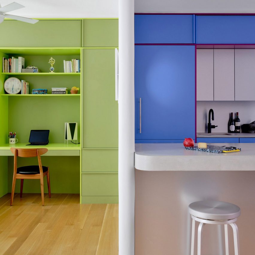
Bright hues define the different interventions that New York architecture studio Ideas of Order has made in this apartment at the northern tip of Manhattan.
The 1,000-square-foot primary residence in Hudson Heights was partially renovated for a couple, who had been living in the space for several years before deciding to invest in making it better suited to their needs, rather than buying another apartment.
“Their sons had been sharing a room, but were beginning to need their own spaces,” Ideas of Order told Dezeen.
“They also wanted a space that could be designed for flexibility for when their children left for college.”
The kitchen also needed updating, to make it more suitable for entertaining, and more efficient storage space was required in the entryway.
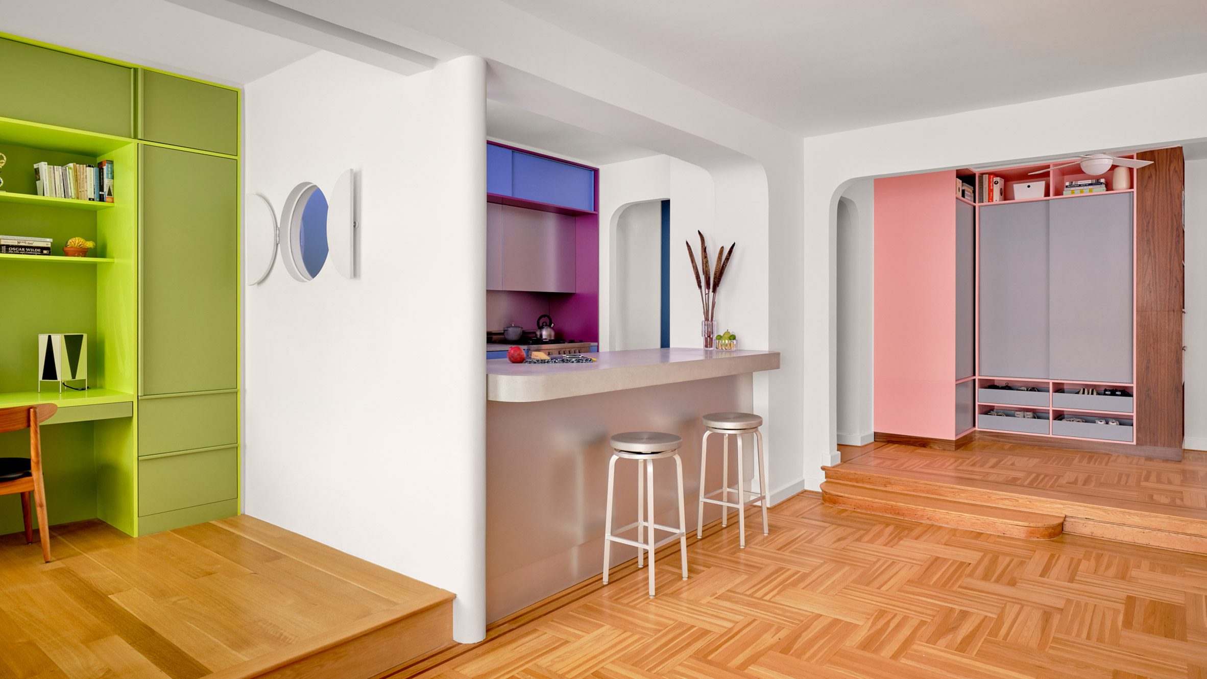
So the architects reworked one side of the open living area, adding a bedroom on one side of the kitchen and refreshing the other areas.
The husband is French, and the couple spent several years living together in France.
During this period, they both became enamoured by the midcentury architecture and design in the country and wanted to apply this style to their own home.
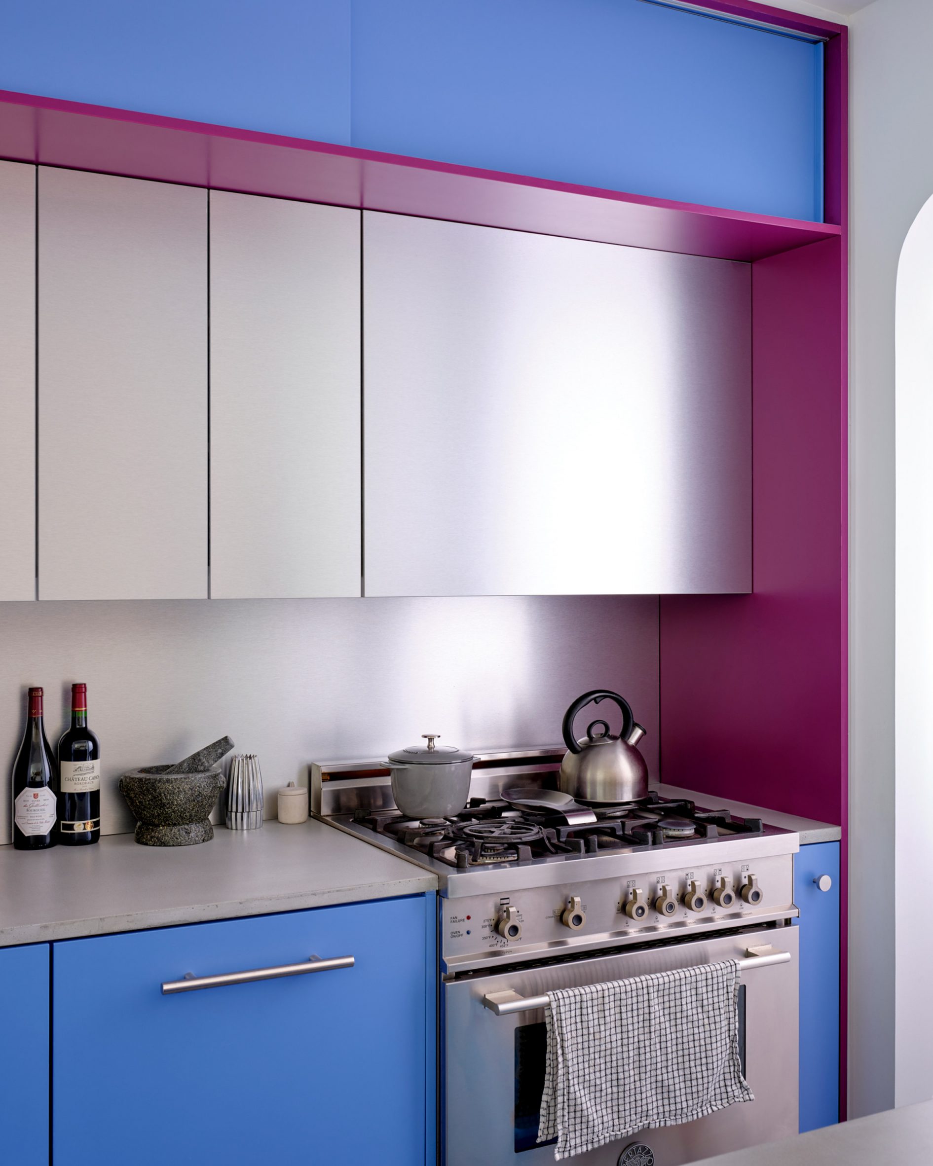
“Inspired by their stories and the history of how colour was used by French midcentury designers like Charlotte Perriand, we suggested a series of polychrome millwork pieces inspired by Perriand’s design language, but updated for a contemporary home,” said Ideas of Order.
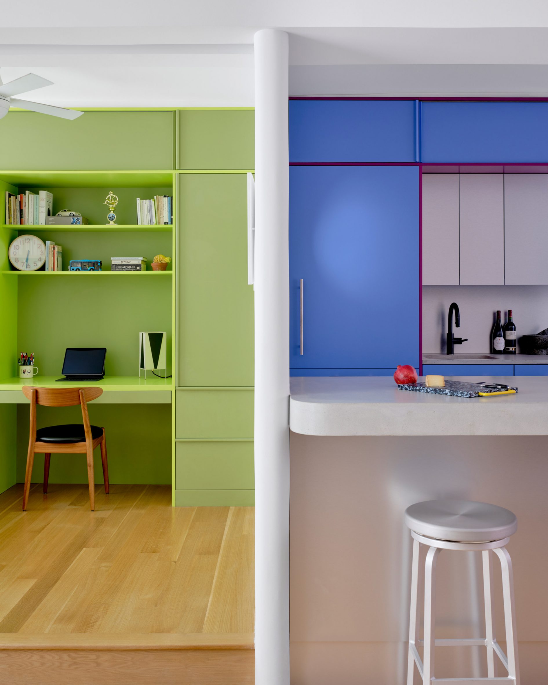
The different areas of the home were therefore given their own identities by applying bright hues.
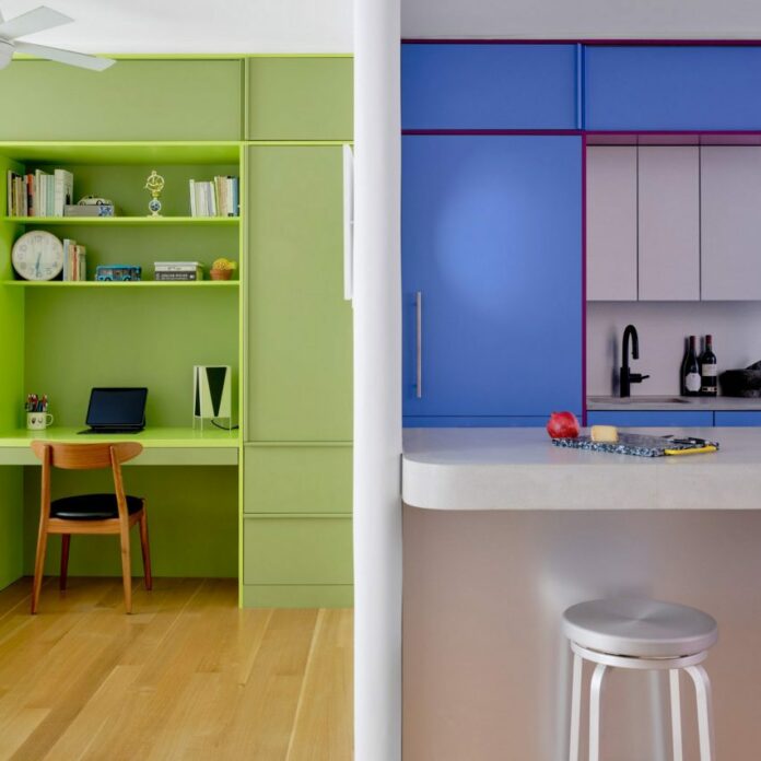
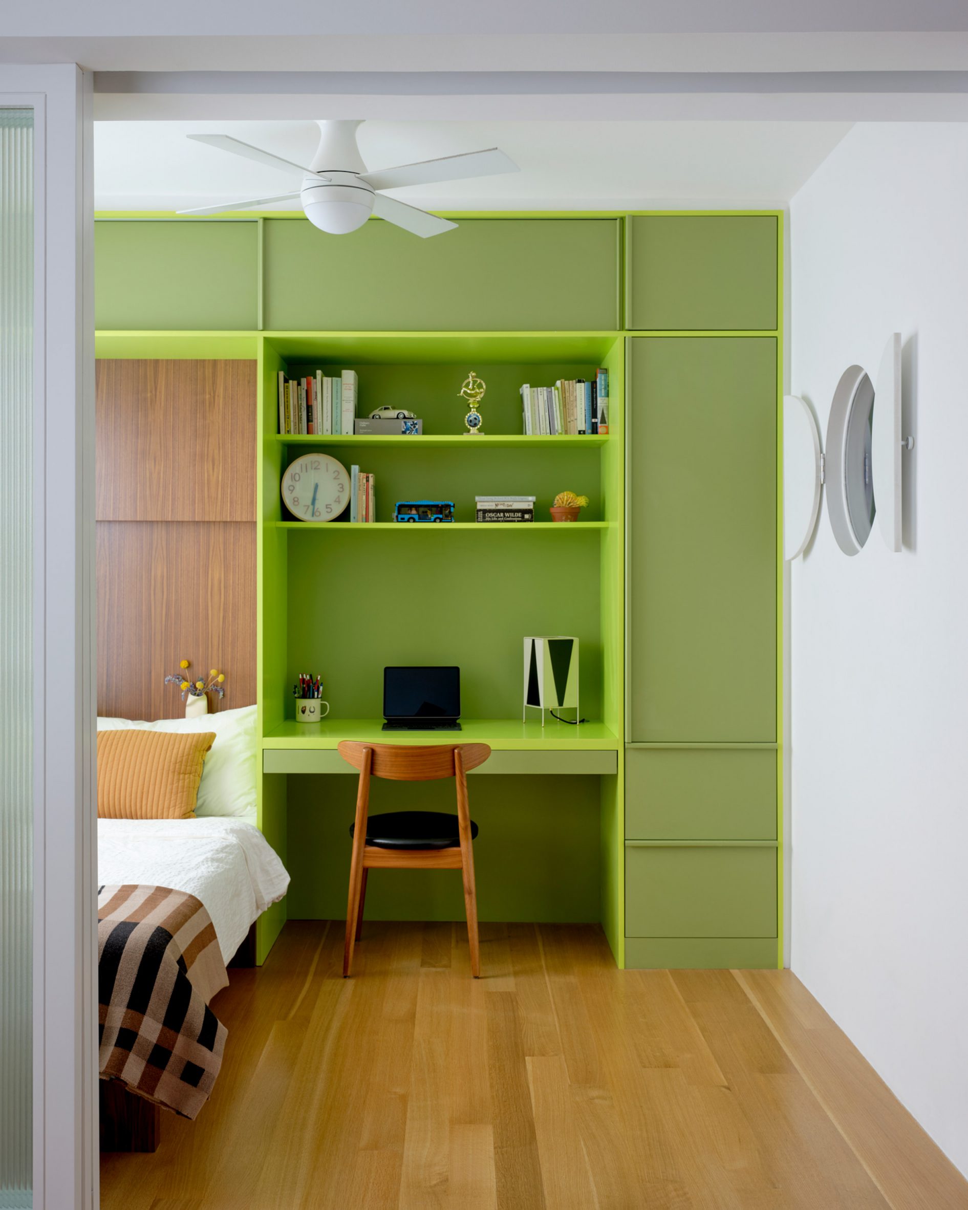
Lime green is used in the bedroom across a full wall of built-ins that incorporate a single bed, a workstation and plenty of storage.
Sliding doors with fritted glass panels pull across to enclose the slightly raised room, while a porthole window with double shutters looks through the new wall that separates the kitchen.
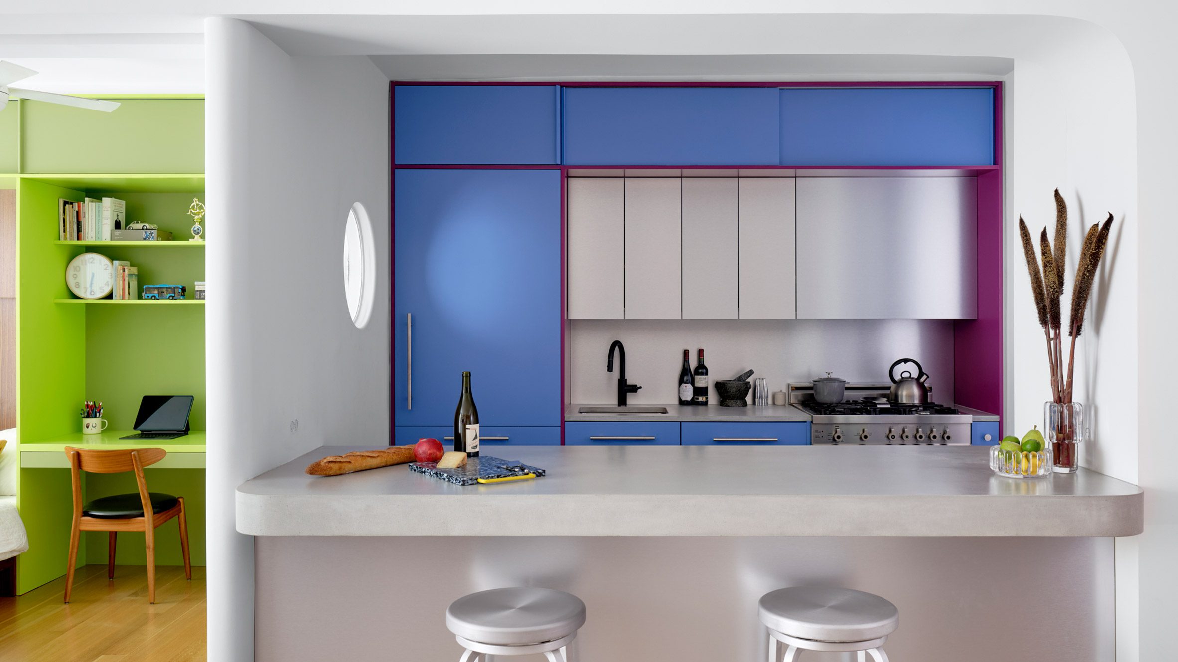
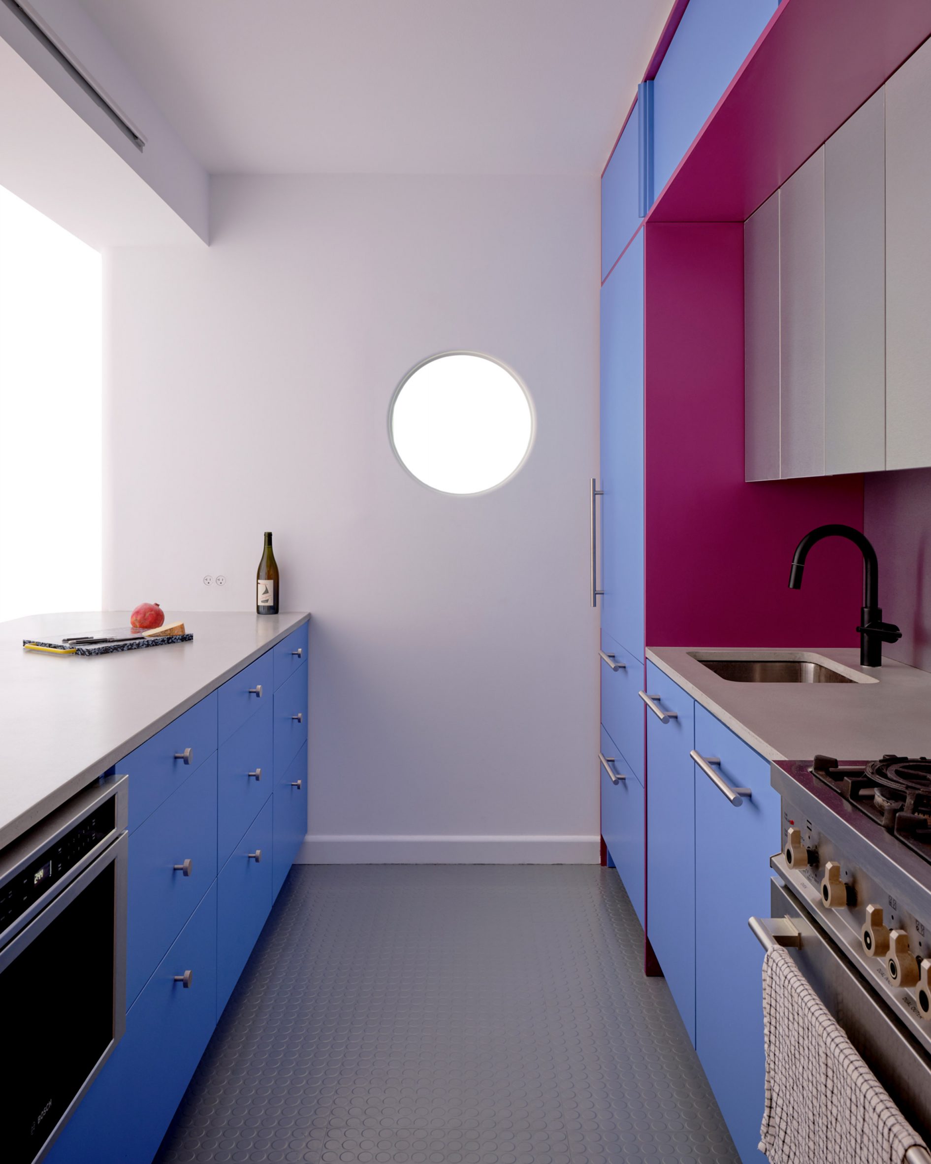
This adjacent space is denoted by raspberry and periwinkle millwork, which surrounds a small preparation area with an aluminium backsplash and matching panels above.
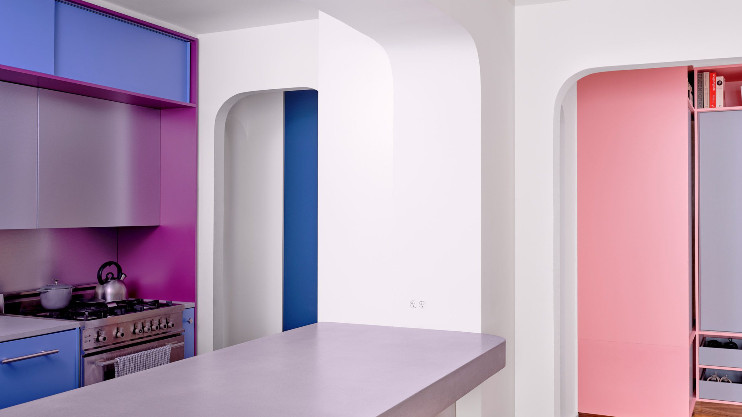
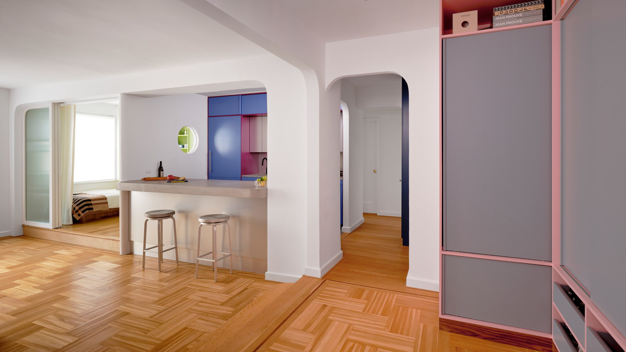
The same metal also fronts the bar counter between an arched opening to the living area, which is topped with concrete.
Rubber flooring in the kitchen offers a practical alternative to the wood used through the rest of the apartment.
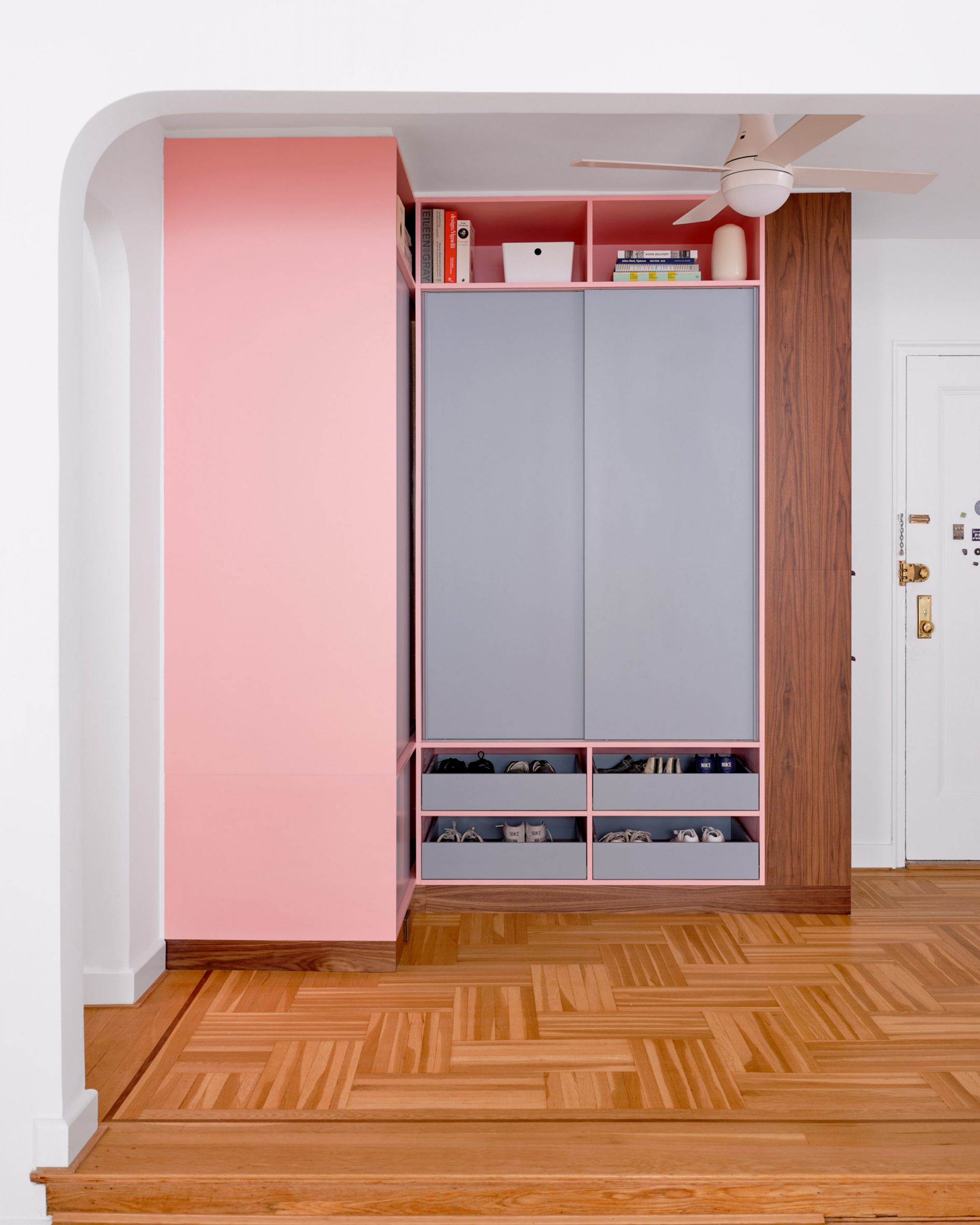
Finally, in the entryway – which is again raised slightly higher than the living area – an L-shaped cabinet system was constructed in a corner beside the door.
Pale pink is applied to the frames, while the doors and drawer fronts are finished in light grey and walnut is used for the trim. Choosing the right hues was a challenge that took many iterations to find the right balance, according to the architects.
“It was important that each pair of colours in the millwork work together, but that the colours also harmonise when viewed as a whole,” they said. “We wanted the colours to be bright, but not overpowering. And we wanted the colour pairings to feel timeless and not too trendy.”
Another challenge was the budget, which was modest by New York City standards and required some conscientious spending – particularly on small details that would make a big impact.
“We love the custom pulls for the millwork, the shutters for the circular window, and the rounded end to the partition between bedroom and kitchen, which reflects the rounded openings throughout the apartment,” the architects said.
Ideas of Order was founded by Jacob Esocoff and Henry Ng, who are both Fosters + Partners and WORKac alumni.
Their renovation is one of the most colourful interiors we’ve featured in New York City of late, compared to a neutral show apartment inside the One Wall Street skyscraper and a loft in Dumbo with a subdued palette.
The photography is by Sean Davidson.
The post Ideas of Order selects bright colours for New York apartment renovation appeared first on Dezeen.
www.dezeen.com

