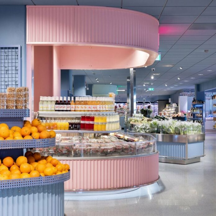
Swedish studio Westblom Krasse Arkitektkontor and design agency Snask have revamped a supermarket in Täby, adding pastel hues and materials such as terrazzo and wood to “turn shopping into an experience”.
The design was intended as a facelift for the store, which is part of Sweden’s ICA supermarket chain and had been given many smaller additions over the years without an overall design direction.
Together, Snask and Westblom Krasse Arkitektkontor redesigned the 2,200-square-metre store outside of Stockholm, refreshing its interior by creating multiple themed stations.
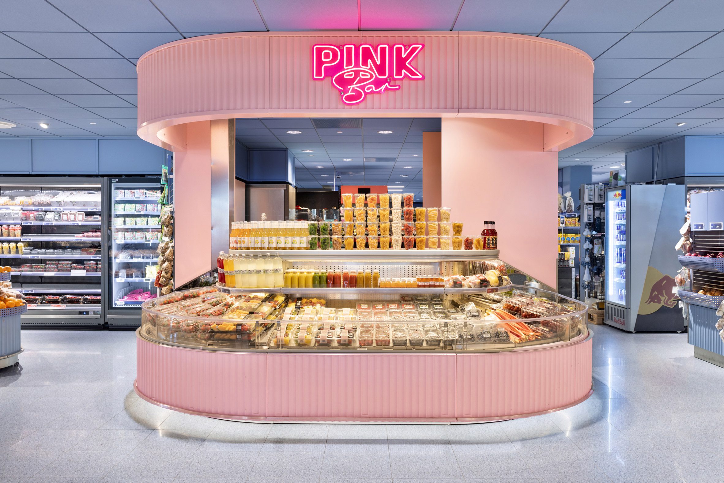
These include a pink juice and smoothie bar, a “vegan butchery” station, a seafood and champagne bar and a bar for delicacies, designed to give ICA Stop the feel of a market hall.
“Our main goal was to create a more personal shopping experience,” Snask creative director Freddie Öst told Dezeen.
“We did this by modernising the brand and giving it a concept as the culinary dream come true.”
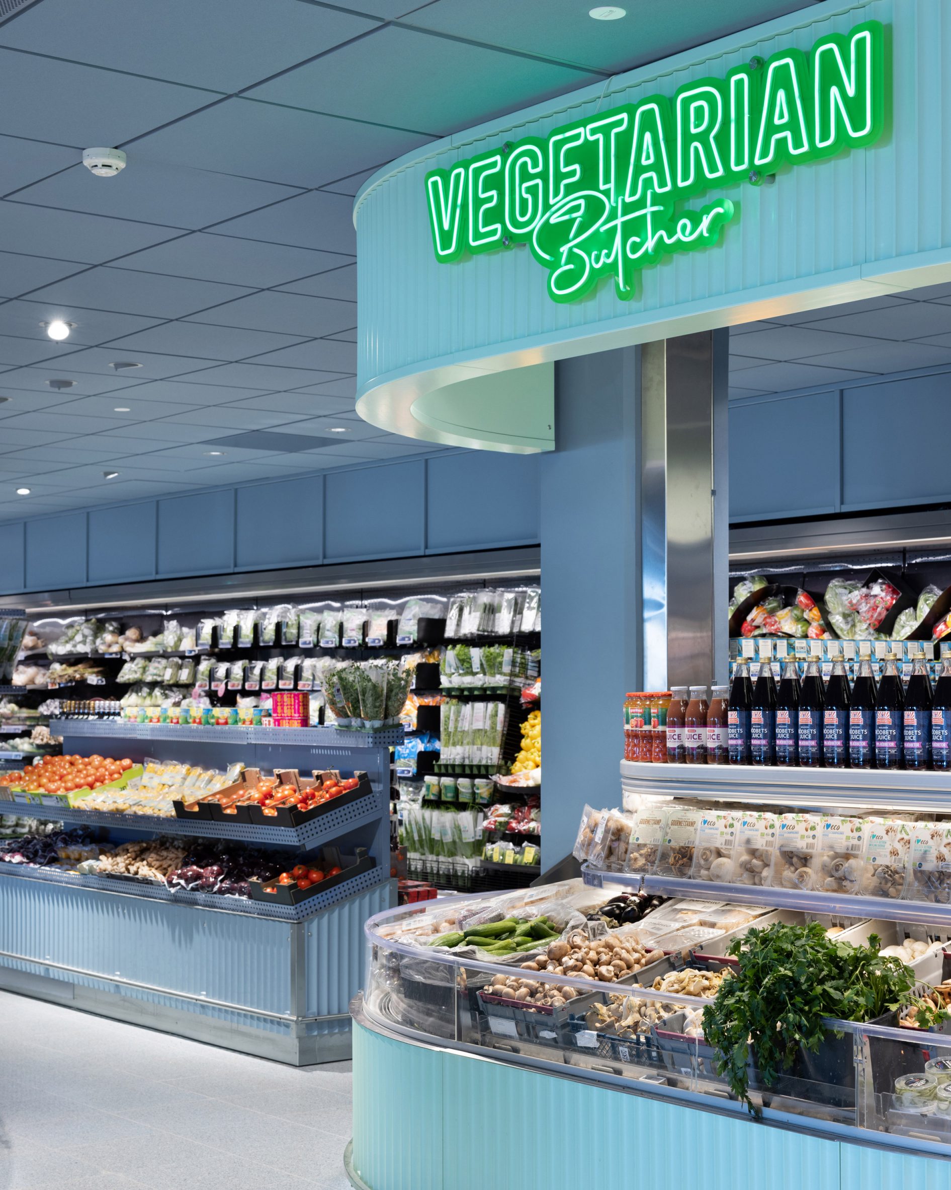
To create clean sightlines inside the shop, which also has a restaurant space at the front, Westblom Krasse Arkitektkontor and Snask used rounded shapes throughout the interior.
“This wasn’t just about keeping the store from turning into a sardine can,” Öst said. “It was about giving everything and everyone room to breathe – and look fabulous doing it – even products that would otherwise be blocking one another.”
For both practical and aesthetic reasons, the bars and counters were given a ribbed effect that adds textural interest to the store interior.
“It’s like putting pinstripes on a curve – it adds just the right amount of flair without messing with the flow,” Öst said.
“[It’s] a classy shout out to those fluted columns from the architectural playbook,” he added. “We made store design not just functional but fashionably sleek, with a wink and a nod to the ancients.”
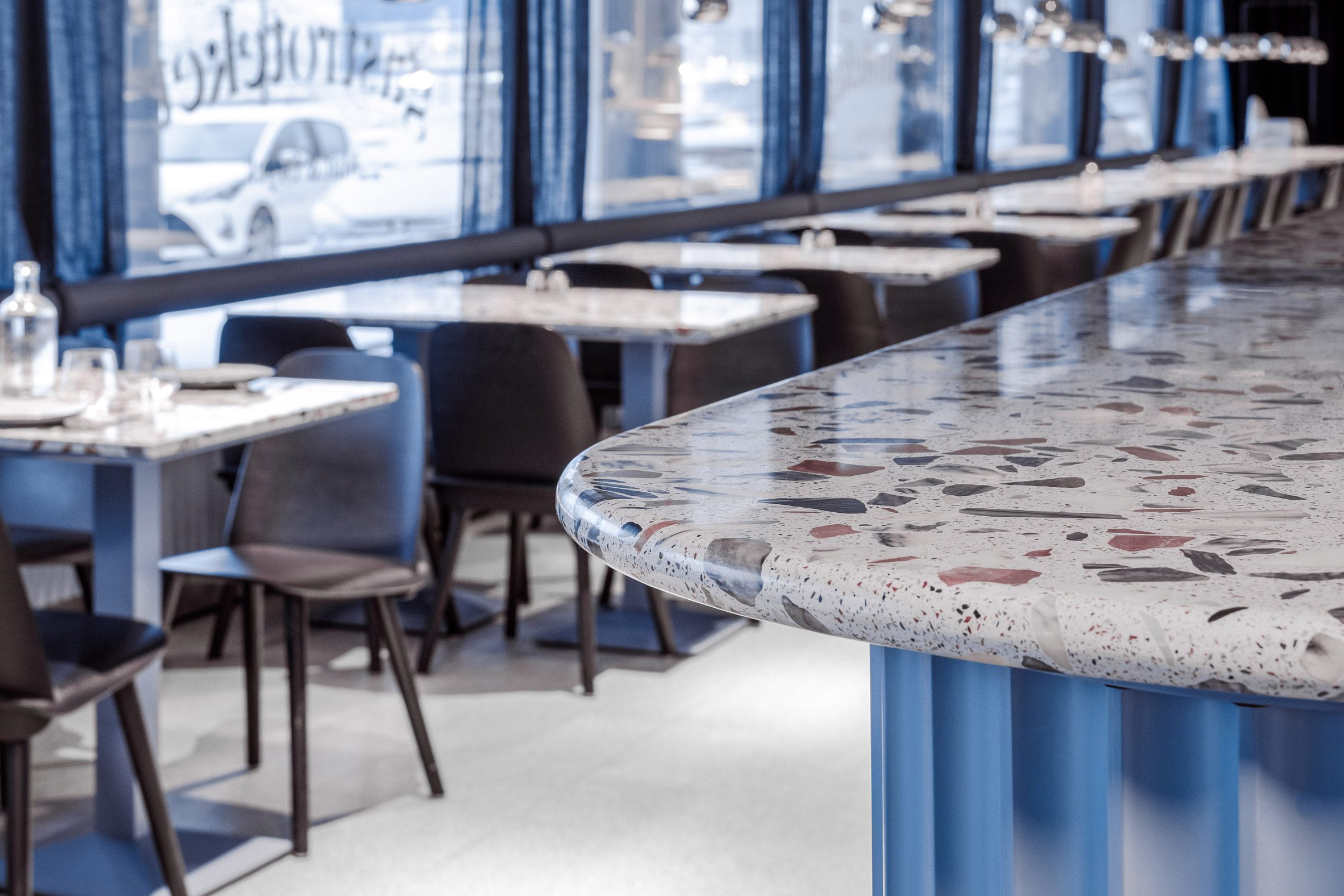
The studios used materials not usually associated with supermarkets for the interior, including lacquered wood, stainless steel and terrazzo, which was used for the tabletops in the restaurant section.
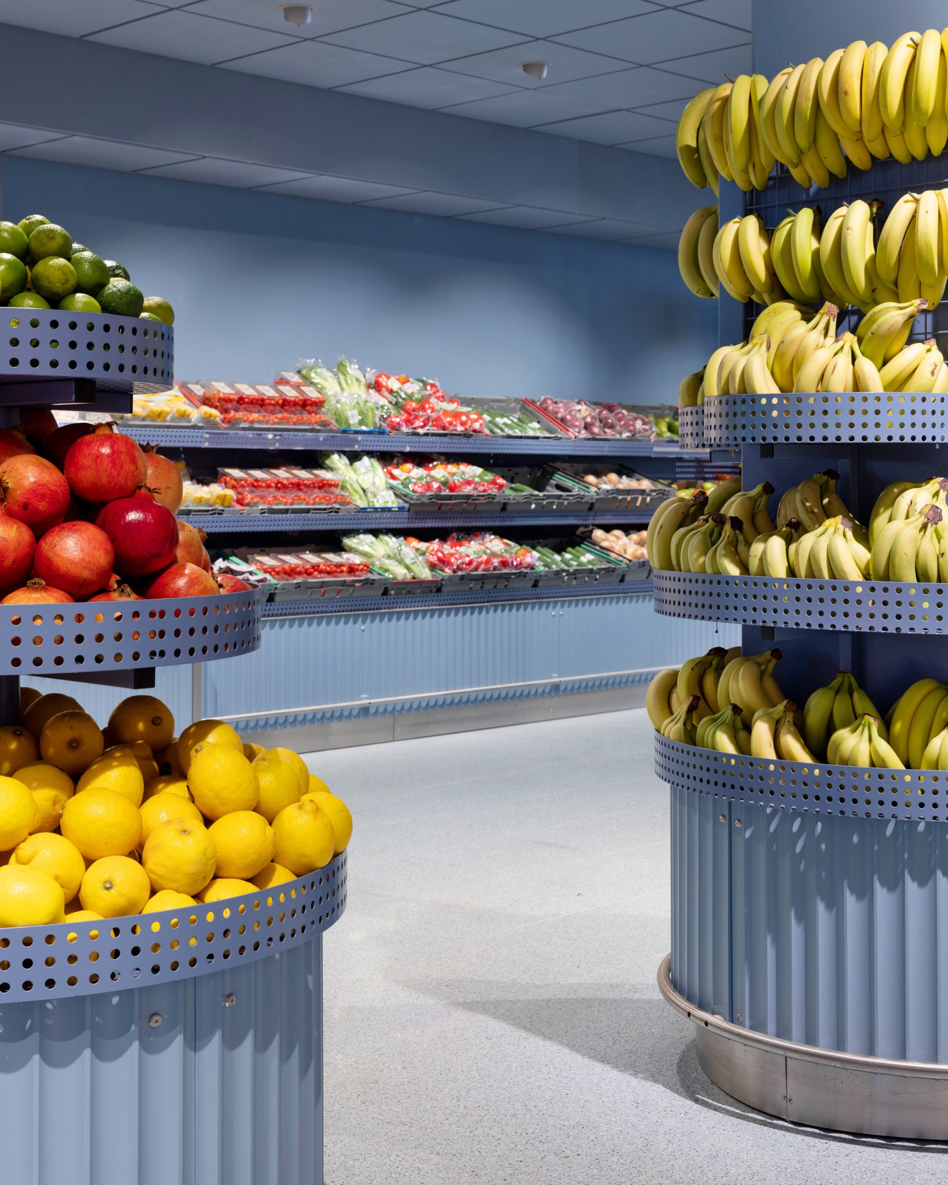
Counters were wrapped in thick medium-density fibreboard (MDF) and fortified with steel rods to protect them against “rogue shopping carts”, while the fruit and vegetable shelves were constructed from perforated lacquered metal.
“We made sure to blur the lines between a regular supermarket and the nirvana of a chef, turning shopping into an experience,” Öst said.
As the store remained open while it was being refurbished, the studios had to plan the change of the interior in different stages.
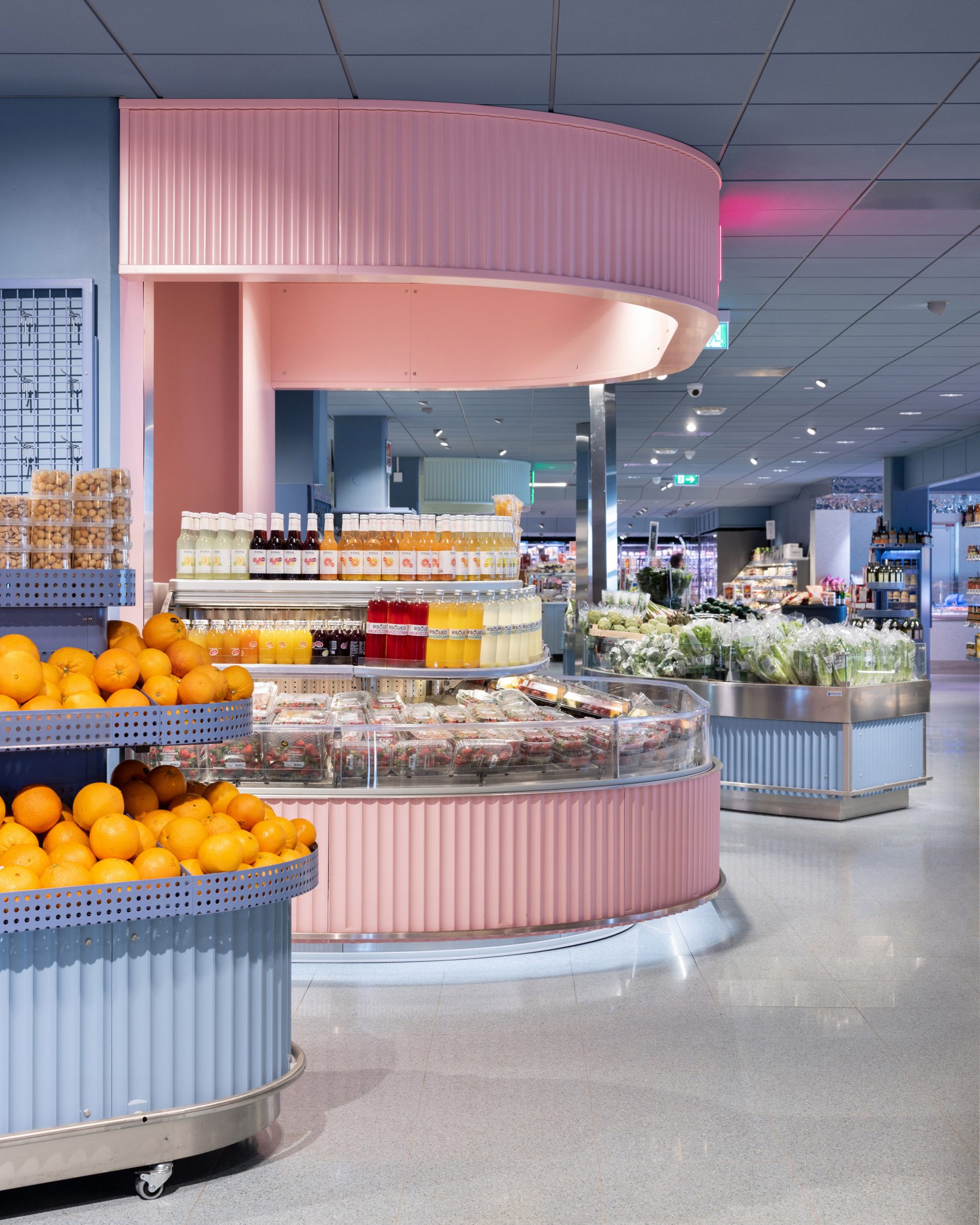
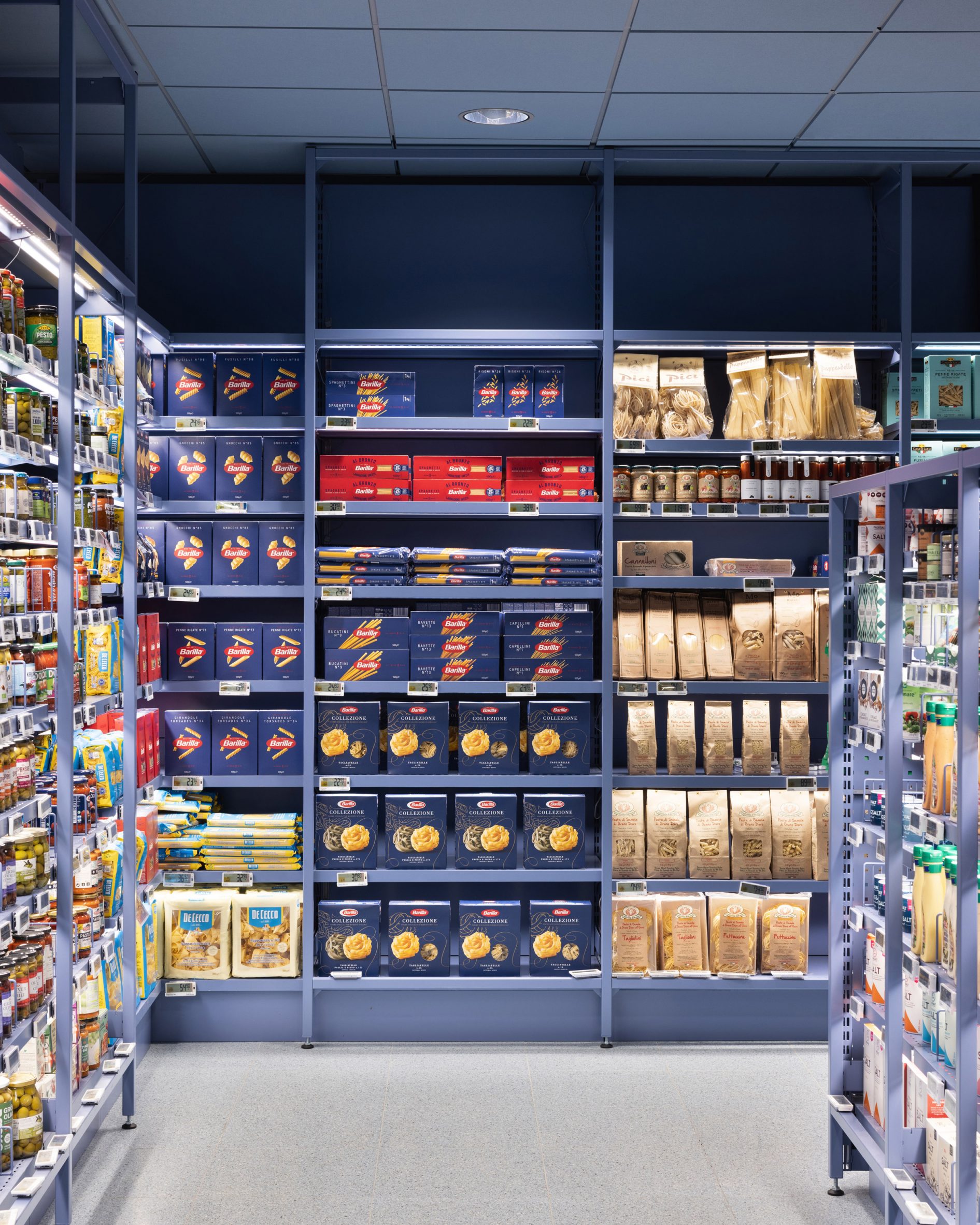
They chose to use pastel colours throughout the stores for the shelving and bars to keep the focus on the food itself.
“We fine-tuned the entire space against a new backdrop of soothing soft blue allowing for the fresh produce to become the leading actor with its rainbow hues,” Öst said.
“The stainless steel counters add a pop like a comic strip,” he added. “The market hall slithers like a friendly serpent, presenting an array of cheese, meats and cold cuts, guiding you through the culinary wonderland without disturbing the colours of food and packaging.”
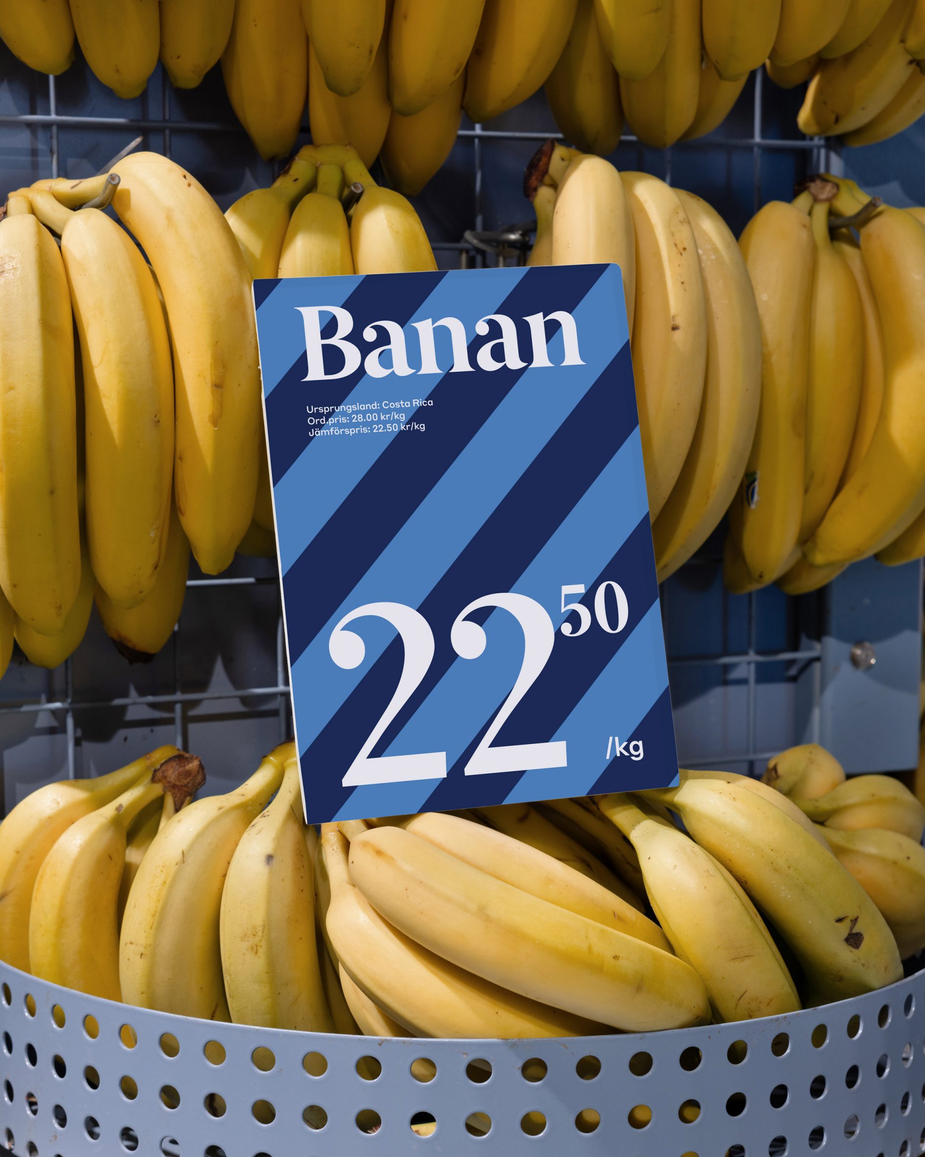
As well as the refreshed interior, Snask also worked on the branding for ICA Stop.
“The logo was redrawn and we also added the S symbol, making it a recognizable brand marker,” Öst explained.
“Per usual, we threw away the old ways of doing things and dialled up both colours, typography, design, architecture and fun.”
The unusual interior of the store, which is now open to customers, has divided opinions.
“Most customers adored the change, while others… not so much. But hey, that’s the result of flipping the supermarket game on its head,” Öst concluded, adding a quote by graphic designer Tibor Kalman: “When you create something no one hates, no one loves it either”.
Other creative grocery store designs include Wine and Egg in Los Angeles, which was designed to have a “European feel”, and the stripped-back and simple interior of supermarket Consum’s Benicàssim store.
The photography is by Mikael Lundblad och Jesper Westblom.
The post ICA Stop supermarket designed as a "culinary dream come true" appeared first on Dezeen.
www.dezeen.com

