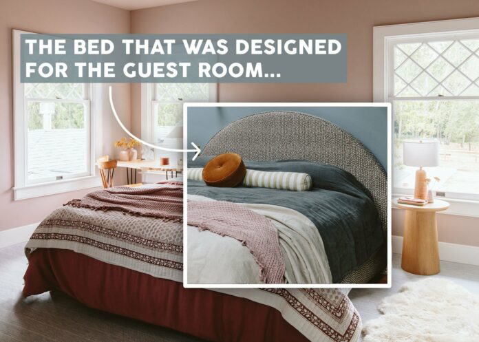

What feels like 8 months ago, we were about to shoot the house for Real Simple magazine, but I didn’t know which rooms so I kinda had to prep for all of them, including the guest room. This room (the guest) was the first room ready after we moved in, actually, with furniture that we owned already except for a bed. You see, while we did plan for the windows to be far enough apart to fit a king bed, it really only fits a king mattress – not the side rails and headboard (as you can see below). So we knew/figured we’d have to customize the bed there to make sure that it doesn’t go in front of the windows.

First, here is what the bed looks like without a headboard.

As you can see if we had an upholstered bed with side rails and took the headboard straight up, it would be in front of both windows. A big deal? Not really but certainly not ideal. Around the same time, we started working with a local upholstery team that could turn things around quickly (which is dangerous/tempting for me). So something custom was around the same price as the bed I had my eye on (without our special fabric which you’ll see). We drew it up, with the bed gradually coming into an arch, thus not obstructing the view of the window at all. GREAT.

This was the general idea.
The Inspiration…

Odele Platform Bed
Now this bed (above) is from Lulu and Georgia (and comes in a lot of different colors) and the shape of it served as the inspiration that I thought could work between the two windows. Originally, I was just going to order it but I put it off and the lead time was too long. But the shape (a simple arch) is what we were going for, just in a more fun pattern. (P.S. I don’t typically like to just take a piece of furniture and make my own, but I don’t feel weird about this because it’s just an arch – which nobody has propriety ownership over, LOL, and I didn’t even really do the piping details). But if you are in the market for a bed like this, just order from L&G – their pieces IMO are well-priced for very high quality (and a lot of options). The overall dimensions would be 75″W x 87″D x 58”H (for a king).
The Fabric…

Scattered Dot Fabric
I had ordered a bunch of fabric samples from Rebecca Atwood and fell in love with this one in the guest room. The pinks and blues and the small print felt so appropriate in that room.

See the vision?


The week before the shoot we found out that the bed we were waiting on for our bedroom was delayed. We had ordered this one from Crate & Barrel (Jake Arnold’s collection is incredible). So then we had to make the decision – do we put this bed, designed for a different room, in here for the shoot just to have something more editorial? And if so, do we then move it afterward to the guest room?
That was the plan – to shoot it here and then move it. But then Ivan and the Raleigh Hills Upholstery team came to install the bed and we realized it was A REAL THING. It is extremely heavy, well-made, and doesn’t just slip together. It took two guys an hour to put it together.

So come back Monday to see how we made the whole room work together. It’s still a room I have some hesitations with but I LOVE being in it so much that it’s hard to motivate myself to change it. Let’s just say IT’S A CHOICE and not a super farm-oriented choice.
*Pretty Photos by Kaitlin Green
The post How We Custom Made Our Guest Bed That Ended Up In Our Primary Room (And WHY???) appeared first on Emily Henderson.
stylebyemilyhenderson.com


