How To Be Besties With Bold Colour
Interiors

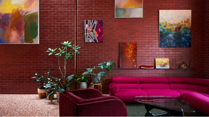
Grazia & Co Harvey Swivel Armchair. Jardan sofa upholstered in Instyle Feel fabric in Fabulous. Halcyon Lake rug. Art from right to left: ‘Chorus VI’ painting by Jordy Hewitt. ‘Pressure’ series painting by Mark Whalen. Painting by Jordy Hewitt. Fall painting by Ash Keating Studio. Multicoloured painting by Matthew Johnson. Woven baskets from Tjanpi Desert Weavers. Clap-sticks from Yarn Bark. Photo – Caitlin Mills for The Design Files. Editorial styling – Annie Portelli

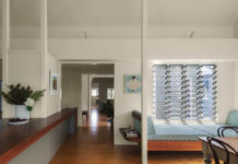
Rug by Halcyon Lake. Sofa by Jardan. Coffee table and yellow chair by SBW. Original drawings by Virginia Hodgkinson. Vintage French lamp from Angelucci 20th Century. Tretford peacock carpet from Gibbon Group. The leather wingback is a vintage ’60s family hand me down that’s been reupholstered. Vintage Featherston Contour Chair purchased Luther & Co. Photo – Martina Gemmola. Styling by Ruth Welsby.

Wall light by Mondoluce. Figurative paintings by Virginia Hodgkinson. Photo – Martina Gemmola. Styling by Ruth Welsby.
‘Mere colour can speak to the soul a thousand different ways’. This quote from Oscar Wilde perfectly sums up why we all have different reactions to colour, and why it’s one of the most personal elements of designing interiors.
Below you’ll find my tips for how to be brave with bold hues. I hope they give you a bit more confidence in experimenting with yummy colours that bring you joy!
Find your colour inspiration
The best way to choose colour is by starting with your wardrobe, because what you feel comfortable wearing is generally what you will feel comfortable living with. However, if you are a true Melbournian and partial to an all black uniform, never fear, there are plenty of other ways you can kick-start your colour journey!
History is such a good reference for colours, patterns and textures. Whether it’s Romanesque style or mid-century modern, there are elements to be inspired by from every era.
Likewise, look to your own history, be it trips overseas, an image of your gran in her yellow kitchen, or your favourite dessert — tap into these memories to pull out colours that hold a special place in your heart.
If all else fails, see what Mother Nature is up to — she knows how to combine colour with textures and patterns like no one else!
Be curious and look at the environments and colours you surround yourself with, and sooner or later you’ll land on the colour that resonates with you most.
Set the mood
Colour is such a powerful tool for evoking mood. It has the ability to completely change the experience and atmosphere of a space.
Understanding the psychological impact colours can have is a great starting point for determining the mood you want to set.
For instance, director of WOWOWA Monique Woodward’s home was described as a ‘warm nostalgic hug’. To achieve this feeling of joy and create a cocooning effect, Monique used a graduation of magenta hues.
Tone has a big role to play in creating a ‘mood’. If you like a colour but find it’s a bit too intense, use the Dulux Atlas to find variations of the hue to give you the perfect tint, tone or shade.
Play with colour combos
In order to understand which colours are friends, and which are foes, you’ll need to become besties with the colour wheel.
For example, if you’re leaning towards a warmer colour palette but the space is becoming a bit too ‘heaty’, throw in some cooler hues — like blue and green — to balance it out.
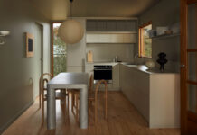
The ‘Modo Pento’ project by WOWOWA does this by combining an eye-catching teal carpet with pops of yellow in the kitchen, and also introducing warmth from the timbers and leathers alongside gold accents.
You can always balance out bold colours with neutrals or natural textures such as stone, rattan and timber. Muddy hues can also create the perfect backdrop for an intense bold colour to shine, yet balance out the overall scheme.
If you’re really stuck on where to start, simply look at what you already have around, like a favourite artwork, and see what combo you can create with that.
Before you invest, test
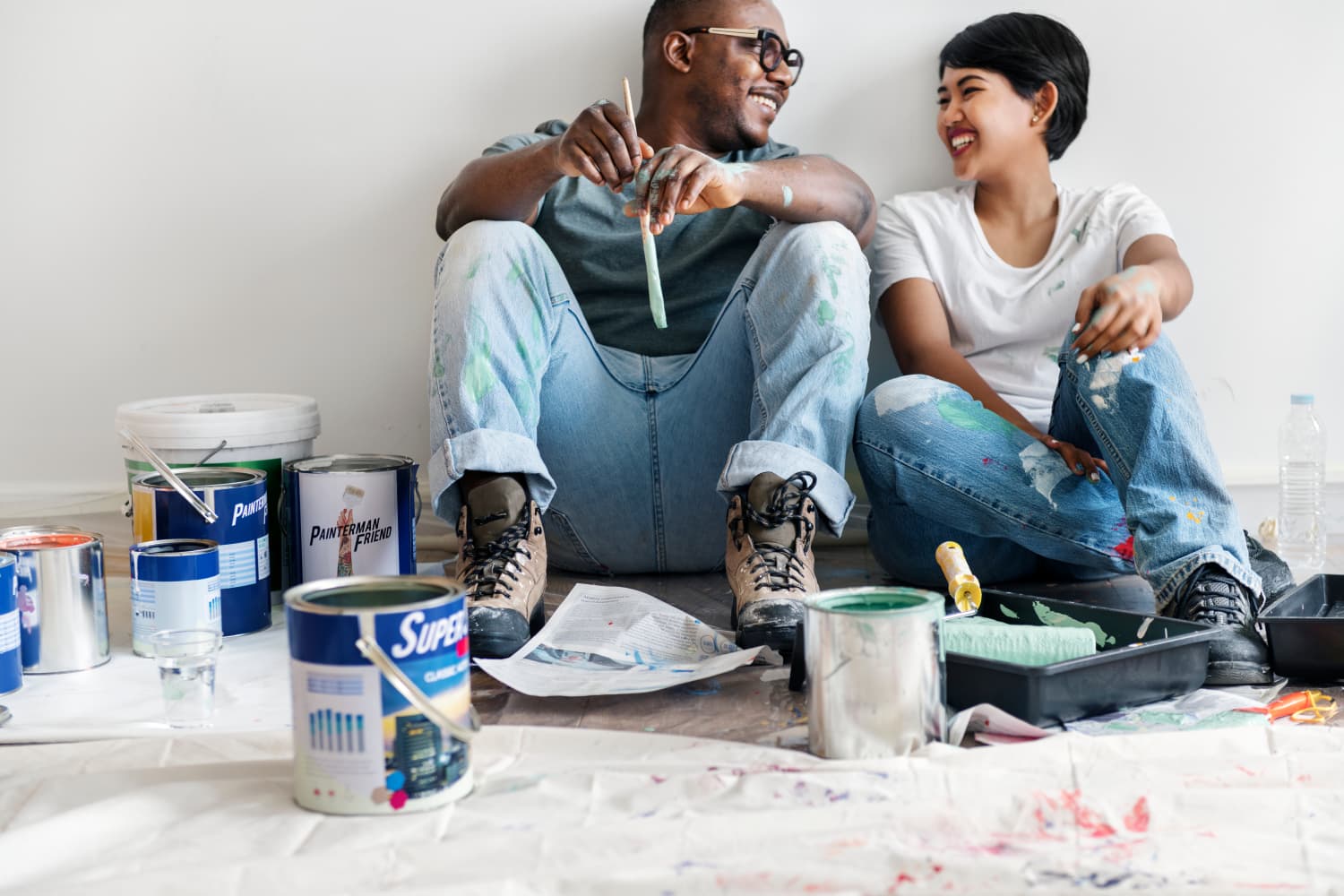
Dulux, and most other paint brands, supply A4 brush-outs for you to use. Make sure you test the brush-out in all lighting before committing — but remember, it’s not a lifelong relationship with paint, if it’s not working out, just repaint!
And, if you’re not ready to go the full hog, start small. Introduce pops of colour with furnishings, art and objects. Maybe splash out with a bold piece and see how you feel, find your style and stick with it.
If you’re beginning to feel lost, return back to where it started and remember the mood you wanted to create.
Finally — contrary to everything I just said, there are no rules. If it brings you joy — do it!
Additional credits for moodboard: Hum XI artwork, by Jordy Hewitt. Ceramic Green Sculpture by Stephanie Phillips from Pepite. Loop sculptural vase by Tessy M King from Craft Victoria. Otto cushion in Licorice by Trinket Solo.
thedesignfiles.wpenginepowered.com

