How This ’80s Melbourne Home Was Reimagined Through Bold Colours
Interiors


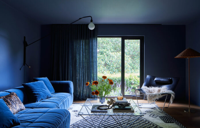
The sitting room ‘snug’ is enveloped in blue — from the moody walls to the Arflex Strips Sofa.

The room is designed specifically for unwinding and binge-watching TV.

The open-plan kitchen and dining area.

A Fior De Pesco marble island bench is paired with playful blue joinery.

Timber floors add an earthy feel to the bold palette.

Lauren sought to create a modern but refined feel for the house’s new spaces.

The hallway leads into the main bedroom.

A woven wallpaper helps make the room feel ‘quiet’ and calming.

The ensuite reveals jewel-toned burgundy tiles and brass accents.

Textural elements like rugs and linen curtains create a cosy atmosphere.
While Hamilton House features bold colours and eclectic accents, interior decorator Lauren Eagn says it was actually designed as a departure from the owners’ previous house, which was even more ‘maximalist’.
‘Lisa and Chip had come from a more heritage home with maximalist interiors, but they really wanted to simplify the interiors this time around,’ Lauren says.
Their new house was a brown brick 1980s Berwick home nestled between a gorgeous mature garden and a local nature reserve, but they wanted to ‘put their own mark on the interiors’ and engaged The Little Brick Studio for an extension.
‘My brief was to work on the interiors for these new spaces. Specifically, the primary suite, gallery entrance, snug lounge, kitchen, and dining,’ Lauren says.
‘I always set out to have some major themes in a home which helps the direction of the project. For Hamilton House, it was cohesion, colour and curated (the alliteration was a bonus).’
The concept of cohesion spoke to linking the existing and new parts of the home and bringing a thread of materiality throughout; curated referred to refining the more modern and ‘loose’ styling elements; and Lisa gave Lauren the freedom to really ‘go for it’ when it came to playing with refreshingly bold colours.
‘She wanted a kitchen that really felt like her, and had thoughts for blue and brass elements. That acted as a great starting point and a springboard for some of the other spaces,’ Lauren explains.
The kitchen is anchored by an elegant Fior De Pesco marble island bench and splashback, contrasted with contemporary gold accents in lighting and rangehood. Blue became a central colour for the entire renovation, with the playful tones of the joinery are echoed in the dining chairs, art pieces — and again in the sapphire-coloured sitting room with a velvet Arflex Strips Sofa at the centre.
‘The purpose of that room was to really bunker down of an evening and enjoy binging TV, so a deep earthy blue was perfect,’ Lauren says.
Other spaces showcase warmer colours, with straw wallpaper and burgundy accents creating a serene affect in the main bedroom that Lauren describes as switching over to ‘sleep-mode’.
Each of the spaces has its own unique identity, immediately communicating what they’re about. ‘In the kitchen it’s generous, fun and ready to be filled with friends and family. The snug is perfect for relaxing the end of the day, and the bedroom is full of gorgeous layers that are so calm and gentle,’ Lauren adds.
Want to see more from The Design Files? Sign up to our newsletter for your weekly dose of home and design inspiration here!
thedesignfiles.wpenginepowered.com


