How A Cleverly Converted Garage Transformed This Adelaide Family Home
Architecture

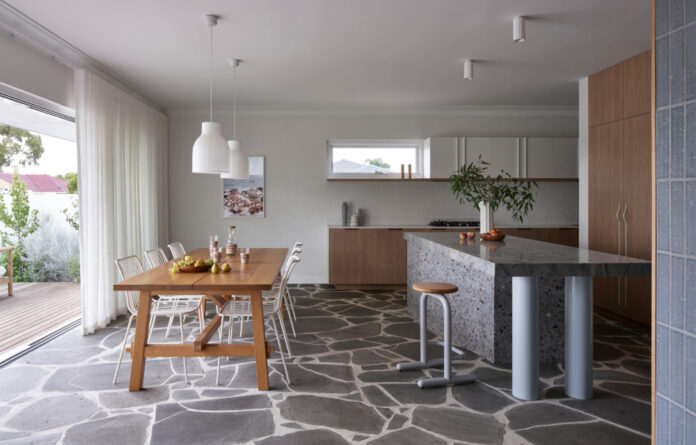
Heywood Ranch is a renovation by Adelaide architectural and design firm Das Studio. IKEA Dining Table. Pedrali chairs. Muuto pendant lights. Eccola carafe and glasses on dining table. Beacon Lighting surface mounted downlights.

A deck links the front yard to the new dining space.

The former garage has been transformed. Eco Outdoor Bluestone Crazy Paving flooring. Dowel Jones barstool. Alessi kettle on cooktop.

Polytec Boston Oak Timber joinery and shelf, Made Measure handles. Laminex White Linen cupboards, Linear Standard handles. CDK Mirage Lake Quartzite on island benchtop. Fibonacci The Graduate Slab terrazzo. HK Living vase. Freedom bowl.

Italia Ceramics tiles on fireplace. Jetmaster double-sided fireplace.

The kitchen has been especially designed to hide mess.

Ferm Living wallpaper. Polytec Boston Oak Timber joinery and shelf, Linear Standard handles. Artwork by Billie Justice Thompson. J Series J77 Chair from HAY.

Easycraft Easy VJ wall lining, painted Dulux Spirit. CDK Mirage Lake Quartzite splashback. Artemide wall light. Abi Interiors tapware and basin. Cibo Design mirror cabinet.
Believe it or not, the idea behind this renovation began with a ‘drunken sketch’.
Das Studio architect and creative director Sara Horstmann was having dinner at her sister Rachel’s place a few years ago, when the conversation turned to the possibility of renovating their West Beach home.
She pitched Rachel and her husband Brett a slightly unconventional idea: to convert their expansive double-garage into an open-plan living area that could unlock the extra space the family of five had been dreaming of.
Being a corner block, the property already had alternative parking spaces in a large carport tucked off the side street. Plus, the garage received the best winter sun of all rooms in the home, ‘so adapting it to take advantage of this was a clear solution from the outset’, Sara says.
‘A week later, the government announced the Covid HomeBuilder Grant,’ she adss. ‘Rach rang me to say, “We can’t stop thinking about the sketch, and the government is offering people money to build now so how about we actually do this?”’
The more formal brief asked for a fourth bedroom, a buffer between the bedrooms and living areas, an extra bathroom, and an improved kitchen — all of which was unlocked by knocking out a wall between the garage and living room to create a 60-square-metre addition. The old garage door was replaced with glass sliders that open to a walled deck area, connected to the expansive front yard where the kids often play outside.
Rather than covering over the garage’s existing, yellow-coloured brick walls, they opted to bag the brickwork in a crisp white tone, embracing this textural backdrop in the new interiors.
‘When Brett and Rach purchased the home, much of its original modernist charm had been covered over or removed, but one of the few features that remained was the delightful bluestone crazy paved front porch, so we leaned into this as our starting point,’ Sara says.
In addition to the new bluestone flooring, the kitchen showcases an island wrapped in Fibonacci terrazzo slabs topped with a beautiful Mirage Lake Quartzite bench. ‘We loved its colour and movement, similar to a stormy ocean swell,’ Sara adds.
They took a high-low approach to the remaining finishes; using cost-effective melamine for the kitchen cabinet fronts; scrapping some initial plans for joinery and turning to IKEA and Facebook Marketplace to fit out the new bedroom. In the end, the construction budget came in at $250,000.
Sara says the ‘relatively straight-forward’ renovation has completely transformed the family home. ‘I love that we were able to utilise our design skills to make their lives better, and to see the beautiful outcome of that every time we visit them — which is often, because they paid for our design services with love and home cooked meals!’
thedesignfiles.wpenginepowered.com


