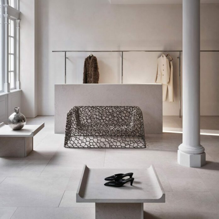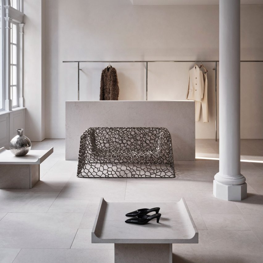
Stockholm studio Halleroed has designed fashion brand Totême’s flagship store in London, which features a sculpture by artist Carl Milles and a steel sofa by designer Marc Newson.
Halleroed designed the store, located on Mount Street in the upmarket Mayfair area, together with Totême founders Elin Kling and Karl Lindman. The duo wanted its third flagship to feature nods to the brand’s heritage.
“We like the idea of keeping certain elements that we find in our Swedish heritage,” Lindman told Dezeen at the store’s launch event.
“It can be by using certain vintage pieces, or like in [the brand’s Mercer Street store] in New York, we had a collaboration with Svenskt Tenn,” he added. “It’s about lifting this notion of Scandinavian design or Swedish design.”
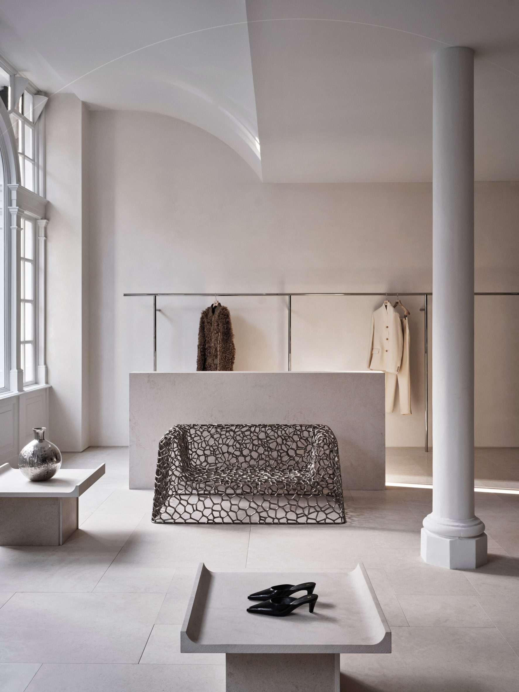
Halleroed drew on the space itself when designing the interior, focussing on how the light falls.
“We were inspired by the space itself with beautiful original windows letting the daylight in,” Halleored co-founder Ruxandra Halleroed told Dezeen.
“The upper part of the windows was partly hidden, which was a shame, so we redesigned the ceiling with a half vault towards the front to show the full height of the windows.”
The design also references the work of Italian architect Carlo Scarpa as well as the Swedish Grace movement.
“We were also inspired by the Swedish Grace period – around 1920-30s – that has an elegant and pure design, something we think works well for Totême as a brand,” Halleroed co-founder Christian Halleroed told Dezeen.
“Also the work of Carlo Scarpa we find interesting, more as a mindset on how to work with details and textures to create a subtle elegance and luxury.”
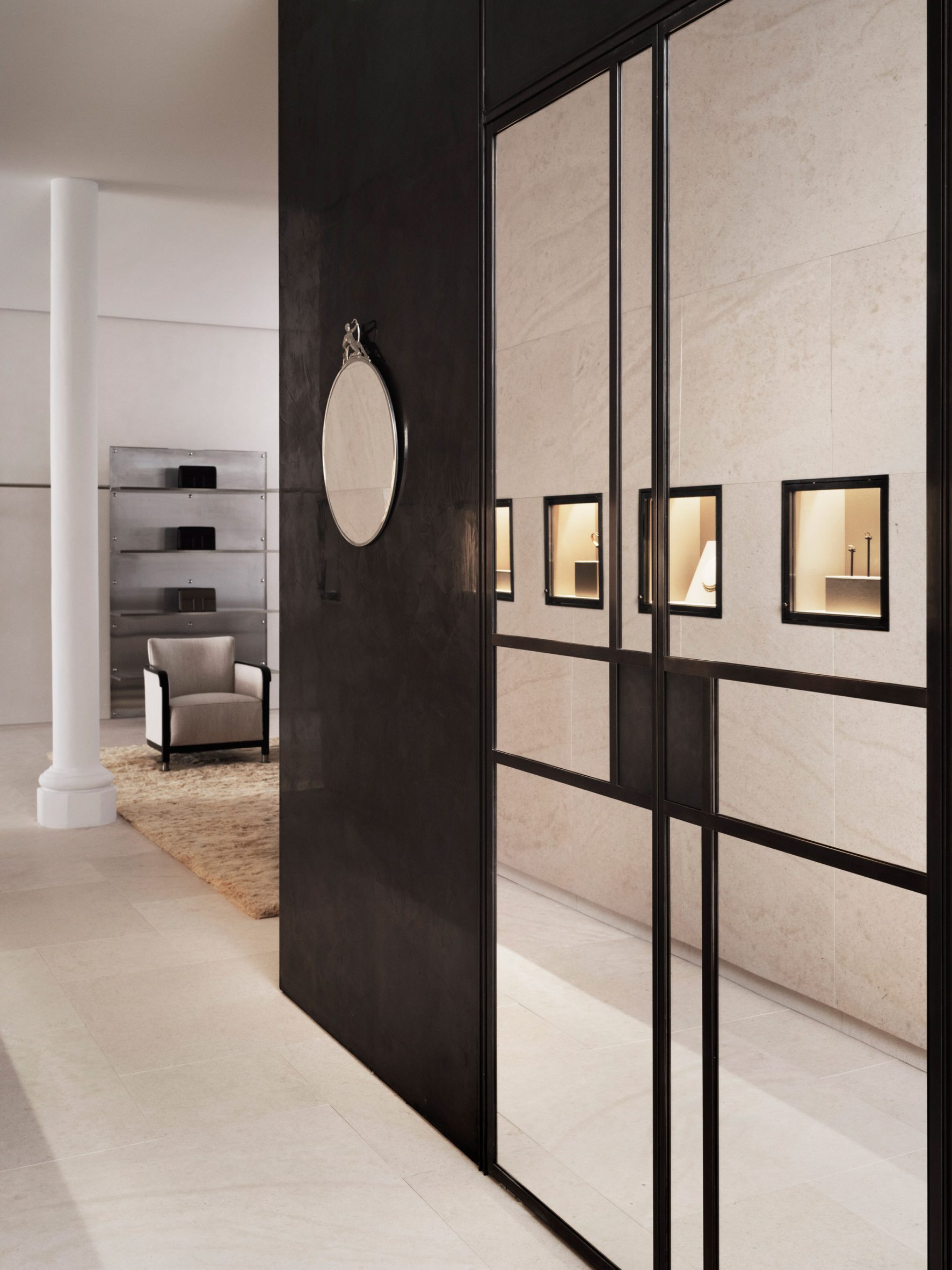
Kling and Lindman wanted to keep the feel of “very posh” Mount Street where the store is located, while also underlining the space’s minimalist feel.
To do so, a lot of effort was put into the colour palette and different textured materials used for the flagship store.
“We worked with an off-white palette in different tones and different textures,” Ruxandra Halleroed said.
“The textures are as important as colour and materials. For walls, we have a glossy, off-white stucco, ceiling in same colour but matte. The floor is in a beige, honed limestone with a so-called Opus pattern.”
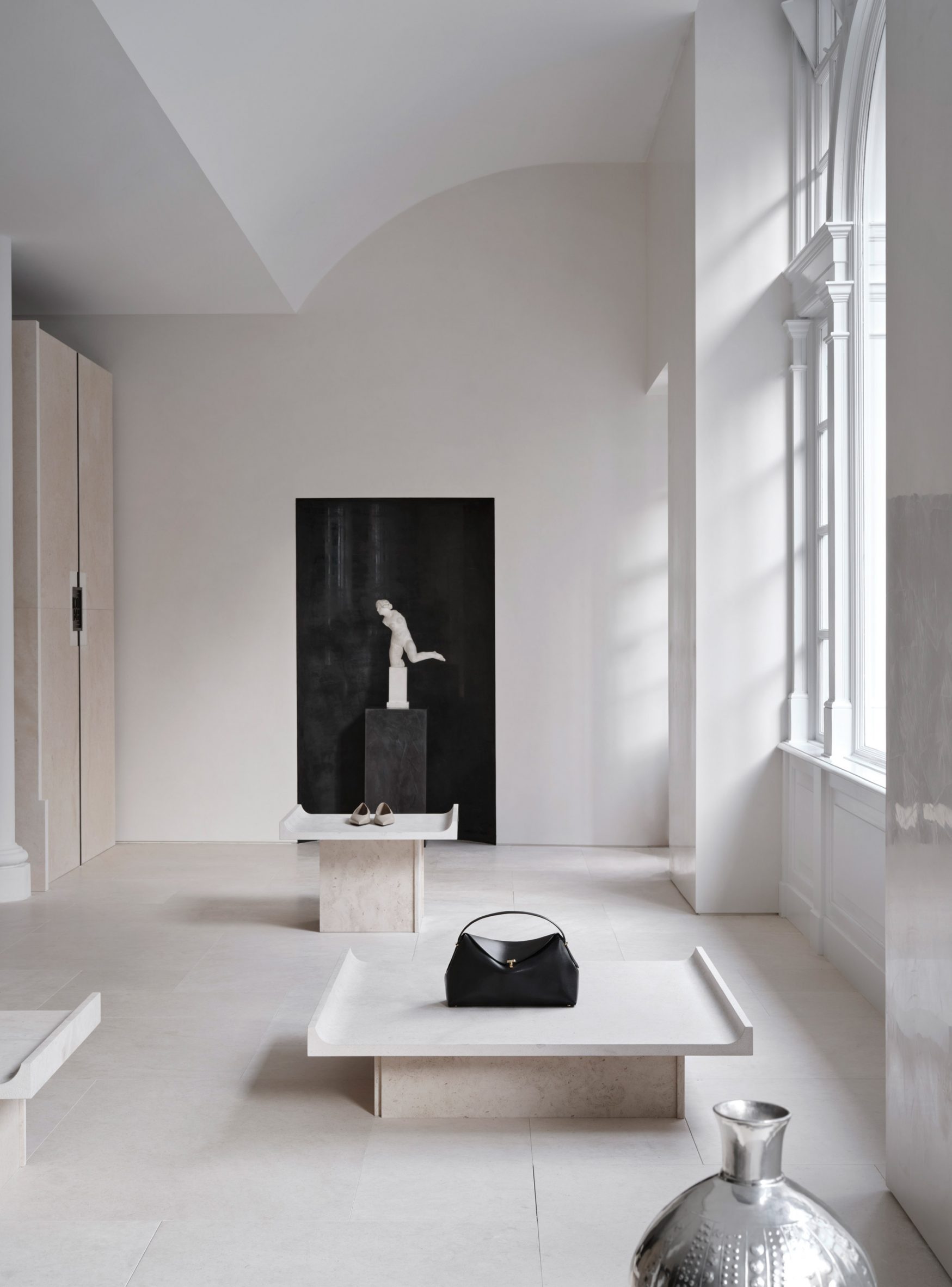
In the middle of the Totême shop, Halleroed created a stone-clad cube that holds shelves, vitrines and niches filled with artworks.
“The volume in the middle is clad with the same limestone, but in three different textures: honed, bush hammered and spiked texture, combined with oxidised dark brass,” Christian Halleroed said.
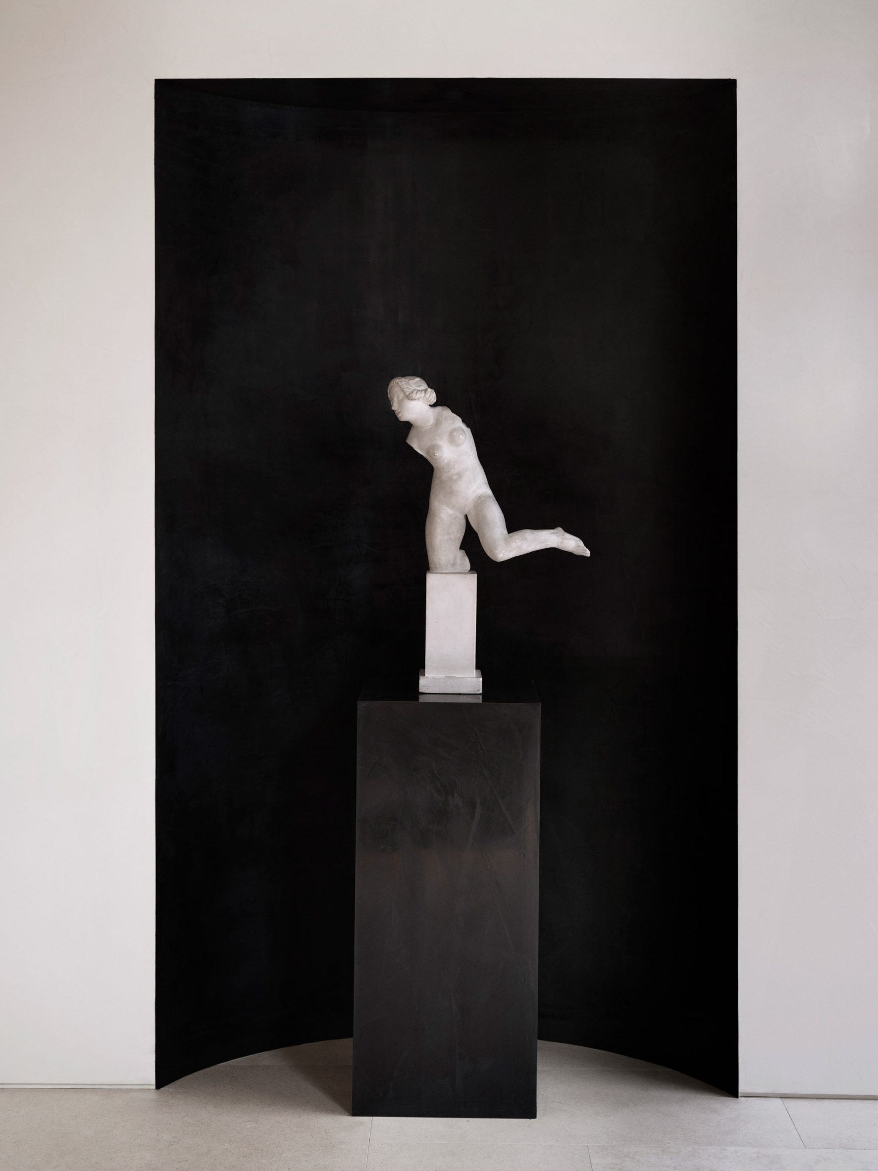
The store also features a square black volume in the back made from high-gloss stucco and dark brass.
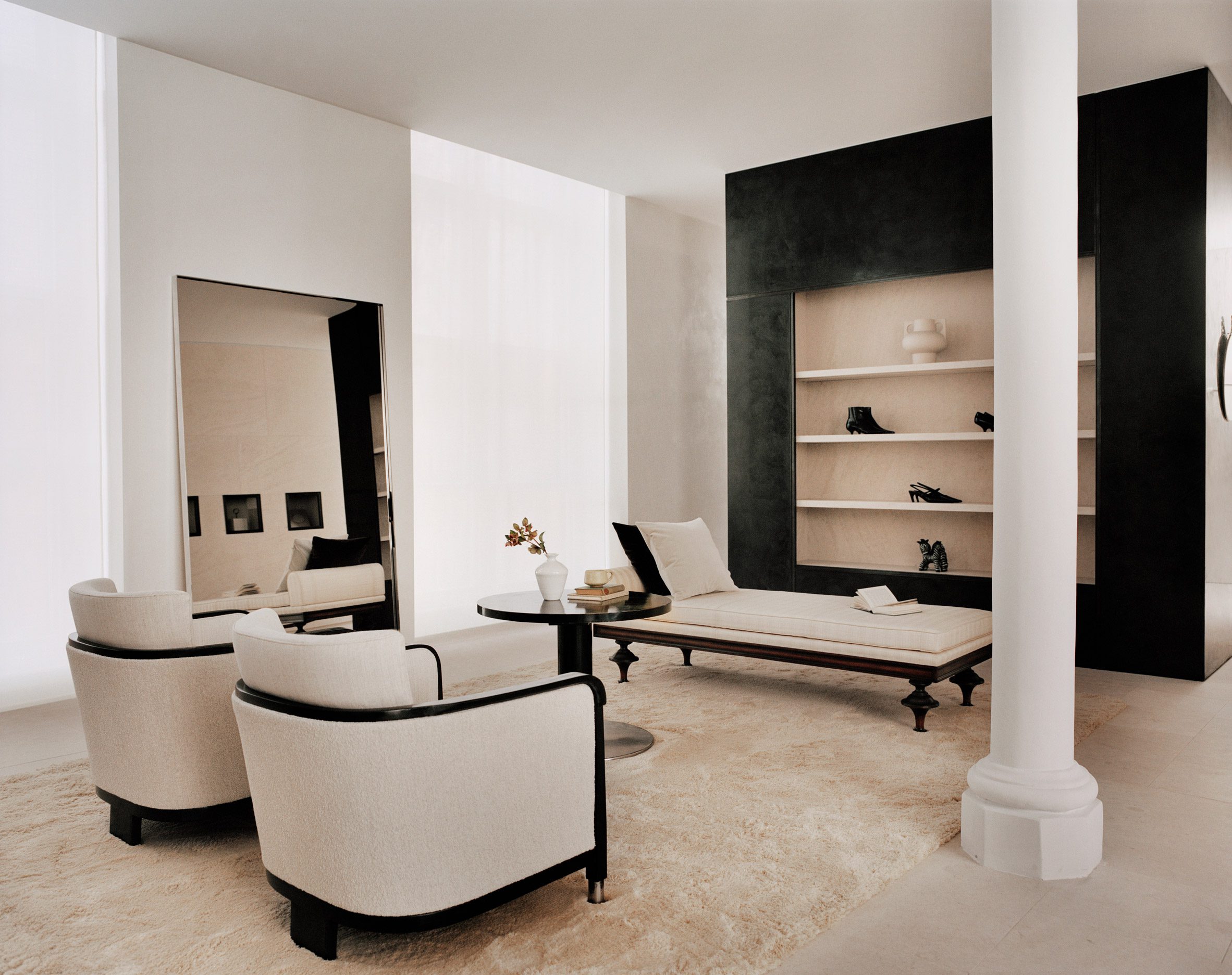
To contrast the minimalist interior, the store is decorated with multiple artworks, including a sculpture by Milles and Newson’s intricately woven steel Random Pak Twin sofa, which Lindman found online.
“He’s a slave to auction houses,” Kling told Dezeen.
“So he found it and sent it to me and I loved it, and we also have a Marc Newsom piece in every store,” she added. “So we thought, ‘this one’s for the Mount Street store’. At that time we only had the signed contract, nothing else.”
The two founders and Halleroed decided on the gypsum Milles sculpture for the Totême store together, with Halleroed designing a custom niche to place it in that is made from black high-gloss stucco to contrast the pale artwork.
Halleroed also added vintage Swedish Grace furniture to the store, including armchairs and a coffee table by furniture designer Otto Schulz, a daybed and a mirror in pewter made for the Stockholm Exhibition 1930.
The studio has designed a number of other store interiors, including a Paris boutique for French brand L/Uniform and an Acne Studios store in Chengdu that aimed to combine the futuristic and primitive.
The post Halleroed references Swedish Grace and Carlo Scarpa for Totême flagship store appeared first on Dezeen.
www.dezeen.com

