[ad_1]
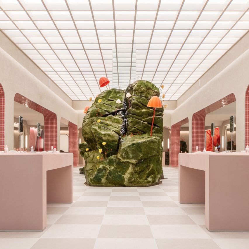
Online beauty brand Glossier has opened a physical store in Seattle where pale-pink furniture surrounds a sculpture sprouting artificial mushrooms.
The design of the recently opened Seattle store was based on a 2019 pop-up in the city, which was situated just four blocks away.
Located in the Capitol Hill neighbourhood and designed by Glossier’s in-house team, the 6,200-square-foot (576-square-metre) retail space is four times larger than the pop-up and marks the brand’s largest physical store to date.
“As a digital-first company, Glossier has had the freedom to be experimental with retail in a way that beauty companies so closely tied to brick and mortar haven’t,” said the brand.
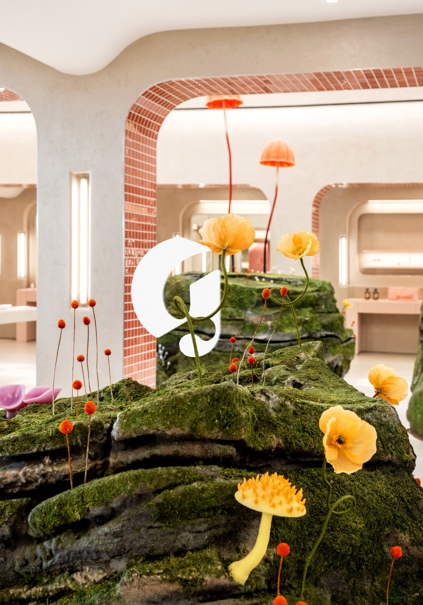
A large sculpture at the centre of the space is designed to look like a boulder covered in moss and colourful mushrooms, influenced by the flora of the Pacific Northwest region.
This is based on a landscape installation created by designer Lily Kwong for the pop-up, which also featured plant-covered mounds and pink-purple blooms.
“Fungi have an astonishing ability to grow and thrive in the most unlikely places and we wanted to bring that phenomenon to life in our design concept,” said the design team.
“Moss-covered rocks pierce through the store’s foundation and gigantic, Willy Wonka-esque mushrooms sprout through the sleek, minimal architecture.”
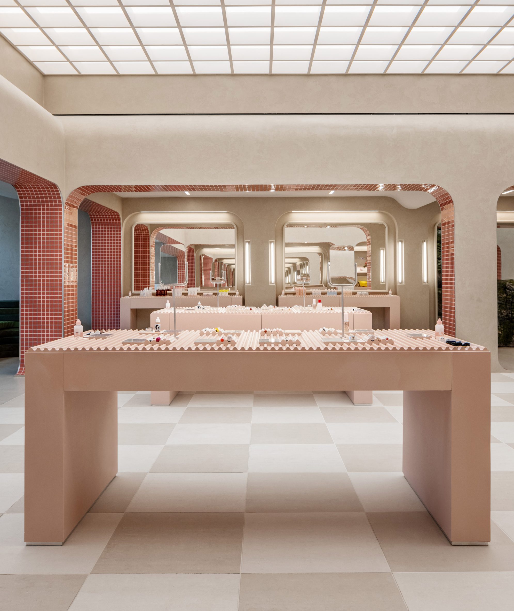
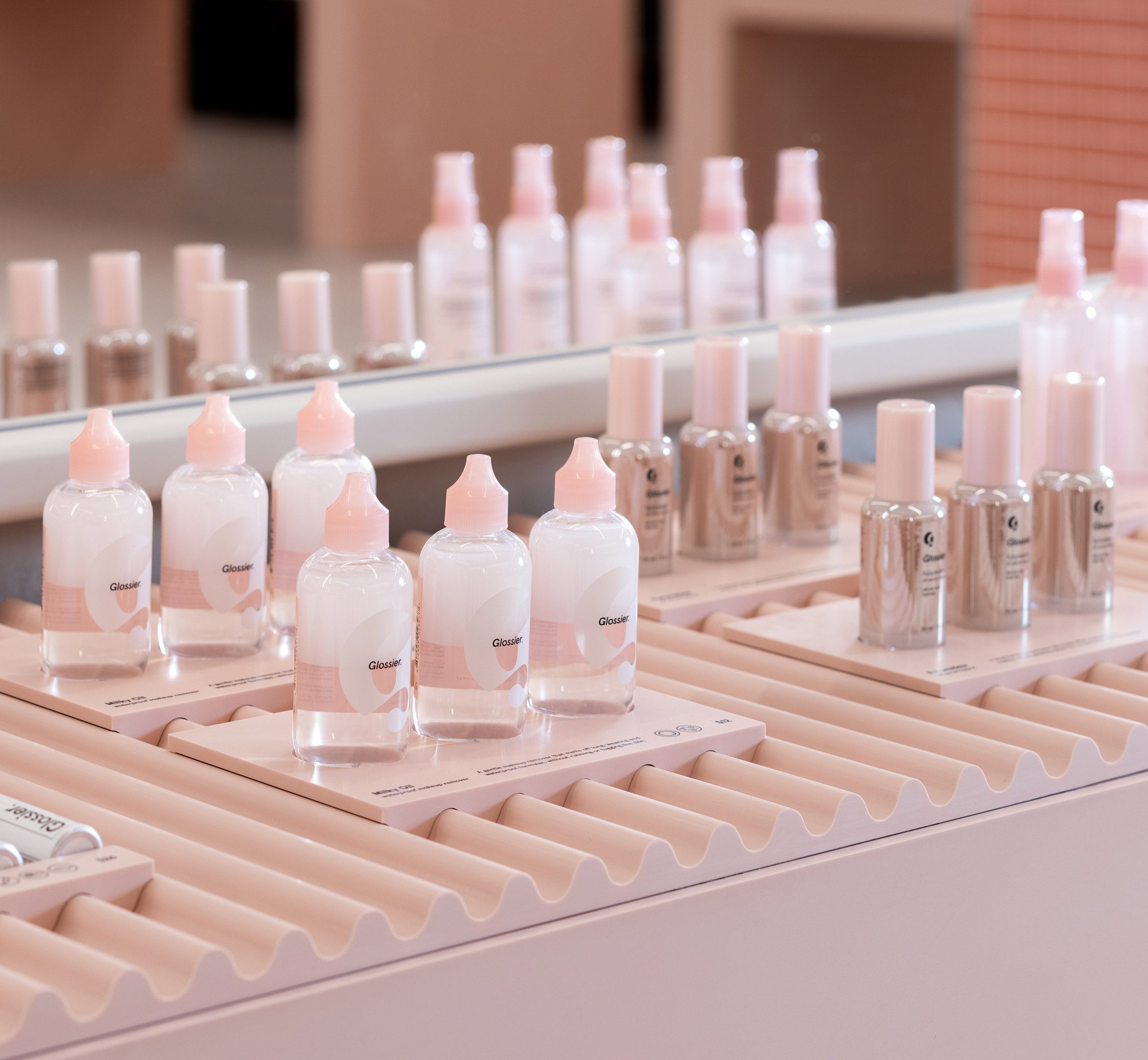
Surrounding the sculpture are pale-pink counters that display Glossier products on rippled surfaces.
Archways with filleted corners and pink-tiled sides divide the central area from the periphery, where more merchandise is placed beside mirrors for testing.
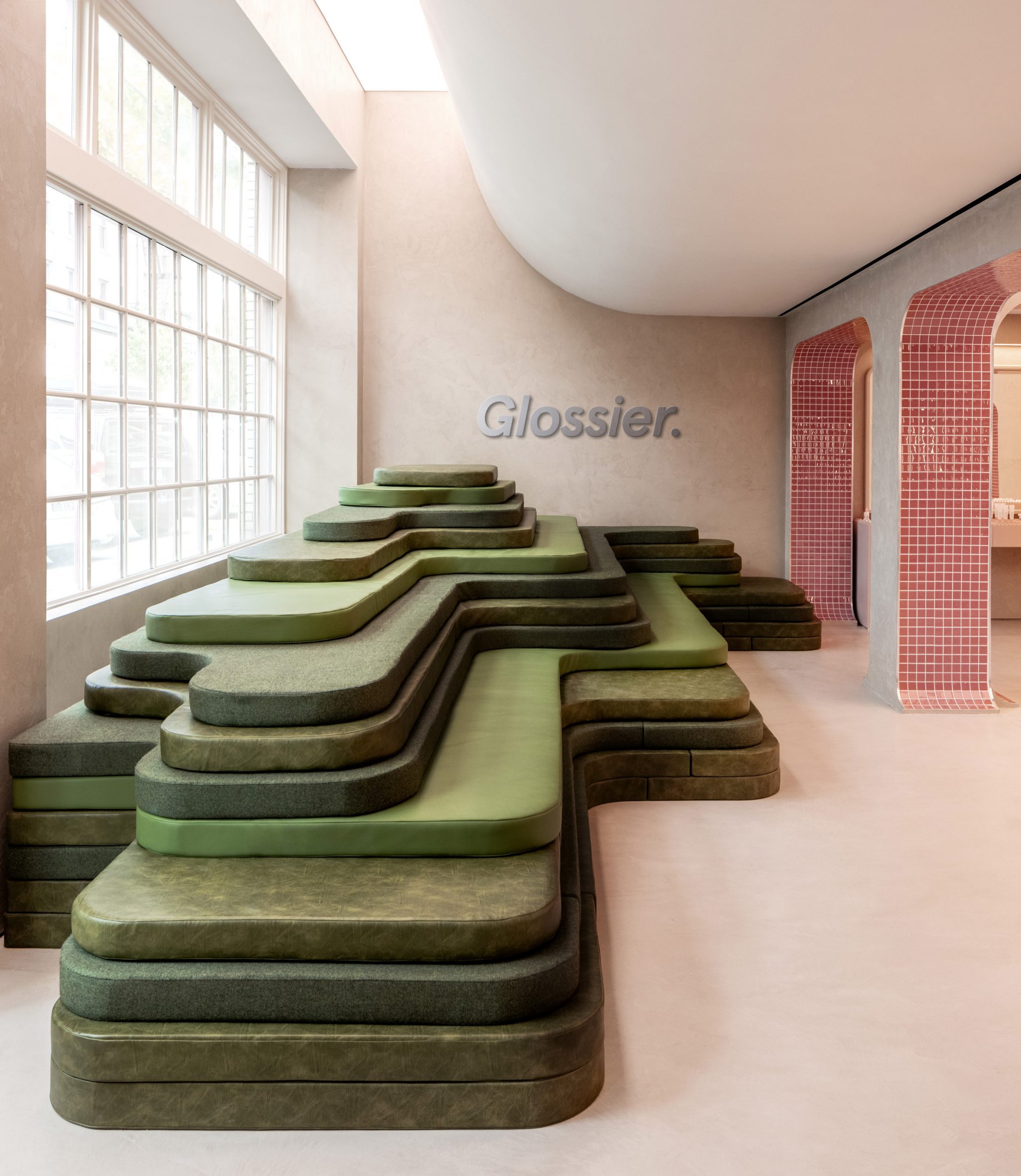
Beside the storefront’s large windows, the form of a terraced hill is evoked by a stack of flat thin cushions upholstered in various green textiles and leathers.
Walls around the store are finished in a light-toned textured plaster, while a checkerboard of beige and dusty-pink tiles covers the floor.
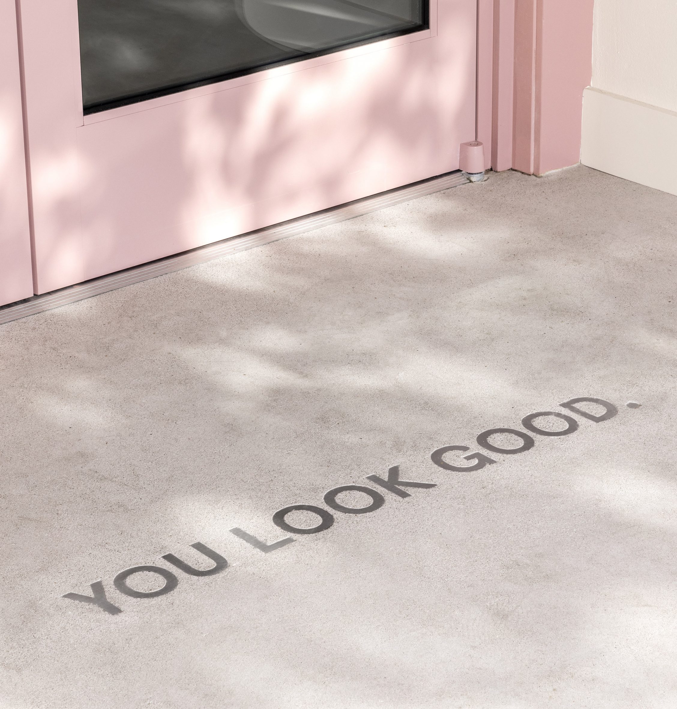
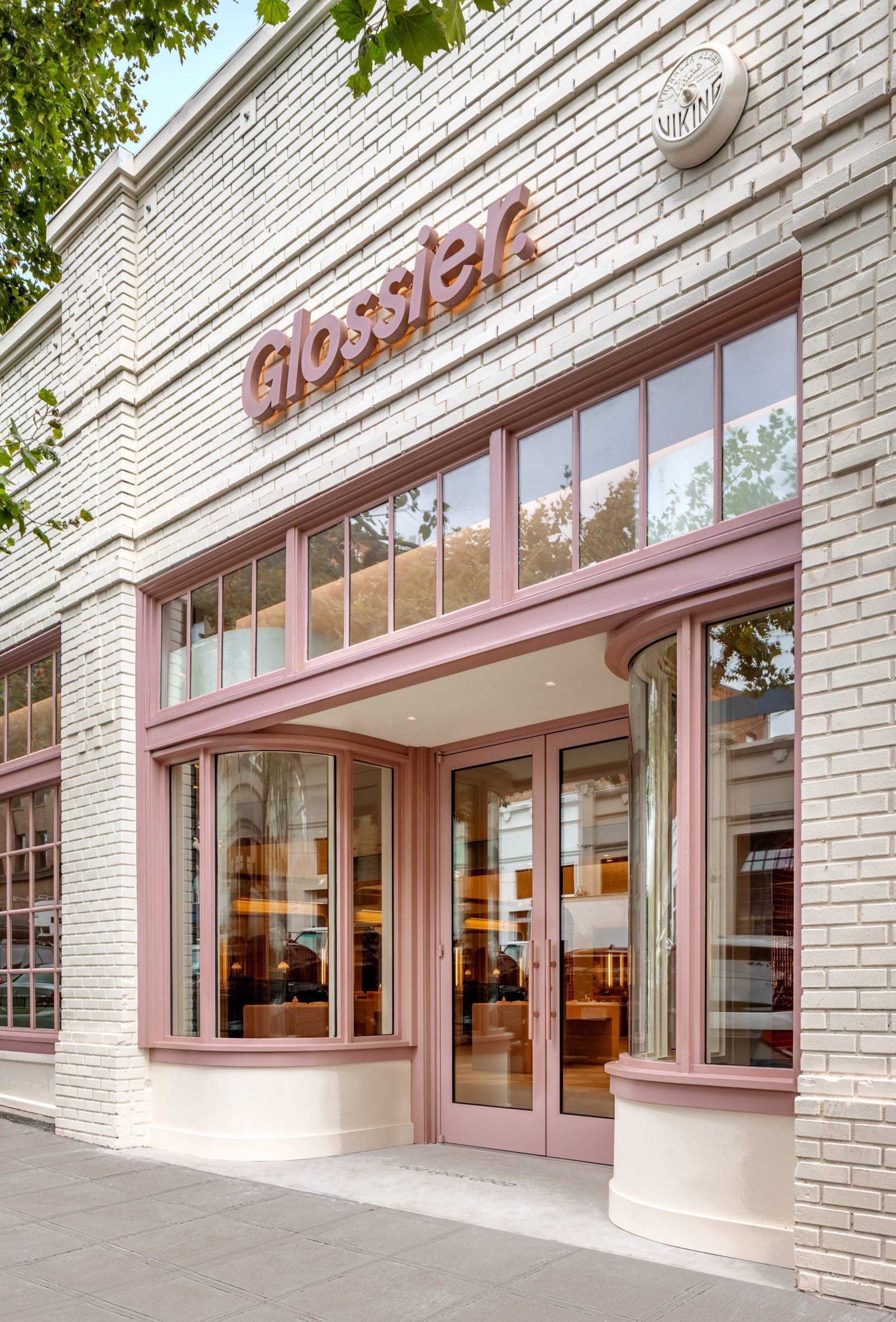
On the exterior, doors and window trims are painted a dark blush hue to match the Glossier logo and contrast the building’s cream brickwork.
Glossier was founded in 2012 as an online beauty brand, but since opened several physical retail experiences – although all were closed last year due to safety concerns surrounding the Covid-19 pandemic.
They included a flagship store with soft-pink plasterwork and a Boy Brow Room in New York, where the company’s Rafael de Cárdenas-designed HQ is also located.
The Seattle store at 1514 10th Avenue marks the brand’s return to physical retail, with outposts in Los Angeles and London both expected to open before the end of 2021.
The post Glossier Seattle store features mossy mushroom-covered mound appeared first on Dezeen.
[ad_2]
www.dezeen.com


