[ad_1]
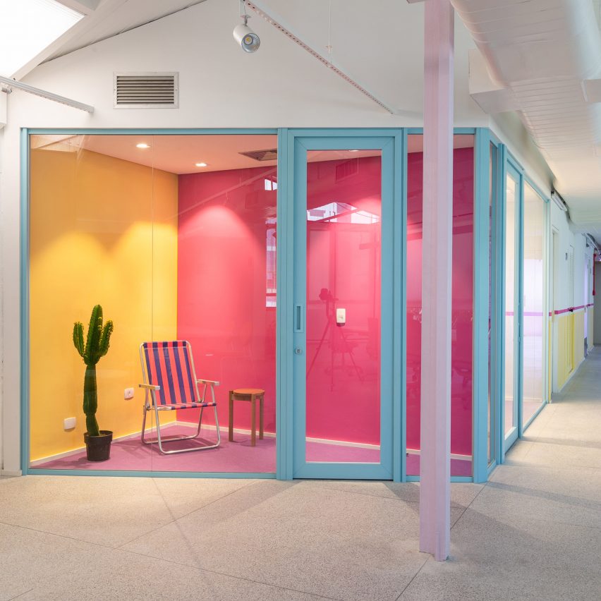
Shades of pink, purple and yellow run through the workspaces that Brazilian studio Gema Arquitetura has designed for skincare brand Sallve in São Paulo.
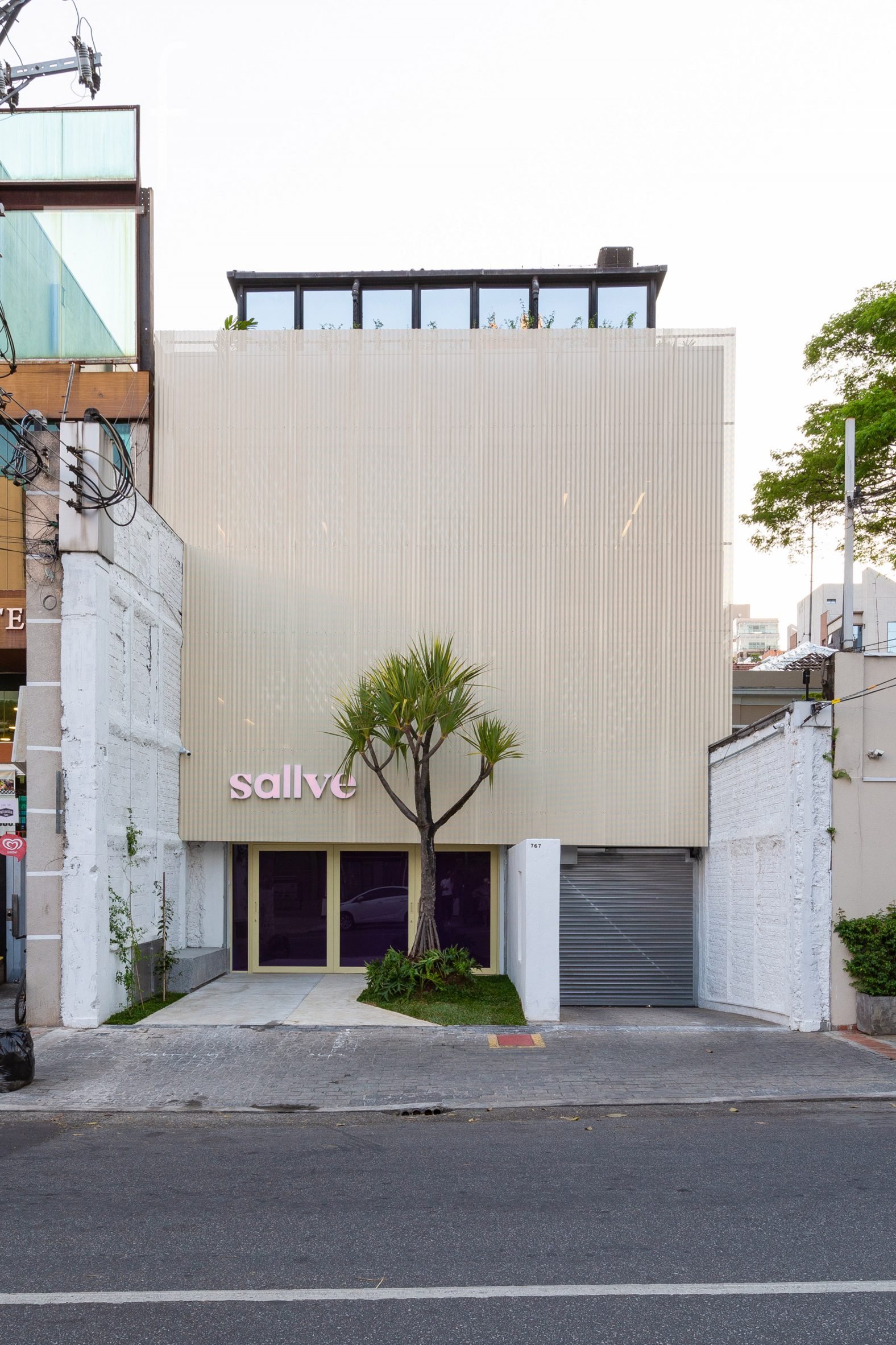
Sallve’s offices, studios and labs sit above the company’s inaugural retail space in an existing five-storey building in the city’s Pinheiros neighbourhood.
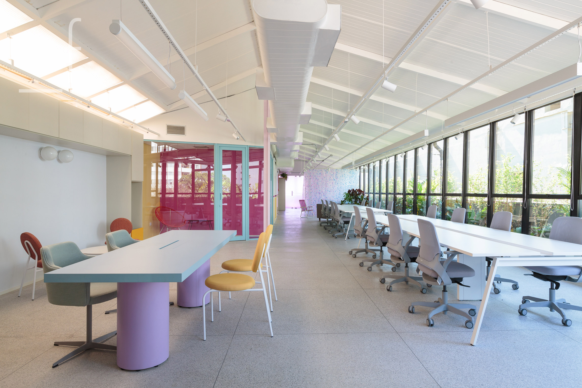
The studio transformed 1,500 square metres of space, spread across an elongated floor plan that allowed for a flow to be created between the different levels.
“Focal points organise and direct the user’s trajectory, in a path that welcomes from the street and leads along the floors,” said Gema Arquitectura, which has offices in São Paulo and Belo Horizonte.
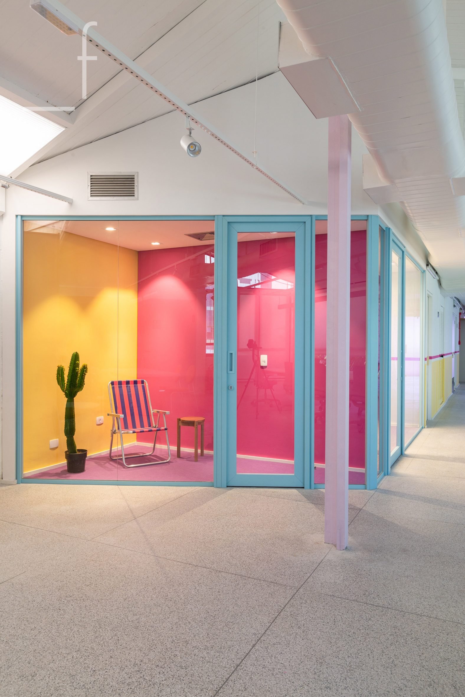
These focal points include splashes of bright colour on walls, floors and furniture, immediately visible when entering the building.
The chosen hues echo those used across Sallve’s product packaging and visual identity to align the space closely with the brand.
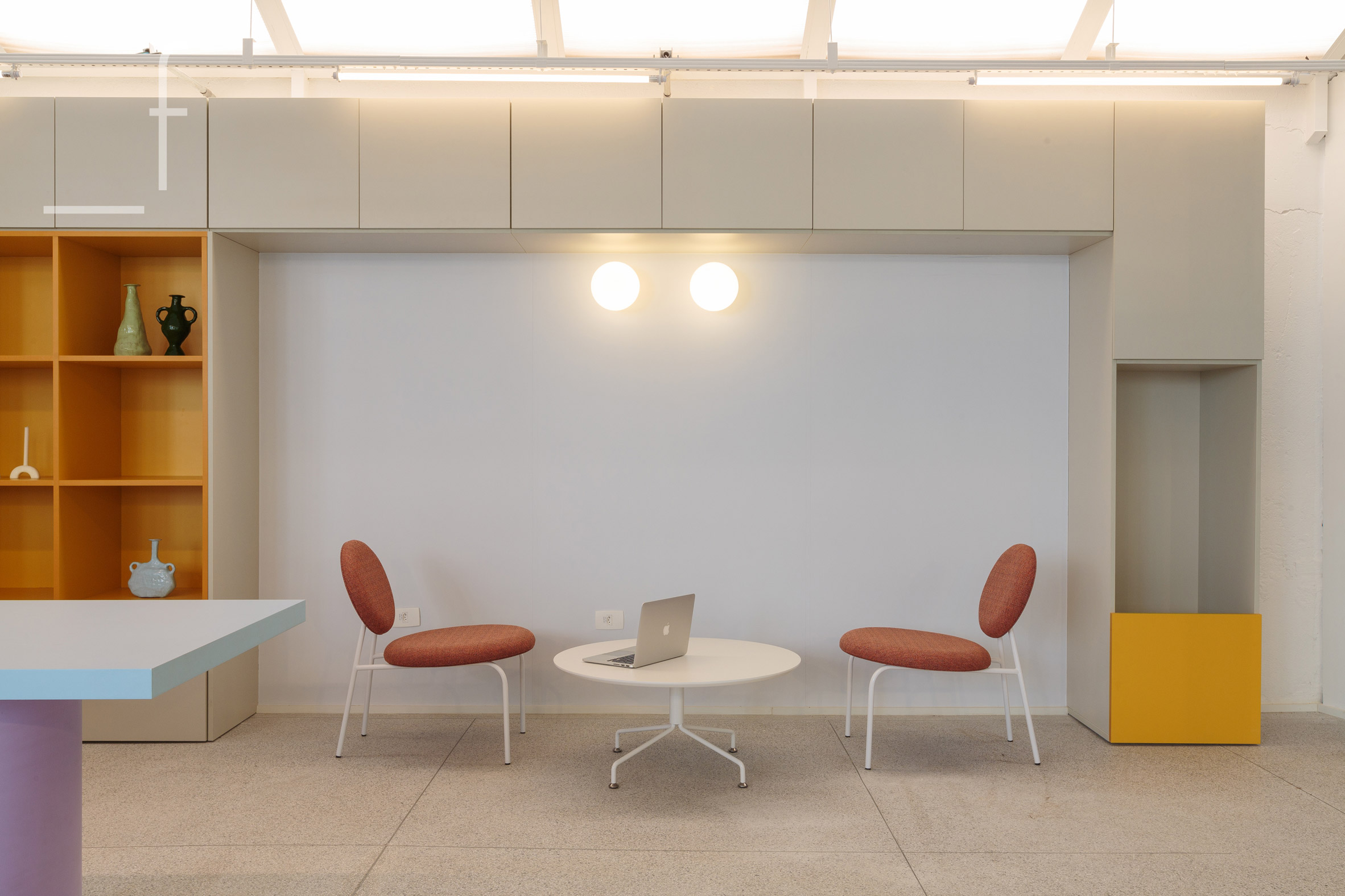
“We immersed ourselves in the brand, its positioning, vibration and sought a language that represented the company in a true, uncomplicated and unique way,” Gema Arquitectura said.
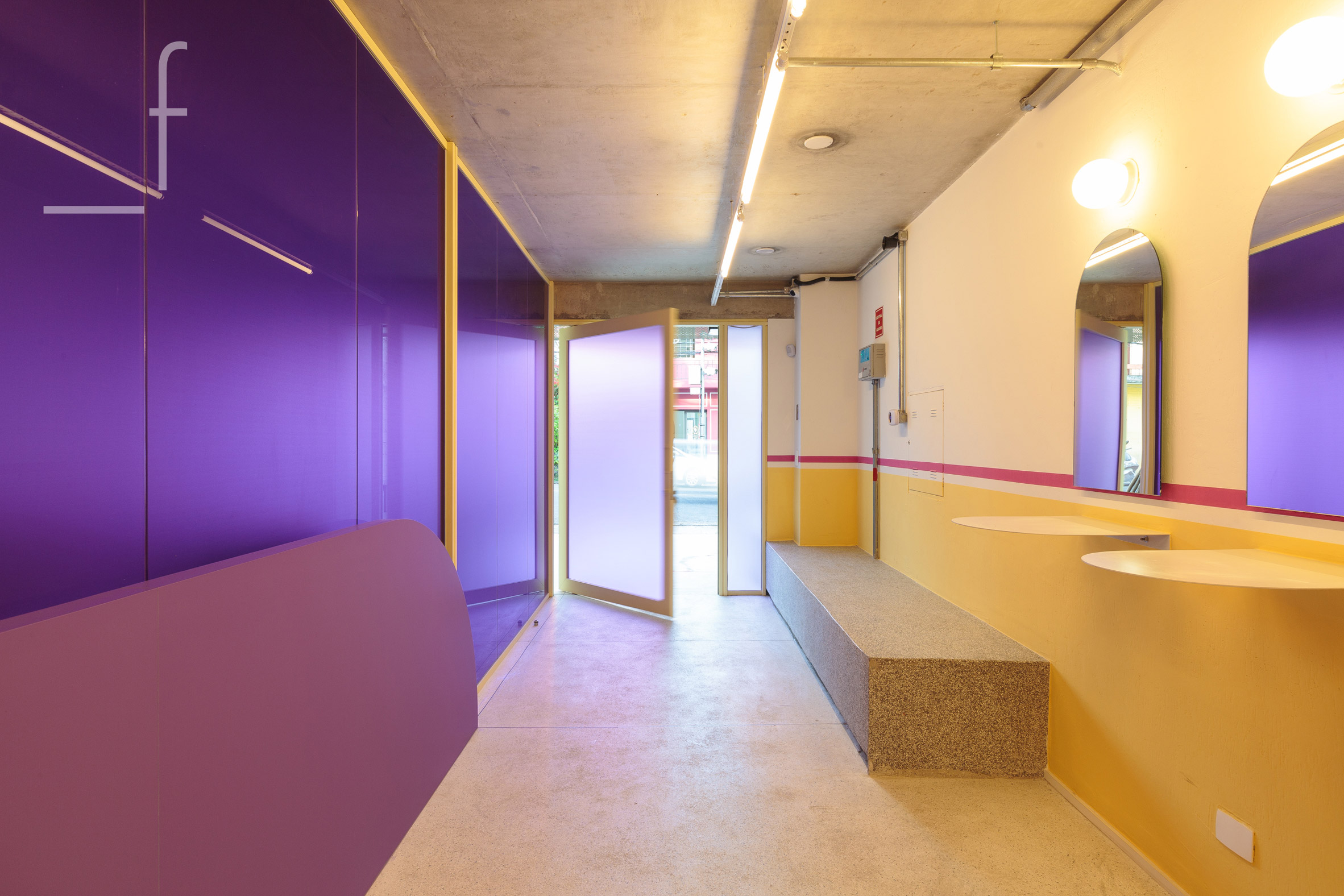
From the front door, a corridor is lined in glossy bold purple film on one side, and bands of yellow and pink paint on the other.
The ground floor includes areas for greeting guests, flexible meetings, making coffee and product testing.
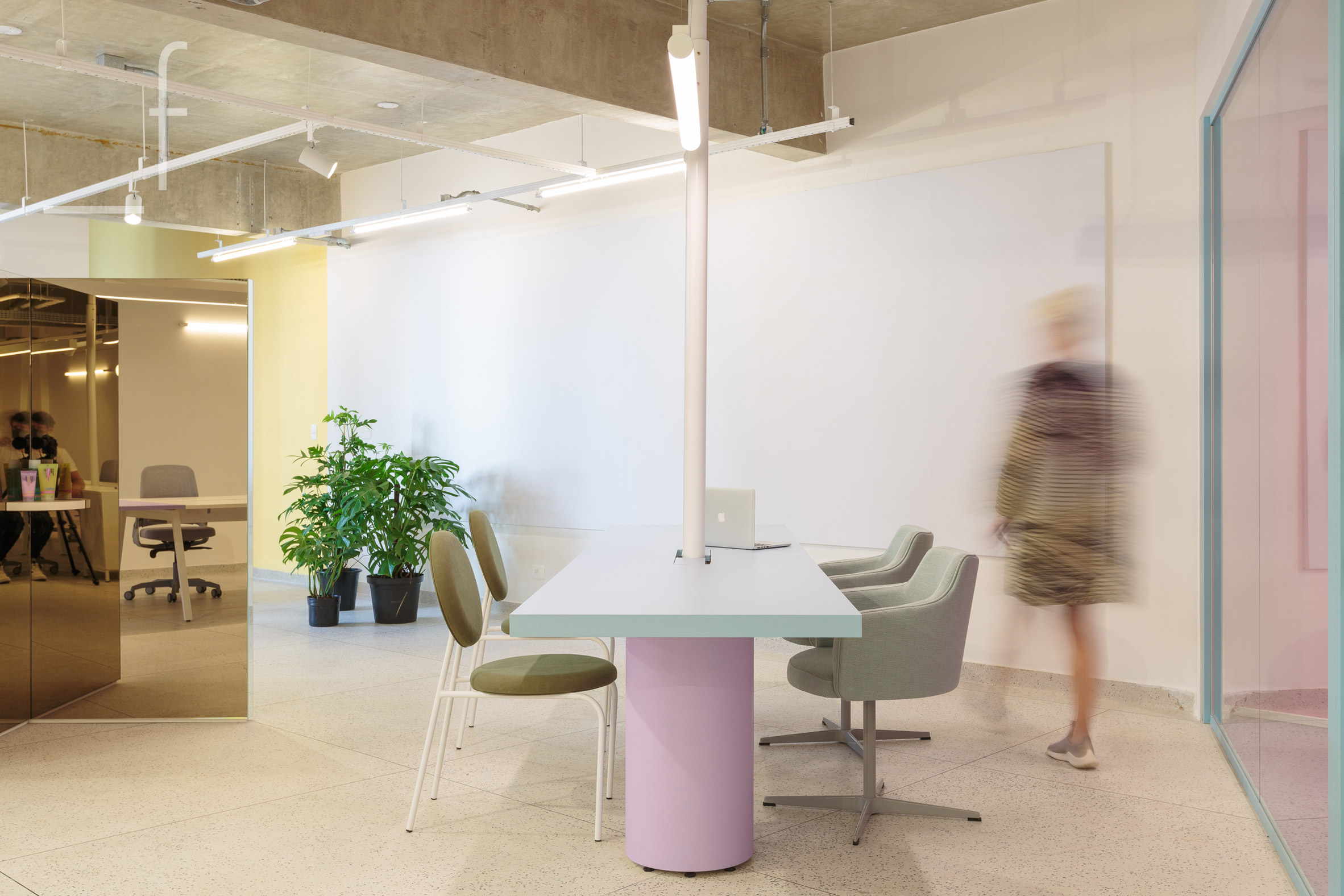
Pastel-toned tables and chairs are available for casual working, while further desk space is accessed through a row of bespoke pivoting screens framed in pale yellow.
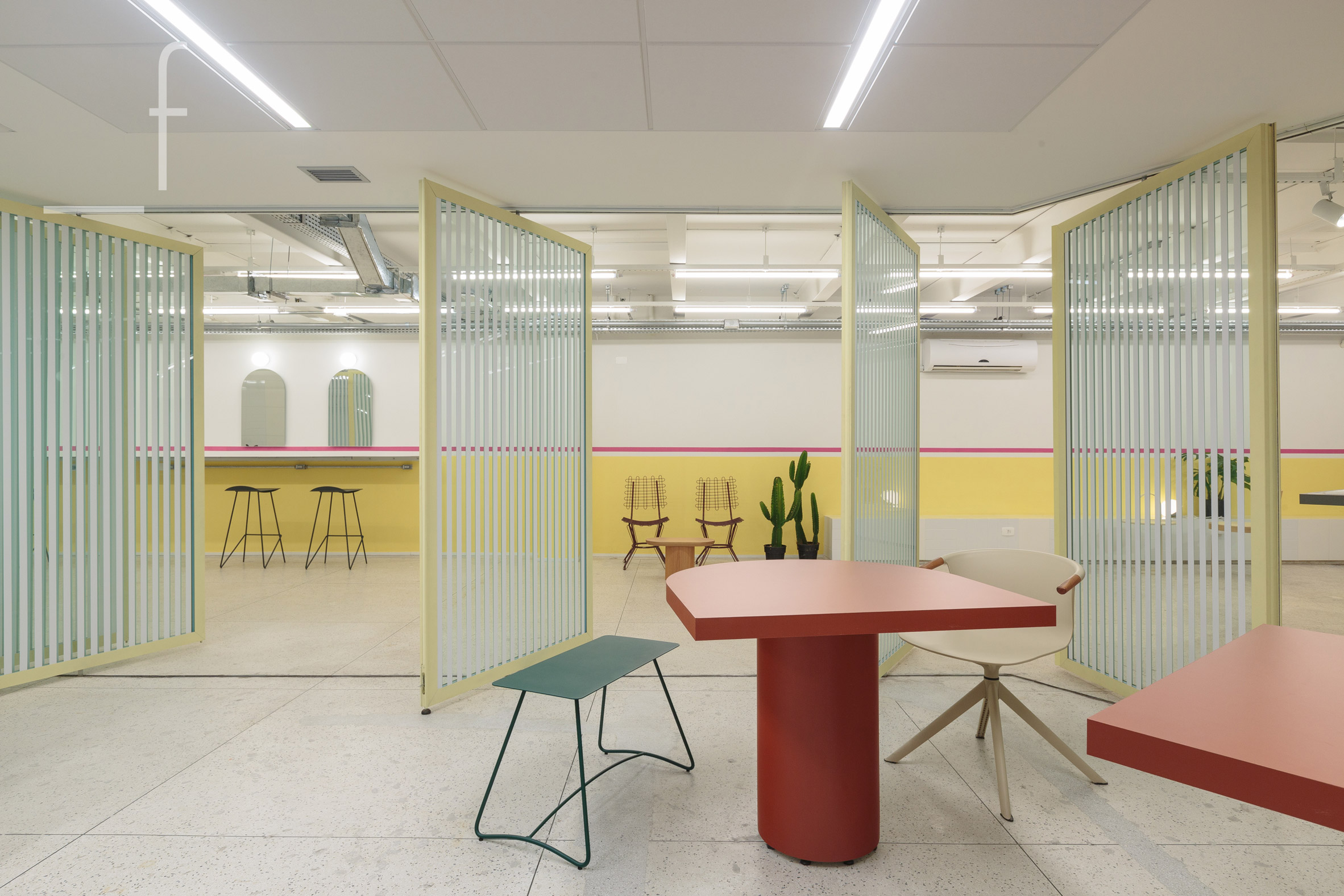
One level up are Sallve’s laboratories for developing skincare formulas, where the interiors continue the same colour scheme used in a more clinical environment.
Meeting rooms and creative studios on the upper storeys are demarcated by glass partitions and feature pink and purple carpets.
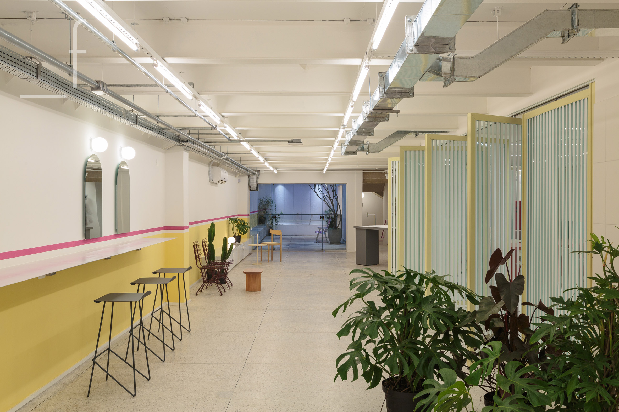
Elsewhere in the building, the carpet was removed to reveal terrazzo floors that were restored. Ductwork and services were left exposed across the concrete ceilings throughout.
Bathrooms were expanded to be more comfortable, and now include enclosed stalls, benches and large mirrors.
On the exterior, the building’s front facade was covered in a wavy metallic veil, while walls that define the property boundaries were painted white.
Separate entrances to the store and the workspace were clearly defined, and are set back from the street to create a welcoming forecourt.
“Intuitively, the building expands into the surroundings, seeking an affective connection with the city and the people,” said Gema Arquitetura.
“Fluidity and dynamism define the space, in a tailoring of design, building this identity through simple and real connections.”
Other skincare and wellness brands have similarly used their office interiors to reflect the visual identity of their products, from Goop’s soothing HQ in Santa Monica to Aesop’s “simple and elegant” workspaces in London.
The photography is by Felco.
Project credits:
Architecture: Gema Arquitetura
Constructor: Its Informov
Responsible architects: Nara Grossi, Priscila Almeida, Joseana Costa
Team: Giuliana Mora, Renan Merlin, Luiza Langeani
The post Gema Arquitetura brings colour to Sallve offices in São Paulo appeared first on Dezeen.
[ad_2]
www.dezeen.com


