
January marked our team’s (“Velinda Hellen Design”) fourth year, with over 300 projects under our belt. The majority of these are return clients or referrals, a testament to your trust and support, especially during our start-up days amidst the pandemic. Your collaboration and confidence have been our anchor, propelling us forward. We can’t help but reminisce about the many faces that have crossed our path over the years. It’s a sentiment echoed among our team: we have the best clients, hands down! And a significant portion of that gratitude goes to EHD.
Amid the many gifts from our collaboration with EHD, top-notch clients stand out. When clients mention discovering us through EHD, it’s an instant reassurance that we’re aligned with kindred spirits. While there might be statistical correlations between informed blog readers and creatively-minded, generous clients who would be an asset to any dinner party, I avoided any/all statistics classes in school. Instead, here are results from my amateur field research, having worked now with several of you readers over the last four years:
You all:
· You embrace color fearlessly.
· Love a clean, contemporary line, but don’t fully abandon eras gone by.
· Bring informed perspectives to the table, and push boundaries.
· Break the mold!… I’ve heard rumors that many designers look to leave residential design because clients can be too “exhausting”. Our EHD reader-clients are REFRESHING.
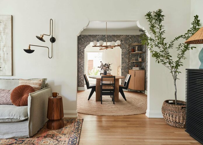
Take today’s reveal’s clients, the most delightful EHD-reading couple. Their Spanish bungalow in West Hollywood was a canvas awaiting the perfect balance of Mediterranean charm and modern allure. With multiple shared eyelines, the challenge was guiding the eye seamlessly through each distinct space. Our solution? “Forget the accent wall”. To avoid confusing the eye amid this much information, “It’s time to whip out the accent room!”

Now, choosing bold elements isn’t without its balancing act. Thankfully, I’m supported by a team of design tightrope walkers, like Julie Rose and Grace DeAsis. For this project, Julie was the lead designer and my collaborator on each careful step taken to avoid “wobbling”.
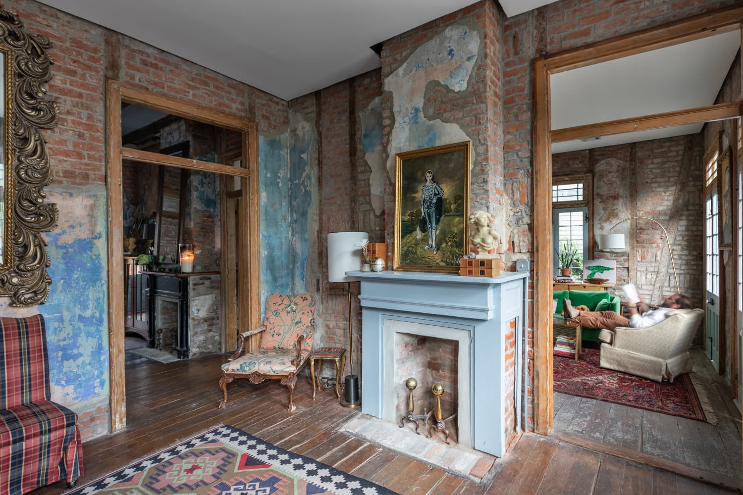
But let’s back up…To 2022 when we finished this project. Before blooming, this Spanish beauty looked like this:


Unlike our clients, the home lacked warmth and personality. Functionality was lackluster, though the original hardwood floors had already been impressively redone, pulled back to a natural white oak tone our clients loved (as did we!).
The layout of the kitchen unnecessarily divided a nice-sized kitchen nearly in half. And unlike the rest of the house, which had an open flow and entryways with lovely, historic arch detail, this room had a standard, narrow passageway that cut off potential natural light to the dining area and inevitably exiled a host from the hub of future gatherings. This would not do.

With a need to expand the passageway to mimic the other two and the acknowledgment the dining room would now be a visual extension of every main living space, we had uncovered our currently-shy, but soon-to-be anchoring all-star. An ugly duckling ready to become a swan.

But unlike every 90s movie, we couldn’t simply straighten frizz, remove eyewear, and expect a shallow love-interest to suddenly take notice. We needed to establish a palette that was stand-alone-exciting enough to pull the eye first within the design (as any good, anchoring “accent” will do), but gracious enough to complement or share elements well with other rooms. Our palette and overall aesthetic direction started here:

The original concept was to bring in some vintage elements and a wallpaper that blended the colors of all adjoining spaces.
And without further ado, here she is…

To maximize entertainment potential in a consolidated footprint, a round extendable dining table became the central piece. This avoided interrupting the flow of this usual pass-through room unless extra guests demanded it. HOT TIP: A dining table in a similar tone as the floors will help keep the large piece from feeling overwhelming, especially helpful in a smaller space. Duo corner cabinets were brought in to provide both open and closed storage as well as a place for appetizers and cocktail setups to land when entertaining.

While adjacent spaces would be lighter and brighter, this one would carry the most visual weight through chunky black chairs, lots of natural texture, and a bold blue and green patterned wallpaper. This central space had “oomph” (an incredibly technical design term). To keep it from leaning too heavy, wood tones and the oversized natural rug (for when the table is at its max capacity) all played off of the gorgeous white oak tones of the floor.

Here’s just a small peek into the office nook, where we repeat elements from other spaces you still have in store: floor tiles and custom cabinets match the kitchen while the color pop teases what’s to come in the bathroom.

To successfully play off this established aesthetic, the adjacent rooms needed to be related without matching; “sisters” but not “twins” to this not-to-be-forgotten middle child. Beyond implementing similar finishes and complementary color palettes, they also needed to maximize function and balance the home’s historic heart with the client’s contemporary cravings. And what better place to curb a craving than in a kitchen:

Want to guarantee colors will pair well? Take a leap across the color wheel. Opposites attract! Our design color anchors were blues and greens; our leap landed us in the pink world, which happens to be a simplistic yet contemporary nod to traditional Spanish designs.

The soft Portola Roman Clay added a bit of texture and warmth to the walls and an extra layer of depth to the space, but little was needed thanks to the gorgeous variations of the concrete floor tiles, which our client reports is easy to keep clean since it was properly sealed despite the porousness. The flooring was kept heavily mosaic influenced; a clear “old world’ statement since the more contemporary, white oak tones were again repeated in this room through the custom cabinetry, remember we are going for “sisters” not “twins”. The integrated pulls in lieu of traditional hardware further “modernized” the look in a subtle way.

To keep things feeling open and airy, we opted for floating shelves instead of traditional uppers along this run as well as white minimal light fixtures and window treatments.

Continuing the streamlined theme, a seamless counter to an apron front sink was installed in a more natural quartz material that brought in some of the rustic earthy-ness aesthetic our clients were drawn to from their inspiration of the space.

Topping things off with a zellige backsplash in a similar color to the stone laid out in a modern leaning pattern, vertically stacked.

An adjusted cabinet layout allowed the original square footage to multiply in functionality and now frame the walk out to the gorgeous patio, bringing the outdoors in. The space not only feels/looks more spacious, it has uninterrupted flow from the dining room to the courtyard, meaning nobody ends up exiled…this is now wholly a hub.


Never mind the fact you’re technically standing in the laundry room too. Who would notice, given the streamlined carpentry (with louvered doors for ventilation), integrated/hidden appliances, and a narrow but mighty utility storage?

This pretty “sister” shows a softer side, overall, complementing the anchoring room without competing. She doesn’t mind that the louder, bolder “middle child” demands attention first. Her own, subtler demands are satisfied.
But she’s not alone in having to “share a room”. On the other side of our dining room lives the brightest sibling. And when we met her, she looked like this:


Great bones and historical character! Look at that barrel ceiling and original fireplace. We didn’t want to lose an ounce of it, but wanted it to shine brighter. And that same zellige tile that shone in the kitchen helped:

A simple refinish for stunning sophistication. But you’re looking at this space’s biggest challenge. Designers in the 1920s were completely careless when it came to placement for TVs. Every last one of ‘em. Bizarre. We didn’t want to lose the overall shape of this original fireplace by pulling away the mantle, but the layout of the room combined with the height of this one just wasn’t going to work. Our savior: the Frame TV stationed on an easel-style TV stand.

As you all know by now a trick to add more visual height to any room is high and wide window treatments, we went with a dark olive tone for some added color and depth. The thicker velvet fabric is great for blocking out any TV glare.

The rest of this room was simple furnishing and lighting fixture swaps, which were kept wall-mounted (true to the era of the home) but modernized. Lighting is a great place to “play” or even follow trends as they are easy to swap over time. And boy did we love the playful, nimble double-arm sconce in this room.

Sophisticated and bright, vintage-leaning rugs with the help of our friend, Sheba, who owns Blue Parakeet Rugs and a slipcovered sofa (leaning once again old world) are balanced by a contemporary, chunky chair and pops of black (more subtly repeating the black pops in the dining room). Then, further proving to be fearless and fun, our clients encouraged a colorful reface of the front door for a fully-swoon-worthy-yet simple first impression.

A formerly “dead” space was reimagined to serve as an entry drop zone. Including storage for shoes, hooks for jackets, and incorporating the existing black bar cabinet which holds all the party essentials.
Speaking of needing to make an impact; there is only one bathroom in this house. So, the single commode quarters needed to be as exciting as a guest’s powder room yet as soothing as a spa, all while being fully functional for everyday use. At first, she fell short of fully hitting any of these marks:


But after a buff, came a beauty (WHOA! It’s like she took her glasses off??!):

While the footprint and even windows were kept, the space was reimagined. A large shower and tub plus maximizing storage were two things on the top of our client’s list.

The former shower became a separate water closet “nook” to maximize the space allotted to this older bathroom’s wash zones and add a bit of privacy to the toilet area, which was oddly in the forefront before. Adjusting the placement of the plumbing gave way to the opportunity to integrate a built-in cabinet for additional storage, further maximizing both flow and functionality.

Adding to the visual “openness” is this floating vanity moment. It’s a custom design with rounded edges and a mirror integrated into the stone of the backsplash. Paired with classic-leaning lighting for an overall timeless touch.

Here’s that color the office built-in “sneak peek” teased, applied here in a Roman Clay finish which speaks to the subtle movement/wall material of the pink hue in the kitchen.

Inspired by arched elements often found in Spanish-style homes (and the barrel ceiling present in this one), curves became a repeated element in this space. Rounded elements repeat through the arched stone shower opening, the curved glass cutouts on the shower doors, and the singular oval sink (we, of course, asked our clients’ preference for two sinks vs one with more counter space and they chose the latter).

Further adding to the traditional vibes, penny tiles were used for the floor and shower surround for more of that modern spa-like look. The water closet nook was dressed in a wallpaper that stayed true to the palette established in the nearby dining room and was chosen in a traditional pattern. A vintage rug, again from Blue Parakeet, was used as a bath mat for some additional charm within the now fully-new design.
And thus, the Spanish sisters burgeoned into beauties. Given the great bones and personality already at the core plus the easy-going nature of our savvy clients, the only real challenge faced on this project was avoiding a fight for attention from each craving sister space. But it ended harmoniously.
Speaking of harmony. I started writing for EHD in 2018 and at that point, I casually used “friends” to address you readers. Now, many of you have become just that “IRL”. From casually addressing you in 2018 to now, it’s been an incredible journey of collaborating with both teams and clients who deserve that valued term.
We hope to work with more of you! Currently immersed in thrilling full-service projects, our virtual services are a tad limited. But fear not, if you’re eager to join forces, simply drop “EHD” on your intake form, and we’ll fast-track you onto our client list. Planning a major renovation? Let’s chat—we’re already lining up projects through 2025 and we’re happy to extend a complimentary call. Thank you, FRIENDS!

*Design by: Velinda Hellen Design
**VHD DESIGN LEAD: Julie Rose
***Photographer: Sara Ligorria-Tramp
****Stylist: Emily Edith Bowser
The post Forget the Focal Wall – Enter the Focal Room (How To Manage A Multispace Eyeline Within Your Design) + A Colorful Bathroom! appeared first on Emily Henderson.
stylebyemilyhenderson.com

