[ad_1]
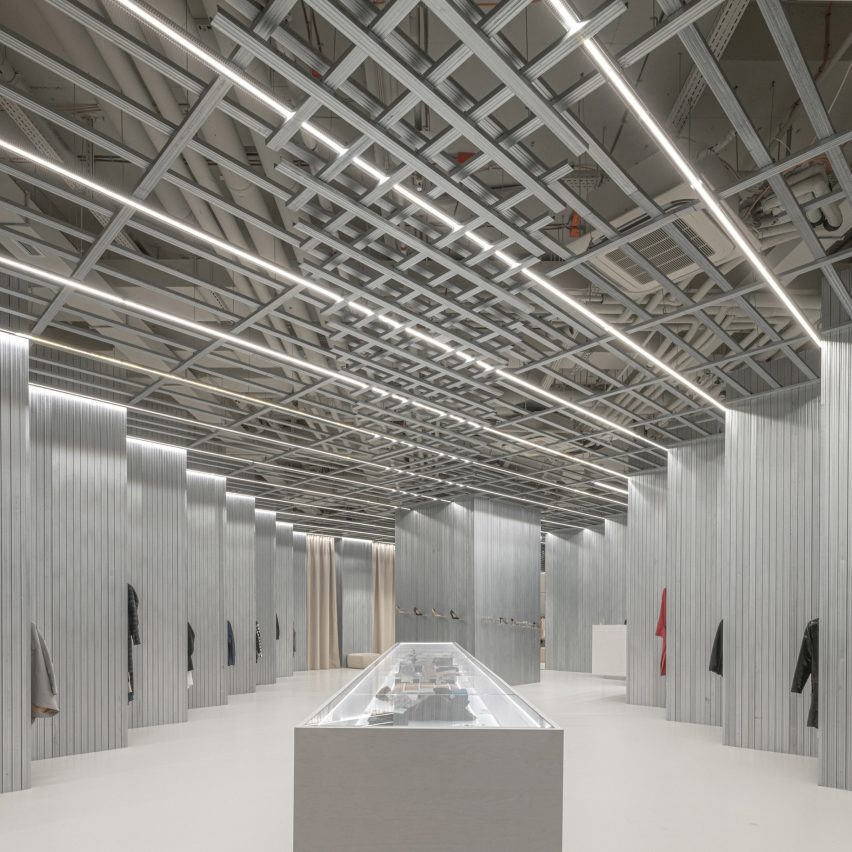
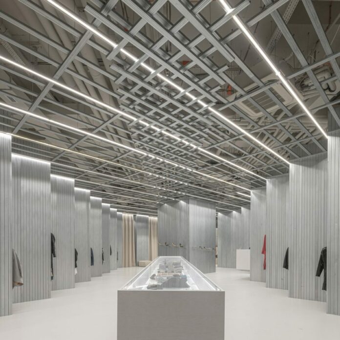
Design studio D415 has used standard construction materials such as plasterboard and steel profiles in unexpected ways to create a concept store in Bratislava, spotlighting young fashion designers from Slovakia and neighbouring Czechia.
Set inside the Nivy shopping centre, Som Store gives each featured fashion brand an equally-sized space in which to showcase its work with the aim of helping the region’s designers reach a wider audience.
In order to present these Sometimes disparate collections in a cohesive way, D415 opted for an approach the studio calls “introvert x extrovert”.
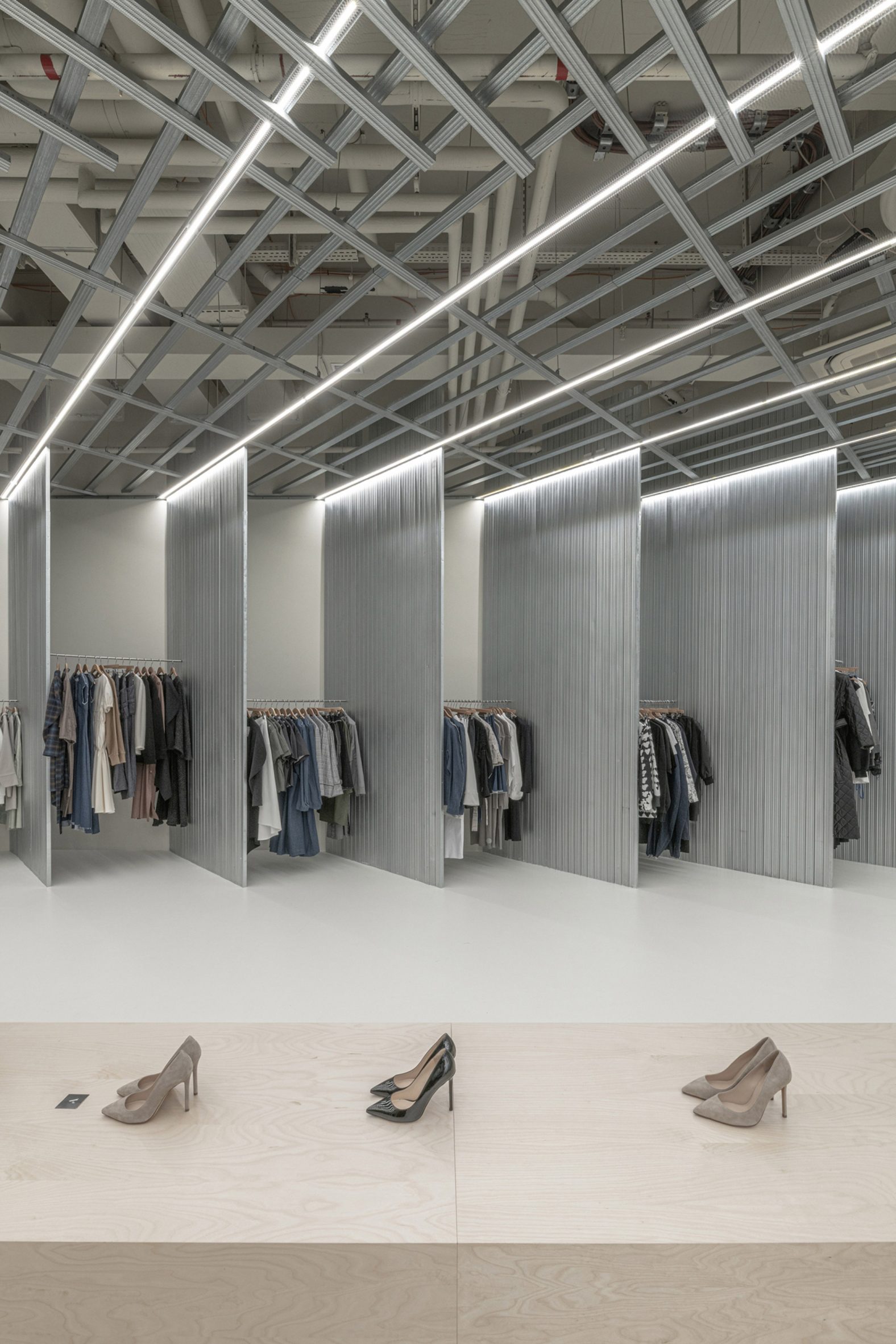
By enveloping each collection within panels of steel, positioned at a 45-degree angle from the entrance, only glimpses of the products can be seen from the storefront.
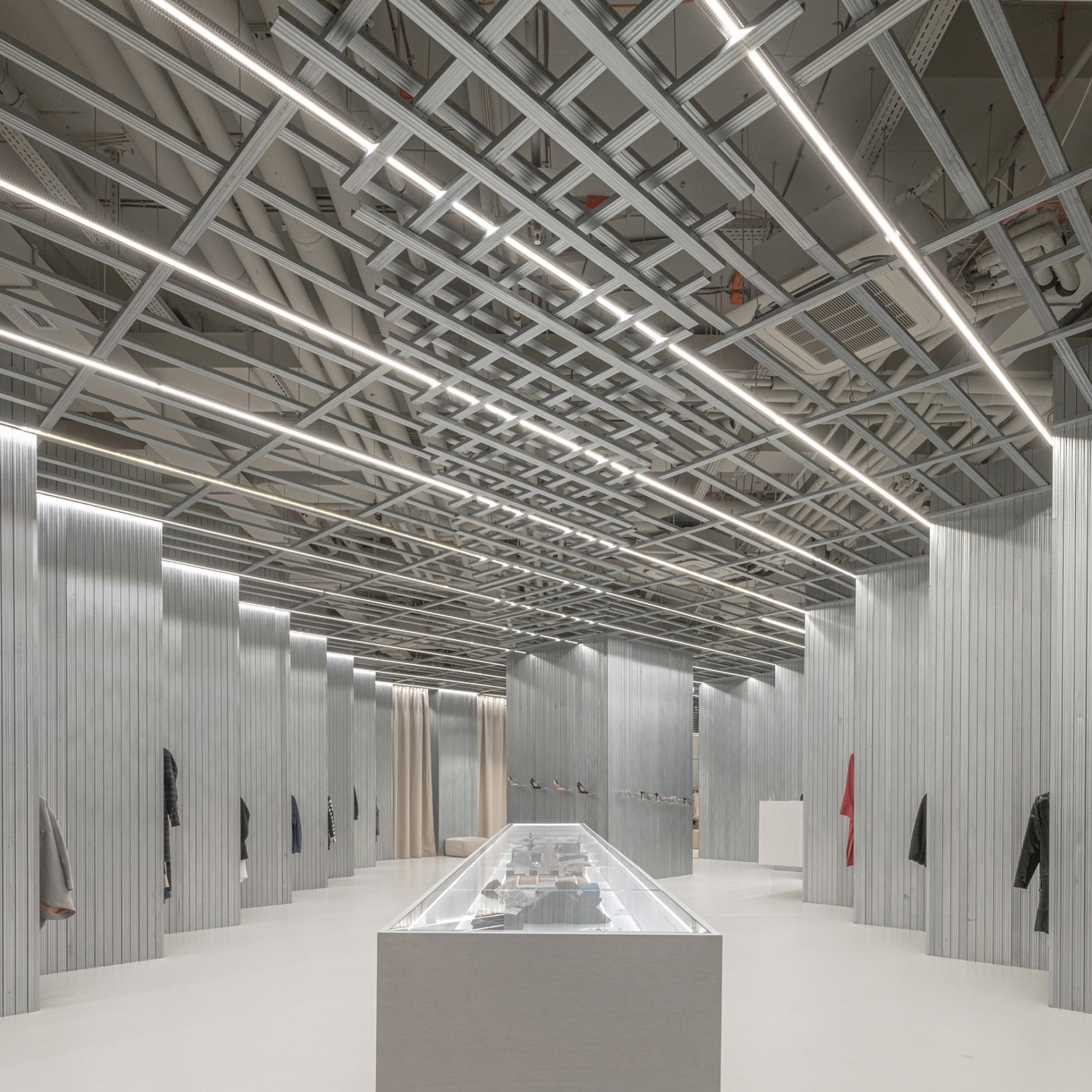
As they venture further into the store, customers are gradually able to see and browse the different collections.
“When entering the store, the entire space has an introverted character,” D415’s Peter Gonda told Dezeen. “All the models on display can be seen only in a hint and the number of outfits on display is not distracting.”
“The extroverted character of the space is only apparent upon entering the store, where the individual models on display are revealed from behind the rotated walls.”
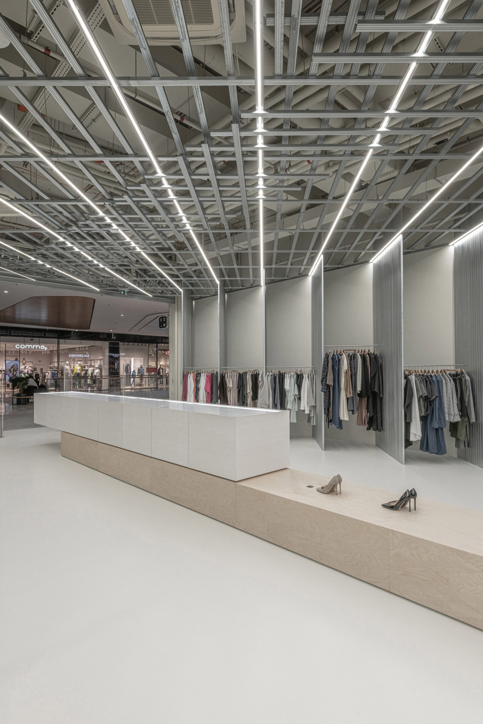
Rather than putting off customers, Gonda has found that this set-up helps to create a sense of intrigue that draws them into the store.
“The client was concerned that the insufficient presentation of clothes from the entrance to the store would have a negative impact on the store’s traffic,” he explained. “The opposite turned out to be the right solution.”
“Customers are attracted to enter the store by a certain degree of mystery, which is not typical for fashion stores in large shopping centres, where the new collection is already in the store window.”
These 45-degree angles are repeated throughout the whole space, with its angled grid layout created using a matrix of steel profiles.
Here, this humble material – commonly used for framing drywalls – is exposed and celebrated as the hero material of the space.
“The element was used raw, with a standard galvanized surface treatment just as it is sold for building structures,” Gonda said.
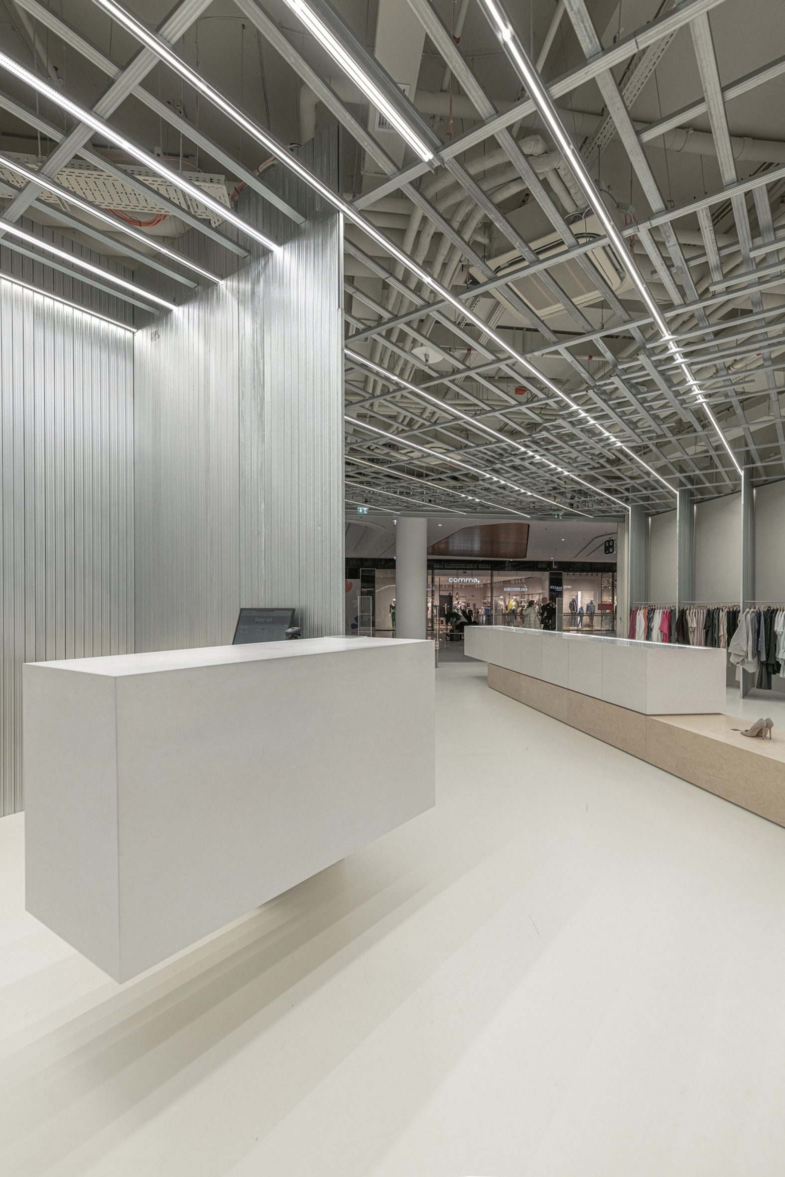
The steel profiles are used against a backdrop of unpainted plasterboard. Both are typically unappreciated materials, according to Gonda, and both have a matt grey in colour while being distinctive enough to create a subtle visual contrast.
“It’s a demonstration of how it is possible to create a final element that is not only functional but also decorative from simple building elements, which were primarily intended as a supporting secondary structure,” Gonda said.
Finished in the same pale grey tone, the resin floor was chosen because it can easily be repaired by tradespeople, which according to D415 makes it more sustainable.
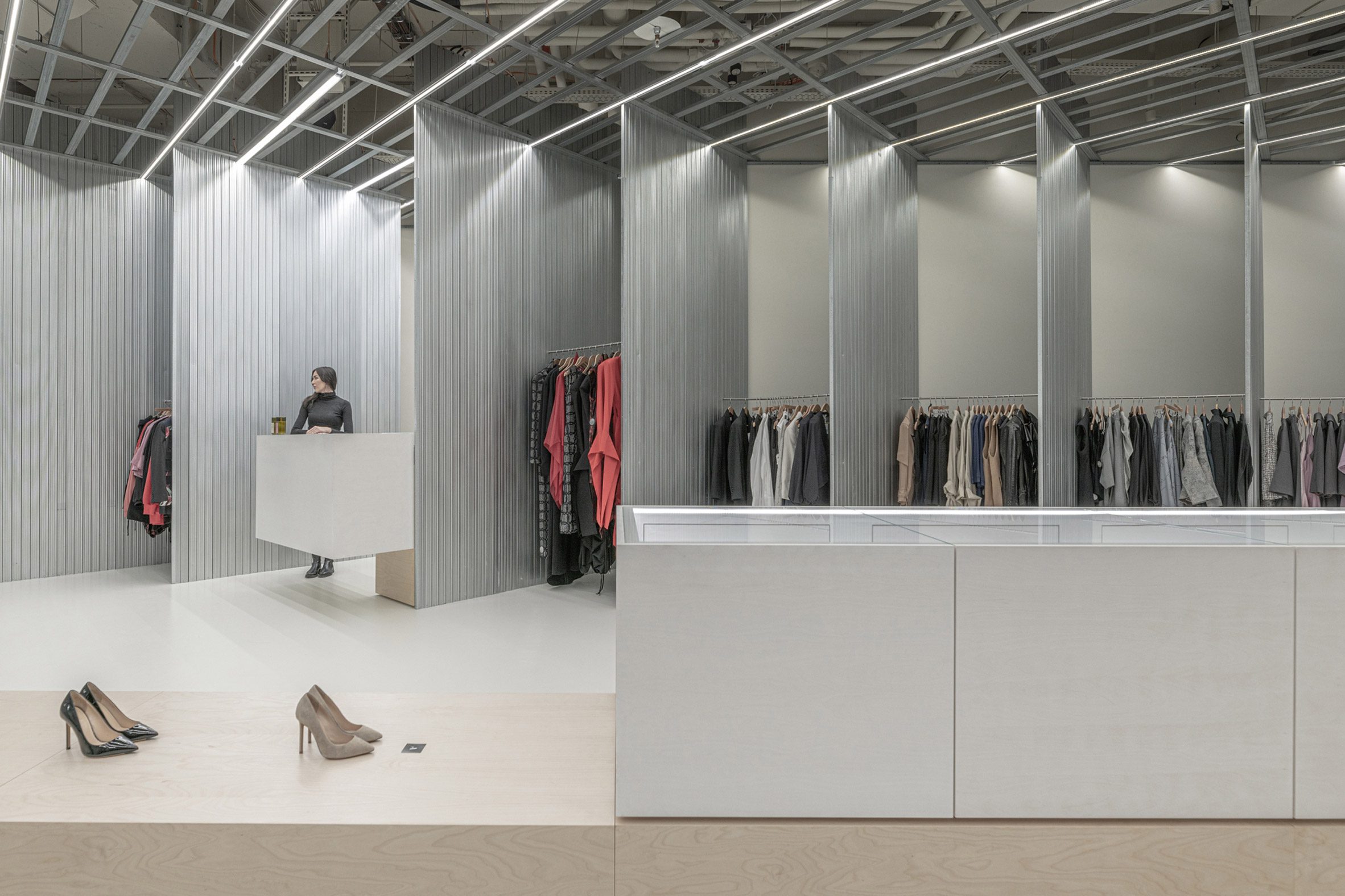
Similarly, the steel elements can be unscrewed and reused for their original purpose further down the line.
To ensure that the clothes remain the focal point, the furniture elements including the versatile display cabinets and the “floating” cash desk are simple, rectilinear in design and made from birch board.
At the centre of the space is a long multifunctional furniture element that variously serves as a display stand for accessories and a bench that provides seating for trying on products and for any fashion shows and events that will be held in the store.
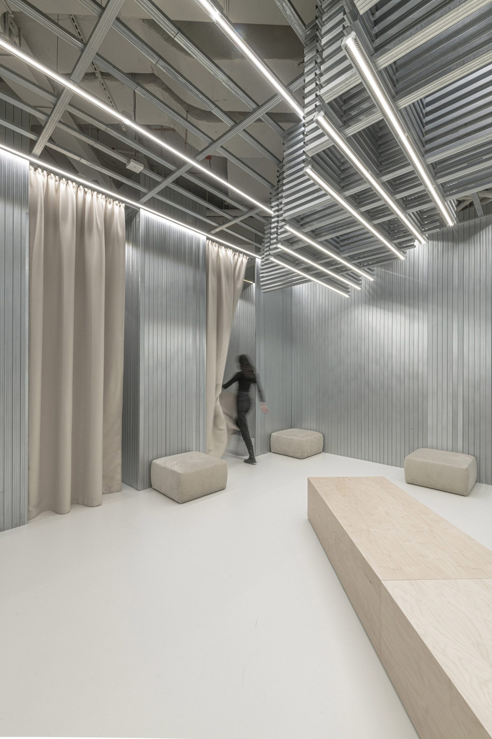
Out-sized squashy seats dot the space around the changing area, colour-coordinated with the full-height curtains that frame the fitting rooms.
Som Store has been shortlisted in the small retail interior category of this year’s Dezeen Awards.
Also in the running is a plastic-free paint shop by Linda Bergroth and a skincare store finished in salvaged materials and biotextiles by Nina+Co.
The photography is by D415.
The post D415 reimagines mundane materials for Bratislava boutique Som Store appeared first on Dezeen.
[ad_2]
www.dezeen.com

