[ad_1]
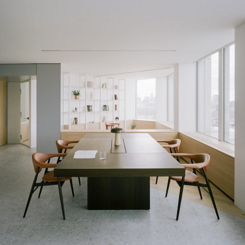
ConForm Architects has completed a “homely” office for a financial firm on the 11th floor of the recently refurbished Smithson Tower, the brutalist complex designed by Alison and Peter Smithson in the early 1960s.
Formerly known as the Economist Building – and home to the publication of the same name until 2016 – the Grade II-listed Smithson Tower in London’s Mayfair was refurbished by DSDHA.
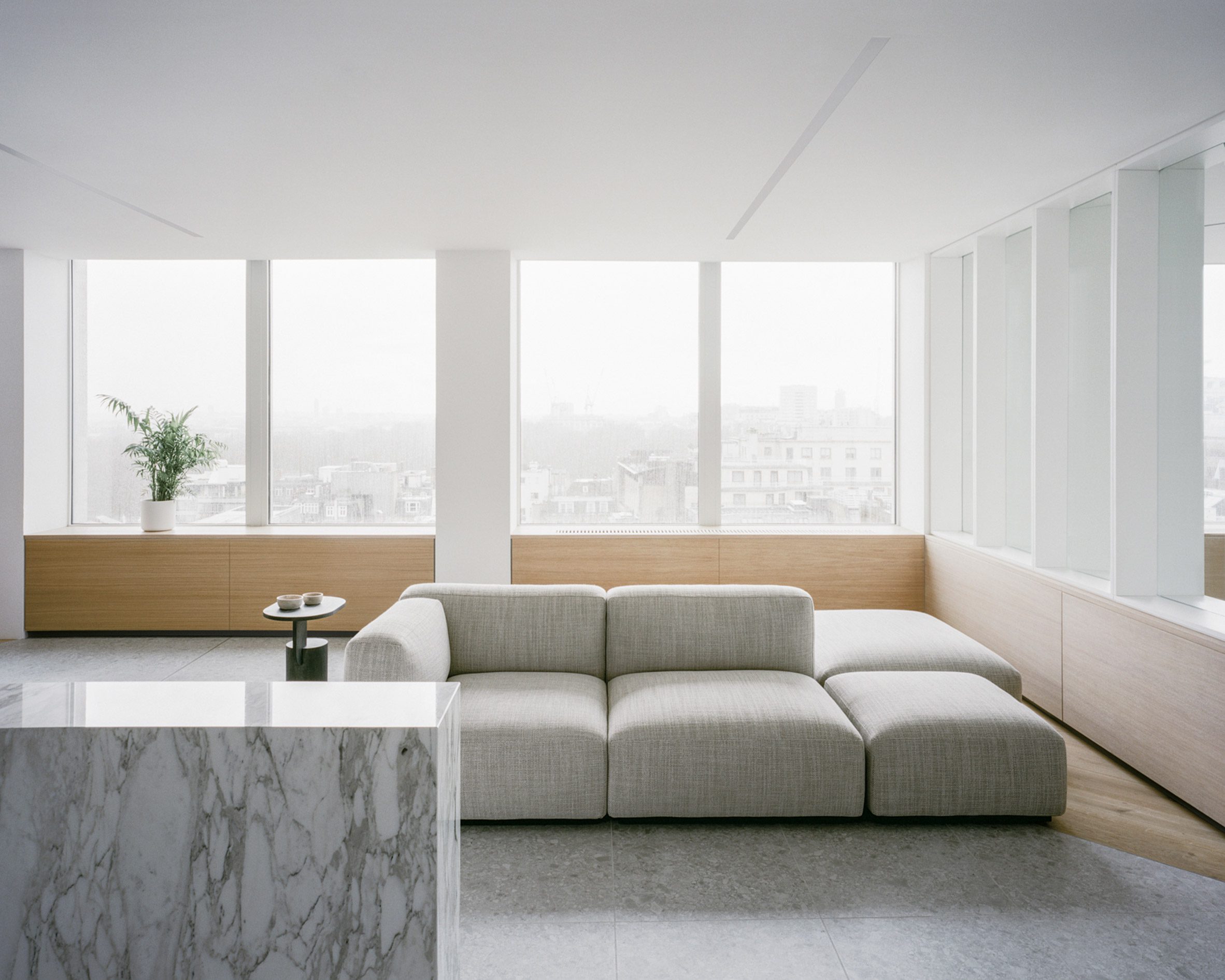
Each 3,600-square-foot floor plate was emptied and primed for individual leases. ConForm Architects was invited to fit out the building’s 11th floor to create an HQ for a financial firm.
The young London-based practice, led by Ben Edgley and Eoin O’Leary, said that its design responds to the contemporary move towards designing offices that are collaborative rather than cellular.
Historically, the building’s octagonal floor plans saw circulation concentrated around a single central core, while the interiors of each office featured partitions that aligned with the perimeter facade’s columns.
“A strip-out around the central core offered unparalleled 360-degree views, and the foundation for a great 21st-century open plan proposal,” said the architects of DSDHA’s refurbishment.
“This condition informed initial thoughts and discussions with the client, who appreciated and wished to retain this open-plan nature, whilst also requiring privacy and acoustic separation for meeting rooms and between various operational spaces.”
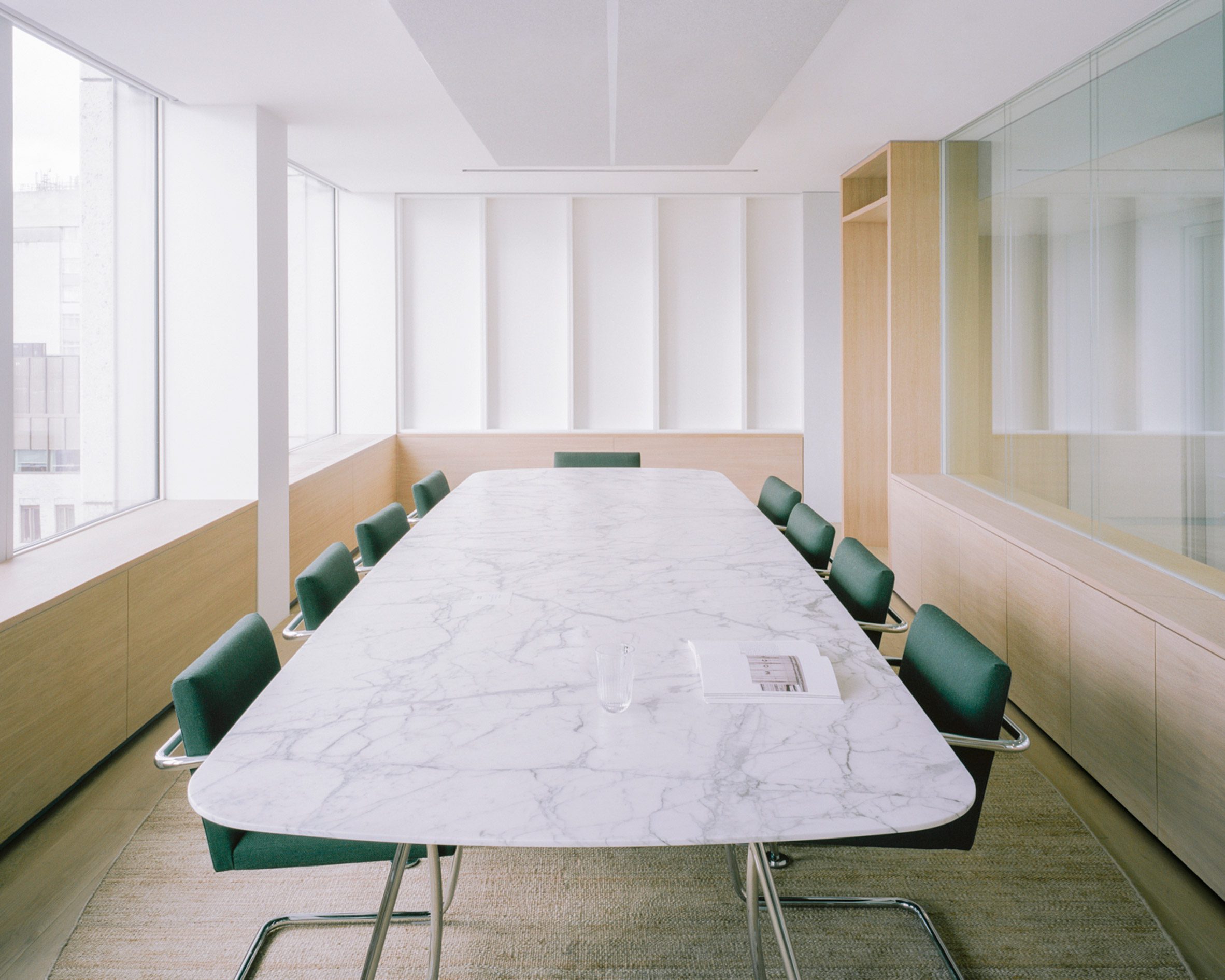
The space is split into eight zones defined by the strong structural grid of the existing building and its columns.
These zones are designed to cater to different ways of working and include informal and comfortable working environments that have a domestic feel to them. The aim, the architects said, was to create a home-away-from-home for guests and staff.
“The floor plan feels open and creates impressive views to the surrounding city, but the design concept also celebrates and reflects the uniqueness of the classic layout,” said the firm.
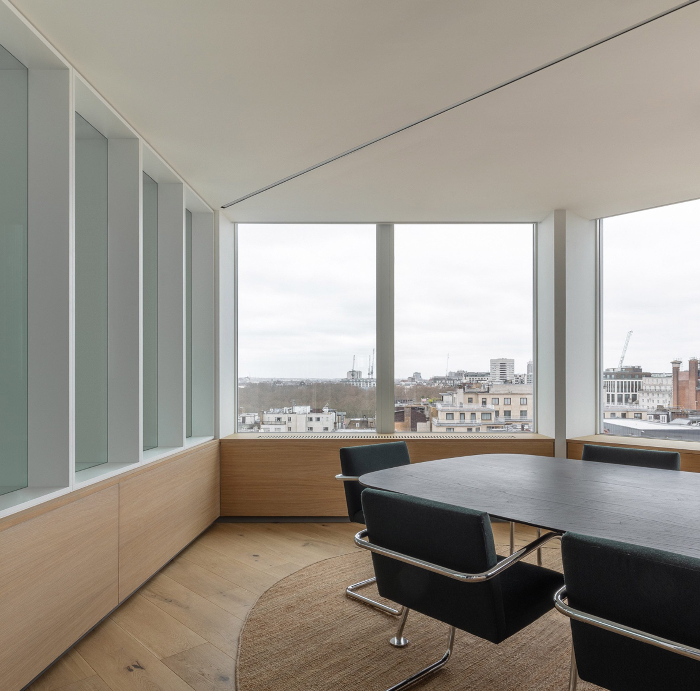
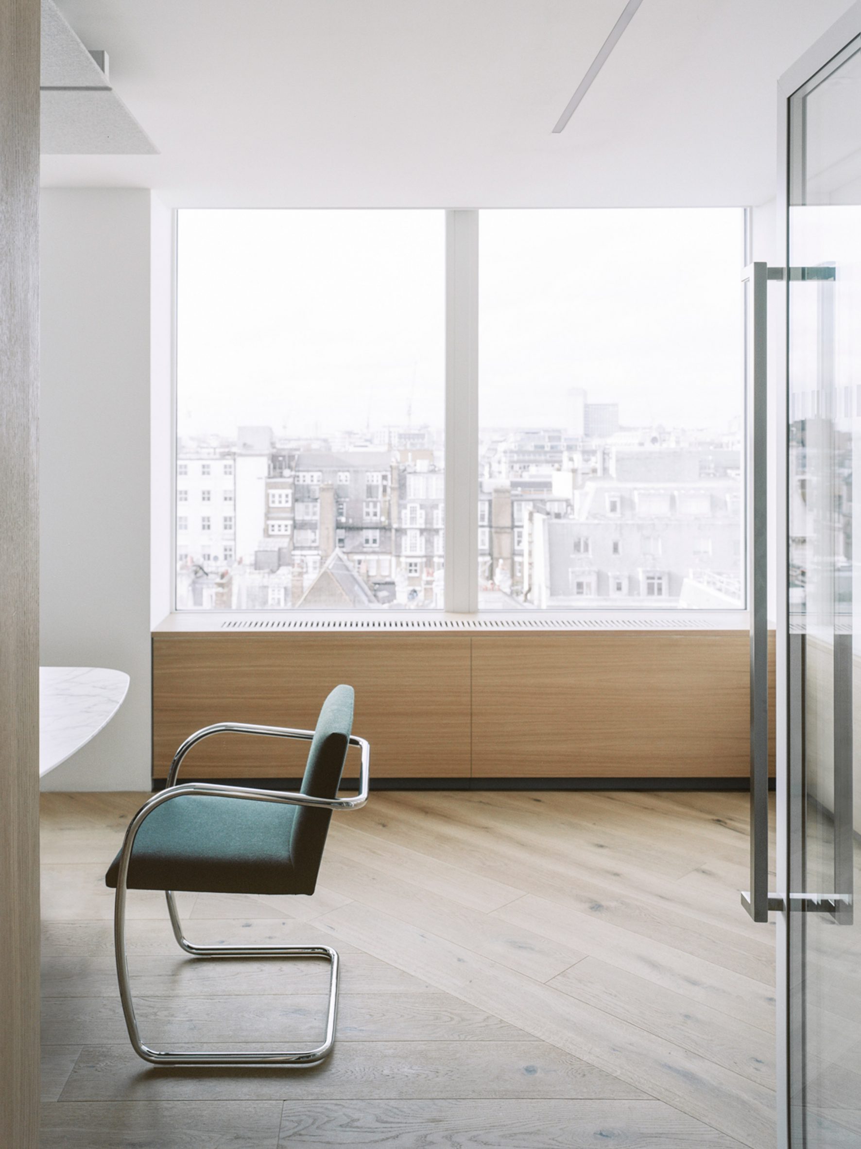
Low-level joinery at sill level divides up the zones while also providing storage, concealing services and protection for the air handling units.
Above this, the architects have replicated the existing white framing of the glazing that frames views between spaces.
Fixed desk spaces are located to the northeast and southeast of the plan, offering up the more impressive city views. This also allows the often high-capacity meeting rooms to avoid overheating during regular morning meetings, and assists the limited air circulation capacity.
The reception is positioned by the passenger lifts with views across Green Park and Hyde Park beyond.
“A major challenge to the scheme was incorporating and adapting the existing air conditioning and heating and cooling infrastructure,” explained the firm.
“The Economist Building was the first building in the UK to have air conditioning and the historic system was geared around exclusively servicing the cellular perimeter offices.”
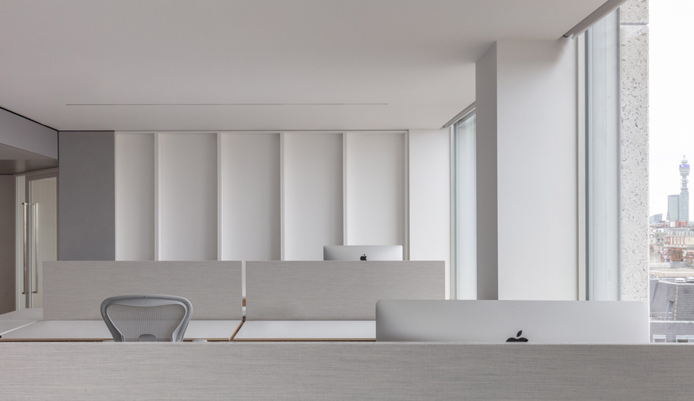
The original circulation route around the building’s core correlated with that of the air ducts. The firm took the opportunity to accentuate this service zone by lowering the head height and lining the core with acoustic panels by Danish brand Kvadrat.
This, it said, provides a more intimate and contextual path around the building’s core.
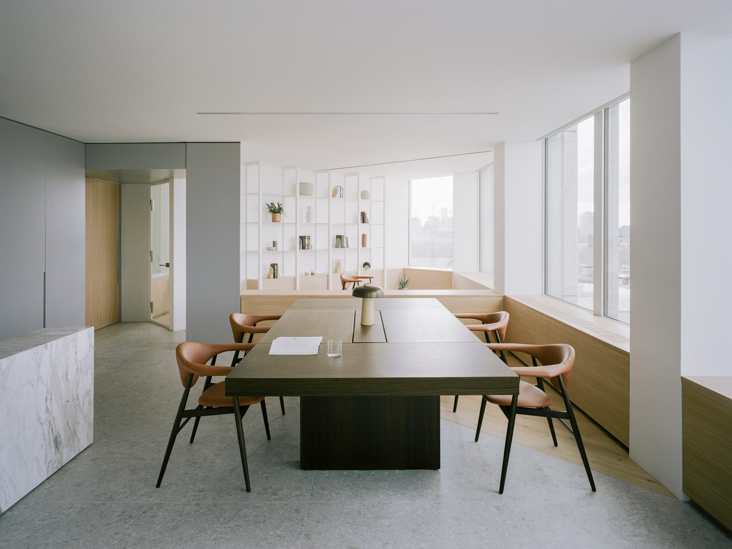
The building’s octagonal plan is reflected in the floor finishes, which cut diagonally across the office’s different zones to deliberately blur any distinct thresholds and help enhance the open-plan design.
“As this concept developed, the diagonal axis became increasingly interesting as it offered through views across each corner, between primary spaces,” explained ConForm.
“Further historical research revealed an early concept sketch design undertaken by the Smithsons, of a diagonally gridded ceiling plan that sought to connect column and mullion locations to their counterpart on the perpendicular elevation at a 45 degree angle,” the studio added.
“Junctions where these diagonals met the core featured angular internal feature columns. This diagonal concept became a key design feature delineating spaces and connecting spaces across the plan.”
Dezeen has created a round-up of cosy offices that blur the boundaries between work and home, including rooms modelled on Airbnb apartments and a workplace featuring a black-painted napping room.
Photogtaphy is by Lorenzo Zandri.
The post ConForm Architects creates "homely" office in brutalist Smithson Tower appeared first on Dezeen.
[ad_2]
www.dezeen.com


