[ad_1]
Before & After: A Warm Home Makeover For A Melbourne Couple + Their Cats
Interiors


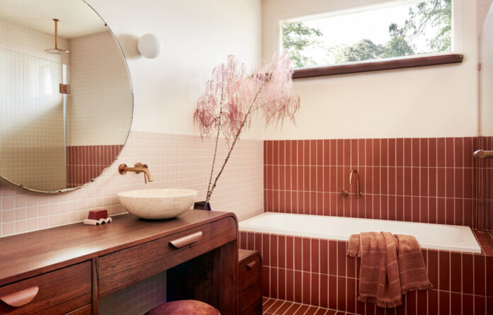
The tiered recycled hardwood timber bathroom vanity.

The bathroom features warm, pastel tones.

The vanity provides ‘a step for small children to reach the basin and a low seat and for parents to perch on during bath time,’ says Kim.

The tiles references original terracotta tiles in the home.

White Laminex bench tops, subtle green splashback tiles, and timber-look Laminex in the kitchen.

Tasmanian oak timber mouldings on the kitchen island elevate the joinery, adding more personality and a tactile warmth to the space.

The before shots featuring a glossy kitchen with a red glass splashback, and a monochrome bathroom with a feature river stone surface.
The school teacher owners of this Preston, Melbourne house came to designer and creative director Kim Kneipp seeking a refined renovation of their kitchen and bathroom.
These rooms had been previously renovated circa early 2000s and didn’t match the wider home or the clients’ taste.
‘The clients first contacted us with a small budget wanting to remove the red splashback from the kitchen and resolve circulation around the kitchen,’ says Kim. ‘They also disliked the river stone feature tiles in the bathroom and enquired about changing some of the surfaces.’
Discussions around the clients’ lifestyle and imminent family planning resulted in an expanded budget and brief to include a complete makeover of the bathroom and laundry, and a more thorough update of the back kitchen line.
‘As school teachers, the briefing document they sent through was one of the cutest we’ve ever had,’ says Kim. ‘Formatted like a school presentation in a typed modified cursive font — it was organised over seven pages, with bullet points, arrows, reference images, and a subheading that said, “We would like to create some living spaces inspired by mid-century modern with elements of Panama and art deco design.”’
Kim designed the renovation around these references that coincidentally tied in with some retro terracotta tiles at the rear of the house. ‘We wanted to bring back some charm and character to the house, so terracotta floor tiles became the foundation for the bathroom and laundry palette,’ she says.
‘Knowing that the clients loved art deco design, we then embraced this aesthetic for the bathroom and inverted the colour proportions for the laundry to respond to their love of mid-century modernism.’
For the kitchen, the clients sought a brighter, more neutral scheme featuring warm white Laminex bench tops, subtle green splashback tiles, and timber-look Laminex for the new backline joinery. Tasmanian oak timber mouldings on the kitchen island elevate the joinery, adding more personality and a tactile warmth to the space.
Laminex surfaces also feature elsewhere across bigger joinery pieces, with hardwood timbers for the bespoke vanity and feature shelves. Copper tapware and walnut timber tones add depth and contrast.
The clients’ two cats were an important consideration of the laundry design. ‘It doesn’t matter if you’re the most vigilant litter box cleaner, there are always those little grains that spill out onto the floor,’ explains Kim. ‘With underfloor heating in both the bathroom and laundry, we designed for a barefoot cosy house experience and didn’t want it to be interrupted.’
The solution — introduce a space under the laundry sink for a concealed litter tray and custom cat entrance.
‘The cats love their little private entrance! There were some great emails and photos going back and forth trying to ascertain how big an opening we would need to fit their cats,’ says Kim. ‘It’s definitely a multi-hyphenate, hardworking space. It’s a laundry/powder room/mud room/cat room.’
Other features in the home have been designed with future family life in mind, such as the tiered recycled hardwood timber bathroom vanity. ‘[This provides] a step for small children to reach the basin and a low seat and for parents to perch on during bath time,’ says Kim
These renovations all sit within the existing footprint of the home, although the spaces have been slightly reconfigured for improved flow and function.
‘By closing off a large opening into the lounge room from the hallway, one is ushered directly from arrival into the kitchen, allowing the lounge room to become a snug destination off the dining room. We also opened up the entrance into the kitchen, giving it a cleaner, more architectural gesture, rather than just looking like an aperture for a door,’ says Kim.
‘We completely gutted the bathroom, reclaiming some space from a storage unit that pushed inwards from the hallway and removing a dead space circulation alcove between the bathroom, powder room, and laundry.’
The clients love their ‘new’ home that perfectly fits their needs now and into the future.
[ad_2]
thedesignfiles.wpenginepowered.com


