[ad_1]
Before + After: A Bulky 1990s Kitchen Made Timeless + Ultra Functional
Interiors

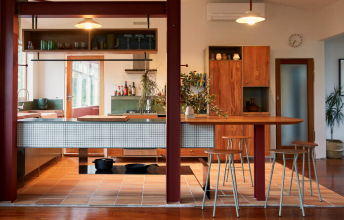
Konini Road Kitchen is a renovated kitchen by Atelier Jones Design.

The kitchen is part of a wider 1950s house renovation located in Titirangi, Auckland.

The design of the kitchen could be from the 1950s with its servery window, or the 1970s with its green tiled splashback, or perhaps the 21st century with its stainless steel appliances — which was exactly the intention.

The updated kitchen is timeless, connected to the surrounding landscape, and specifically tailored to the clients’ lifestyle.

Atelier Jones Design were inspired by utilitarian designs that prioritise user needs.

The new kitchen features several zones intended for a specific purpose, including waste management, pasta making, and socialising.

The previous 1990s kitchen!
Function comes first in this newly renovated kitchen designed by Atelier Jones Design.
The New Zealand design studio was recently tasked with transforming the client’s existing 1990s kitchen with something more timeless, connected to the surrounding landscape, and specifically tailored to the clients’ lifestyle.
‘While it was functional, it was a bit dated and looked bulky, which didn’t align with the clients’ vision,’ says Raimana Jones, designer and founder of Atelier Jones Design, of the previous kitchen located in a 1950s house in Titirangi, Auckland.
In designing the project, Atelier Jones Design was inspired by utilitarian designs that prioritise the homeowner’s needs.
‘One notable reference that I was naturally drawn to is the Frankfurt kitchen by Margaret Schutte Lishwosky,’ says Raimana. ‘It was a kitchen built for the efficiency of tasks in mind and I appreciate the integration of small elements such as built-in aluminium pouring bins for storing flour and spices. These are the types of small functional details that can noticeably reduce friction when performing a task.’
The new kitchen features several zones intended for a specific purpose, including waste management, pasta making, and socialising.
An existing cooktop was moved to the opposite side of the kitchen to achieve the latter requirement, allowing guests to more easily mingle around the bench or converse from the adjacent lounge.
‘The other move that changed the organisation of the kitchen was the removal of the dividing wall and its replacement with structural steel. This really makes the space more sociable and welcoming… It also increased visual access to the captivating bush,’ says Raimana.
Look closer at this kitchen and you’ll see even more practical features in the fine detailing, such as the wooden spice station with magnetic jars, and a slidable chopping board.
The intention was to simply create a dedicated zone for food prepping and to allow flexibility to move it along the stainless bench top of the floating peninsula, eliminating the need for additional auxiliary products,’ says Raimana of the chopping board. ‘It was crafted from leftover wood from the sink cutout. Its chamfered edge serves as a finishing touch when it is parked in that corner area.’
The visible spice station satisfies multiple senses. Raimana explains, ‘Being exposed to their colour and aromas can give you inspiration when cooking and I think that spice station does that beautifully. It’s also equipped with a bar that allows the owners to hang herbs and spices to dry, creating a beautiful and aromatic display. I would love to have this in my own home.
‘A fellow peer said that if Wes Anderson would design a kitchen, it would function and look like this. I can see that now.’
A bold use of materials and textures in the kitchen — such as oiled and recycled rimu and visually lighter steel components — balance modernity and humility.
The kitchen colour palette is inspired by the surrounding native bush, as reflected in the soft lichen hue powder-coated on the steel cabinets, and deep red accents on structural elements evoking the pōhutukawa trees of Titirangi.
Custom lamp shades designed and made by industrial designer Tom Lopes feature black sand mixed into the clay in a nod to the nearby West Coast beaches.
The updated kitchen feels unspecific to any era, and yet, is entirely tailored to its Titirangi location.
[ad_2]
thedesignfiles.wpenginepowered.com


