[ad_1]
Before + After: 3 Brilliant Kitchen Transformations Filled With Inspiration
Interiors

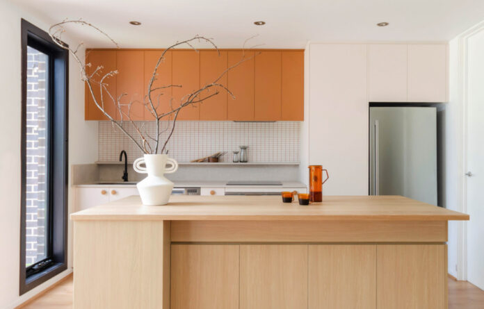
Evergreen is kitchen renovation project for a professional couple in Clayton South, Melbourne.

It was a total transformation, complete with orange details right down to the coloured grout!

Functionality was the key focus of the redesign.

Despite working within the same layout, it’s barely recognisable in the before!
EVERGREEN
Beyond its warm finishes and playful orange detailing, the renovation of this kitchen was really all about functionality.
The Glade Design director Jacqueline Chen says one of the clients worked in the hospitality industry and presented her with a list of must-haves to incorporate in the design. The space had to have ample storage for appliances they used every day, in addition to creating a new island bench that could be ‘as large as possible’ to accommodate the baking and recipe testing they often used the kitchen for.
Instead of starting with the layout, which was ‘already fixed’ due to the position of the sink and electrical appliances, Jacqueline focused on the colour scheme and the joinery.
‘Because this is a small kitchen, I really had to plan the storage carefully,’ she says. ‘I made sure to note down what the clients would be putting in each cabinet and designed them to fit their items perfectly.’
‘The cooking side of the kitchen is almost the same as before, except I swapped out the sink for a single-bowl one and moved the dishwasher a bit closer. And with just that small adjustment, I was able to add spice drawers on both sides of the cooktop!’
In replace of the cold, monochromatic look and feel of the existing kitchen, she opted for a low-maintenance timber bench top and a ‘flower-inspired colour scheme’ featuring burnt orange and soft pinks, as a nod to the tones in the home’s bedroom. It’s now halfway between ‘zen minimalist to maximalist’, and has improved the client’s use of the kitchen, despite being the exact same size as before. Clever!

‘This humble abode belongs to me and my partner,’ The Glade Design director Jacqueline Chen says.

After living in the 1970s home for a year they decided to give our kitchen a much-needed makeover.

‘Since our house is surrounded by parks and native trees, we wanted to incorporate natural elements into our kitchen design.’

‘We also wanted to retain some of the 70s elements, such as the flooring and windows, to maintain a consistent look throughout the house, while giving it a fresh new feel.’
THE SAGE
When it came to updating her own home in Glen Waverley last year, Jacqueline and her partner looked to the existing features of their 1970s abode for inspiration. While they swapped out some of the dated (and broken) appliances for an induction cooktop as soon as they moved in, they decided to use the old kitchen for a year before they tackled the renovation, in order to identify ‘what was working and what wasn’t’.
‘Interestingly, there was a certain charm to the kitchen’s dark ambiance and cosy feel that we grew to love over the year. As a result, we decided to keep some of the existing elements when designing the new kitchen,’ Jacqueline adds.
They tackled all the functional issues — including the shallow counter, inadequate fridge space, tiny pantry, and rearranged the layout to create new joinery — while preserving the slate flooring and original timber window frames to blend the past with their modern aesthetic.
‘The 1970s were known for their bold and vibrant interior design, featuring natural materials, bold patterns, and open layouts,’ Jacqueline says. The renovation pays homage to this era with a calming sage green colour scheme, teak wood detailing and beige and grey limestone countertops. It’s a cohesive and fresh take on the retro references, and all of the finishes were carefully selected to play into the green, brown and orange tones of the slate floors!
They had originally opted for Japanese finger tiles as a feature, rather than the entire splashback. But when their chosen stone splashback cracked during the install, they decided to problem solve by using the tiles across the space — and despite the initial frustration, Jacqueline says they wouldn’t have it any other way now: ‘Sometimes, a mistake can even lead to a better outcome.’

Forty-One was a total renovation of a family home in Kew, Melbourne.

The kitchen brings a ‘warm and cozy feel’ to the house, in line with the family’s brief.

The full house interior renovation took six months to complete.

The before!
FORTY-ONE
Before being purchased by a family of three, this Kew home was in a state of disrepair. And the kitchen especially was in need of an upgrade.
‘The exterior of the house was to remain unchanged, and they wanted something between modern and traditional. They want a neutral colour scheme, allowing them to add colour through furniture,’ Jacqueline explains.
Their brief asked for a kitchen that was ‘extremely low maintenance’, without any small tiles or hard-to-clean joinery and benches. These non-negotiables meant natural stone was off the table, so Jacqueline looked to engineered materials as an alternative to create a similar look with the sophisticated benchtop.
‘We landed on Laminex’s Surf [for the cabinetry] a beautiful hue that strikes a balance between warm and cold tones,’ she says. ‘The absolute matte finish not only elevates the overall look of the kitchen, but it’s also fingerprint-resistant, a crucial consideration for low-maintenance.’
She also designed a walk-in pantry, complete with adjustable shelves, and gun metal handles with just a ‘hint of brown’ to help tie everything together.
‘The end result is a space that feels both calming and refined, a true reflection of the homeowner’s personality and style. That’s what I love most about this transformation – it’s a beautiful representation of how small details can truly make a big difference.’
[ad_2]
thedesignfiles.wpenginepowered.com


