[ad_1]

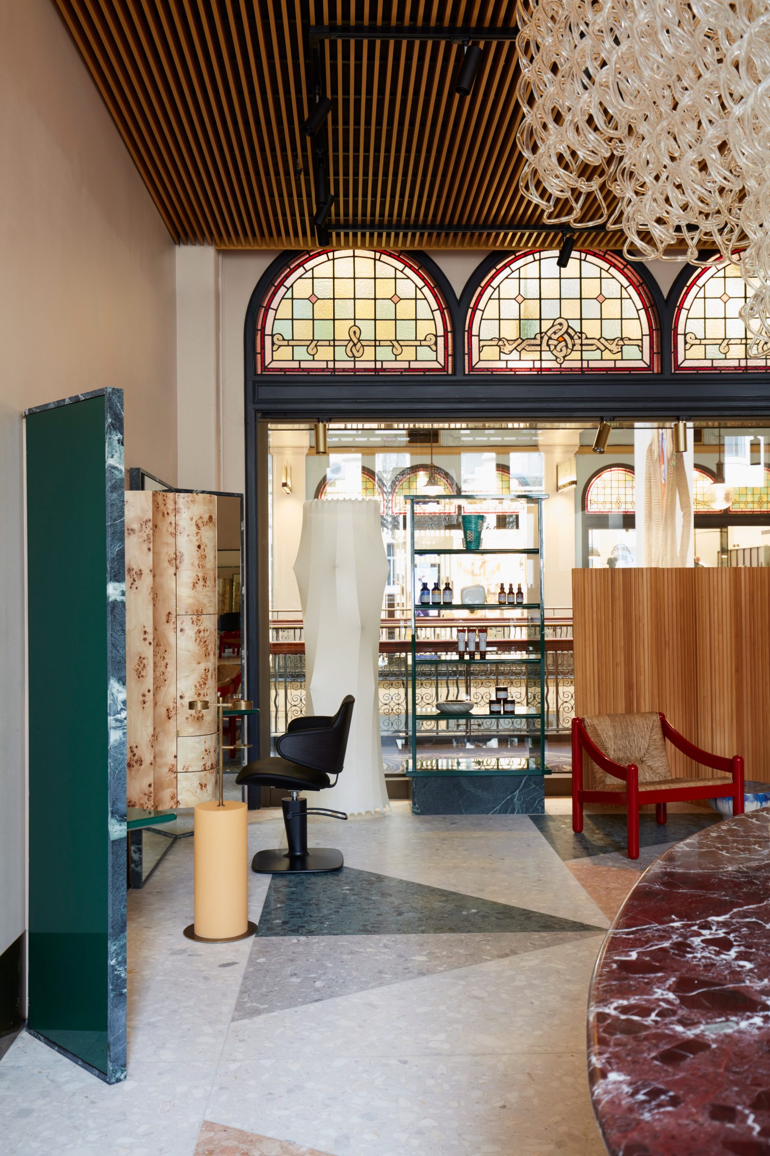
Triangular slabs of terrazzo and a vintage chandelier frame Sydney’s Koda hair salon, which local studio Arent & Pyke has conceived as an eclectic mishmash of old and new.
Located on the upper mezzanine level of the city’s George McRae-designed Queen Victoria Building, the salon was created for Australian hairdresser Koda.
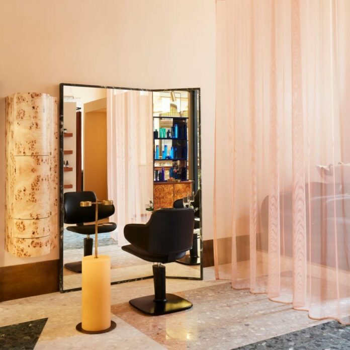
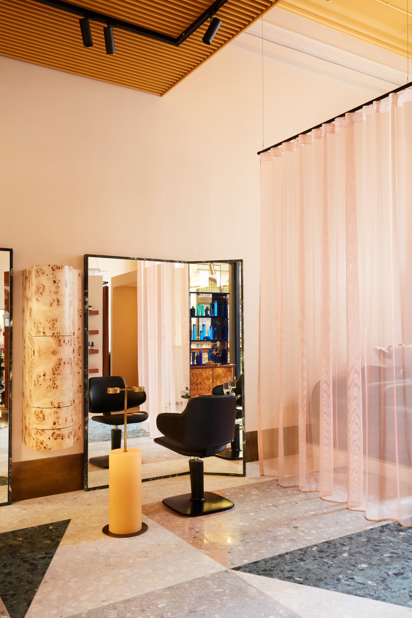
Arent & Pyke created the interiors to “be best appreciated from seated height”, placing wide quartzite-rimmed mirrors at angles in front of the curved black styling chairs to offer a contrast with the salon’s tall ceilings.
The move was made “given that clients are accustomed to looking up and down” when getting their hair done, the studio explained.
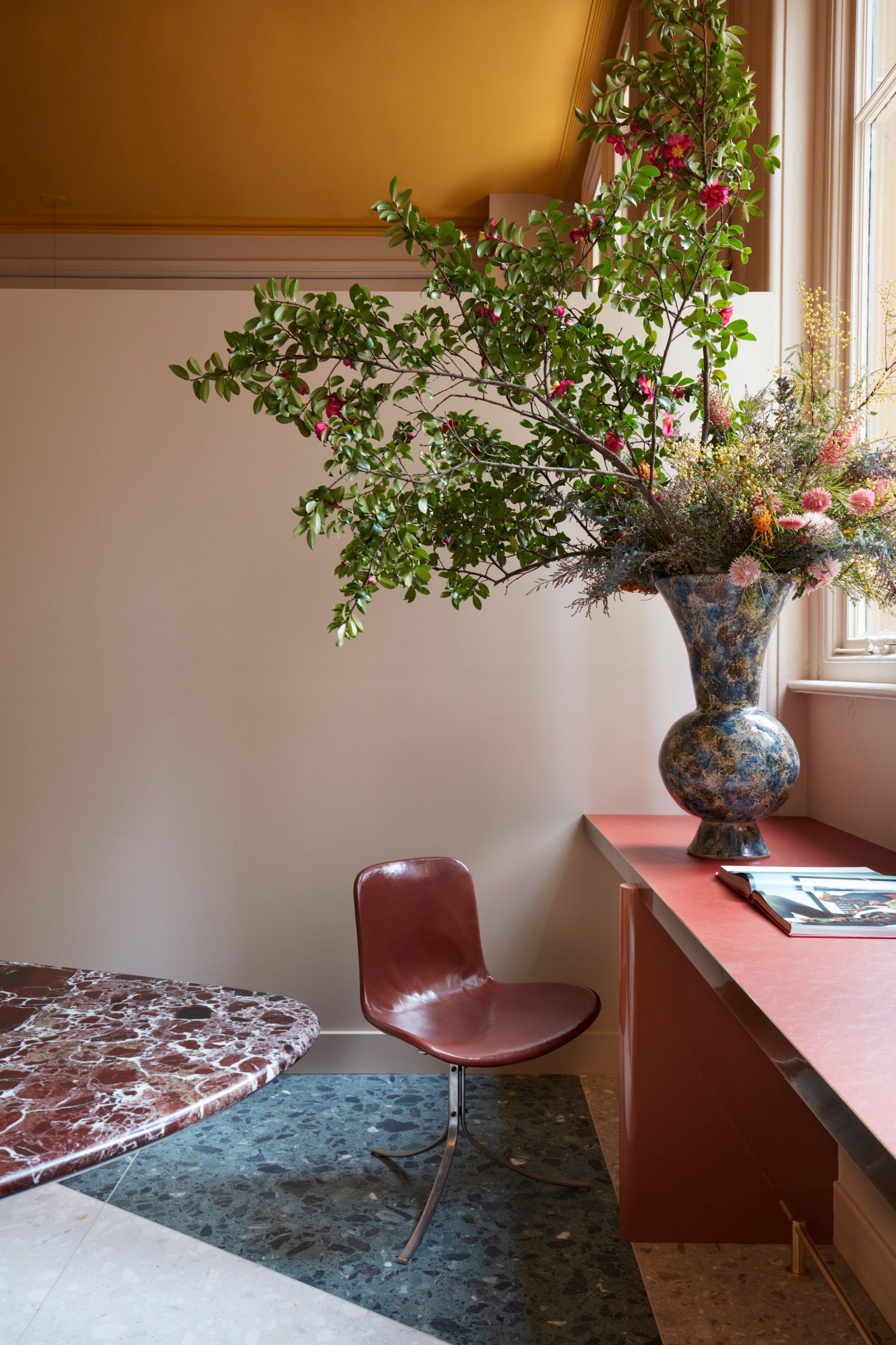
Triangular slabs of dusty pink and forest green terrazzo line Koda’s floors, which Arent & Pyke chose to mimic the marble flooring of Villa Planchart – a house in Caracas, Venezuela, completed by architect Gio Ponti in 1956.
Ceilings were painted an “energising” shade of gold and fitted with delicate timber battens that conceal various services while in one corner, a geometric 1970s chandelier illuminates the space from above.
“Both nostalgic and futuristic, Koda is a majestic work of sculpt fiction,” Arent & Pyke said.
“Four elongated windows crowned with coloured glass pool light from within, so the built spine intentionally reaches approximately half of the rear salon’s 4.5-metre ceiling height, enabling appreciation of their beauty from every vantage point.”
Brightly coloured accents were paired with burlwood mid-century furniture including a low-slung credenza topped with glossy cobalt-blue display shelving.
The studio aimed to rid the space of “transactional” clutter, replacing traditional tool trolleys with cylindrical styling stands with aged brass details designed by Arent & Pyke.
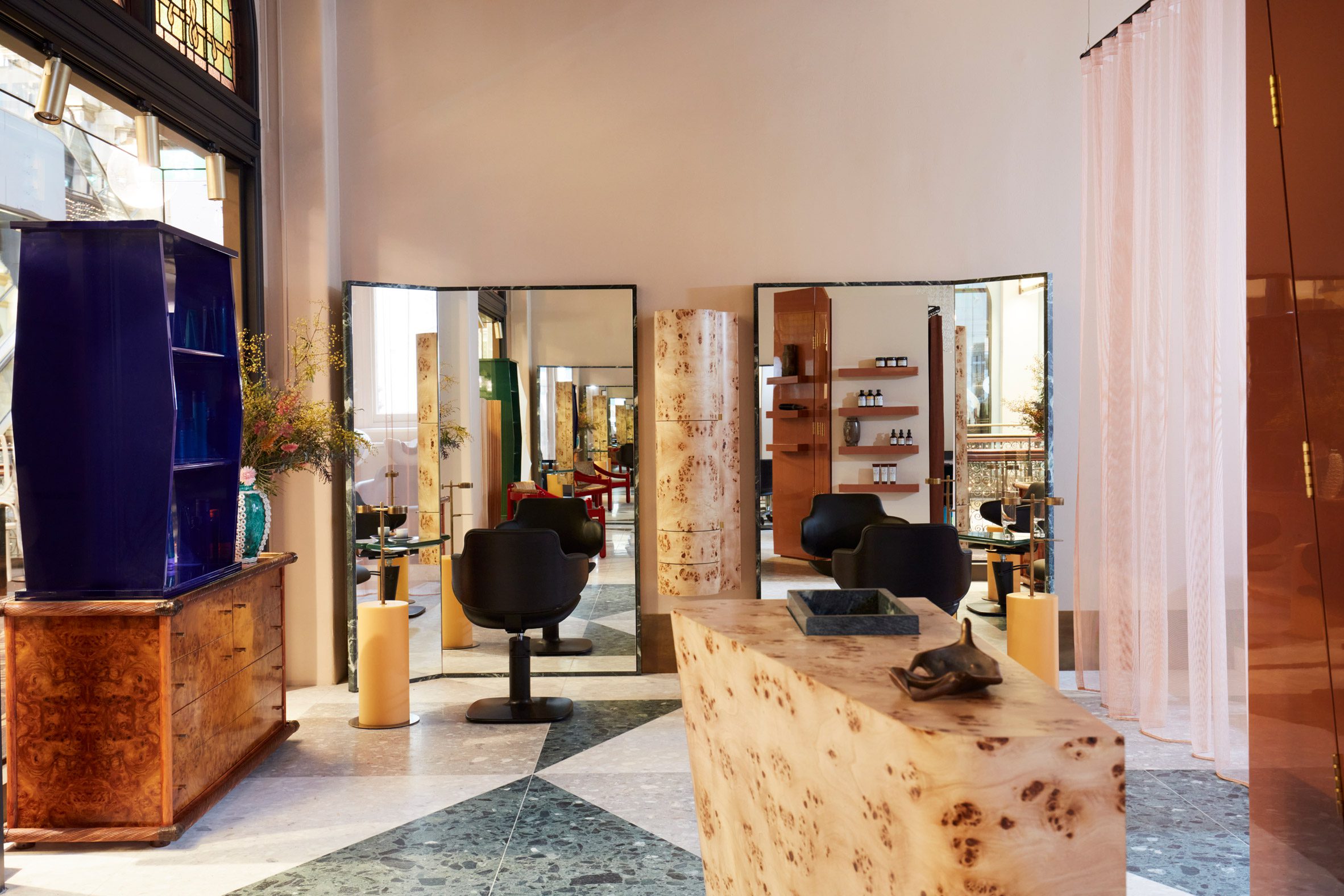
Curving light-hued timber cabinetry was also mounted to the blush-toned walls to create eclectic storage.
A translucent pale pink curtain was suspended from a rail to create a layer of privacy for the wash bay, which was positioned on a raised platform.
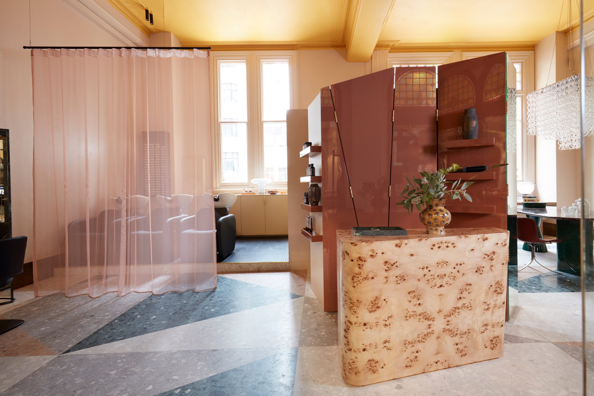
“Koda is a crafted tale of artisanal vision balancing angled poise with organic shapes and undulating forms,” said Arent & Pyke.
Founded by Juliette Arent and Sarah-Jane Pyke in 2007, the studio previously renovated a 1930s Sydney home with a monochromatic interior.
Other notable hair salon interiors include a minimalist Swedish outlet finished in pastel colours and a US barbershop with a cavernous cork lounge.
The photography is by Prue Ruscoe.
The post Arent & Pyke designs Sydney hair salon to be "best appreciated from seated height" appeared first on Dezeen.
[ad_2]
www.dezeen.com

