An 1860s Terrace Home Injected With Light + Joy
Interiors

David Boyle Architect was engaged to provide opportunities for natural light and a sense of spaciousness not normally associated with terrace house living in this Glebe home. Photography – Simon Whitbread. Styling – Holly Irvine

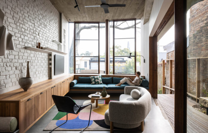
The renovation introduces a new living domain featuring a sunken L-shaped living area with four-metre-high ceilings and a wraparound timber deck. Photography – Brett Boardman

Interior designers Smith + Levine were tasked with furnishing the home with fun, relaxed and ‘easy to live with’ pieces. Photography – Simon Whitbread. Styling – Holly Irvine

Sculpture on wall by The Visuals. Custom upholstery by EnSight Furniture. Photography – Simon Whitbread. Styling – Holly Irvine

A series of sequential internal and external spaces step down and weave down into the garden. Landscape design by Spirit Level. Photography – Brett Boardman

Shou sugi ban cladding on the extension facade. Photography – Simon Whitbread. Styling – Holly Irvine

The entire extension is fitted with green roofs using native ground covers for internal thermal comfort and biodiversity. Photography – Brett Boardman

The secret upper-level rooftop ‘sky garden’ is framed by the canopy of the gumtree. Photography – Brett Boardman

The L-shaped plan draws the outdoors into the kitchen area. Photography – Brett Boardman

Concrete, recycled brick and recycled timber are repeated throughout the refined material palette. Photography – Simon Whitbread. Styling – Holly Irvine

Tiles and exposed brick add texture to the kitchen. Photography – Brett Boardman

The upstairs hallway and void. Photography – Brett Boardman

The ability to track the movement of the sun and observe the patterns of light and shadow is one of the greatest successes of the project. Photography – Brett Boardman

One can view the passing clouds above from the comfort of the downstairs bathroom. Photography – Simon Whitbread. Styling – Holly Irvine

Green tiles in the bathroom tie in with the furnishing scheme and bush-like landscaping. Photography – Simon Whitbread. Styling – Holly Irvine

Furniture selections were inspired by references to modernism in David’s architecture including built-in seating. Photography – Simon Whitbread. Styling – Holly Irvine

Lower ceilings on the upper level create more intimate spaces for two additional bedrooms upstairs. Photography – Simon Whitbread. Styling – Holly Irvine

The upstairs lounge/study. Photography – Simon Whitbread. Styling – Holly Irvine
It’s hard to believe, but prior to its recent transformation, this Glebe terrace offered little street appeal.
The 1860s Sydney house was rundown and dominated at the rear by tall brick walls from larger neighbouring homes that blocked light to the property.
David Boyle Architect was engaged to inject more natural light into the home, and a sense of spaciousness not normally associated with terrace house living.
His intent was to ‘provide a sense of adventurous discovery and surprise as you move through the home from public to private spaces,’ and ‘create a series of flowing spaces bathed in direct and reflected light that might initiate moments to pause and reflect on the carefully curated details and materials.’
In renovating the home, a sculptural two storey extension was added behind the heritage protected front rooms. Throughout, a series of skylights in the roof and voids gently ‘drop’ light and move air throughout the home.
The ground floor level was lowered to better connect to the property’s garden, forming a sunken L-shaped living area with four-metre-high ceilings and a wraparound timber deck.
A large bay window adjacent sits opposite the mature spotted gum in the backyard — perfect for naps under the branches of the tree — while creating a rare bush-like view among the densely populated inner-city suburb.
Lower ceilings on the upper level create more intimate spaces for two additional bedrooms upstairs.
The entire extension is fitted with green roofs using native ground covers for internal thermal comfort and biodiversity.
Interior designers Smith + Levine were tasked with furnishing the home with fun, relaxed and ‘easy to live with’ pieces.
Drawing on references to modernism in David’s architecture (including built-in seating and a sunken lounge room), the interior scheme introduces block-coloured upholstery and mid-century furniture, to enhance the materials palette of concrete, recycled brick, and recycled timber.
An oversized soft pendant above the dining table balances the strong lines and volumes of the space.
Smith + Levine co-director Louise Smith explains, ‘It is still a terrace house on a narrow block, so the proportions of the lounge area has limitations. We had to explore many layout options and furniture shapes/selections to maximise the seating without overcrowding the space.’
The ability to track the movement of the sun, observe the patterns of light and shadow throughout the day, and view passing clouds as far away as the downstairs bath is one of the greatest successes of the project.
The expansion and contraction of space allows for a variety of architectural experiences, a connection to the landscape, and elicits an emotional response that feels both joyous and secure.
thedesignfiles.wpenginepowered.com


