[ad_1]
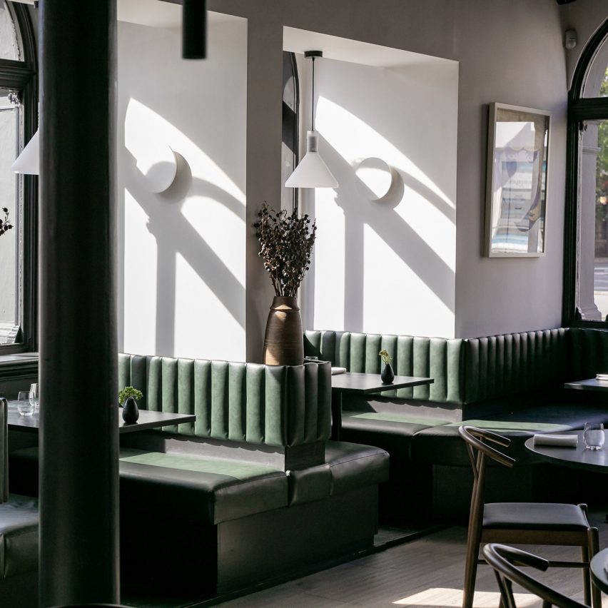
Interior designer Akram Fahmi has revamped the Etch restaurant in Hove, East Sussex, creating black and white interiors to reflect its minimalist menu.
Located in a space that was originally a bank, Etch was first renovated and opened as a restaurant in 2017.
It has been reimagined by Fahmi, the founder of interiors studio London Design House, with an open kitchen and subterranean speakeasy bar.
Fahmi chose the simple colour palette to echo the approach of the restaurant’s menu, where most of the dishes are comprised of just two ingredients.
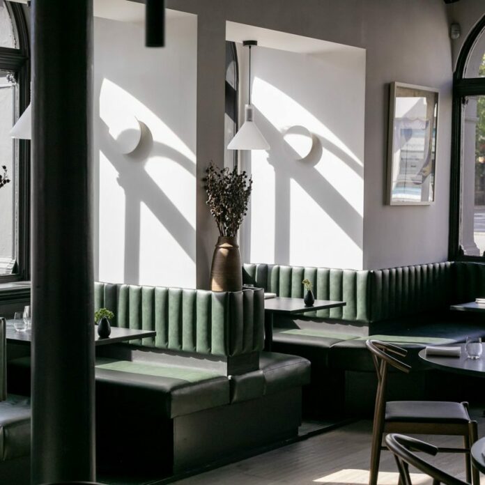
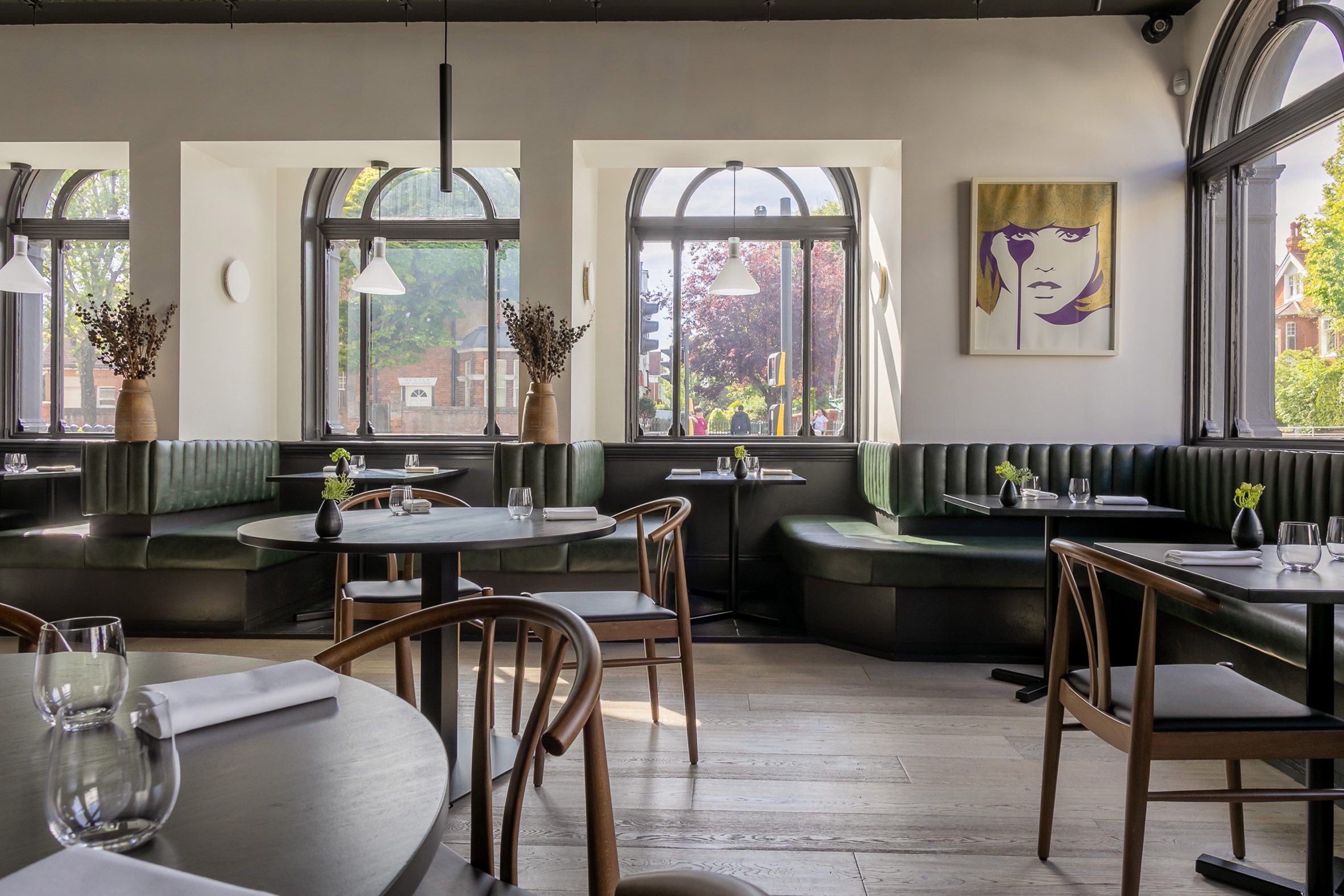
Wide-plank chalk-washed timber floors and white walls contrast black banquette seating and timber framing.
“We identified, and tried to achieve, three key principles in the design; refinement, texture, and locality,” Fahmi told Dezeen.
Rough quarry tiles, matte-finished stone and sinuous stretched-fabric lighting were chosen to reflect the textures of the nearby South Downs, the coastline and the urban landscape.
“The balance in texture and tone is key to the guests’ journey through every space in the restaurant and bar,” Fahmi explained.
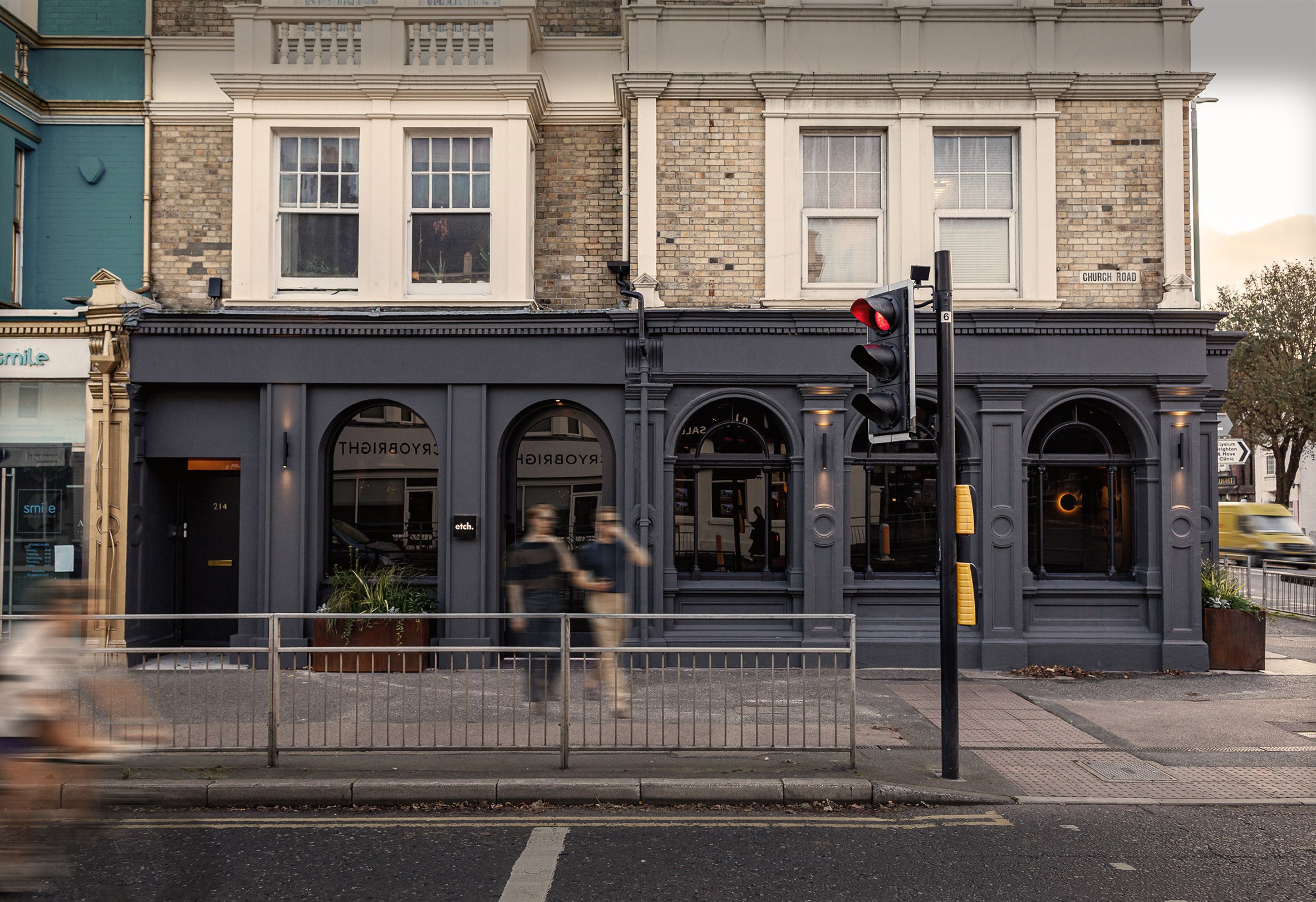
The renovation involved merging two ground-floor units together and uniting a single space that is flooded by natural light from five arched windows.
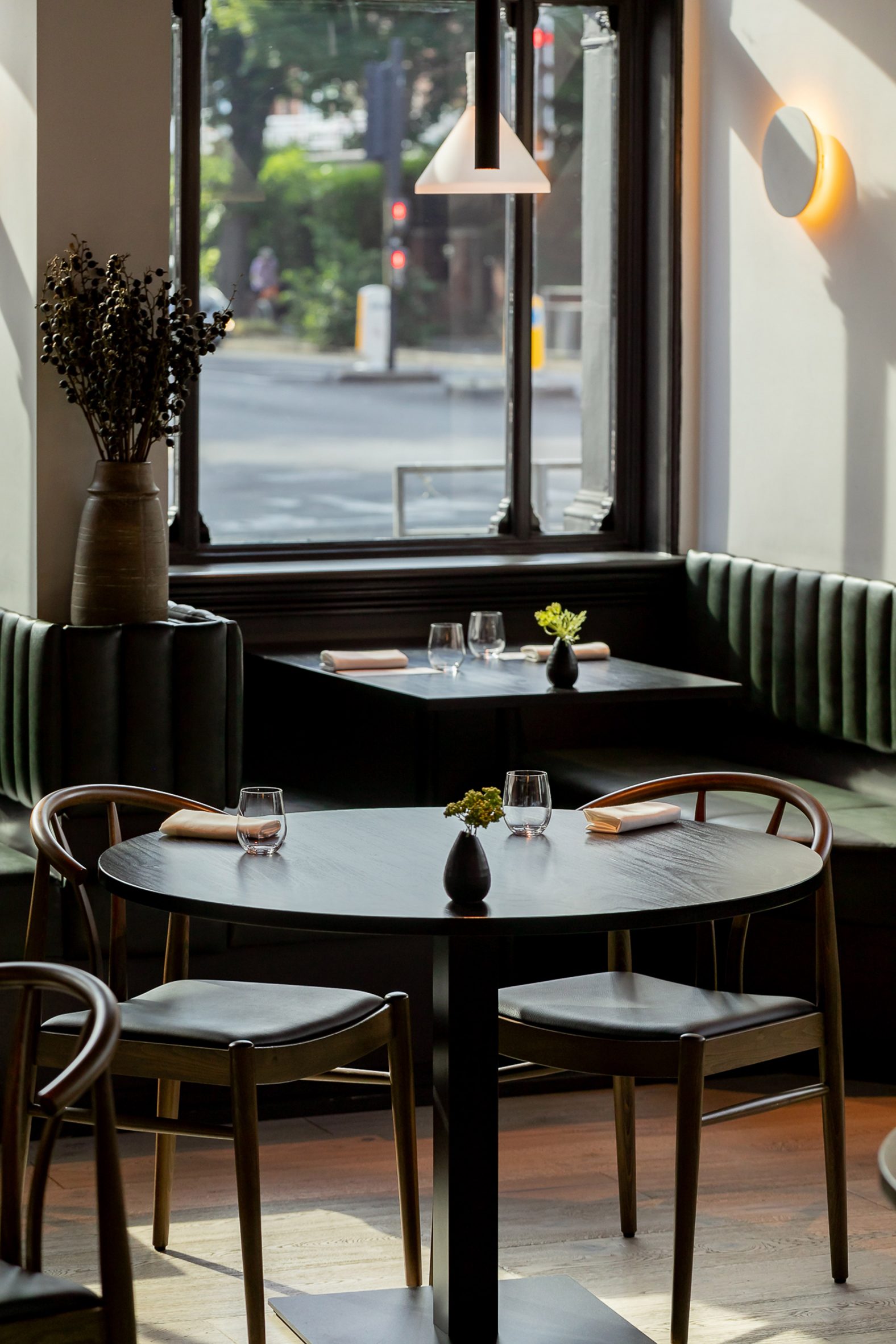
The studio kept three original Victorian arched windows on the corner and added two further full-height arches with modernised detailing to create a uniform facade.
This was further united by painting the whole ground-floor facade charcoal grey.
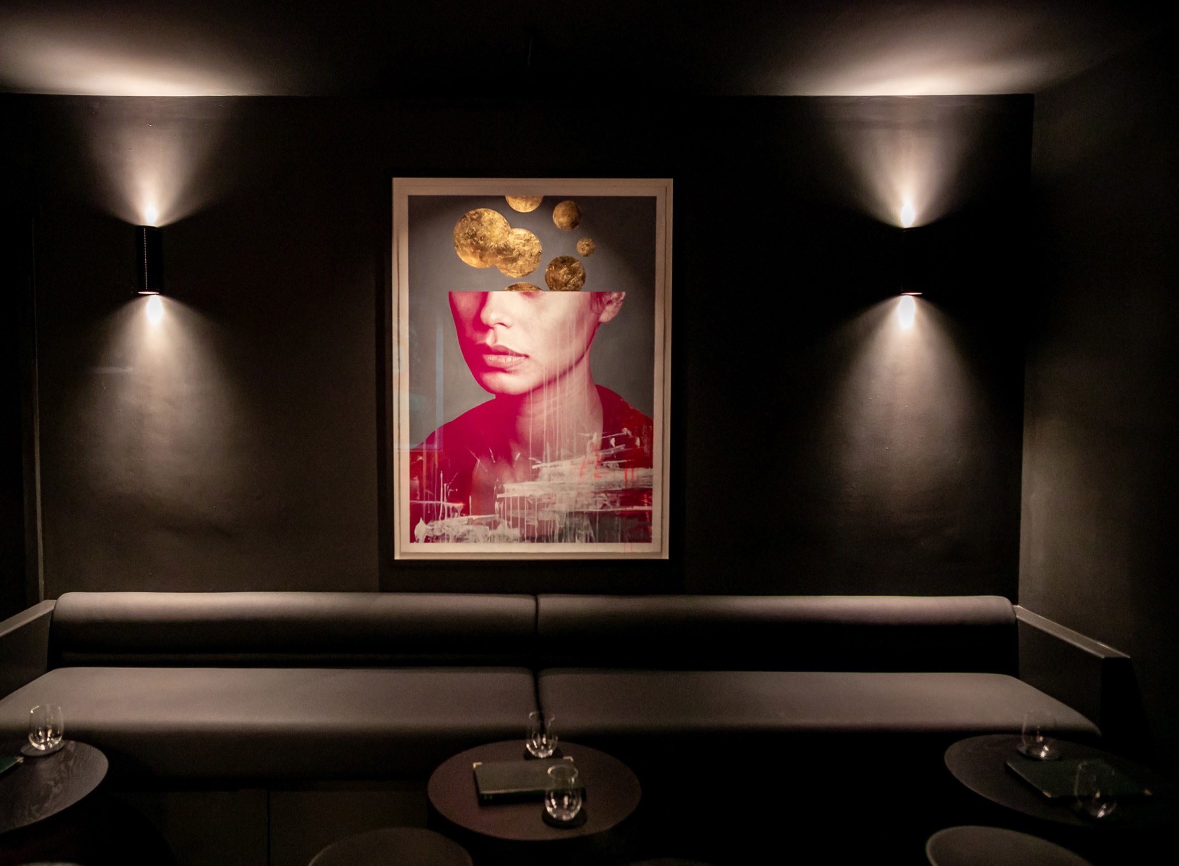
“You want to feel as though the architecture and interiors that you journey through are as curated and elegant as the food in front of you,” Fahmi said.
Internally, cast iron columns from the old bank were retained and suspended ceilings in the main spaces were stripped out to expose the original high ceilings.
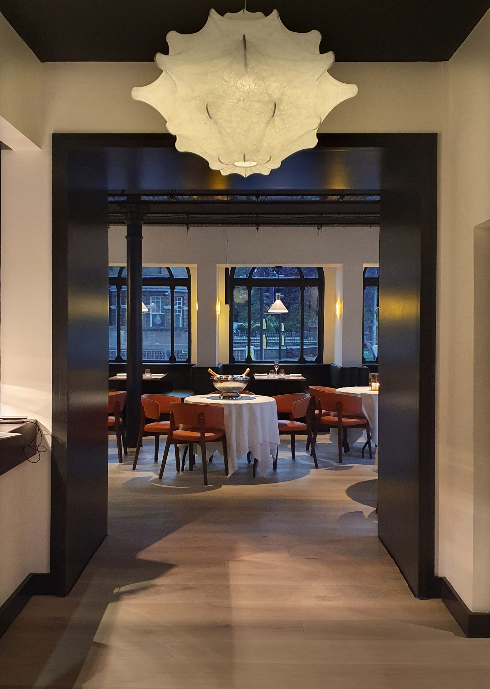
Fahmi worked with the local council to find solutions for extract routes and plans that would “retain and respect the fabric of the historic building as much as possible”.
The studio used passive devices, such as tinting the glazing to reduce solar glare, to help control the internal temperature more efficiently.
New external planting troughs soften the austere facade and hard pavement. The studio chose plants, herbs and grasses that would be suitable for the local coastal environment.
London Design House also worked with local craftspeople and suppliers on the project to reflect Etch’s ethos of sourcing its produce locally and seasonally.
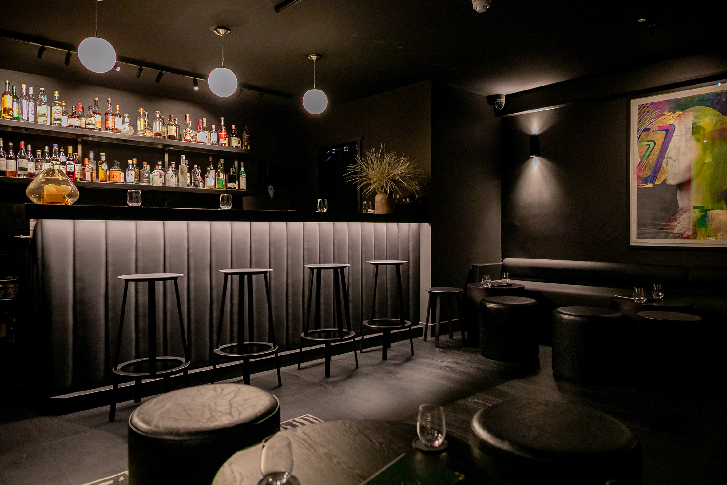
“I wanted the restaurant to feel like an extension of the food and service we offer, which I would describe as British contemporary, but also minimalist – mainly using two quality ingredients,” Etch’s chef and owner Steven Edwards told Dezeen.
The monochrome palette “gives a slightly nordic minimalist feel that works completely with my food style,” he added.
“I think the relationship between the food you eat and the setting you eat it in is really important. It’s not just about the food – although it’s hard for me to say that being a chef!”
Other restaurant interiors recently featured on Dezeen include Studio Becky Carter’s “distinctly New York” interiors for Cecchi’s and Otherworlds’ transformation of a Goan villa into restaurant.
The photography is by Justin de Souza and David Charbit.
The post Akram Fahmi gives Etch restaurant monochrome revamp to reflect two-ingredient dishes appeared first on Dezeen.
[ad_2]
www.dezeen.com

