[ad_1]
A Wonderfully Warm Renovation Of A Converted Sydney Warehouse
Architecture

Bigger isn’t always better according to Carter Williamson Architects, hence their approach to transforming this converted warehouse Sydney’s Camperdown. Photo – Pablo Veiga

Rather than add new spaces, the architects were brought in to improve the quality of spaces within the existing warehouse footprint. Photo – Pablo Veiga

The interior palette of the home, named Rosso Verde, maintains the appearance of a warehouse, but with an added richness. Photo – Pablo Veiga

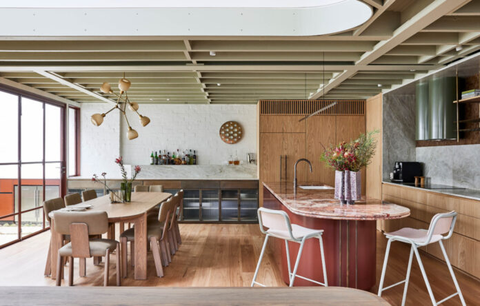
Red is used in the kitchen island stone and joinery, and sits complementary to the green exposed painted ceiling that celebrates the honesty of the warehouse structure. Photo – Pablo Veiga

A central void/lightwell draws light deep into the home. Photo – Pablo Veiga

Colours are repeated throughout for a consistent narrative including warm ochre tones, aged brass tapware, and timber flooring. Photo – Pablo Veiga

‘We opted for an interior narrative that used a combination of earthy tones and textural materials to create warmth, while celebrating the warehouse bones of the building in a sophisticated and elevated way,’ says Julie Niass, senior associate – interiors at Carter Williamson Architects. Photo – Pablo Veiga

The entry to the butler’s pantry behind the kitchen. Photo – Pablo Veiga

Almost a third of the floor plan was removed to introduce the central void and courtyard that injects valuable light and greenery into the home. Photo – Pablo Veiga

The entrance to the home, via the new courtyard designed with Dangar Barin Smith. Photo – Pablo Veiga

The void provides a visual connection between the two floors, and what Julie calls ‘spatial joy’ — a feeling of wonder, light and openness to the plan. Photo – Pablo Veiga

The central void/lightwell. Photo – Pablo Veiga

The view into the living room from the courtyard. Photo – Pablo Veiga

Large windows open the living room to the courtyard. Photo – Pablo Veiga

Red is the predominant colour of the new interior, complemented by various shades of green. Photo – Pablo Veiga

Joinery in the home was made by Palm Beach Design Co. Photo – Pablo Veiga

The living room joinery contains a study nook suitable for a family home. Photo – Pablo Veiga

The client wanted to maintain the warehouse aesthetic, but in a sophisticated and restrained way. Photo – Pablo Veiga

The deep red of the new facade is reflected in the bathroom. Photo – Pablo Veiga

The luxe main bathroom with a stone basin. Photo – Pablo Veiga

The upper level houses the three bedrooms; two bathrooms; and study. Photo – Pablo Veiga

One of the bedrooms sits above the garage, separated from the main built form by a bridge over the courtyard. Photo – Pablo Veiga

‘The new facade red we inserted, drawing inspiration from the typical warehouse aesthetic and adopted steel windows with a rational grid breakup,’ says Julie. Photo – Pablo Veiga

The courtyard from above. Photo – Pablo Veiga

The beautiful oasis garden, designed and delivered by Dangar Barin Smith. Photo – Pablo Veiga
The previous state of this already converted warehouse in Sydney’s inner-west had the rare problem of ‘swimming in too much space.’
‘Built boundary to boundary with no setbacks, the home had lots of floor space but was limited for natural light,’ explains Julie Niass, senior associate – interiors at Carter Williamson Architects. ‘The living space relied only on windows to the south elevation, while dormer windows provided limited light to the upstairs bedrooms.’
A renovation designed by Carter Williamson Architects and constructed by David Fletcher Constructions sought to overcome these issues, creating more defined areas within the home with a connection to the outdoors.
The solution lay in subtracting, not adding, to the existing floor plan, by carving ground floor rooms away to create a generous courtyard on entry.
Julie explains, ‘The biggest move we made was to remove almost a third of the floor plan and roof to introduce what is effectively their backyard — a beautiful oasis garden designed and delivered by Dangar Barin Smith.
A central void/lightwell further draws light into the home while providing a visual connection between the two floors, and what Julie calls ‘spatial joy’ — a feeling of wonder, light and openness to the plan.
The upper level houses the three bedrooms (one of which sits above the garage, separated from the main built form by a bridge over the courtyard); two bathrooms; and study.
The interior palette of the home, named Rosso Verde, maintains the appearance of a warehouse, but with an added richness.
‘Our design for Rosso Verde does not follow the typical industrial precedent set for warehouse conversions, which often lean into cold industrial aesthetics,’ says Julie. ‘Instead, we opted for an interior narrative that used a combination of earthy tones and textural materials to create warmth, while celebrating the warehouse bones of the building in a sophisticated and elevated way.’
In the living spaces, red is used in the kitchen island stone and joinery and sits complementary to the green exposed painted ceiling that celebrates the honesty of the warehouse structure.
‘The new facade red we inserted, drawing inspiration from the typical warehouse aesthetic and adopted steel windows with a rational grid breakup,’ says Julie.
These colours are repeated throughout for a consistent narrative in the project, alongside warm ochre tones, aged brass tapware, and timber flooring.
Post alterations, Julie says the home is a ‘fundamentally different place.’ The home is lighter, warmer, more functional, and an ultimately more beautiful space to be.
[ad_2]
thedesignfiles.net


