[ad_1]
A Wonderfully Retro Brisbane Home Reworked Around Its Gardens
Architecture

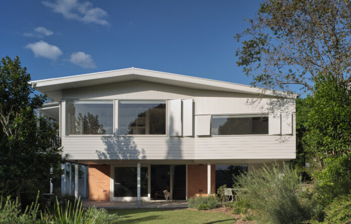
River Loop House by Vokes and Peters is 1960s Brisbane house that’s been preserved and adapted.

The retro abode is set on a ridgeline site high above the banks of the Brisbane River, and once enjoyed views of the water from its elevated terrace.

The humble character of the brick build has been retained and enhanced by Prandium Studio‘s new landscaped gardens.

A lofty void in the stairwell is now filled with light.

The lower level features an original sitting room with a brick hearth around the fireplace.

A look into the new kitchen and living space, complete with a modern take on the quintessential Brisbane balcony.

Morning sun now lights up the kitchen’s stainless steel bench and white tiled splashback.

Windows connect every space to garden views.

The kitchen flows through to the living room.

The new main bedroom.

The bathroom pairs green floors with a matching coloured grout across the all-white tiles.

Step up into the relaxing shower.

It’s home to a family of four and their dog, Winne!
The ‘cautious’ renovation of this 1960s Brisbane home has helped preserve the modernist design for the next generation.
Vokes and Peters co-founder and architect Stuart Vokes says the property was ‘mostly un-renovated and un-altered’ when the new owners purchased it from a senior, long-time resident. And while the two-storey abode needed some updating, they were careful not to stray too far from the integrity of the original design.
‘Our vision was to rearrange the floor plan to optimise the relationship to the plentiful gardens whilst preserving the architectural character of the 60s Brisbane house style,’ Stuart says.
Most of the rooms in the house were shuffled to relocate the kitchen from a ‘dark back-room’ to a new spacious position overlooking the street. Sliding doors open to an inviting outdoor terrace that stretches along the living and kitchen areas, perfectly framing newfound panoramic garden views.
The original living rooms — with fireplaces intact — were kept in their original locations and updated with simple additions, like a custom bench seat in the sill of a large picture window, creating new quiet corners where the owners can take in the ‘verdant and tranquil scenery’. Amongst the project’s light demolition and significant restructuring, just 15 square metres was added onto the house to make way for a new bedroom.
‘Our clients are back to gardening and entertaining friends in the place they call home,’ Stuart says of the updated spaces. ‘We are pleased that the kitchen is now bathed in light on a winter’s morning, encouraging our clients to partake in a dialogue with their broader neighbourhood, simply by occupying the indoor and outdoor spaces on the edge of the front garden.’
A two-storey void also helps bring light and air deep into the house, where the new stairwell leads down to the cosy ‘garden level’ and sitting room.
The simple interiors were designed to highlight the existing materials. Warm timbers, white joinery and stainless steel finishes bring a contemporary feel to the retro build, with playful hints of green in the tiled bathroom that reflect the surrounding suburban landscape, without ‘being overtly decorative’.
Stuart says the beauty of the resulting River Loop House is that the interventions are so sympathetic that a new visitor might think the house was simply repainted and re-tiled, but they’ve been ‘transformative’ in enhancing how the house is used and enjoyed.
Want to see more from The Design Files? Sign up to our newsletter for your weekly dose of home and design inspiration here!
[ad_2]
thedesignfiles.wpenginepowered.com


