[ad_1]
A Sympathetic Renovation + Extension Of A Modernist Caulfield Home
Architecture

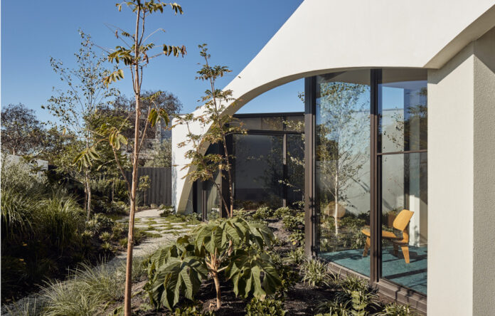
The home was designed with the landscape in mind. Photo – Peter Bennetts

Striking architectural arches link old and new. Photo – Peter Bennetts

Views to the garden are incorporated in every nook. Photo – Peter Bennetts

The home expands from the inside! Photo – Peter Bennetts

Cleverely positioned skylights removed the need for artificial lighting during the day and are one of the many sustainable principles adopted throughout the home. Photo – Peter Bennetts

Curves are a repeated feature in the renovated 70s home! Photo – Peter Bennetts

Curved bench from Kristina Dam. Photo – Peter Bennetts

A palette of warm timber veneer, rusty orange fabric and plush carpet reference its retro vibes. Photo – Peter Bennetts

White-on-white concrete flooring meets the original terrazzo floor! Photo – Peter Bennetts

The master wing is located on the southern site and is connected to the main house by a glass bridge. Photo – Peter Bennetts

The original terrazzo flooring! Photo – Peter Bennetts

Plush blue carpet references the home’s 70s roots. Photo – Peter Bennetts

The glass bridge that connects the master wing to the main area of the home. Photo – Peter Bennetts

A pool is a must for a open, family home. Photo – Peter Bennetts

Pockets of planting surround the house. Photo – Peter Bennetts

From the street, the home’s expansive structure is cleverly hidden. Photo – Peter Bennetts
The renovation and subsequent extension of this split level Caulfield home by Kister Architects is a masterclass in balance.
‘The clients requested something fun but modest, colourful with lots of texture, but minimal with a sense of sparseness,’ says Ilana Kister of Kister Architects.
They were also set on paying homage to the home’s 70s roots, by maintaining the design of the facade and the interior’s retro vibes, but keen to add a contemporary element.
The project began as a single site, double storey renovation, but morphed into a double site renovation with a single storey addition when the clients acquired a second parcel of land on the adjacent block (on the southern side). The 70s split-level northern house was retained, while the house on the southern block was demolished to make way for a sympathetic modern extension.
‘The highlight of the project was the limitless possibilities revealed once the site doubled in size,’ says Ilana.
Stretching the house onto the adjacent southern site allowed the architects to re-think how they were going to bring light into the new spaces, and how to incorporate nature and landscape into the home.
‘Our primary concern was to maintain a continuous connection to nature and light,’ explains Ilana. Thus, the home was designed around courtyard pockets, which frame views to the garden and ‘interesting in-between’ spaces. The sprawling garden and growing abundance of plants are visible from almost every space within the home, while sky lights have been strategically placed to minimise the need for artificial lighting.
To hark back to its 70s modernist beginnings, the architects utilised materials such as bronze hardware, glazing and aluminum, white aggregated concrete with blue plush and white felted carpet alongside orange velvet and warm timber veneers.
‘These are offset with a layered selection of concrete render, glazed Japanese tiles, black veneer and gold wallpaper to blue the retro with a nuanced contemporary palette,’ explains Ilana.
The combination of these two distinct, yet complementary, palettes help to blur the line between the similarly distinct retro and contemporary parts of the home, tying old and new together.
‘The design and development of this has brought an old, tired house into a lovely contemporary haven, that embeds the family into their landscape,’ says Ilana.
[ad_2]
thedesignfiles.net


