[ad_1]
A Revamped Queenslander Designed To Embrace Its Lush Landscape
Architecture

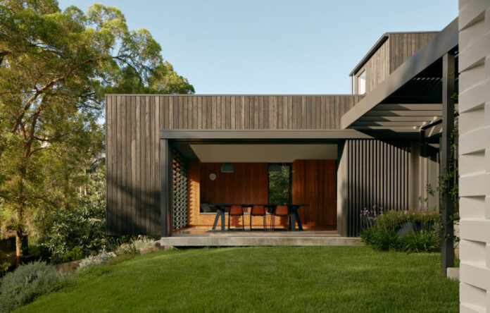
The new home boasts spaces for entertaining, inside and out. Photo – Tom Ross

The renovation opened up the former dark and poorly ventilated lower level. Photo – Tom Ross

A super stylish timber kitchen! Photo – Tom Ross

‘The house feels really settled now, and the downstairs areas of the house which once felt dark and stuffy are now shaded, open and private; opening up in different orientations to give a variety of experiences of the site.’ Photo – Tom Ross

The project used materials like stone and timber that didn’t require maintenance and allowed continuity between the interior and exterior. Photo – Tom Ross

The clients really wanted to have an informality to the house. Photo – Tom Ross

Now, it’s amazingly open plan. Photo – Tom Ross

And light and bright! Photo – Tom Ross

Striking contemporary and shapes bring a modern drama to the the bungalow. Photo – Tom Ross

The clients have done all of the gardening work themselves. Photo – Tom Ross

Talk about making the most of its dreamy location! Photo – Tom Ross

The pared-back street frontage offers a small sneak peek into the the extension, build into the sloping site. Photo – Tom Ross
Before its transformative renovation was completed in 2020, Poinciana House was a family bungalow characterised by issues typical of an older home in Brisbane.
The existing property featured an upstairs area that was in largely good condition, but a lower level that had been poorly renovated in recent years, according to Nielsen Jenkins co-founder Morgan Jenkins.
‘It was a beautiful Queenslander-style house, raised slightly off the ground at the entry, but really disconnected from the ground at the rear, as the contours dropped away. The living spaces were at the rear of the house, towards the view, but were completely internal and extremely hot in the afternoon because they had no eaves or operability,’ Morgan explains.
This was a problem for the owners, who wanted to live in a ‘relaxed way’, connected to the home’s western aspect – while also being protected from the blistering heat.
Nielsen Jenkins’ resulting redesign consists of an unconventional extension that weaves new spaces into the original building, featuring cleverly placed ‘secondary spaces’ the family can retreat to when the sun is at its worst.
‘The protruding stairs actually serve to shade the grass courtyard in peak summer, and sliding shading screens allow the rooms to shut down without compromising the breeze,’ Morgan says. ‘We tried to pull the building apart so as to inhabit more of the site in different ways.’
Most of the upstairs and the old living room was retained, as the architects instead ‘cut a hole in the floor’ to establish a connecting void. They also introduced robust new materials such as charred timber, stone and blockwork, which serve to differentiate the old and new parts of the home.
Now, the new-and-improved family home successfully embraces its incredible view, overlooking trees and surrounding backyards, finished by gardens that settle the home into its natural surrounds.
See more of Nielsen Jenkins work here.
[ad_2]
thedesignfiles.net


