[ad_1]
A Renovated Fitzroy Home, Inspired By The Candied Colours Of Italian Dessert
Architecture

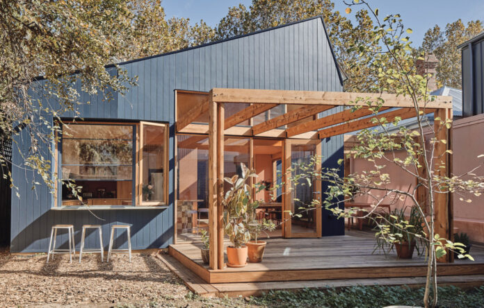
The transformed family home, which has earned the nickname of Casa Cassata – like the Italian dessert! Photo – Peter Bennetts

A renovation by Timmins + Whyte Architecture and Design rebuilt the front part of the home, while a new extension makes way for an L-shaped deck beyond the striking living room. Photo – Peter Bennetts

It now features spaces for entertaining, inside and out. Photo – Peter Bennetts

The entire build took around a year from start to finish. Photo – Peter Bennetts

Photo – Peter Bennetts

Inside the spectacular, ‘dessert-like’ interiors! Photo – Peter Bennetts

‘The original stained-glassed windows at the front of the house were the inspiration for the scaled-up version of coloured glass in the kitchen and living space,’ Sally of Timmins + Whyte Architecture and Design says. Photo – Peter Bennetts

Laminex Tasmanian Oak features in the pastel kitchen. Photo – Peter Bennetts

‘Our client’s time spent in Rome inspired the peachy-pink and terracotta walls. Finishes were handpicked in collaboration with them to create a sweet, colour-saturated and warm interior.’ Photo – Peter Bennetts

The stone island bench features stone tiles from Earp Bros, and liquorice drawer pulls alongside a pink Italian marble on island from Artedomus. Photo – Peter Bennetts

Every room now has an interaction with the garden. Photo – Peter Bennetts

Colour also helped inject personality back into the bedrooms after being stripped back in the former renovation. Photo – Peter Bennetts

Pink resin coffee table by Billy Table. Photo – Peter Bennetts

A tonal bathroom. Photo – Peter Bennetts

Even the bathroom looks out to garden spaces! Photo – Peter Bennetts

‘The additional footprint isn’t large however it has created a spacious kitchen and dining space due to the height of the ceiling and the expanse of glass – something that could not have been achieved by adding a second floor that would have housed superfluous bedrooms.’ Photo – Peter Bennetts

A look into the restored bedroom, with the original stained glass windows in the facade. Photo – Peter Bennetts


The classic facade is painted with Dulux Royal Battle, while the front door is Dulux Italian Clay. Photo – Peter Bennetts
From the street, this charming Edwardian facade doesn’t give much away. But a closer look reveals a coral door, which is just a hint of the weatherboard’s true personality, and the candy-coloured renovation hidden within.
It’s the Fitzroy home of a couple, their young son, and beloved cat, Gnocchi. After a decade of living in an apartment nearby, the family purchased the house (after falling in love with the garden) and approached Timmins + Whyte Architecture and Design to help make it their ‘forever home’.
‘The double-fronted Edwardian was very run down and had a partial renovation in the 70s that stripped it of some of the Edwardian interior finishes and details,’ practice co-founder and director Sally Timmins says. ‘Our close friends and returning clients wanted a house that would feel like it had developed organically rather than having a sterile “new house” feeling.’
This brief led the architects to retain and rebuild the original rooms at the front of the house, while the old, termite-damaged rear spaces were replaced by a sun-drenched extension – complete with nods to the family’s playful personality and Italian heritage.
Time spent in Rome influenced the peachy-pink and terracotta walls, and during the build, the house earned the nickname ‘Casa Cassata’ for its visual similarities with the Italian dessert of the same name, which features candied fruits among a layered cake!
‘The original stained-glassed windows at the front of the house were the inspiration for the scaled-up version of coloured glass in the kitchen and living space,’ Sally explains. ‘The details such as the lilac accents and the [pink and yellow] windows are reminiscent of candied fruits, and the almost confectionary-like colour palette is balanced by the varying types of soft timbers.’
A spectacular checkered stone island bench with pink Italian marble and liquorice drawer pulls continue the whimsical aesthetic, adding to the ‘dessert-like’ theme.
A key goal of the renovation was to bring more natural light in. Along with the trio of coloured glass panels, the sloping roof features large openable skylights to capture direct daylight as the sun travels above the neighbouring two-storey houses, providing a warm glow inside right through the day.
Additionally, the new living and kitchen were set back from the northern boundary, enabling an L-shaped deck to wrap around the new extension -encouraging a strong connection between indoors and out.
‘Our clients love to cook and eat and entertain, and now they can adapt their house to suit their needs’. Sally says. ‘Whether it’s playing cards or ping pong at the dining table with the windows open ventilating the space, or opening up to a larger group with the large sliding door, or a making a drink for old school friends at the spritz bar.’
It’s their own personalised taste of Italy, in the middle of Melbourne!
[ad_2]
thedesignfiles.net


