[ad_1]
A Reimagined Blonde Brick House With ‘Mid-Century Vibes’
Architecture

Inside Blonde House by Studio Tom! Photo – Eve Wilson. Editorial styling – Natalie James

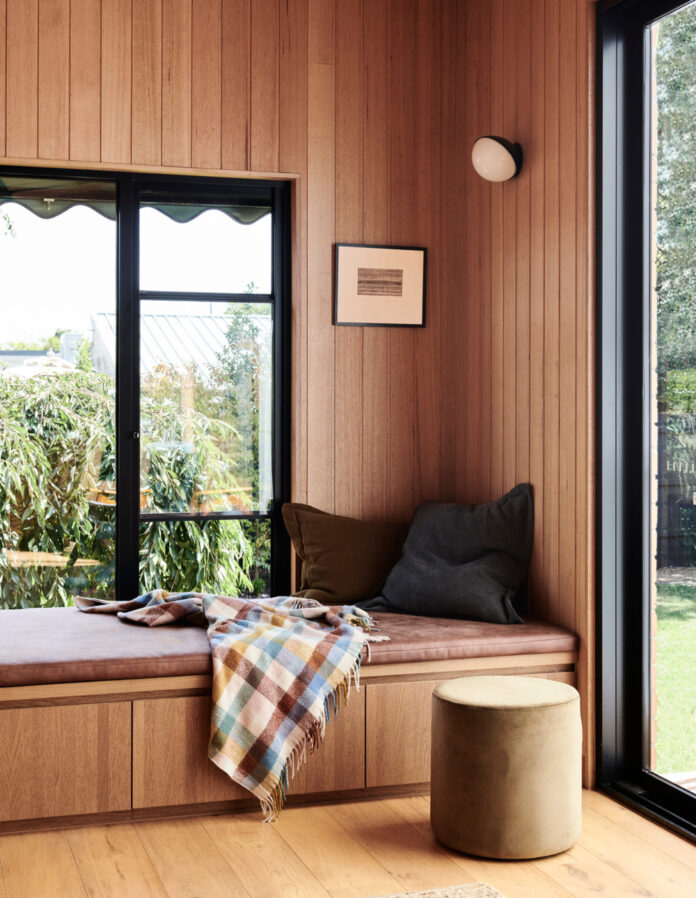
Silvertop Ash shiplap timber lines the walls and the ceiling of the new sunroom, complete with beautifully crafted joinery. Photo – Eve Wilson. Editorial styling – Natalie James

The renovation created additional spaces for the family of five by reconfiguring the home, rather than creating a large extension. Photo – Eve Wilson. Editorial styling – Natalie James

The timber palette feels contemporary, without feeling out of place in the late ’50s, early ’60s build. Photo – Eve Wilson. Editorial styling – Natalie James

The new kitchen brings together sage green tones and black metal accents in light fittings, hardware, and the range hood enclosure. Photo – Eve Wilson. Editorial styling – Natalie James

Robbie says this choice is ‘a nod’ to the home’s existing steel windows. Photo – Eve Wilson. Editorial styling – Natalie James

The kitchen’s new design was thoughtfully planned all within the existing location of the dated kitchen. Photo – Eve Wilson. Editorial styling – Natalie James

Timber joinery serves as its own thoughtful feature in the design, creating storage and space to display personal objects. Photo – Eve Wilson. Editorial styling – Natalie James

A look into the refreshed bathrooms! Photo – Eve Wilson. Editorial styling – Natalie James

Muted sage green tiles are paired with Polarity terrazzo to create a textured bathroom. Photo – Eve Wilson. Editorial styling – Natalie James

The 170sq m house is located on a 590sq m in Malvern East. Photo – Eve Wilson. Editorial styling – Natalie James

‘Although the home is now not much bigger than the original footprint, the modified spaces and considered design approach mean the family now have more room and flexibility,’ Robbie says. Photo – Eve Wilson. Editorial styling – Natalie James
The owners of this home in Malvern East are only its second custodians. They purchased the home in 2018, and gave it a quick DIY makeover before moving in – pulling up carpets, stripping old wallpaper, adding new window furnishings and light fixtures.
But a few years later, they decided it needed a total transformation, and turned to Melbourne interior architecture and design practice Studio Tom.
‘The vision was to complement the mid-century vibes of the residence,’ Studio Tom director Robbie Peirce says.
‘It was important to retain existing character and provide a timeless design that belonged.’
As a classic late ’50s to early ’60s blonde brick residence, it had become dated inside and out, so the main brief was to maximise the original floorplan – while grappling with a ‘limited budget’ and some strict planning caveats. In order to work within these constraints, Studio Tom decided to leave the ‘main bones of the house’ untouched, instead mindfully updating the internal footprint.
‘An existing laundry was modified to become the second bathroom – a must for the couple who had been sharing a bathroom with the kids for years,’ Robbie explains. ‘The kitchen’s new design was thoughtfully planned within the existing dated kitchen location. Pinching a touch of space from an adjacent room offered the kitchen much better flow and storage.’
One of the best parts of the reimagined home is the beautifully warm rear sunroom, where the walls and roof are all lined in Silvertop Ash shiplap timber. The new raised, raked ceiling and glass doors to the backyard let light stream in and gave a greater sense of space, whilst the comfy built-in day bed flanked by a new fireplace is now the perfect place to ‘snuggle and read a book’, or to take in garden views.
Rich mid-tone timbers were another big part of crafting the property’s textural and retro-inspired interiors, paired with calming sage greens and black metal accents, as a subtle nod to the existing steel windows.
Robbie says this project proves how you can balance a home’s past with the needs of the present, thanks to the owners’ sympathetic approach: ‘They saw the value in crafting spaces from what they already had.’
[ad_2]
thedesignfiles.net


